The History of Counterculture Vinyl Album Covers: Censored Albums and Psychedelic Rock of the ’60s and ’70s
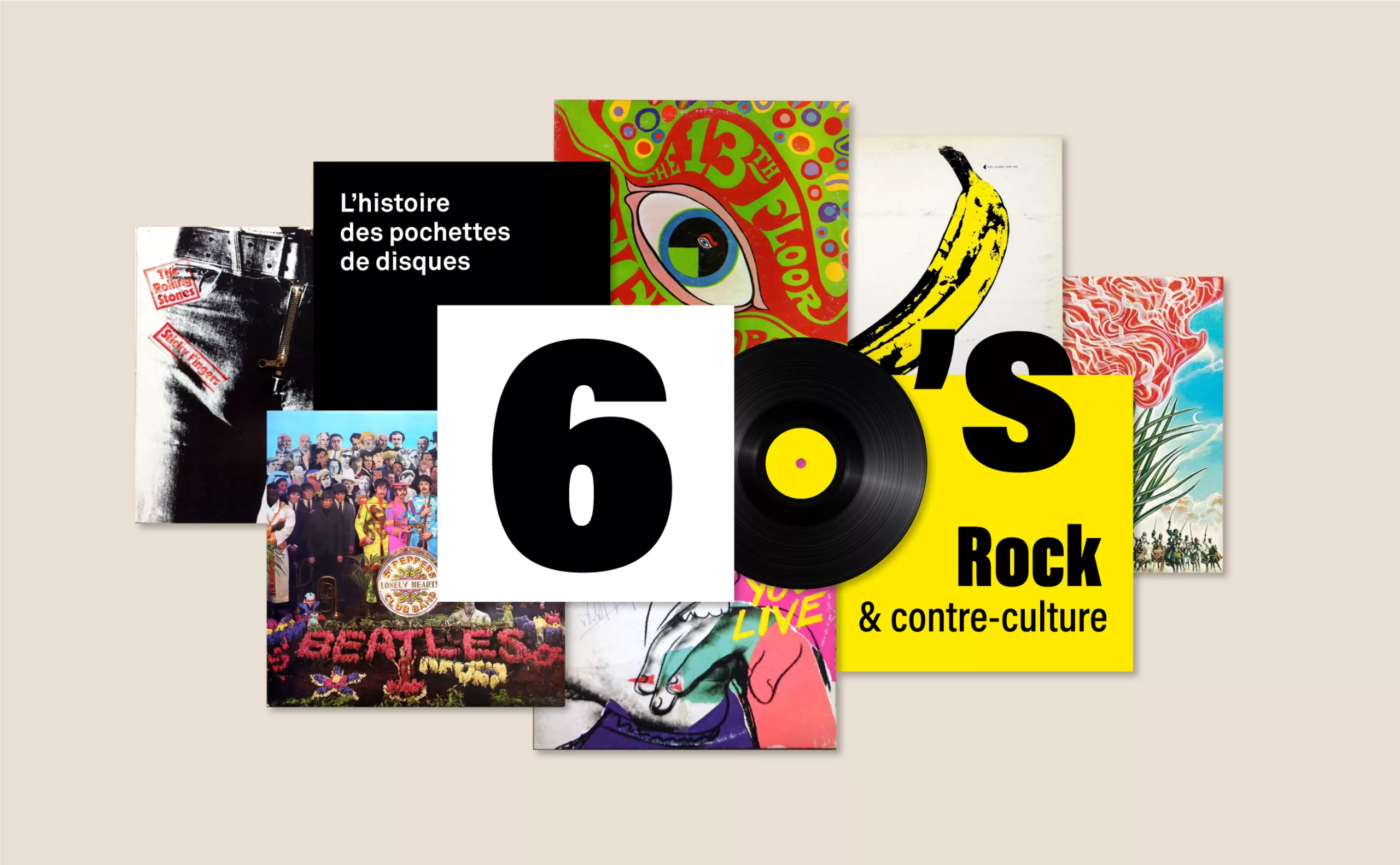
The rise of rock in the early 1960s paved the way for innovation through the launch of vinyl sleeve designs created in collaboration with artists of varying degrees of influence. Among them were Andy Warhol as well as Peter Blake and Jann Haworth (Sgt Pepper’s Lonely Hearts Club Band – The Beatles, 1967), and later Jean-Michel Basquiat (Rammellzee, 1983), or Keith Haring (Someone like you – Sylvester, 1986), who gave free rein to their creativity on a square format, printed – like a work of art – in a limited number of copies. The list also includes Sophie Calle, Jean Dubuffet, Marlene Dumas, Yves Klein, Barbara Kruger, Sol LeWitt, Chris Ofili, Ed Ruscha and Cindy Sherman… to name but a handful!
PS: You’re about to read the second article in our history of vinyl sleeves : we invite you first to read the first one, which tells the story of how jazz sleeves came about, if you haven’t already!
Warhol, a big banana, a pair of underpants, and a zip!
Two of Warhol’s album covers stand out and caused a sensation in the music world, becoming collector’s items: the 1966 cover for the Velvet Underground & Nico and the 1971 cover for the Rolling Stones’ Sticky Fingers , which are, of course, the most subversive!
The Velvet Underground’s *Banana Album*
The Velvet Underground & Nico’s *Banana Album* was recorded at Warhol’s Factory, where he also produced the album. The famous cover featuring a banana sticker designed by Andy Warhol (which is somewhat misleading because neither the band nor the album title are actually mentioned on the front of the cover; people thought it was Andy who was singing) invites listeners to “peel it gently and see”, before discovering beneath the sticker a rather suggestive pink flesh-coloured banana…
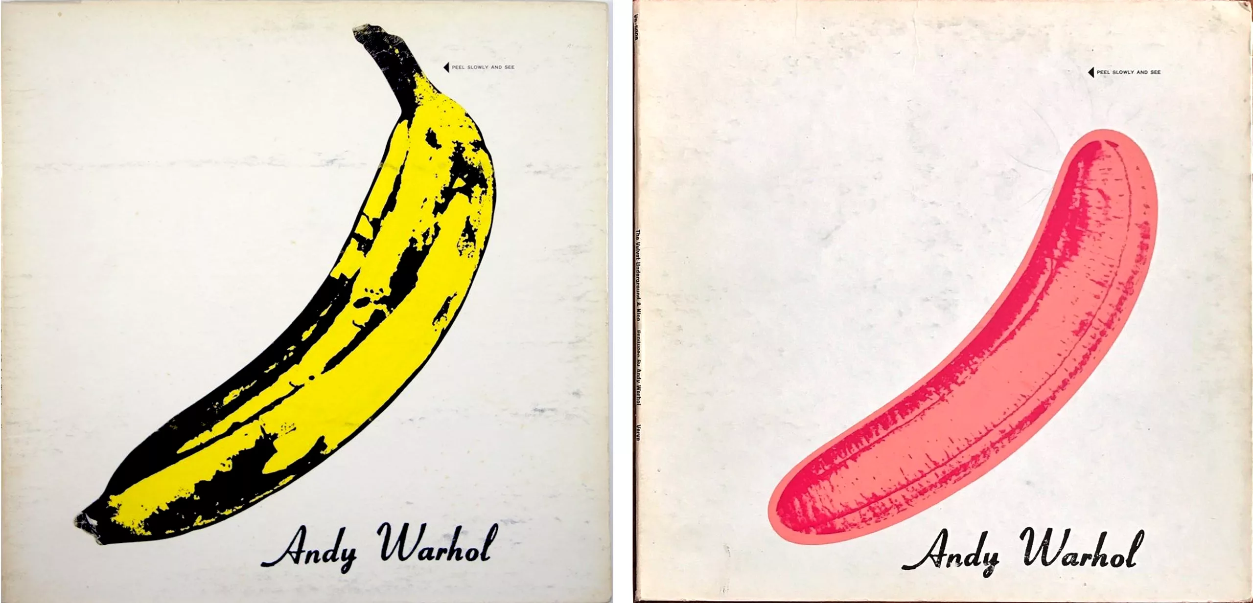
Due to this specific technical production process, which was consequently complicated and costly to carry out, the album was distributed on a limited scale and was a huge flop upon its release. All the more so as the songs, which deal with hard drugs (Heroin, Run run run) or sex (Venus in furs, There She Goes Again), were too subversive and alternative to be played on the radio… Nevertheless, it is now regarded as a major work of rock music, ranked 13th in the 500 greatest albums of all time (according to Rolling Stone magazine)!
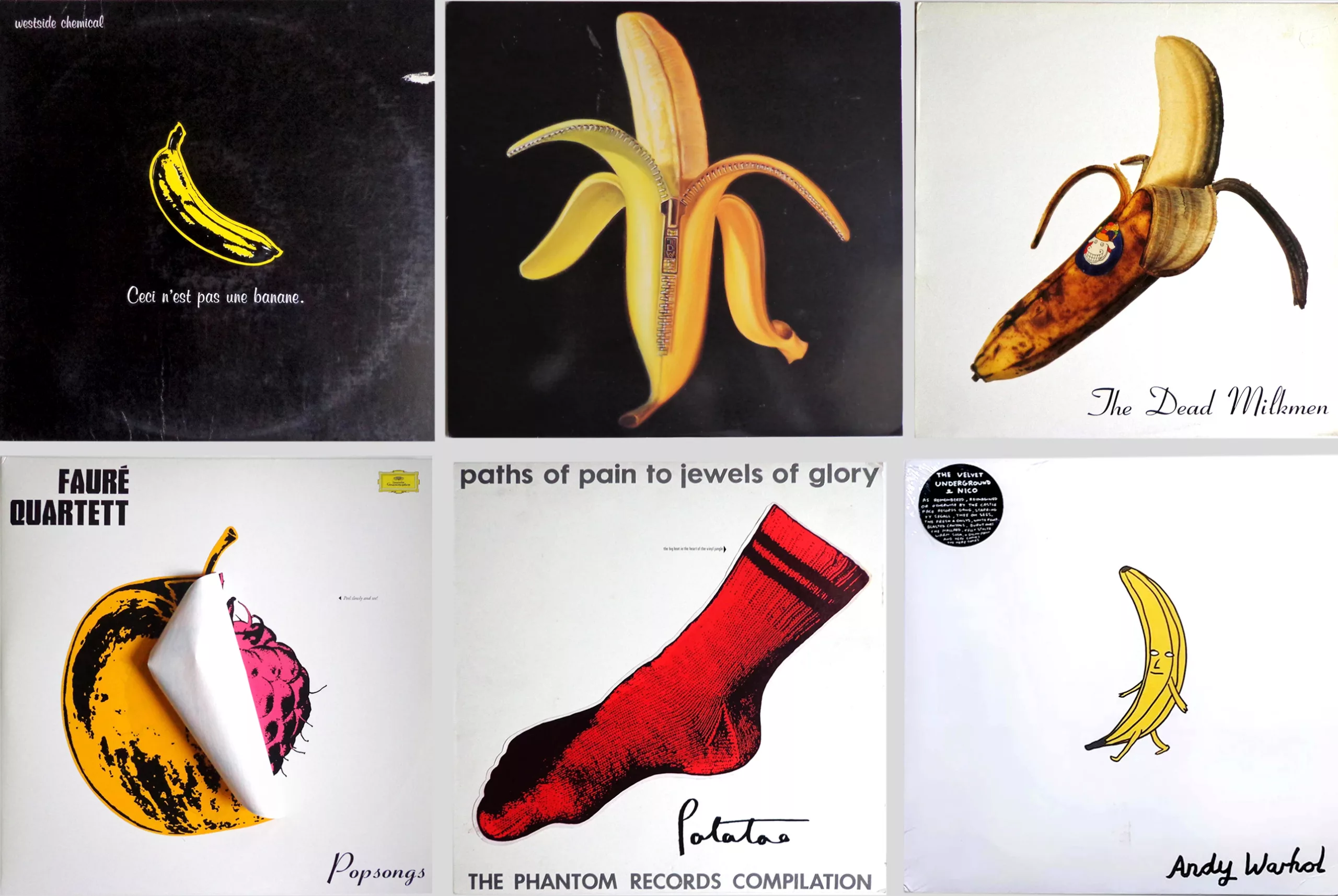
Having become as iconic as Magritte’s pipe, the banana has been reimagined countless times on other vinyl sleeves: in photographs, as a double tribute alongside the zipped banana, in an apple/raspberry version, as a sock (with a foot underneath!) or as a drawing, paying homage to Warhol and the Velvet Underground.
The Rolling Stones’ vinyl sleeve that’s got some real attitude
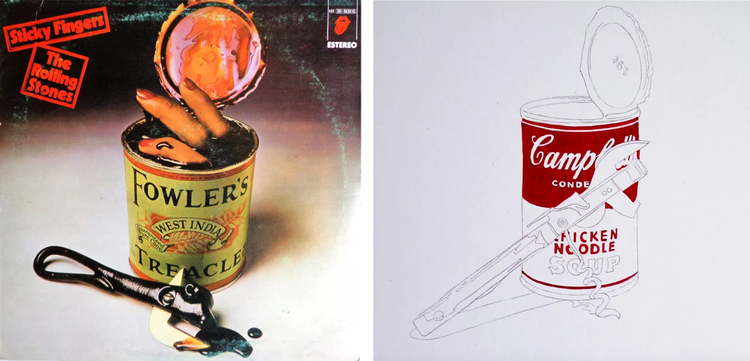
Another equally iconic Warhol album cover is Sticky Fingers by the Rolling Stones (1971), which caused quite a stir. Designed by Andy Warhol and Craig Braun, the album’s suggestive title (“Sticky Fingers”) – illustrated with a photograph of a well-endowed male crotch featuring a real zip that can be fastened – caused a scandal due to its eroticism. Sticky Fingers was nominated for a Grammy Award for Best Album Cover in 1972… but did not win.
It must be said that rock music at the time was reputed to be the music of debauchery, the music of the counter-culture, which shook the very foundations of American society by no longer valuing the capitalist economy and bureaucracy, but rather creativity, spontaneity and freedom. In 1969, LIFE magazine wrote for the first time that “the sacraments of the counter-culture are sex, drugs and rock”. In 1977, the English singer Ian Dury said that “sex & drugs & rock & roll are ‘all my body needs’”.
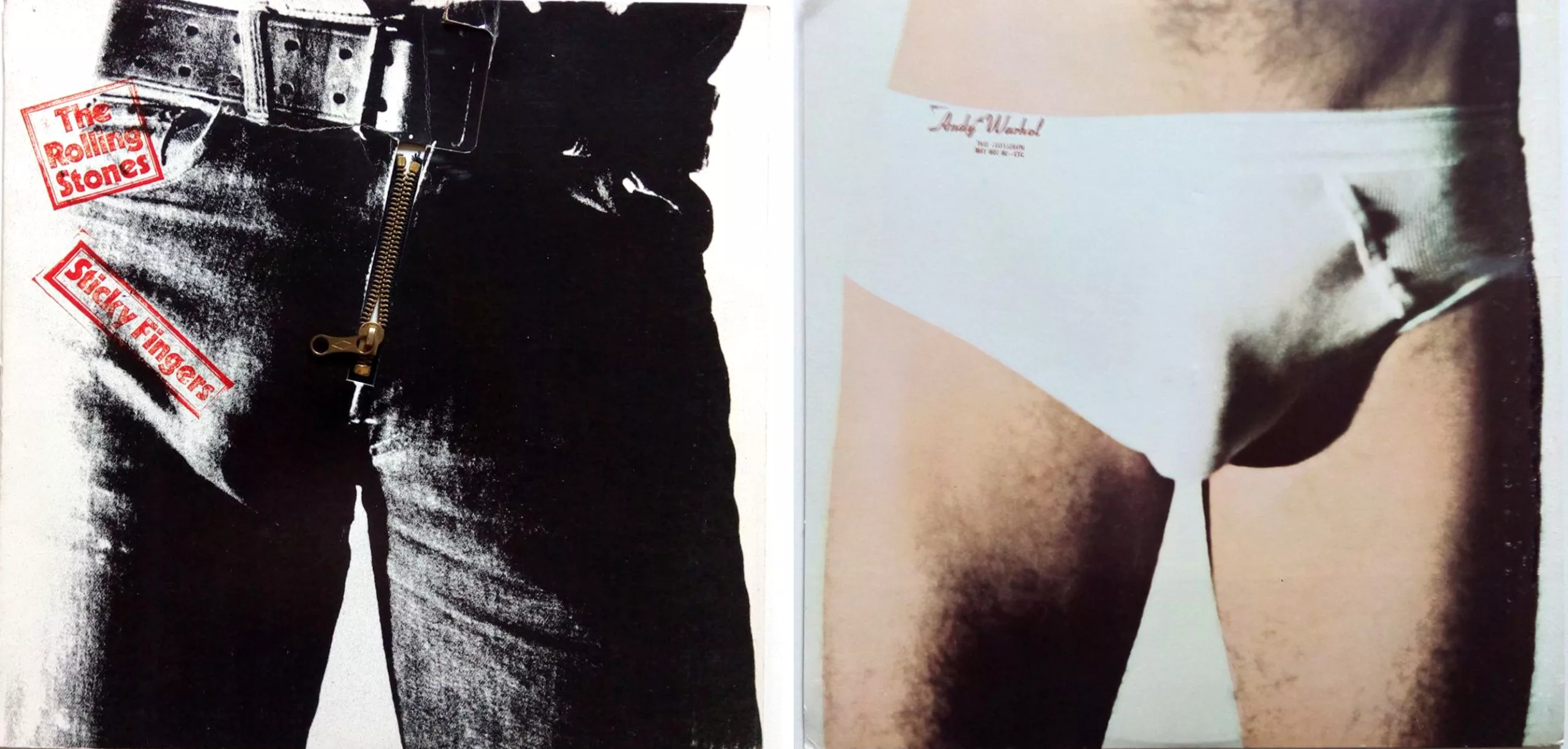
Released under Franco’s regime in 1971, Warhol’s ‘Zipped Jeans’ album was doomed from the outset to be censored in Spain and was therefore reworked into a less suggestive but almost equally provocative version: it depicts severed fingers in a slimy tinned soup. Designed by John Pasche (who also created the Rolling Stones’ logo featuring a tongue sticking out, used for the first time on this album) and photographed by Phil Jude, the cover is a tribute to the artist’s famous Campbell’s Soup screenprints. A roundabout way of paying tribute to Warhol despite the censorship!
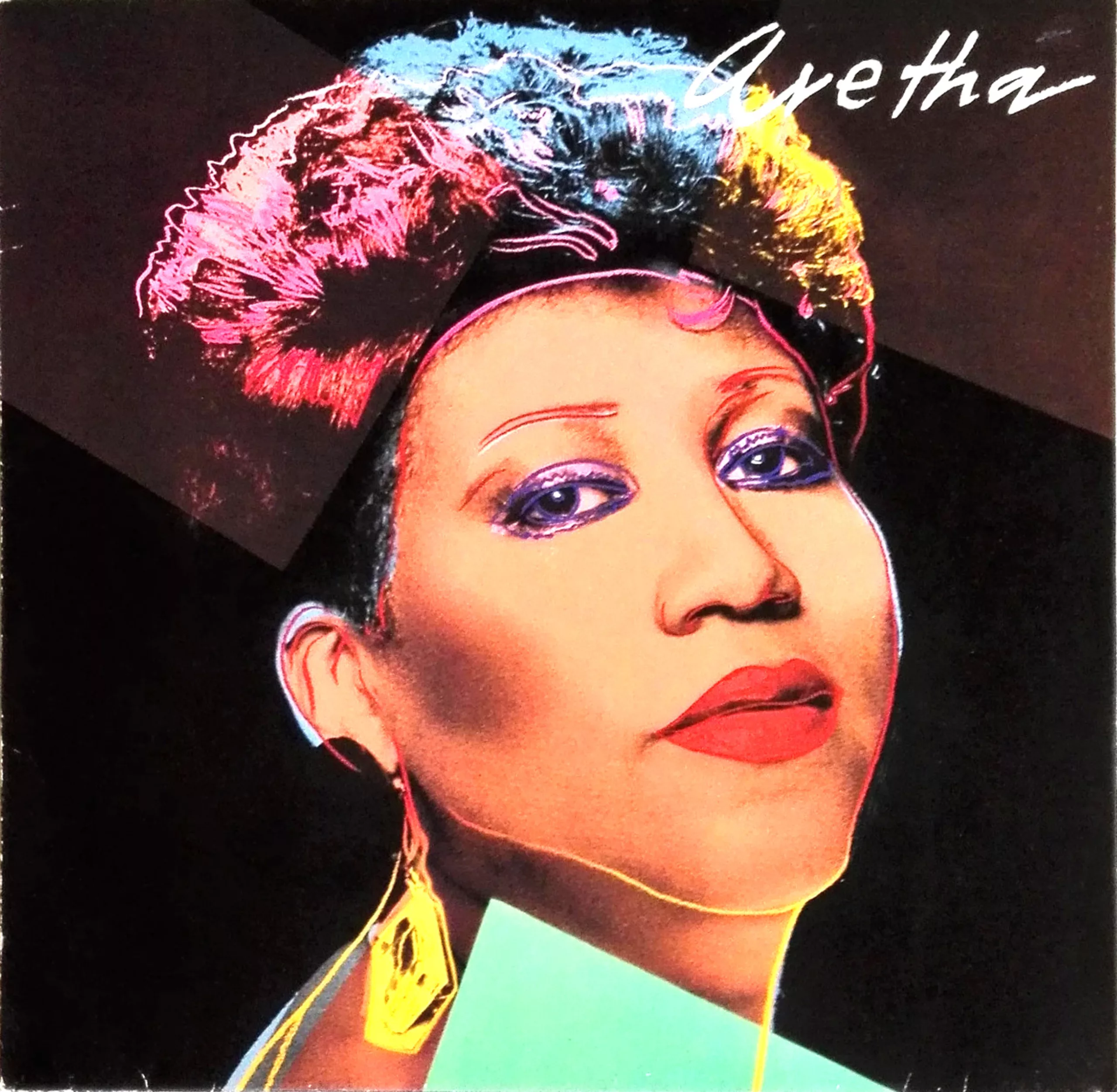
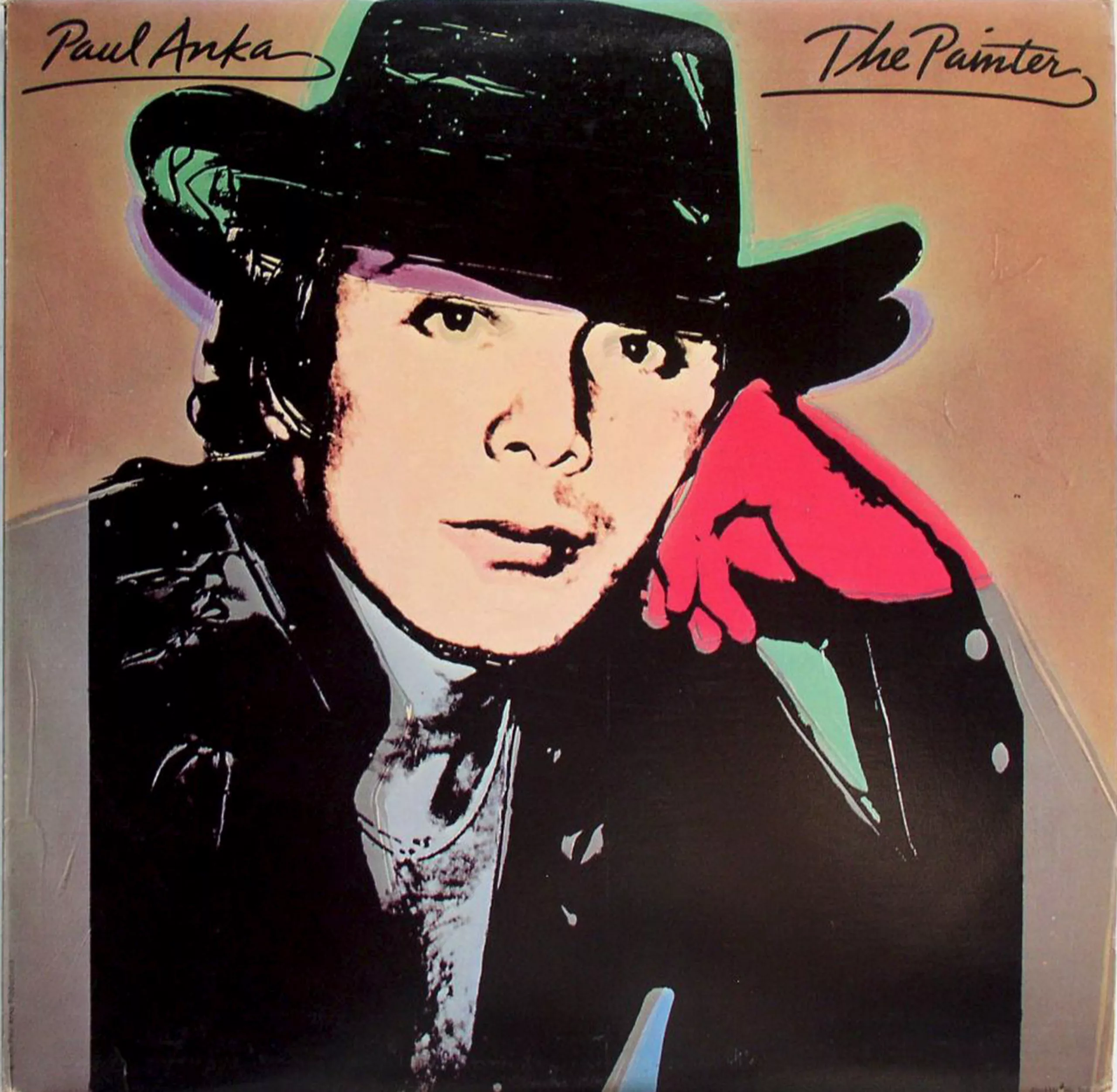
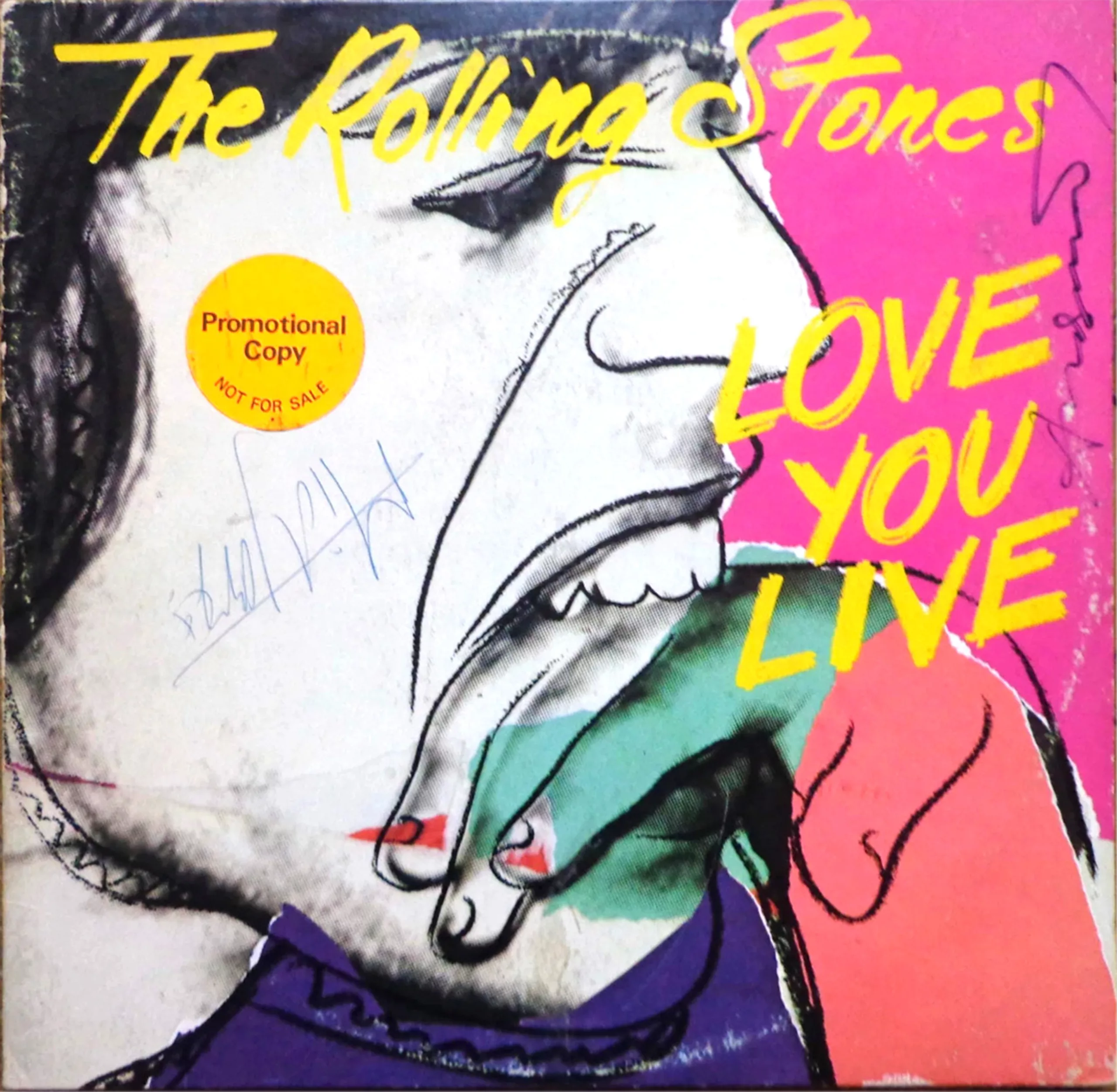
Before long, Warhol was designing album covers for major bands and singers such as the Rolling Stones again in 1977, Aretha Franklin in 1986, Paul Anka in 1976 Debby Harry (Blondie) in 1986 and John Lennon in 1986. He created their portraits in the same way he would for his paintings, using a Polaroid photograph and producing colour screen prints.
The psychedelic vinyl sleeves of the sixties
The rebellious counter-culture gave rise not only to rock but also to psychedelia, from the late 1960s through to the 1970s. Whilst rock music challenged the established capitalist order through behaviour free from all constraints or through a critique of mass consumption – as Warhol did as an artist – psychedelia (from the Ancient Greek ψυχή = psychẽ ‘soul’, and δηλοῦν = dẽloun ‘to make visible, to show’) allows one toescape, to a significant extent, from this rational, rigorous and consumerist world through visual or auditory hallucinations induced by the use of psychotropic drugs such as LSD.
By unlocking new ‘doors to other worlds’ in the brain, psychedelia enables the exploration of heightened and liberated creativity linked to an altered sensory perception. It thus opens up a new artistic movement that is highly colourful, detailed, fluid and surreal. Psychedelic art draws inspiration from Indian folklore (which was very much in vogue amongst hippies), religious icons, Art Nouveau, the Secession movement and other fringe artistic expressions of the 1970s, whilst experimenting with sensory and graphic freedom in a spirit of individualism and rebellion.
The Beatles, Gods of the British rock and psychedelic counterculture
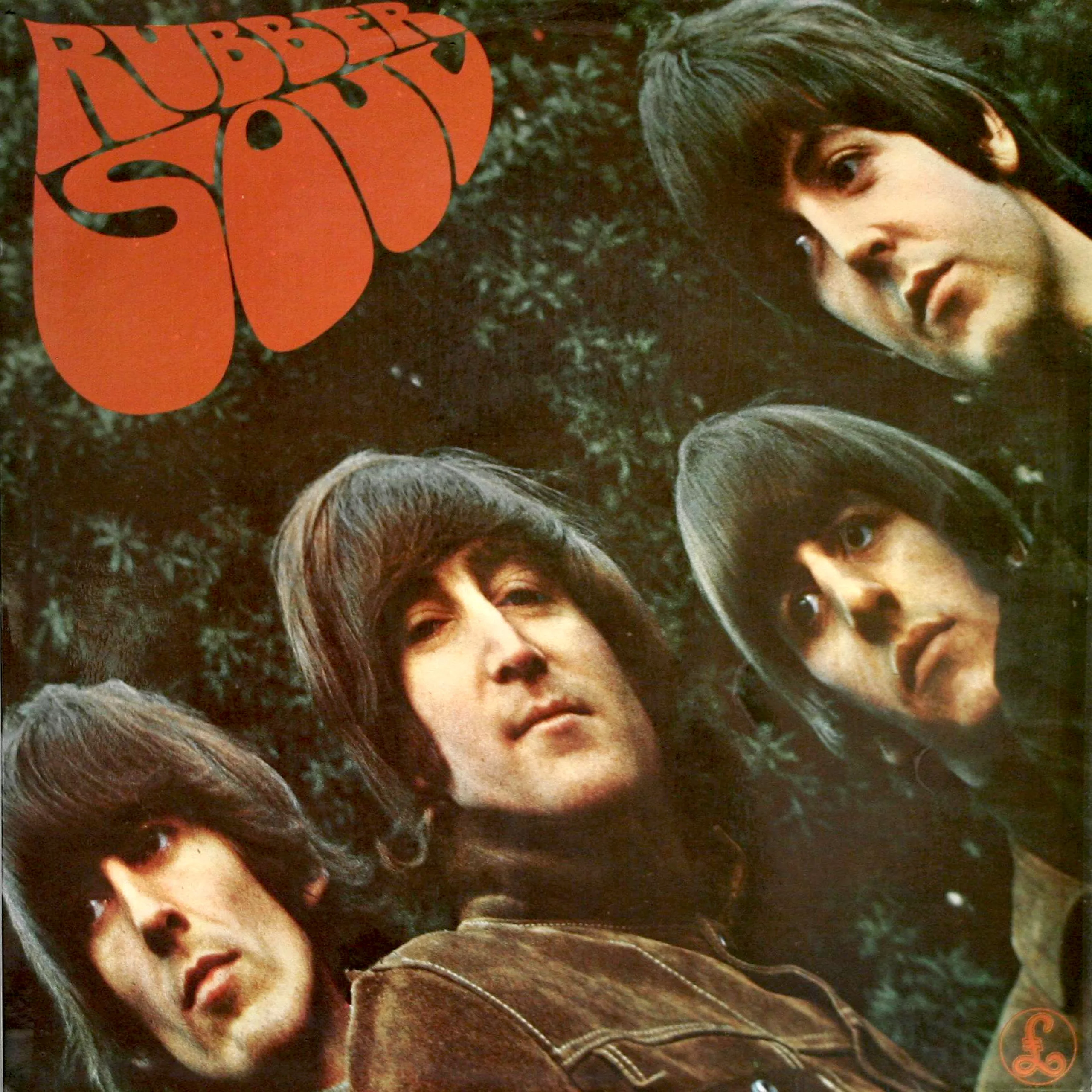
In England, it was the typography by British graphic designer Charles Front that caused a sensation on the Beatles’ album Rubber Soul in 1965. Designed to resemble a drop of rubber (rubber in English), it also heralded the psychedelic era and was adopted by the hippies, although Front insists that the association with drugs was merely a coincidence… This landmark album, however, marked a clear break with the era of the ‘pretty, well-behaved boys’ and the Beatles’ saccharine pop, signalling the start of their experiments – both sonic, with instruments and arrangements from other horizons, and sensory, under the acknowledged influence of various drugs.
And whilst we’re on the subject of the Beatles, we must mention the famous cover of Sgt Pepper’s Lonely Hearts Club Band, which was released two years later in 1967. The ultimate symbol of counterculture, the album spent 27 weeks at the top of the UK charts and is now hailed as the greatest album of all time ! Its cover is therefore obviously one of the must-haves among vinyl covers, and the album’s success is undoubtedly linked to it. Whilst the artist Peter Blake took credit for his creation, he more than shared it with his wife Jann Haworth , who was nevertheless given little credit for it.
A friend of the Beatles for several years, Jann – whose father is a renowned film set designer – is used to working with life-size 2D cut-outs used to create fake crowds. She came up with the idea of photographing the band in front of 71 heroes who had inspired them. George Harrison suggested several Indian gurus to be included, and John wanted to add Hitler – probably as a provocation – alongside Jesus and Gandhi, but the three figures were dropped (much to Haworth’s relief) to avoid causing a global scandal.
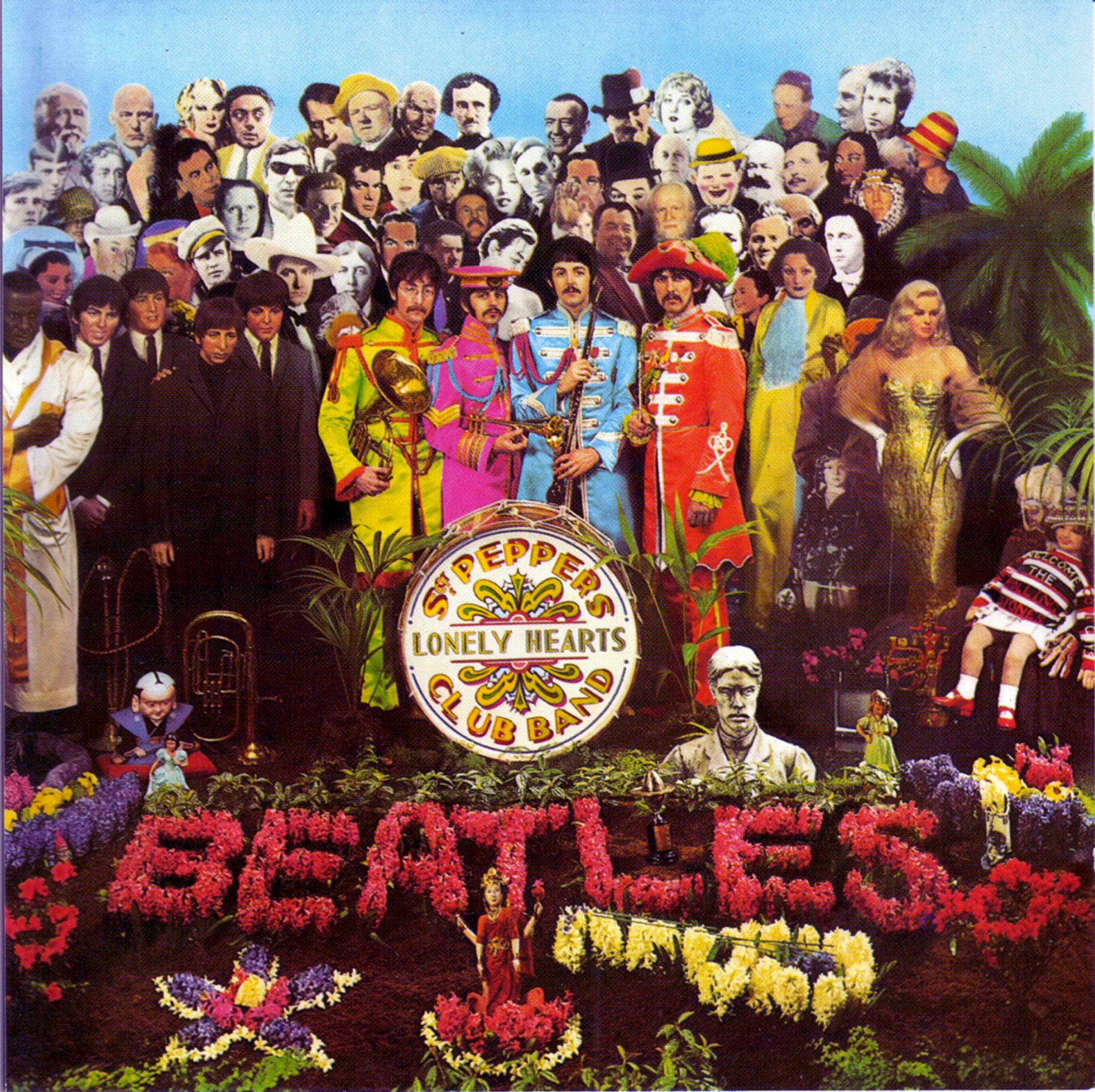
To avoid any potential legal action, the group has sought image rights from all the stars who are still alive. Most have agreed. Of the 71 personalities, including Bob Dylan, Einstein (hidden behind Lennon), Marlon Brando, Carl Gustav Jung and Edgar Allan Poe, only 12 are women (mostly bimbos or actresses such as Marilyn Monroe) much to Jann’s regret, including three depictions of Shirley Temple, who initially refused to appear on the cover until she had listened to the album. Madame Tussauds even lent its four Beatles figures for the set (on the left, in suits and ties), along with a few other figures including Diana Dors (on the right, in a golden dress). The artist also came up with the idea of having the band’s name grow out of a flowerbed.
You have to bear in mind that back then there was no Photoshop and everything had to be done by hand. And a 3D set means actually building that set! To create the crowd, Haworth printed black-and-white photos of the stars’ faces, stuck them onto cardboard cut out with a saw, and coloured the whole thing by hand. After two weeks of creative work and with some £200 in his pocket, photographer Michael Cooper captured the couple’s creation for this album, which would very quickly become a must-have. The set pieces were simply thrown away, and a few opportunists went on to sell off certain items salvaged from the rubbish tip for a fortune. Apart from the fact that the Beatles were already a world-famous band at the time, it was probably the mix of cultural references, the multitude of details to unpick and the kitsch-psychedelic feel of the cover that made it so popular and sought-after by collectors.
The typically psychedelic ‘liquid typography’
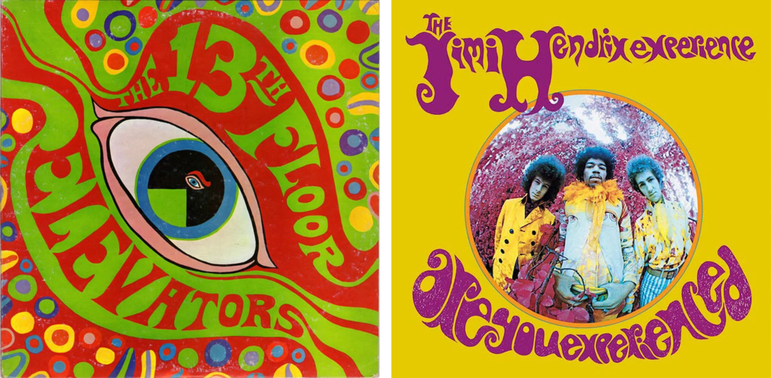
Across the Atlantic, the leading figure in mid-1960s psychedelic rock was Wes Wilson, who drew inspiration from Alfons Mucha, Van Gogh, Gustav Klimt, Egon Schiele and Secession artists such as Alfred Roller (early 1900s, see illustrations below), whose layout and typography he imitated whilst making them more ‘fluid’, through distortions and motion effects, as can be seen in the posters in the second image.
As early as the beginning of the 20th century, the Secession movement integrated art into everyday life by treating letters as images, in a world that was becoming increasingly standardised visually as a result of the Industrial Revolution. (We discuss this in our second article on modernism.)
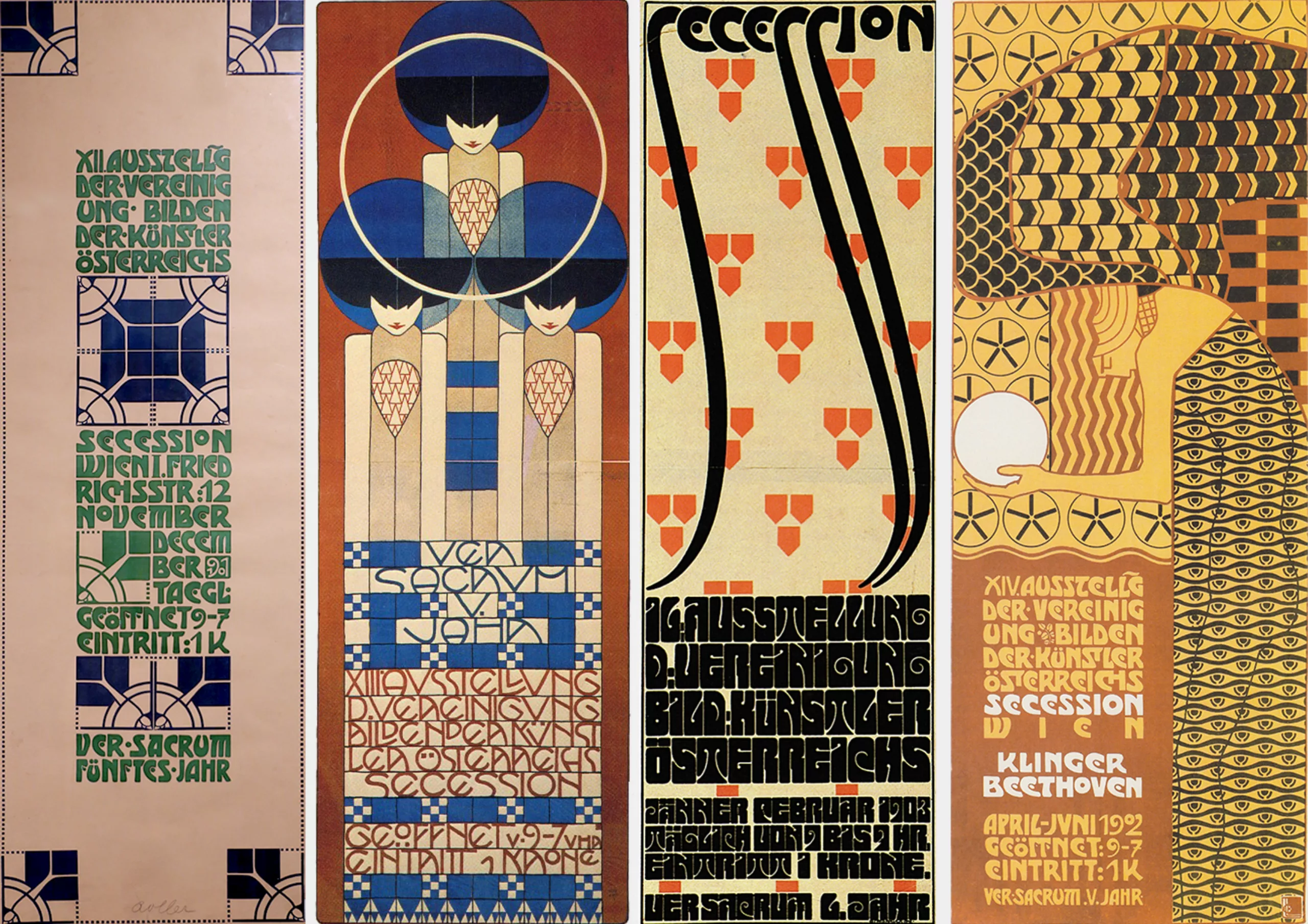
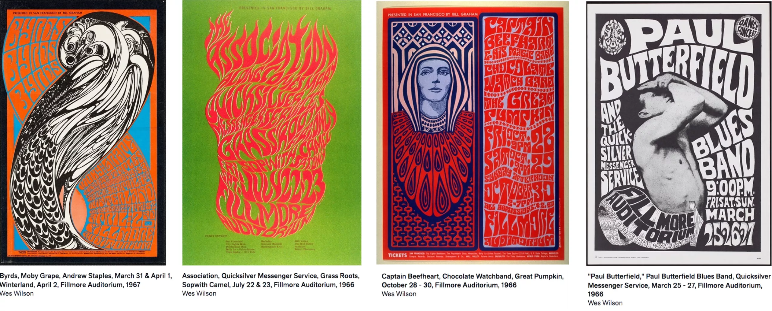
Wilson’s art quickly became a must-see, and he came to be known as the father of American rock concert and festival posters (see the full gallery at the San Francisco Museum of Fine Arts). He produced almost 60 posters in 14 months! The psychedelic style was a graphic reaction that stood in stark contrast to the rigorous lines of commercial posters and photographs promoting the consumer goods of the time, featuring illegible, hand-drawn, curving letters that took up all the available space, much like the artists of the Secession. We can also see that he adopted the same square-shaped typeface as Roller, which he enjoyed distorting (Roller’s Secession poster, third from the left in the top image, and below that the poster on the left and the red and blue poster).
Many artists would try their hand at liquid typography on vinyl sleeves, such as John Cleveland and David King (shown below on the left and right respectively), but none would ever match Wilson’s typographic artistry.
The Parallel Worlds of Mati Klarwein
But the psychedelic style is not limited to typography, distortions and vibrant colours: it is also a surreal world populated by strange creatures. The late 1960s and the psychedelic movement allowed musicians to express themselves visually and with great freedom, thanks to a blend of techniques such as photography and illustration combined with collages, which enabled the creation of surreal visuals rich in symbols and references. Album covers made just as much of an impact – if not more – than the music they contained. The German artist Abdul Mati Klarwein stood out with his creation of strange and colourful paintings and album covers, inspired by the surrealism of Dalí, whom he had met and whose work he admired. In 1994, the American magazine Juxtapoz described Klarwein as “the man behind all the great, legendary record covers you’ve ever seen – if he didn’t create them, he inspired them”.
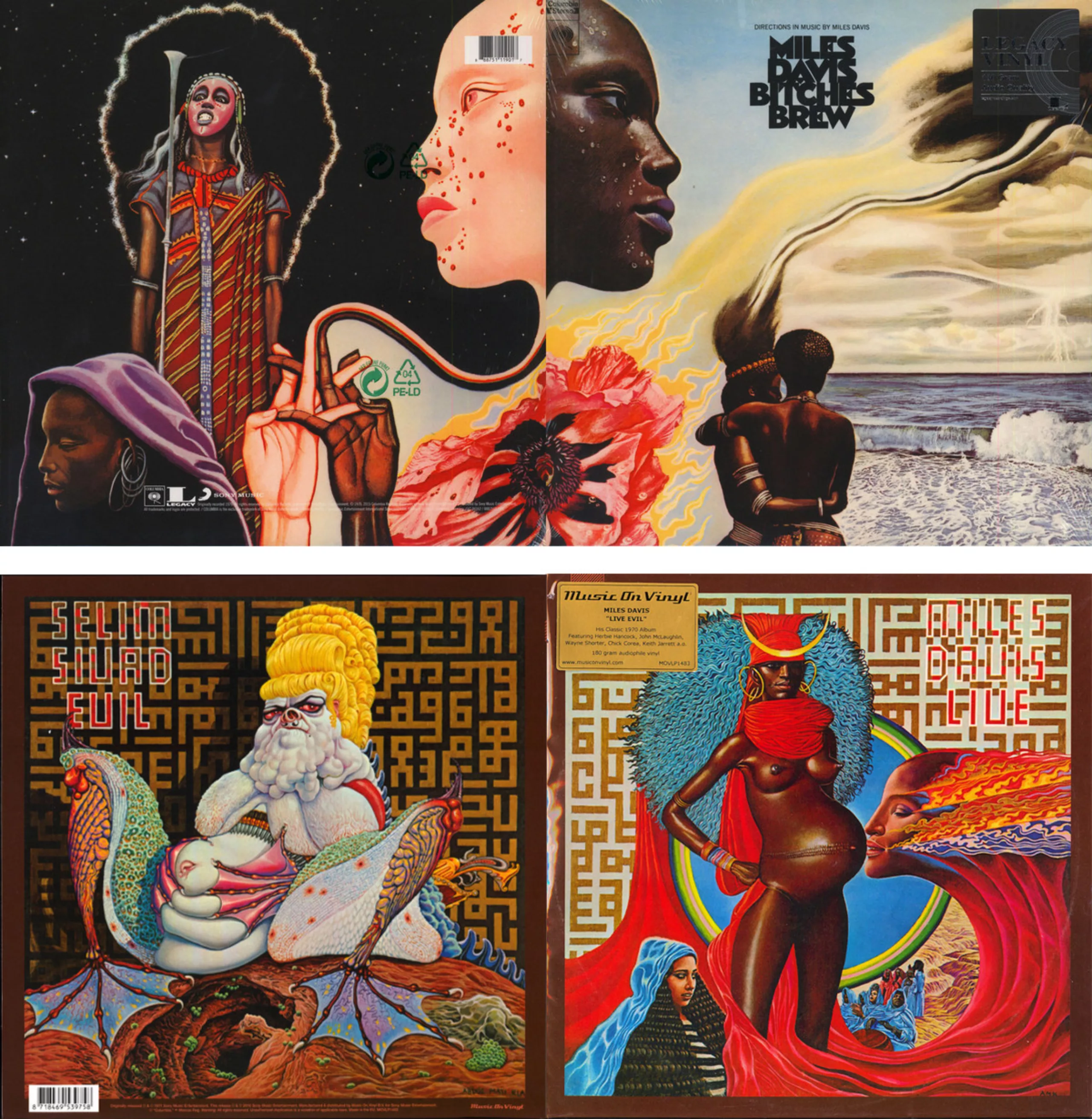
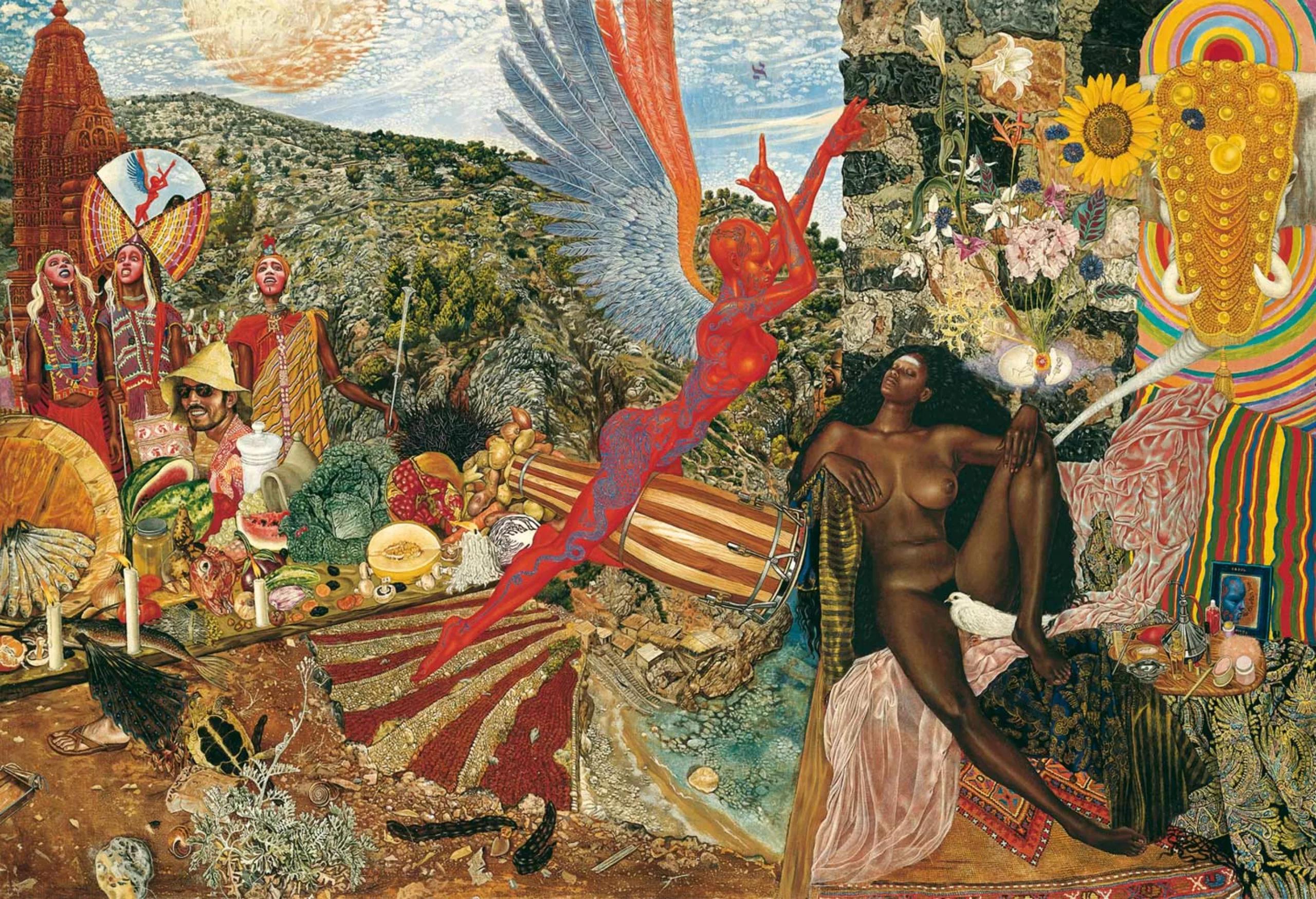
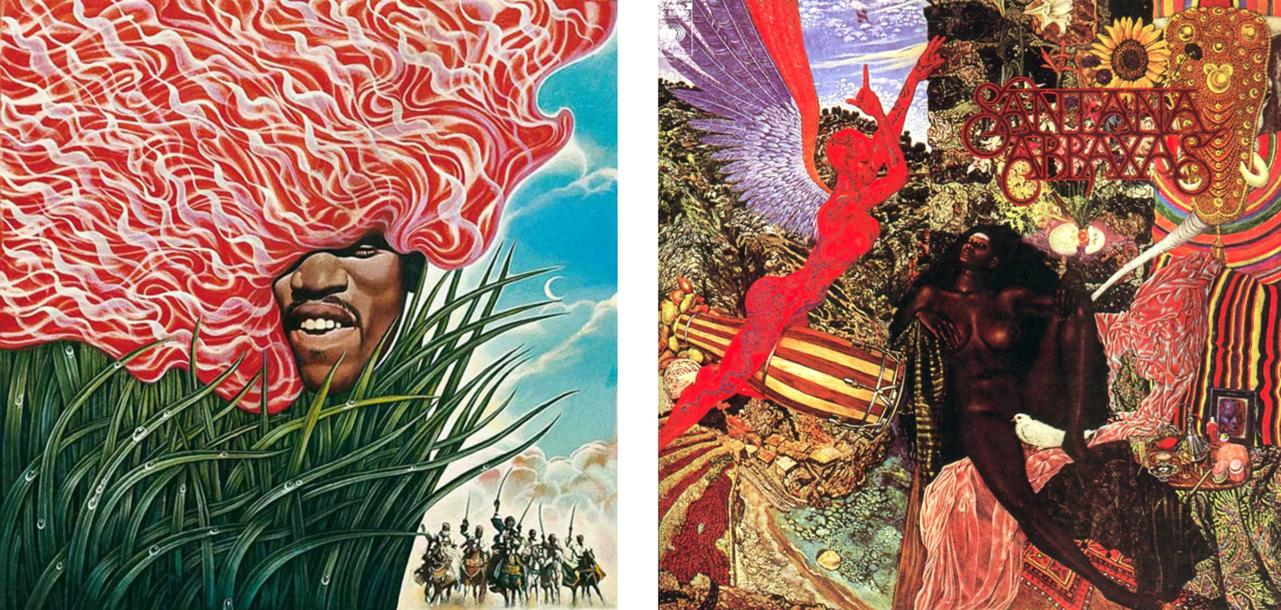
He is responsible for the album covers of Bitches Brew (1970) and Live-Evil by Miles Davis (1971) shown above, as well as Santana’s legendary second album, Abraxas, released in 1970, based on the illustration the Annunciation which he had painted on his arrival in New York at the age of 28 (painting below), as well as an illustration for a Jimi Hendrix album (bottom left) which never saw the light of day due to the musician’s death.
Here’s a little anecdote: for the cover of Live-Evil shown above, David had asked him to paint a toad to represent the devil… Klarwein then decided to paint J. Edgar Hoover as a dripping reptilian drag queen. To better understand this choice, Hoover was the first director of the FBI; he used his position to wage his own vendettas against organisations or figures he deemed dangerous, notably against Martin Luther King, whom he described as “the most dangerous nigger in the nation”. He fabricated a case to prove, at any cost, that King was a communist and engaged in so-called deviant sexual behaviour, before the truth came to light and Hoover’s illegal practices were exposed in 1971, the year the album was released.
There is something about this portrait that hints at Jabba, the giant slug from Star Wars, who would make his screen debut in 1983. The creature’s creator claims to have been inspired by the caterpillar from Alice in Wonderland, whose 1951 Disney version may also have inspired Mati Klarwein before perhaps unconsciously inspiring the creators of Star Wars?
In the next article in this series on vinyl sleeves, we’ll be looking at the sleeves of the future: the innovative ones, the odd ones out – in short, those that left a lasting impression because they were different!
On the subject
-

The futuristic world of Brantonne
In September 1951, René Brantonne began a collaboration with the publishing house Fleuve Noir that was to last more than 20 years (from 1951 to 1965), working on the legendary “Anticipation” series, for which he created 273 original covers.
-
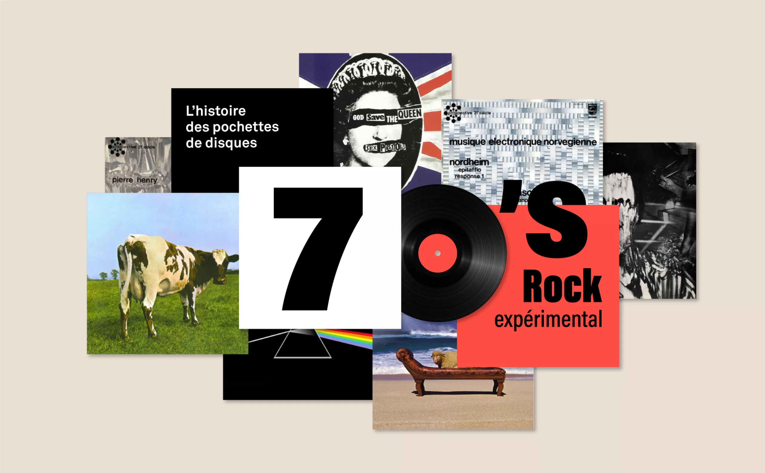
The History of Record Covers: Futuristic and Surrealist Vinyl Covers from the 1970s
The 1970s were a time of innovation. After exploring galaxies far, far away, people had lost their minds a bit.
-
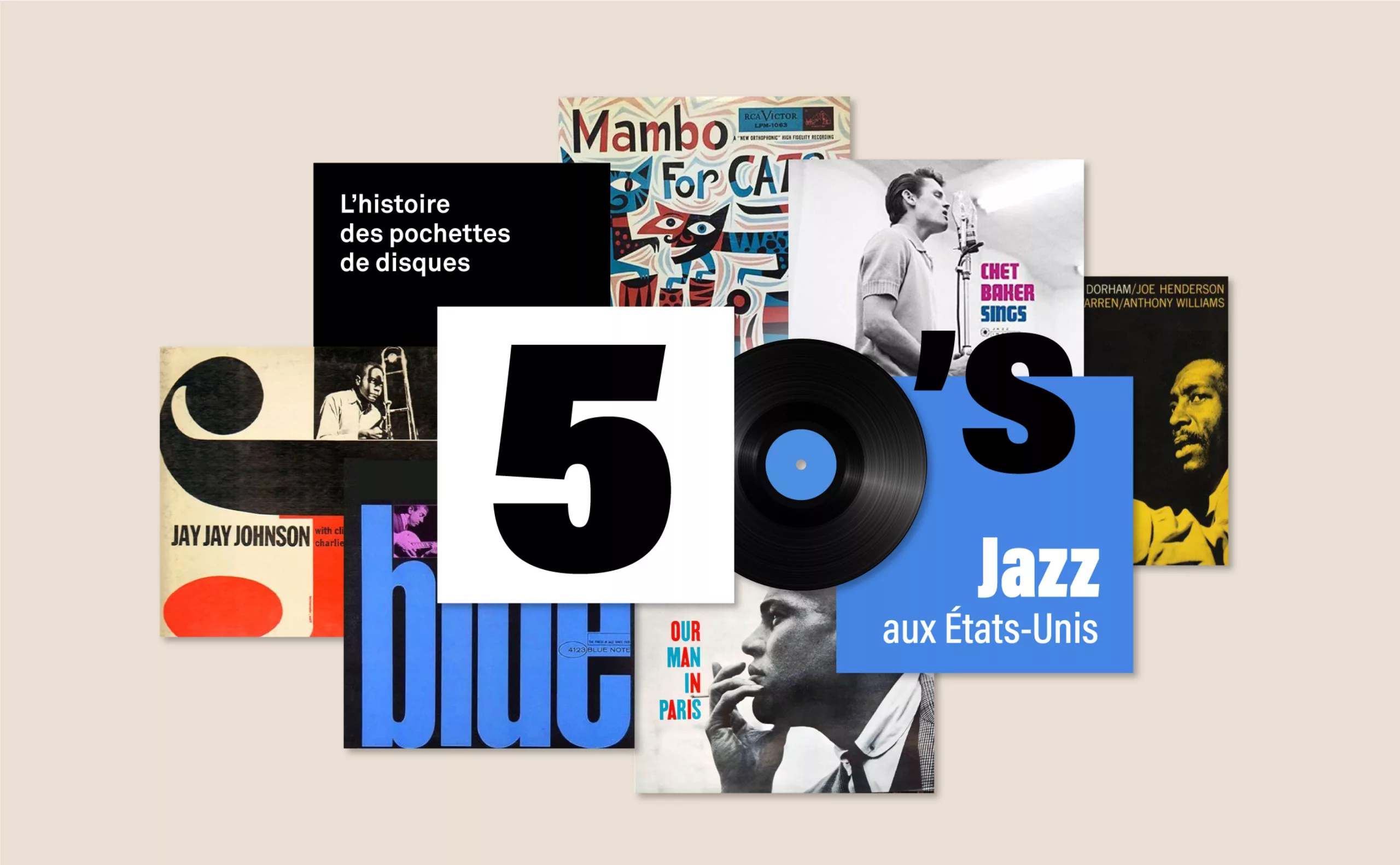
History of record covers: the face of 50s jazz
The vinyl sleeves come to life with jazz. It is a whole graphic universe that makes the music heard, through the illustration or the photo.