The History of Record Covers: Futuristic and Surrealist Vinyl Covers from the 1970s

https://grapheine.com/en/magazine/history-of-counterculture-vinyl-album-covers-censored-albums-and-psychedelic-rock-60s-70s/The frenzy of the late 1960s and early 1970s was all about the space race and innovation. After exploring psychedelic galaxies far, far away, humans would soon set foot on the moon. Back on Earth, everything had to sparkle and materials such as sequins, mirror balls and Paco Rabanne’s metallic dresses were all the rage. Surrealism, which offered an escape from reality, also propelled the unmissable Hipgnosis studio to prominence.
So here is the third instalment of our series on vinyl sleeves. If you haven’t already, check out the previous article on the rock and psychedelic era of the 1960s, and the first article on 1950s jazz and the birth of modern vinyl sleeves.
Space-themed vinyl sleeves
The heliophore paper, with its silvery, kinetic quality, is the ideal medium for this brilliant era focused on the future, the conquest of space and avant-garde art. This embossed paper, available in silver or gold and straight out of the future offers a range of psychedelic or geometric patterns that react to light like butterfly wings, creating the impression of movement.

In France, the Philips record label broke new ground in 1967 by using heliophore technology to illustrate the covers of a series of electroacoustic and experimental music records: the ‘Prospective 21st Century’ collection. & You simply have to see the reflections on these silver vinyl sleeves come to life when you move them – it’s something never before seen in the music world! This engraved paper was widely used in the late 1960s in the display windows of department store galleries and in ‘modern’ advertisements because it comes to life simply through the presence of a light source or movement.
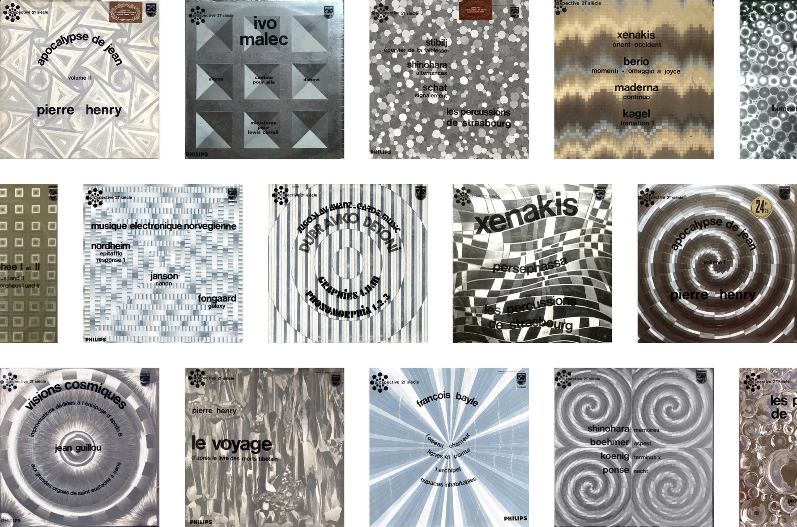
By bringing movement to vinyl sleeves, “Prospective 21st Century” breaks new ground and sets the tone, transporting the listener into a fictional, hypnotic and utterly futuristic world that they imagine even before listening to the records. Through a simple graphic technique, the heliophore thus enables this experimental and unconventional music to be communicated visually and very effectively!
God save the 70s
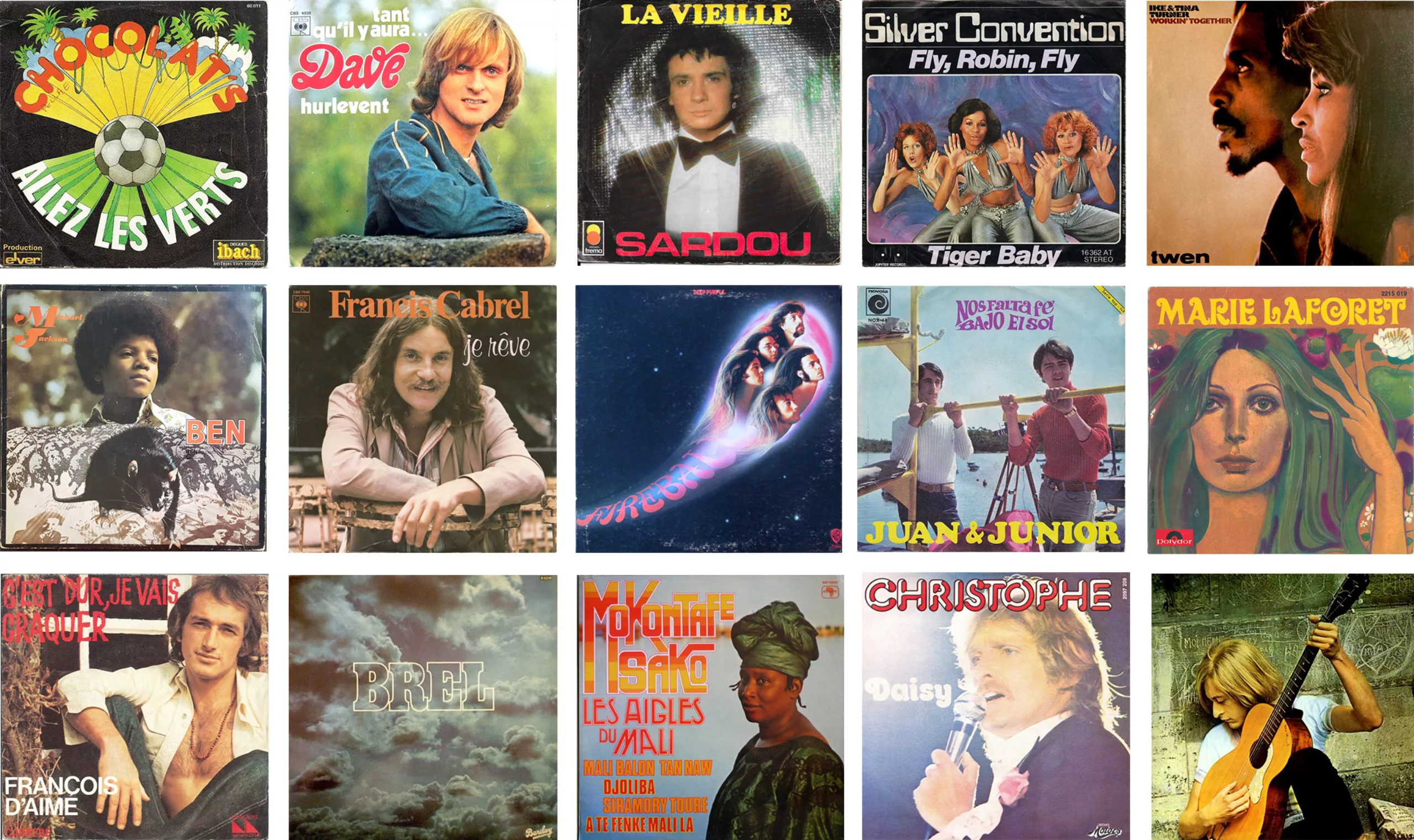
As well as the psychedelic trend, often depicted through illustrations or drawings, and a few ‘oddities’ such as the futuristic heliophore covers, some artists had fun shaking up the medium, as we saw in our second article. Around the 1970s, the vast majority of vinyl sleeves were, in fact, simply covered with a photograph or drawing of the band, the singer or the female vocalist (usually in languid poses, and with long hair)—take a look for yourselves:
The most remarkable album covers – in the literal sense of the word – are still the ones that cause the most outrage, as we saw with Sticky Fingers a few years earlier. In the tradition of controversial, legendary and unconventional vinyl records we must, of course, mention the famous God Save the Queen by the Sex Pistols, released in 1977 to mark the royal jubilee. This reworking of the patriotic anthem launched a scathing attack on the British monarchy, branding it a “fascist regime”. The punk and anarchist song coined the famous slogan “no future”, which was quickly adopted by England’s underprivileged youth. God Save the Queen was banned from the radio and the band barred from television, but the song was a massive hit.
Designed by Jamie Reid, an anarchist collage artist who subverts popular icons, the first cover (on the left, below) features a portrait ofQueen Elizabeth with a swastika in her pupils and a safety pin over her mouth – a punk symbol – which certainly shocked the English middle classes.
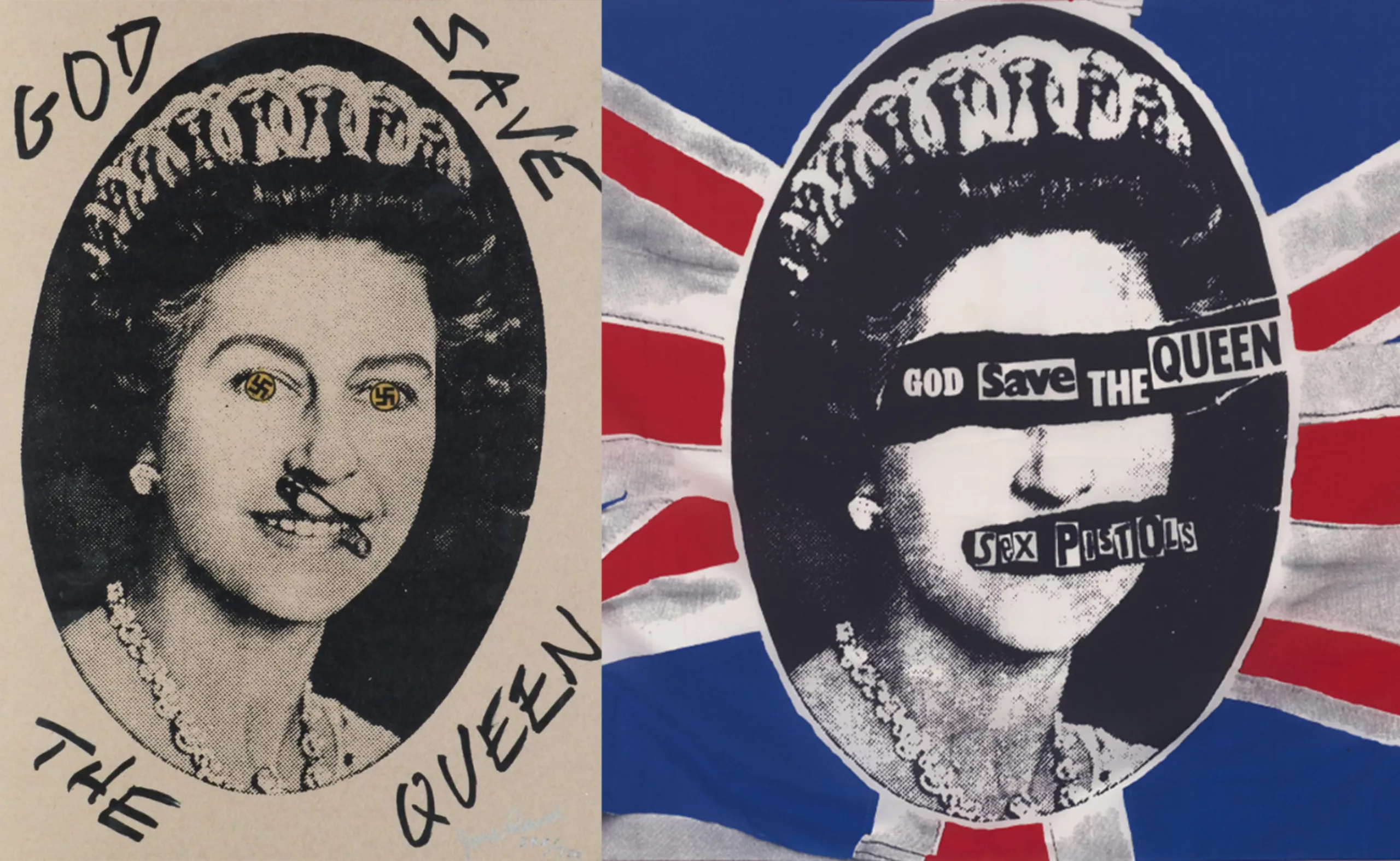
The printers flatly refused to print the cover and the record label terminated its contract and then destroyed the majority of the records, the few surviving copies of which now sell for over 15,000 euros. The second version of the artwork removes the cross and covers the queen’s mouth and eyes with cut-out letters, as in an anonymous letter (on the right, above). In 2022, to mark the 70th anniversary of the Queen’s reign, the single was re-released with a royal blue background: it reached number one in the UK charts. God save the Punk!
Hipgnosis: album covers that break the mould!
It was also in London that the fledgling London-based studio Hignosis single-handedly revolutionised the look of rock album covers: their meticulously designed covers were worthy of Photoshop (but created without it) and truly avant-garde for the time. They are striking for their surrealist style, which is nonetheless very real, as they are mostly created from photographed scenes.
Following the release of The Beatles’ album Sgt Pepper, which we discussed in Article 2, Hipgnosis had a revelation and realised that it was “possible to do things differently” when it came to vinyl cover design – to think outside the box, to push the boundaries into the absurd and explore artistic directions, and not just stick to portraits. Hipgnosis succeeded in rising to the challenge of creating remarkable vinyl covers without them necessarily being erotic or provocative.
“Album covers are in a different galaxy altogether for the brain”
Founded in 1967 by Aubrey Powell and Storm Thorgerson (the guy’s name and surname is Storm Thunderstorm– pretty cool, isn’t it?), the Hipgnosis agency is responsible – amongst other things – for the famous prism by Pink Floyd, the laser coitus of Black Sabbath’s robots, Peter Gabriel’s melting face, and the naked children on the large pebbles for Led Zeppelin’s “Houses of the Holy”, between 1967 and 1982. That’s several hundred album covers in 15 years. Thorgerson says that “album covers are in a different galaxy for the brain”, and you understand this better when you see their work:
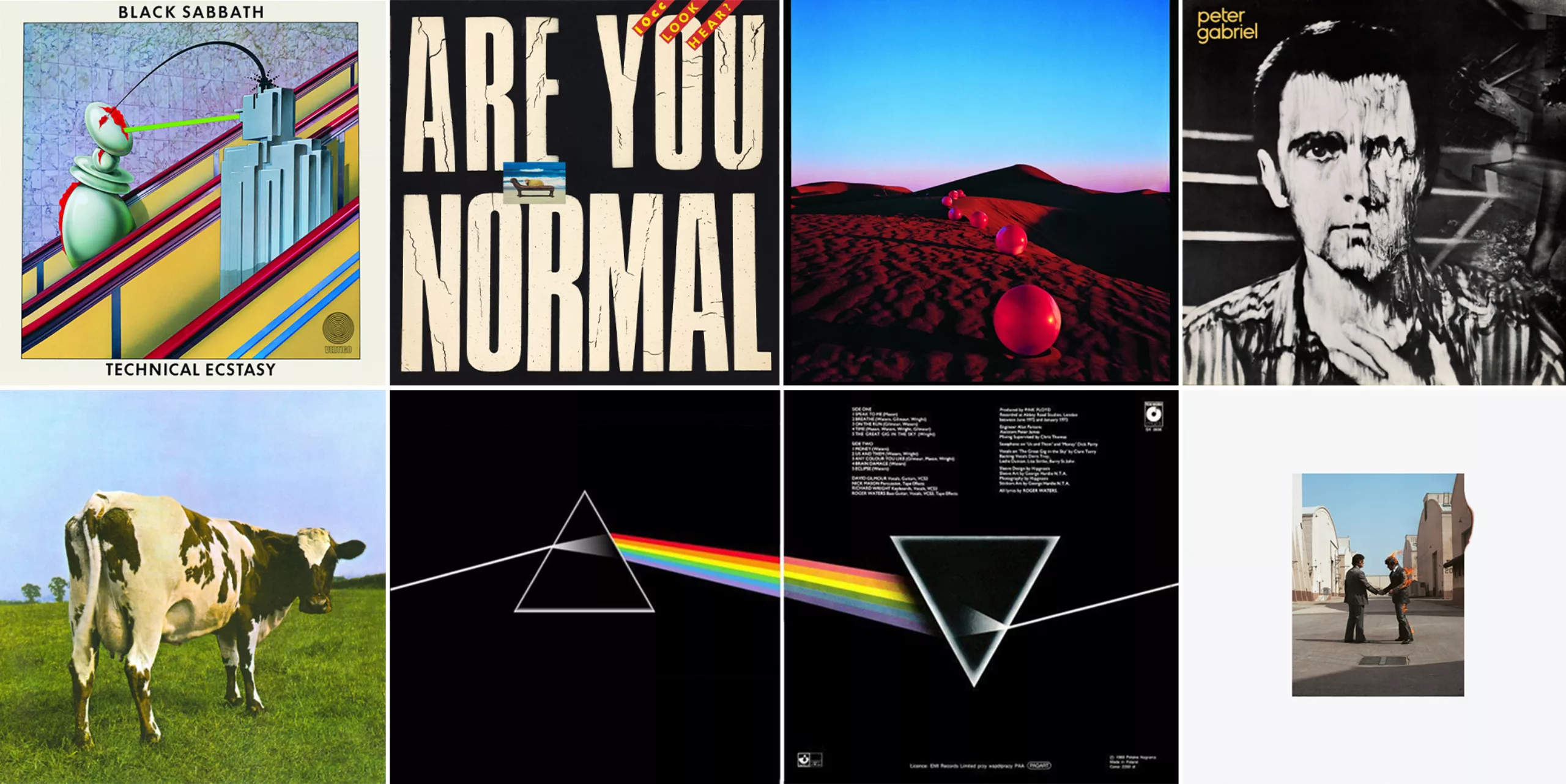
Back then, of course, Photoshop didn’t exist yet, as explained in the article in Rolling Stone, which looks back on the studio’s glory days. It took an average of 3 to 6 weeks to produce each album cover: the photos were taken on film and EVERYTHING was done by hand – the set design, the staging, any editing, the colours, the retouching… all based on the raw photos born of these two individuals’ boundless imagination. The agency enjoys the trust of the biggest rock bands and has a virtually unlimited budget.
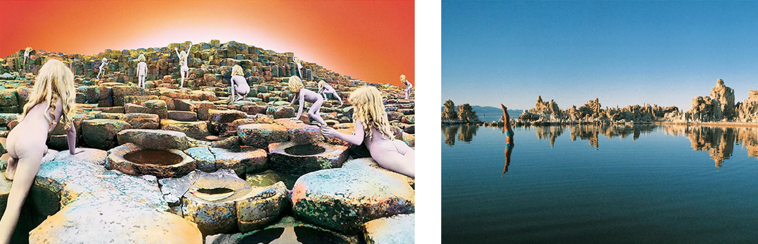
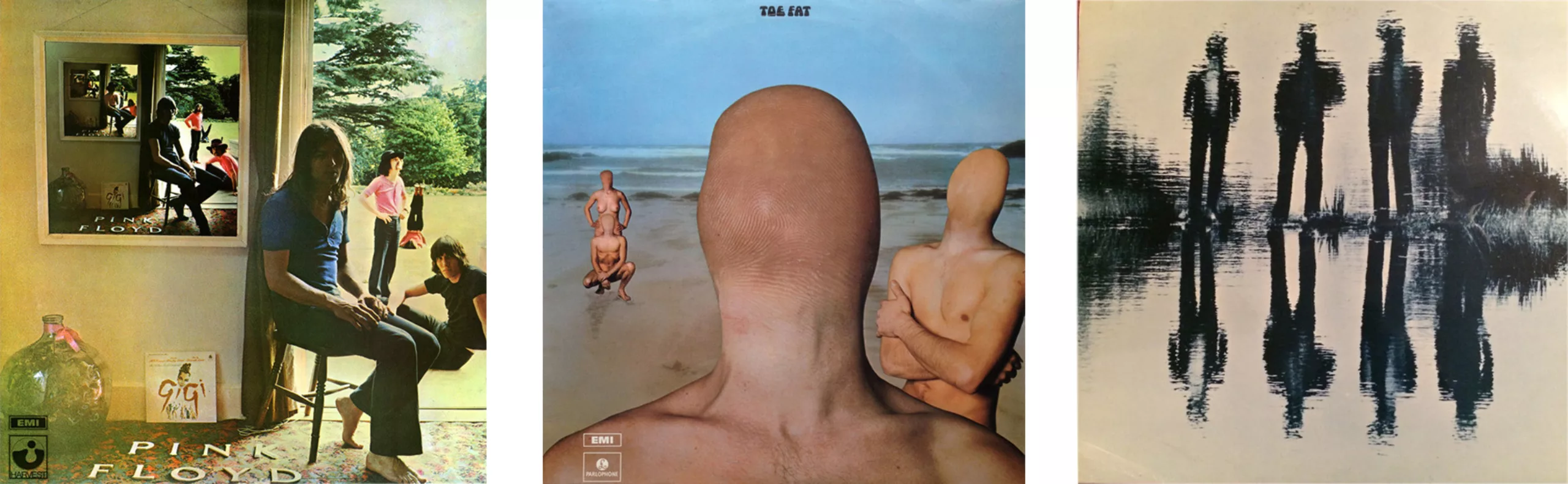
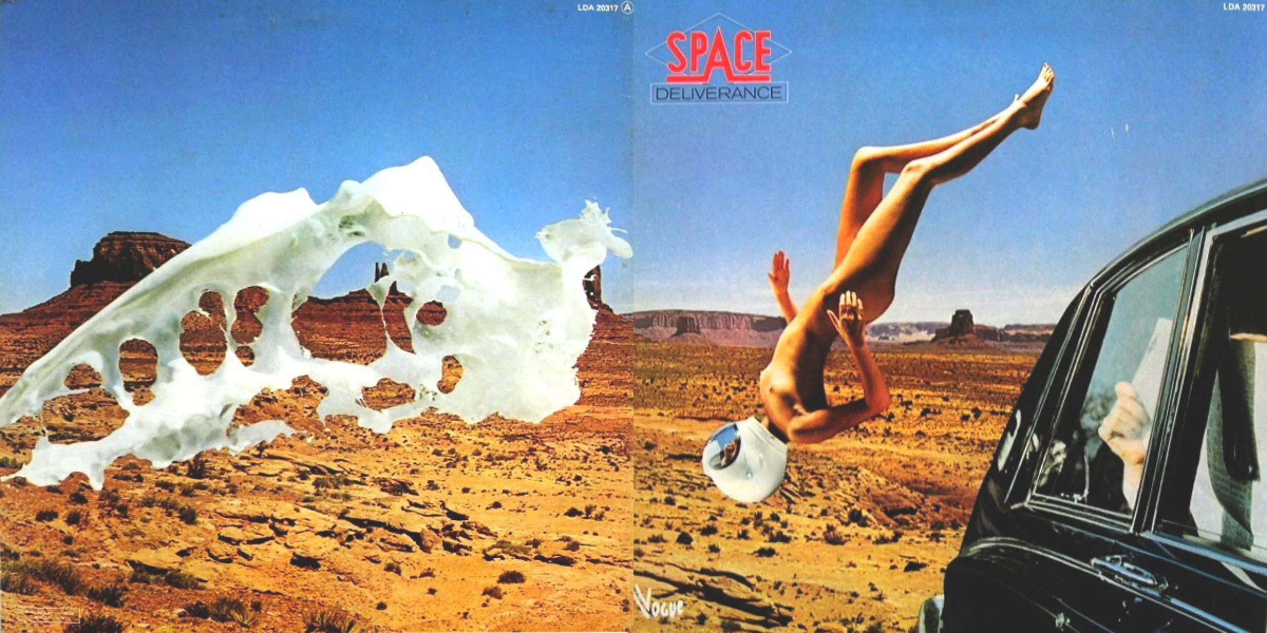
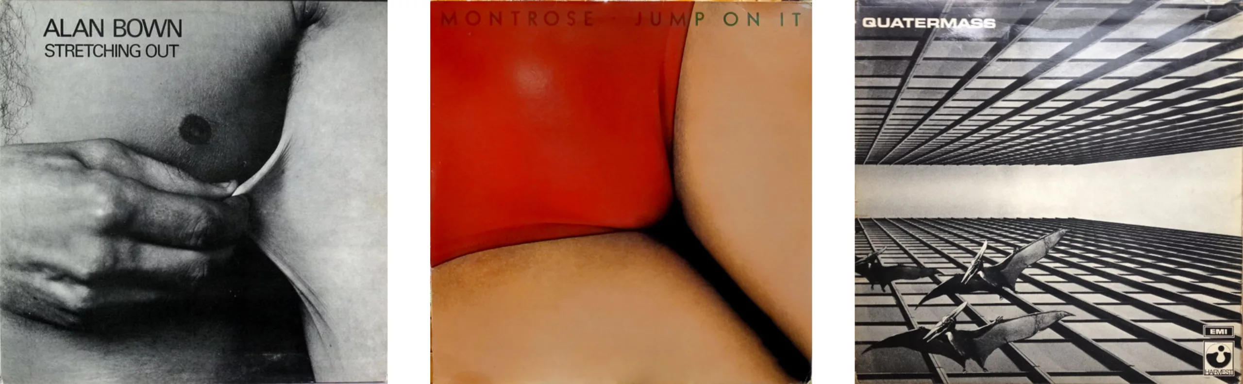

Every album is full of anecdotes about its production, such as the red balls placed on the Moroccan dunes – which were inflated with the help of local boys – for the cover of The Nice’s Elegy (above), the bare-bottomed children catching a chill whilst Led Zeppelin and the two months of post-production that followed to recreate the Irish set which proved impossible to photograph due to the rain, the stuntman holding his breath on a chair until the wind died down on the lake’s surface, and the man on fire who lost an eyebrow whilst filming Wish You Were Here, or even the traumatised sheep from 10cc. The anecdotes are in English in the Rolling Stone article, and here are a few more detailed ones:
Check out the cow from Pink Floyd – Atom Heart Mother, 1970
In 1970, Hipgnosis was given free rein for Pink Floyd’s new album (Storm was a school friend of two of the band members); but there was no title, no lyrics, and certainly no brief apart from “come up with an idea, anything you like”… Whilst chatting to a surrealist artist, the two creatives sought a concept that would be disruptive and make its mark on the world of rock. The idea of a cow emerged, precisely because it was absurd, and they organised a photo shoot in a field before showing the result to the band, who were delighted. The title would come later, Atom Heart Mother, and fits surprisingly well with the image even though it doesn’t appear on the cover: the band insisted that no text be included on the album, keeping it a true mystery. And it worked: this cow, seen from behind in her green field, raises questions, and people wanted to buy the album to discover the music behind this intriguing cover. Atom Heart Mother would be Pink Floyd’s first hit.
Beach Psychoanalysis – Look here? 1980
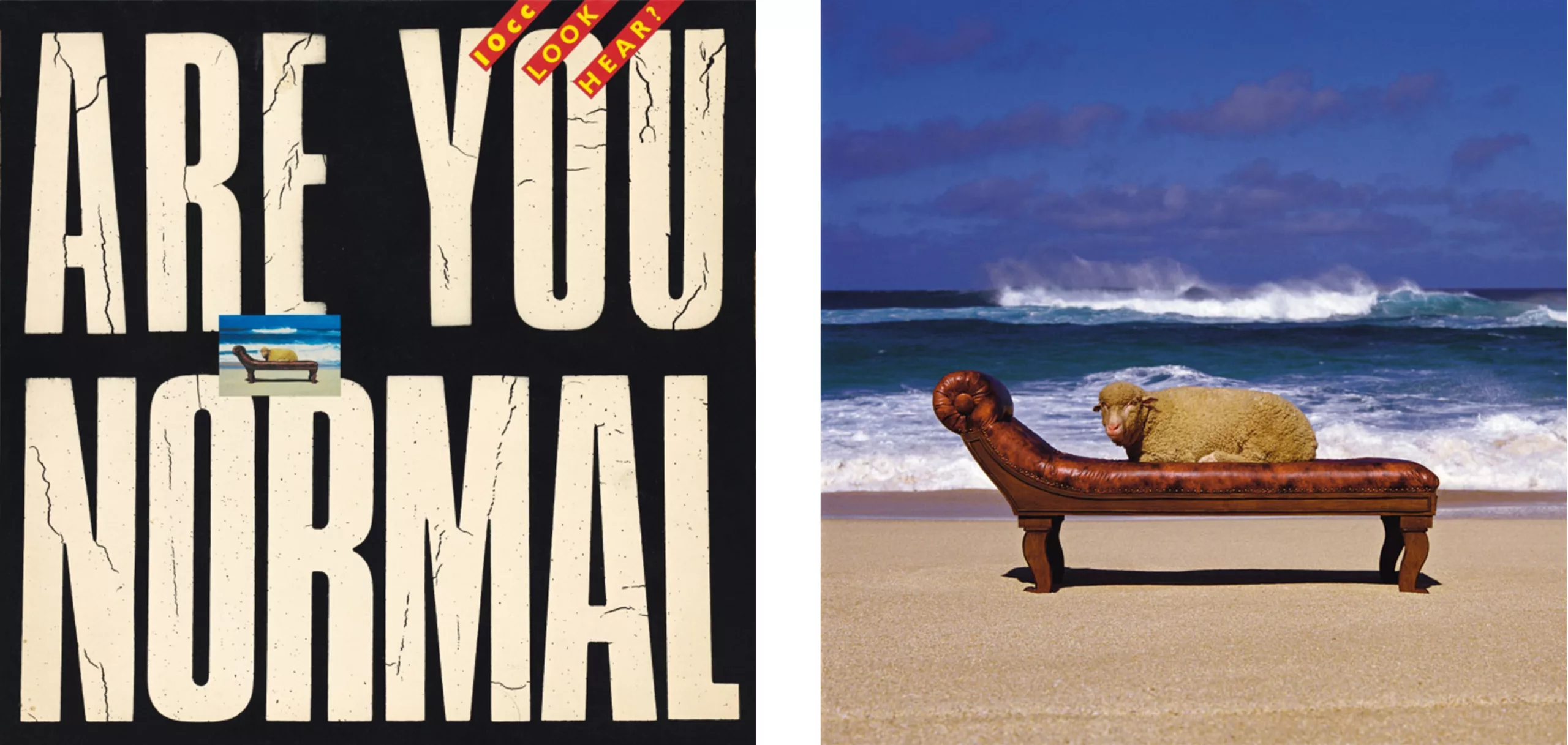
Ten years later, Hipgnosis organised another photo shoot featuring an animal, this time for the band 10cc (Look Here?). On the cover, under the headline “Are You Normal”, there is a tiny image of a sheep on a sofa, facing the sea. The sheep represents people who go round in circles, who go mad and end up in therapy (hence the sofa), and the sea represents the mind. This sort of slightly zany image seems fairly easy to create today, even more so with Artificial Intelligence, but in 1980, it was a real struggle. Powell headed to Hawaii to find some lovely big waves and do his photo shoot. The problem was: there were no sheep on the island, apart from one specimen at the University of Hawaii, which he managed to borrow for the occasion! There’s no Freudian couch either, because psychoanalysis hadn’t yet reached the island… so he had one made. Naturally, the animal was terrified by the waves and the noise and leapt up, trying to swim away: in the end, they had to half-sedate it to keep it lying on the couch.
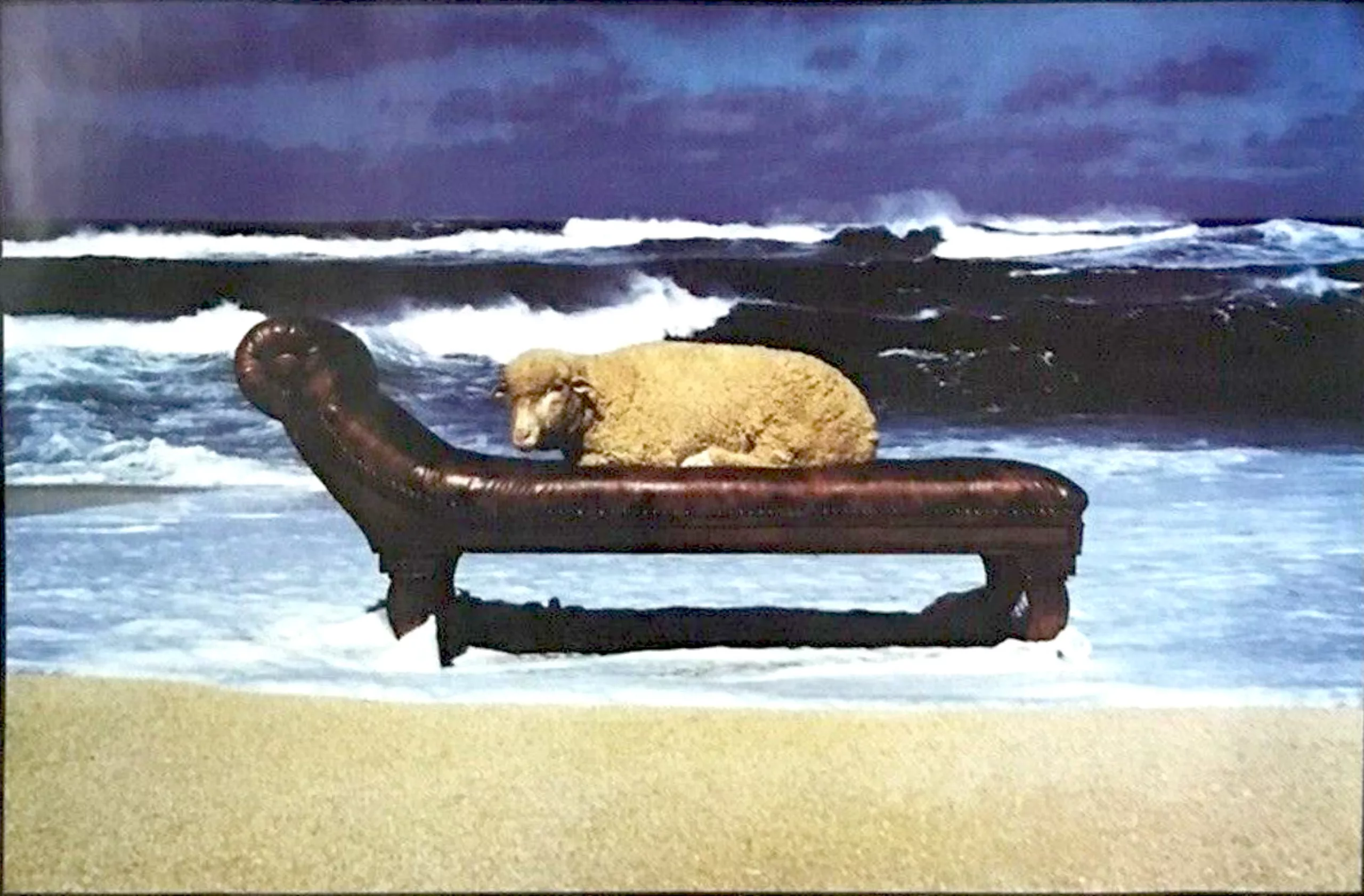
The photos are quite spectacular, and Powell would say that the lethargic beast was staring at him with ‘demonic eyes’.
A story of triangles – The Dark Side of the Moon, 1973
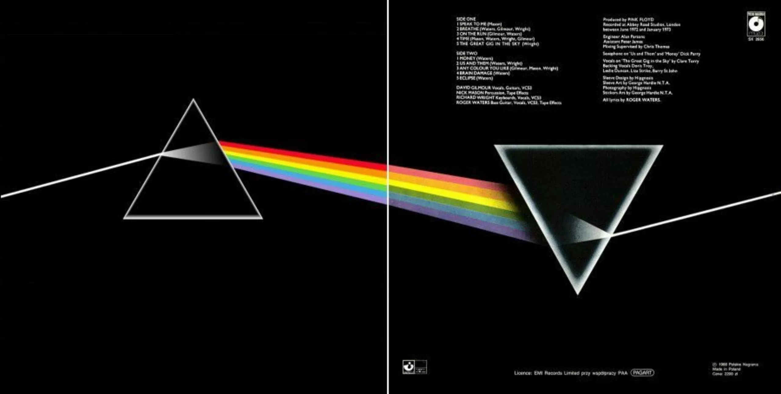
In 1973 – a pivotal year that would catapult the agency to fame – Pink Floyd asked Hipgnosis to design a cover for The Dark Side of the Moon, but “not another one of your bloody surrealist designs”. Feeling dejected, the pair spent several days without inspiration until Powell came across an image in a physics book of a prism-shaped paperweight creating a rainbow. Pink Floyd hardly ever show their faces on stage (let alone on their albums) and make extensive use of lighting effects. The two men sketched out their idea and the prism was approved by the band: it was the perfect embodiment of Pink Floyd! The illustration was created by George Hardie, who had the talent for it.
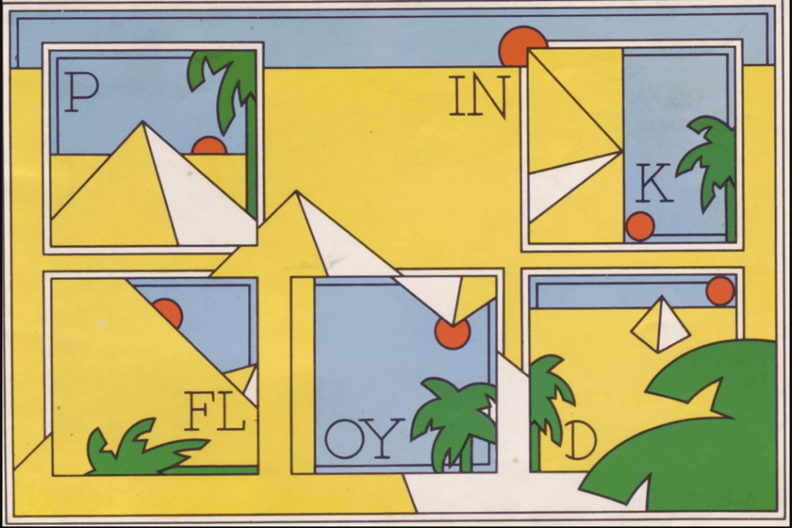
Inside the album there’s a poster and some stickers featuring all sorts of variations on triangles that no longer have much to do with the light from a prism. The thing is the duo can afford to take their triangle-themed whims to extremes, and in this case, specifically as far as the pyramids in Egypt, to “draw inspiration”.
In the Rolling Stone interview, Powell concludes: “The golden age of album covers is behind us. We experienced the best 15 years. There was money. We were privileged to be able to travel and take photos like that.” Not to mention all the hand-retouching. Those were the good old days! The album covers that followed, however, would prove just as creative or iconic.
Sources:
– The Guardian, Pink Floyd’s burning man
– The Guardian, Storm Thorgerson’s iconic album artwork – in pictures
On the subject
-

The futuristic world of Brantonne
In September 1951, René Brantonne began a collaboration with the publishing house Fleuve Noir that was to last more than 20 years (from 1951 to 1965), working on the legendary “Anticipation” series, for which he created 273 original covers.
-
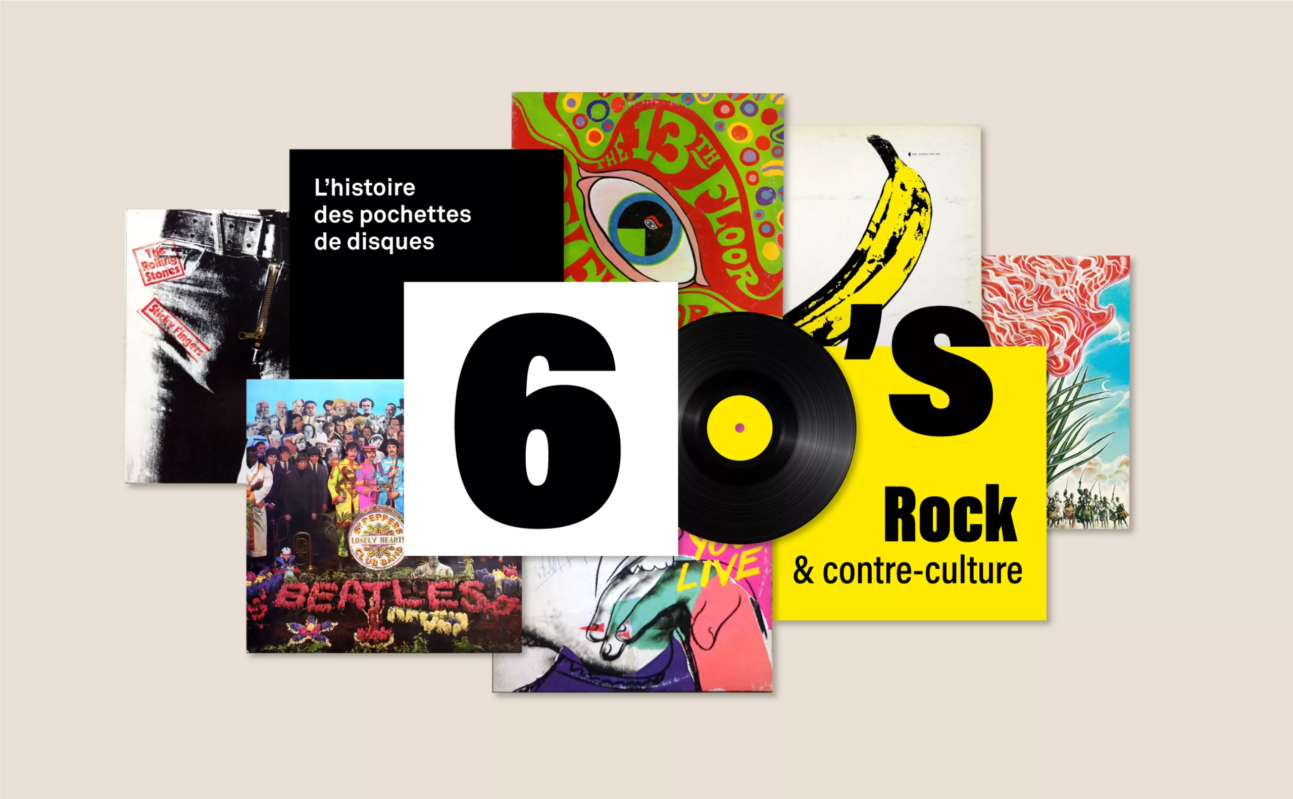
The History of Counterculture Vinyl Album Covers: Censored Albums and Psychedelic Rock of the ’60s and ’70s
Here is the story of psychedelic, risqué, censored, or artist-collaboration vinyl album covers from the 1960s and 1970s.
-

History of record covers: the face of 50s jazz
The vinyl sleeves come to life with jazz. It is a whole graphic universe that makes the music heard, through the illustration or the photo.