FIFA is hiding logos, making them more visible

Version audio de l’article
The World Cup is in full swing, and FIFA has developed a surprising strategy to hide brands that aren’t partners of the competition, in order to have “clean stadiums.” FIFA prohibits any mention of brands that aren’t sponsors of the event, so as not to overshadow its partners, to whom it guarantees exclusivity.
Cover up that brand so I don’t have to see it
Brands must therefore be hidden—with tape, wooden planks, or sheets—to avoid cluttering the visual space with other brands that haven’t paid to appear. Inside the stadiums, the absurdity has reached its peak, as every hand dryer, condiment tube, and seat has been covered with black tape to hide the brand names.
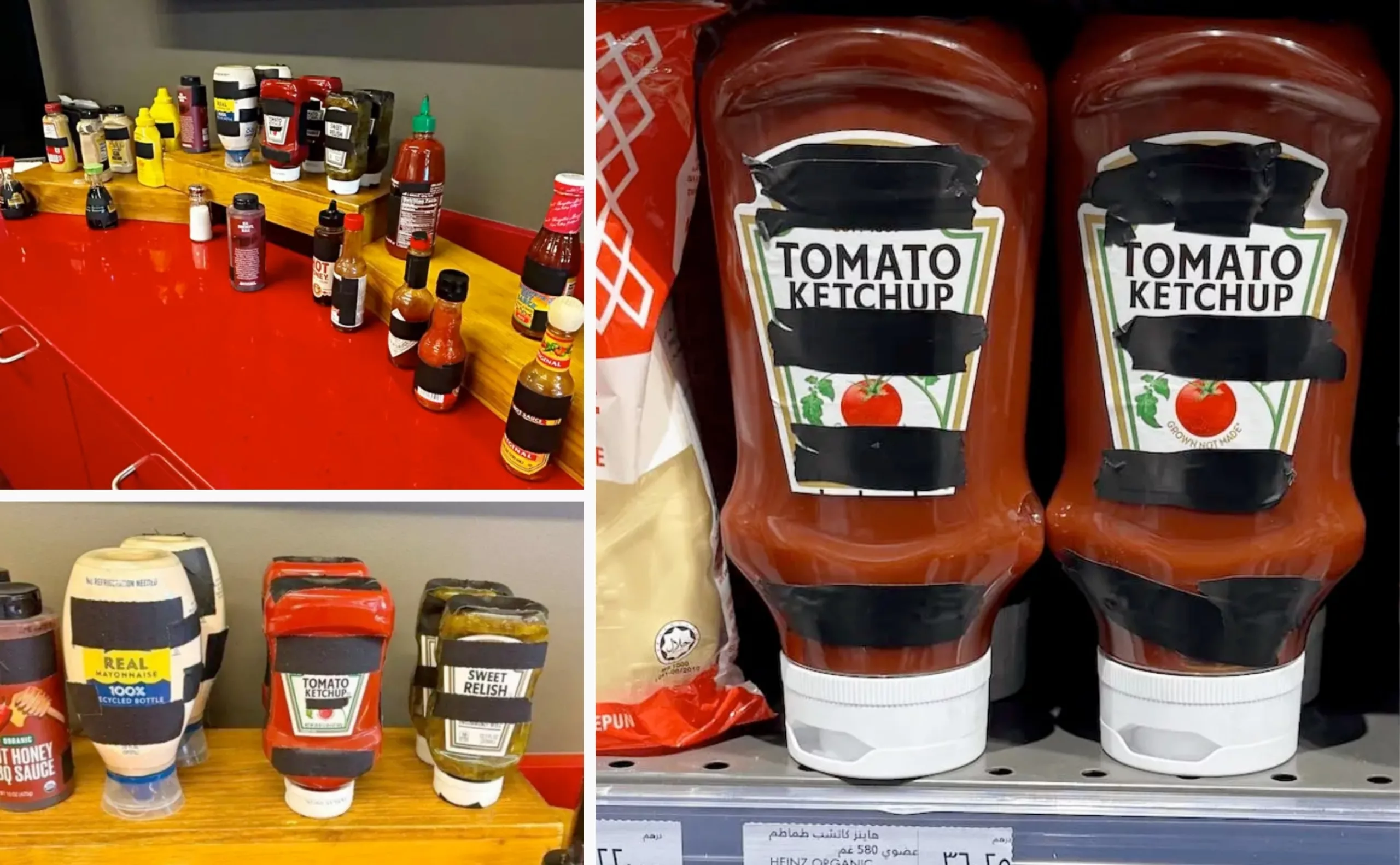
Far from fading into obscurity, the Heinz brand created a buzz. The Saatchi & Saatchi Dubai agency turned the situation to its advantage by launching a campaign featuring the obscured label—and even went so far as to remove its name from its slogan, “It has to be Heinz.” It also placed the censored bottles on store shelves.
Branding isn’t limited to designing a logo—it also includes iconic shapes, some of which are enough on their own to make the brand instantly recognizable!
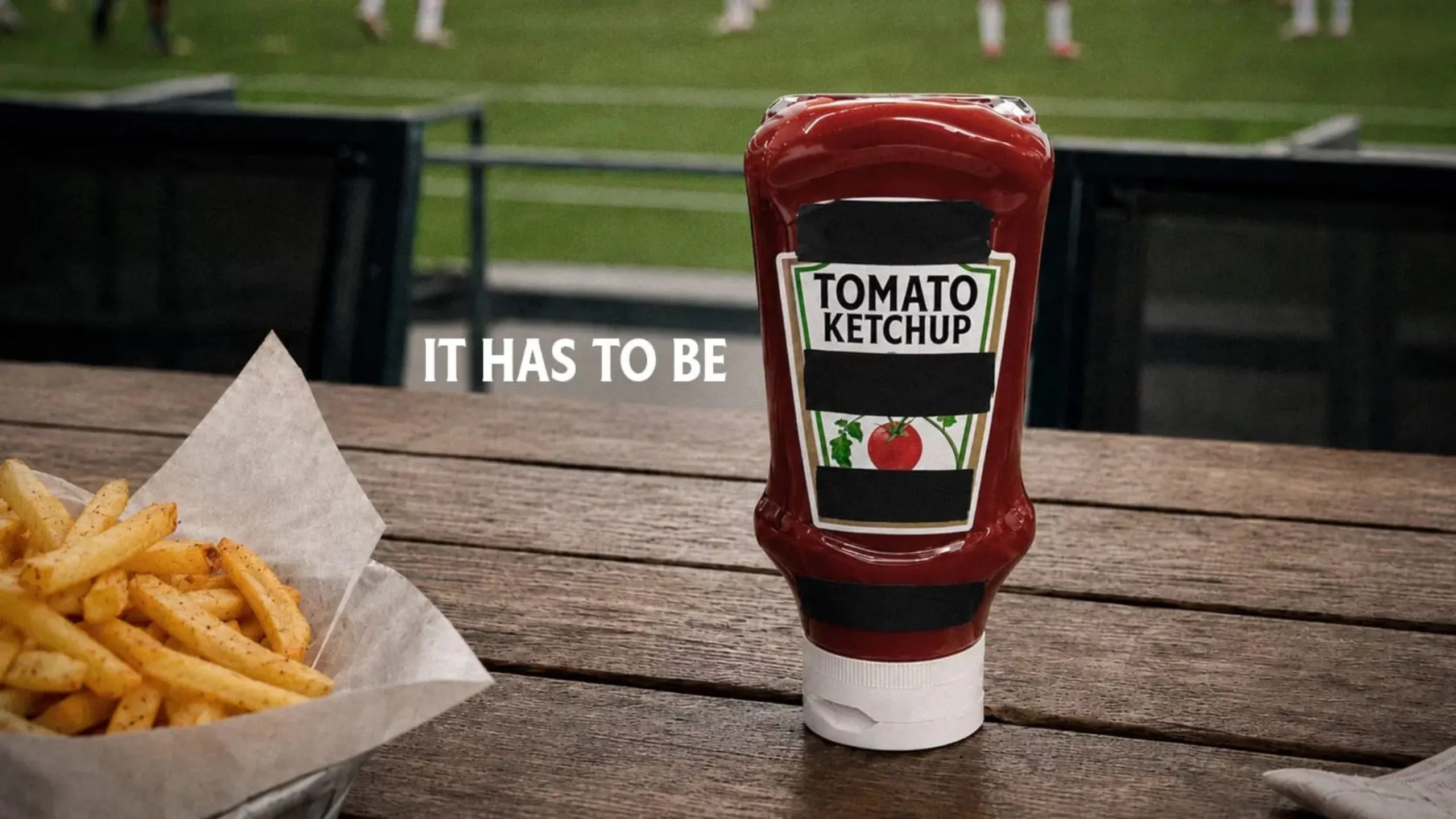
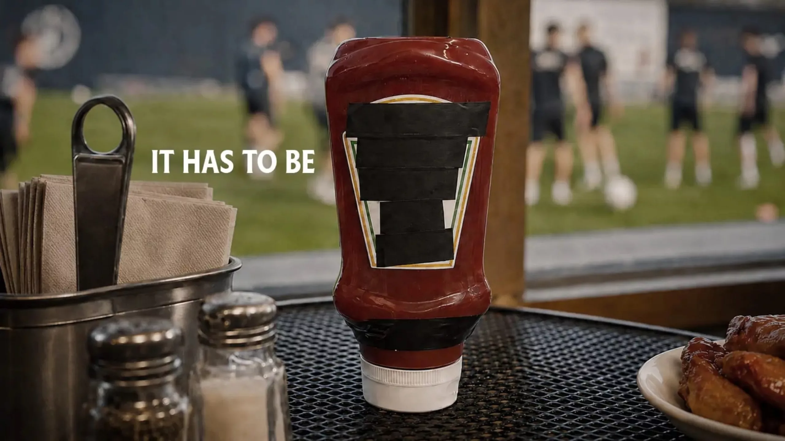
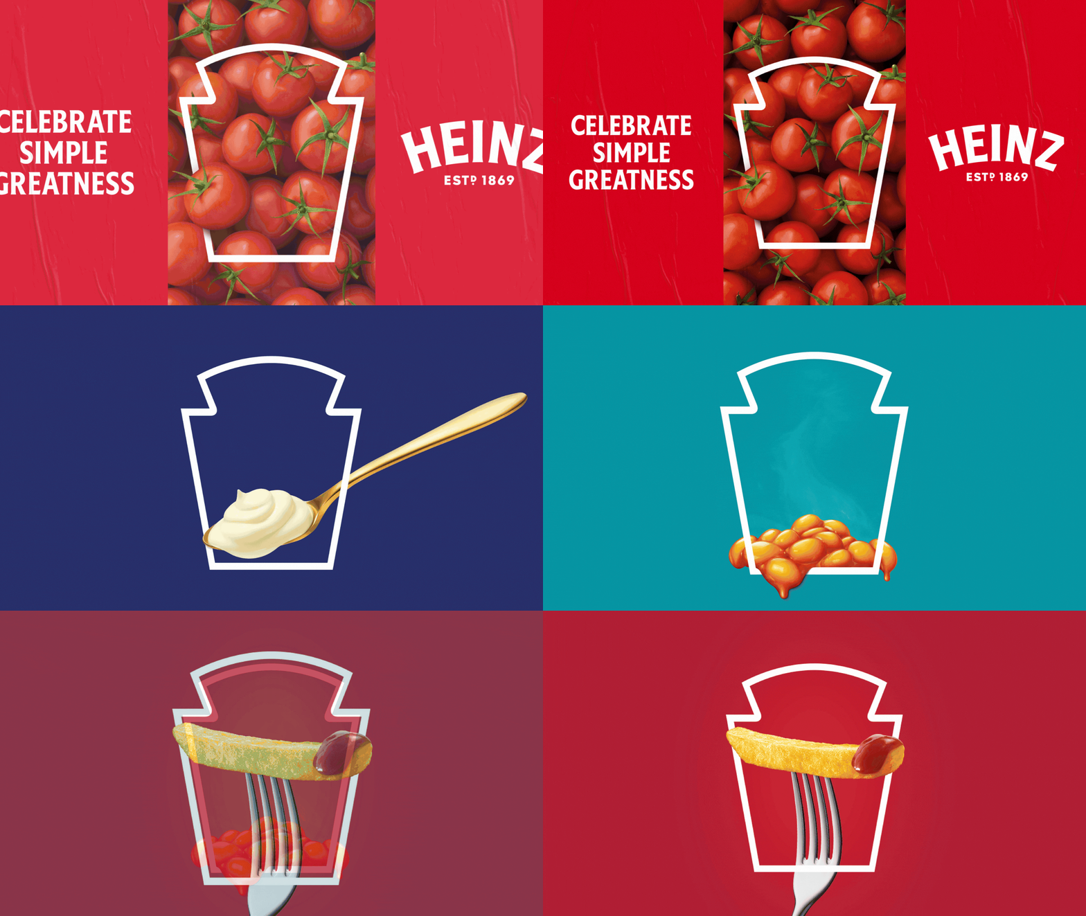
The Jones Knowles Ritches agency had worked on this for Heinz in 2020, highlighting their label—a true graphic symbol of the brand.
When the Levi’s Logo Plays Hide-and-Seek
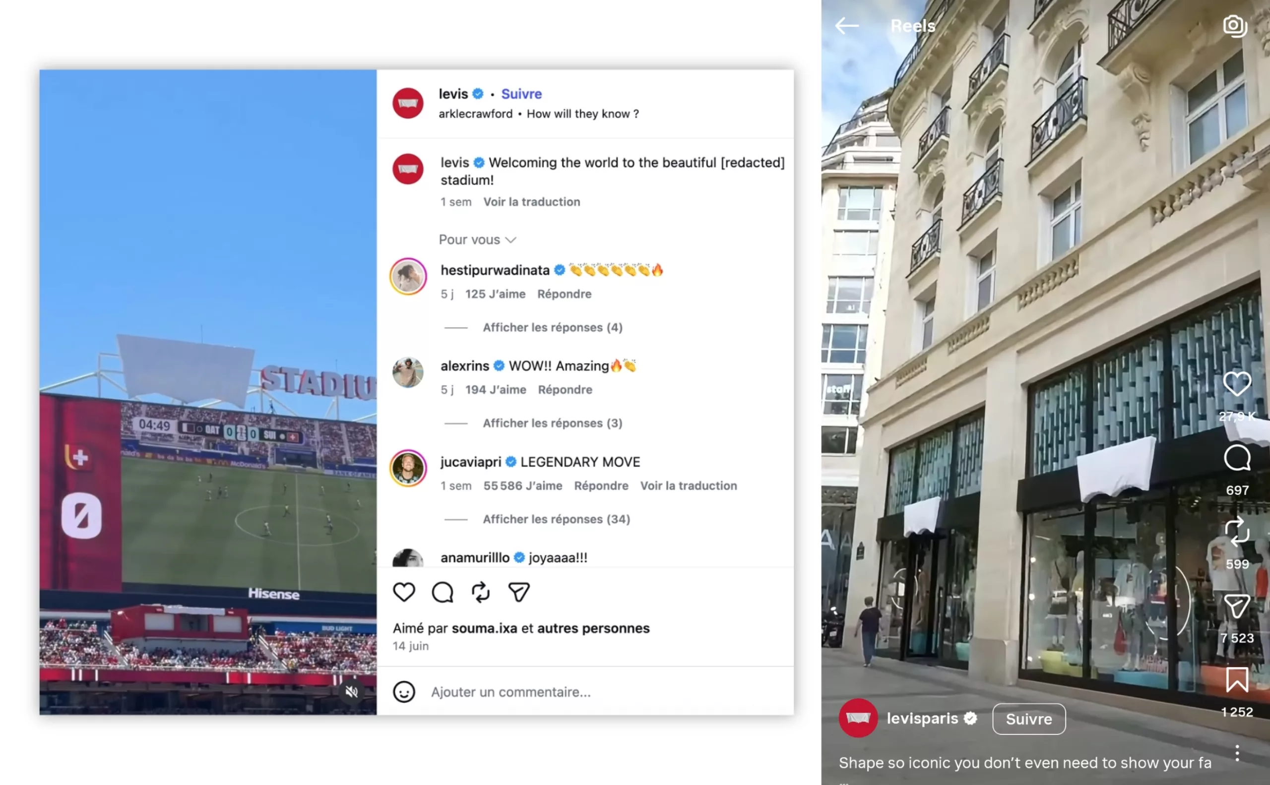
All this buzz started at Levi’s Stadium—renamed San Francisco Bay Area Stadium during the World Cup—where the Levi’s logo was covered with a tarp… making the shape even more visible. Levi’s seized the opportunity and quickly shared a video of the tarp-covered logo with the caption: “No one will know. They’ll know! How would they know?” And as a caption: “Welcome to the beautiful [censored] Stadium!”
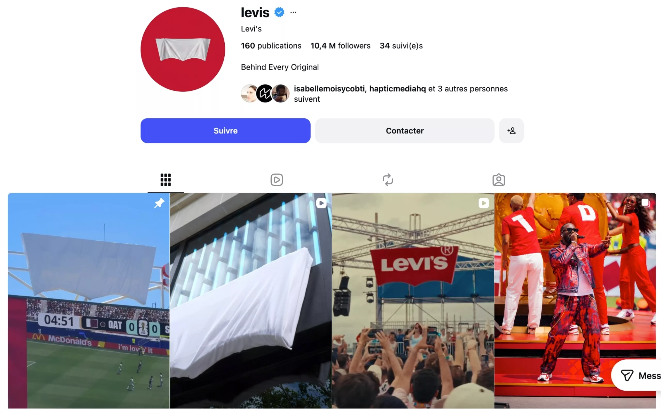
More than 2 million likes later, the brand also changed its profile pictures and covered its store signs in many cities, such as Paris and London, as a nod to this game of hide-and-seek. It was a major free publicity stunt that allowed Levi’s to win the game… without even leaving the sidelines.
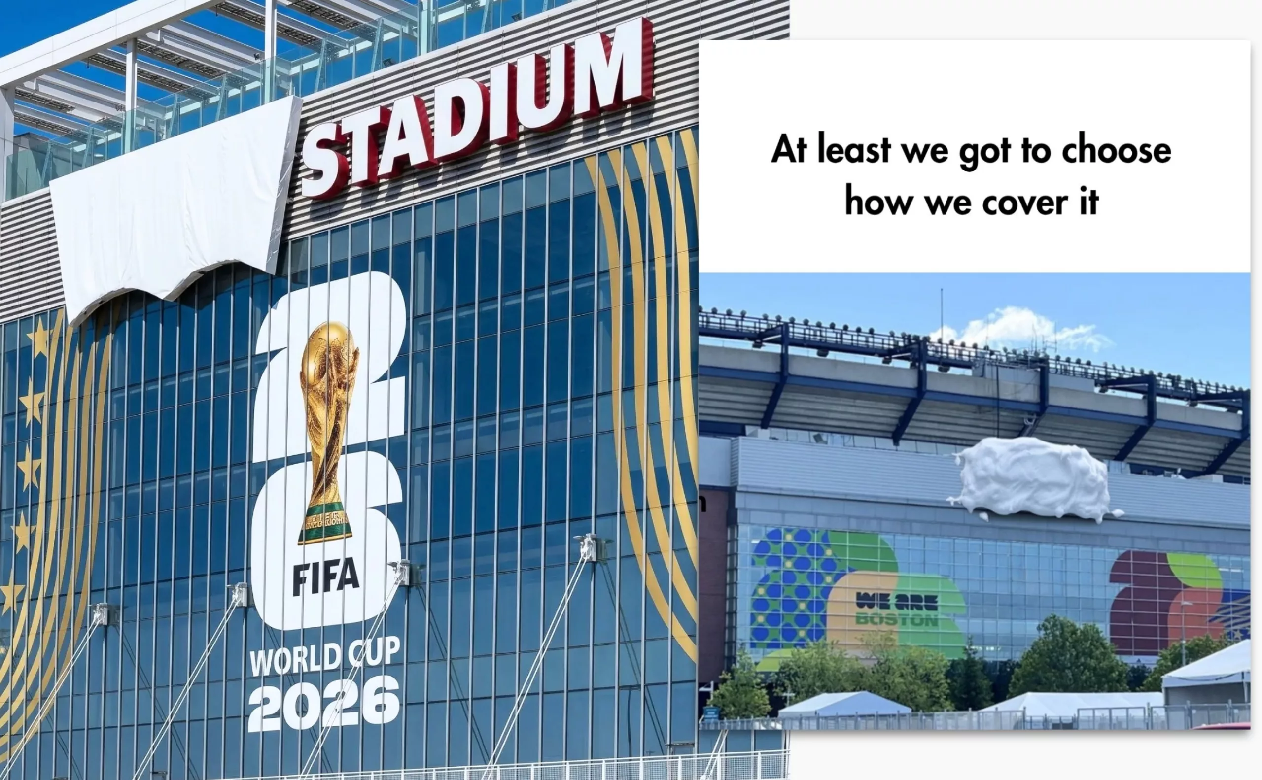
Faced with the same challenge, Gilette pretended to hide its logo under shaving foam, tagging Levi’s on social media: “At least we got to choose what to hide it with.”a
The Levi’s Arcuate, a registered design
The famous shape of the Levi’s logo is inspired by the stitching on the back pockets and even has a name: the “arcuate.” Its design was trademarked in 1943 to prevent counterfeiting and make the jeans instantly recognizable. Much like Louboutin’s signature red, this distinctive mark is instantly recognizable and protected.
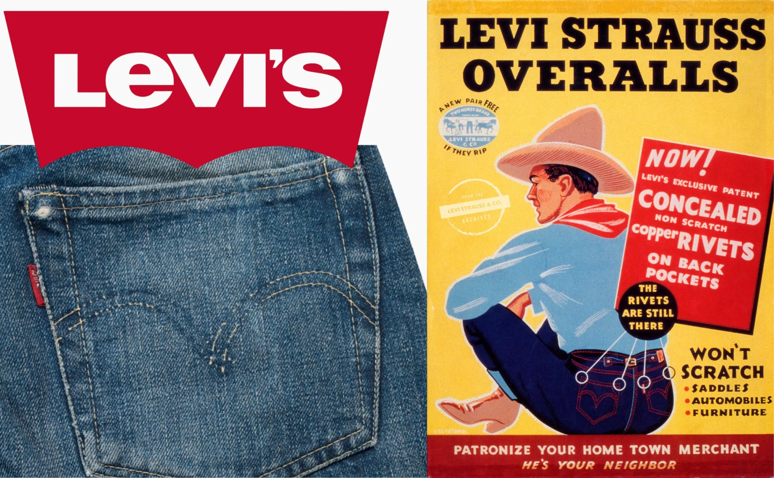
In 1900, the arches were hand-sewn and varied slightly from one piece to another. In 1940, they were hand-painted to conserve thread as part of the war effort, before eventually being machine-sewn with double thread, creating that famous diamond pattern where they meet.
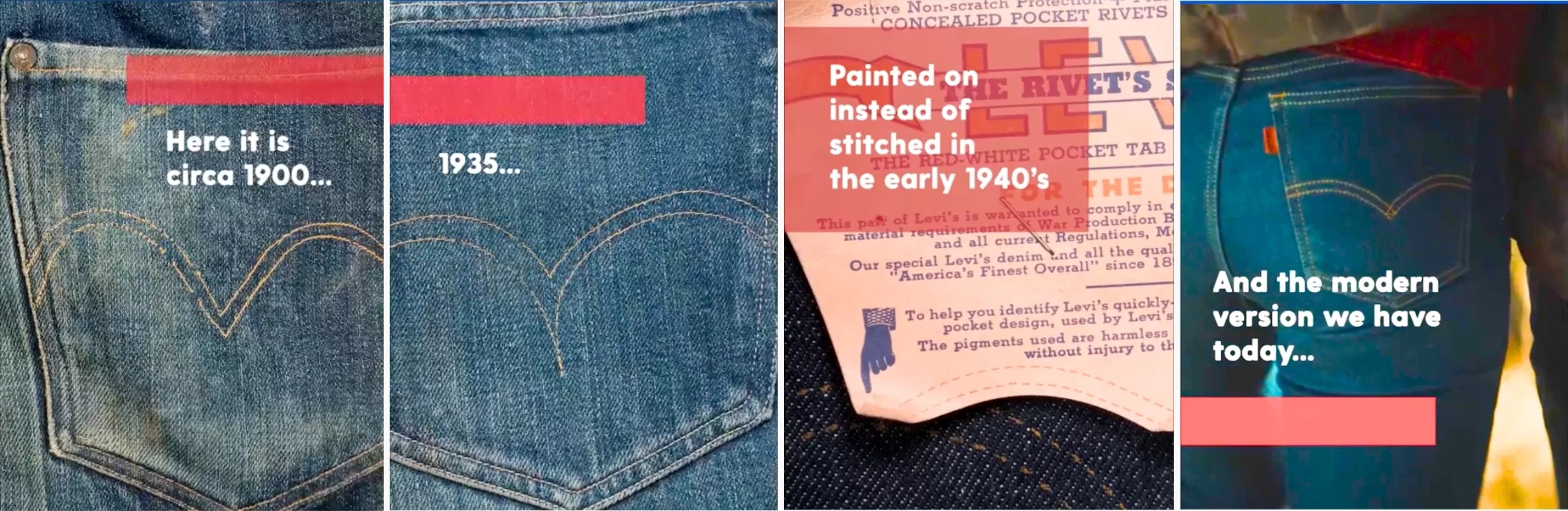
I’m in luv with the shape of U
This buzz has shown that sometimes a brand doesn’t need a logo or a name to be recognized. KFC, SNCF, Coca-Cola, and National Geographic come to mind.
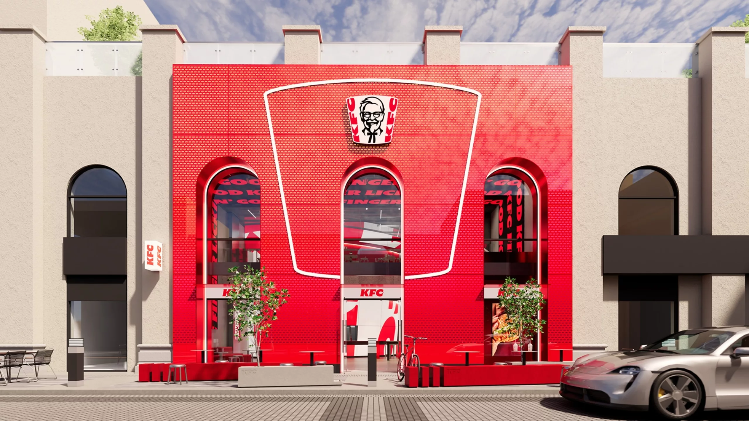
The Bucket in All Its Forms for KFC
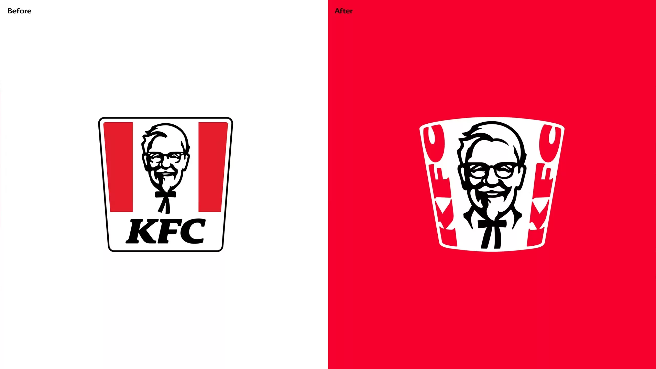
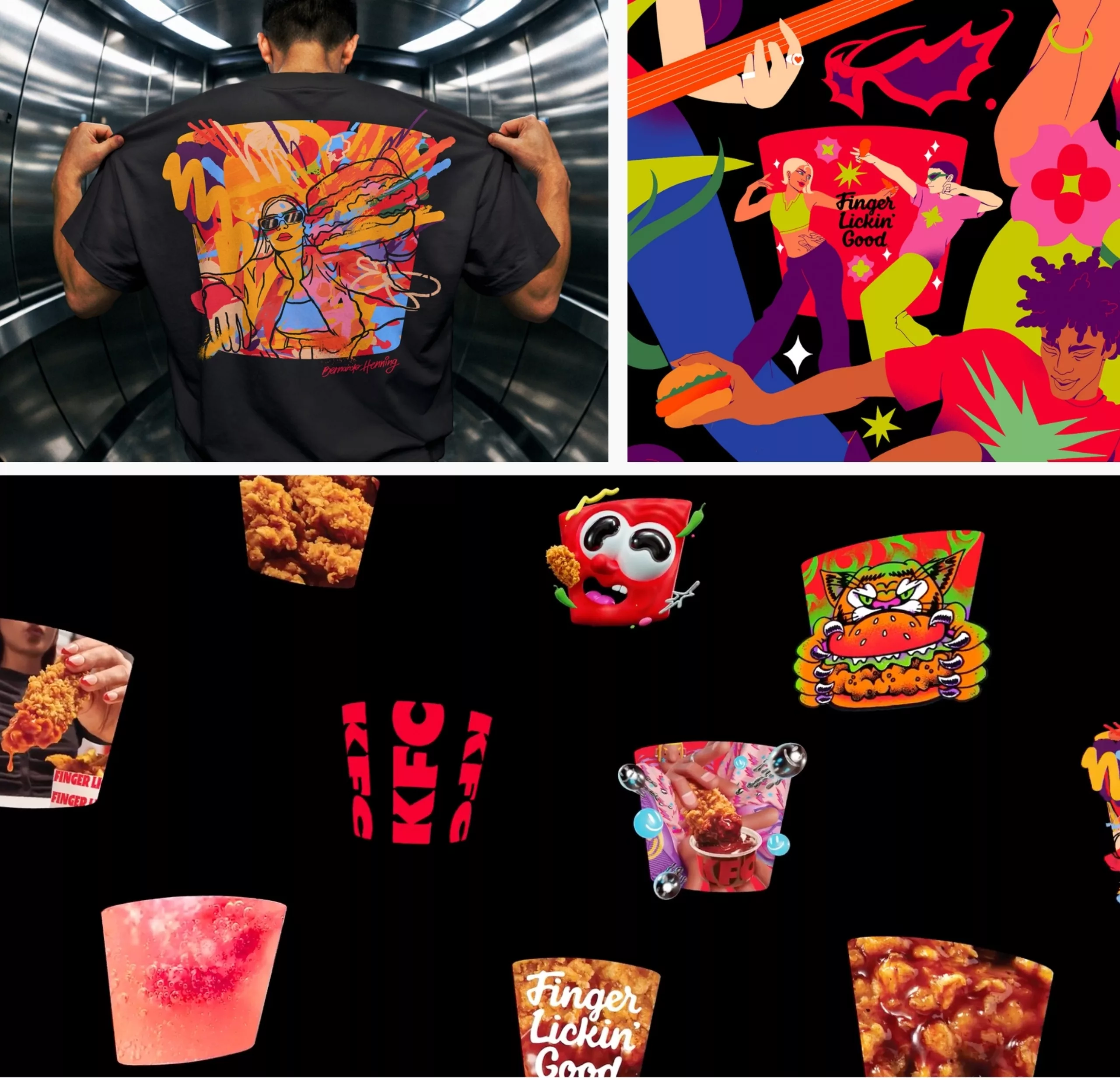
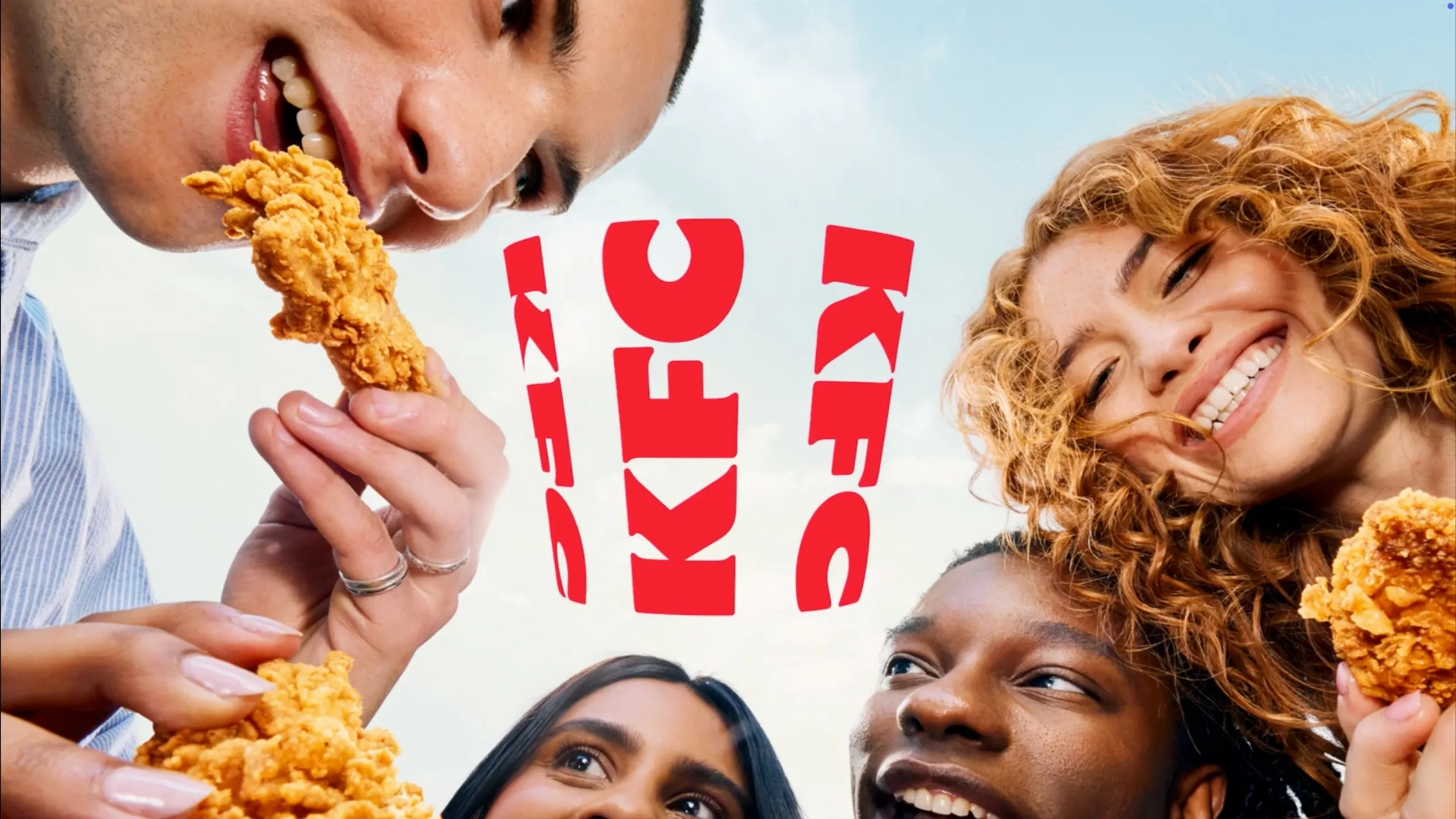
Just a few days ago, KFC unveiled its new visual identity and logo designed by JKR, which centers on the famous bucket used to serve fried chicken. The iconic rounded trapezoid shape emerges through a play on perspective with the typography, and can be filled with illustrations or photos. It’s a clever way to highlight their brand and flagship product through simple suggestion.
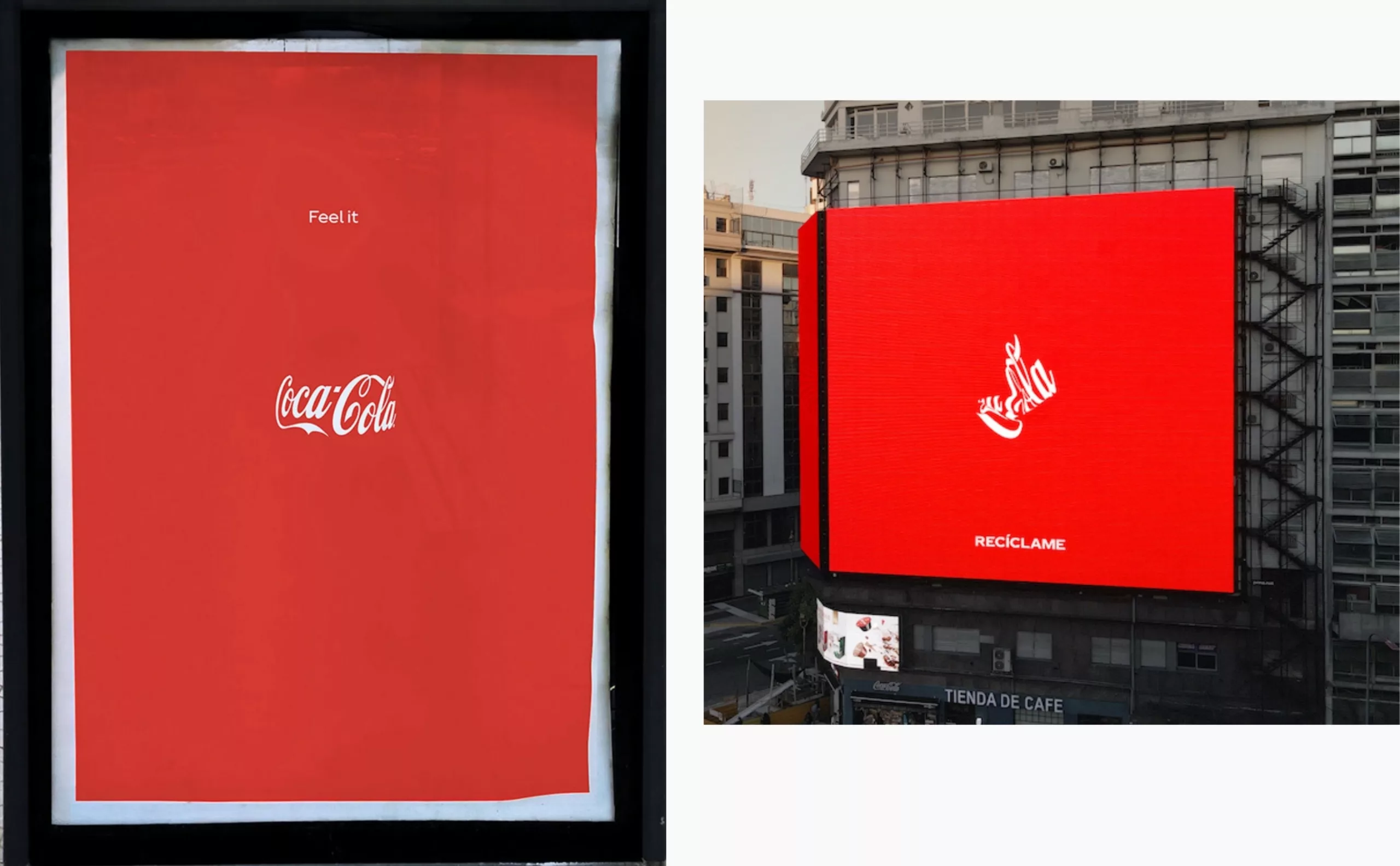
Coca-Cola: Transparency Above All
The same goes for Coca-Cola, which for several years now has afforded itself the luxury of embodying transparency by simply hinting at its bottle through a play on typographic perspective. Publicis Italy brilliantly brought out the shape using just two words and a logo against a red background.
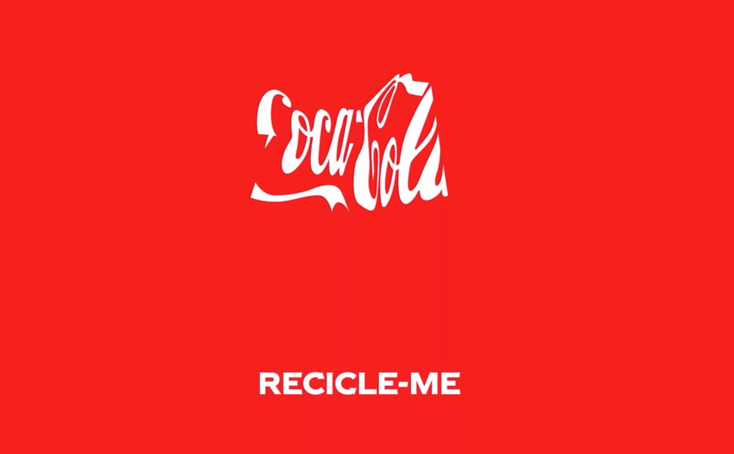
Ogilvy N.Y. took it a step further by distorting the logo to give the impression of a crushed can, with the phrase “recycle me.” Even when illegible, the brand remains recognizable—thanks in particular to the red color and its distinctive typographic curves.
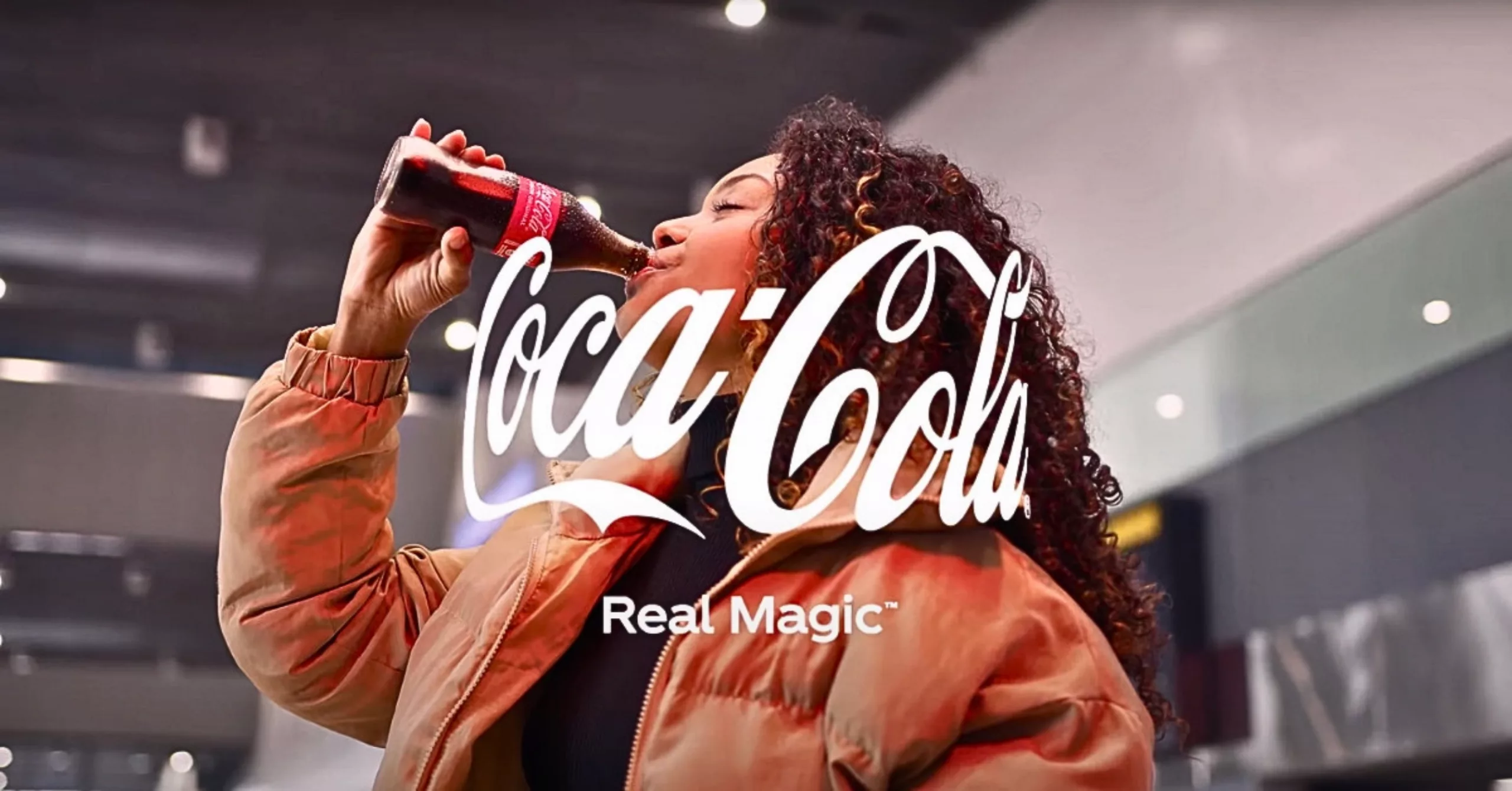
The “Real Magic” campaign presents the bottle’s rounded shape as a “hug” that brings people closer together and envelops them.

A train is all it takes, according to the SNCF
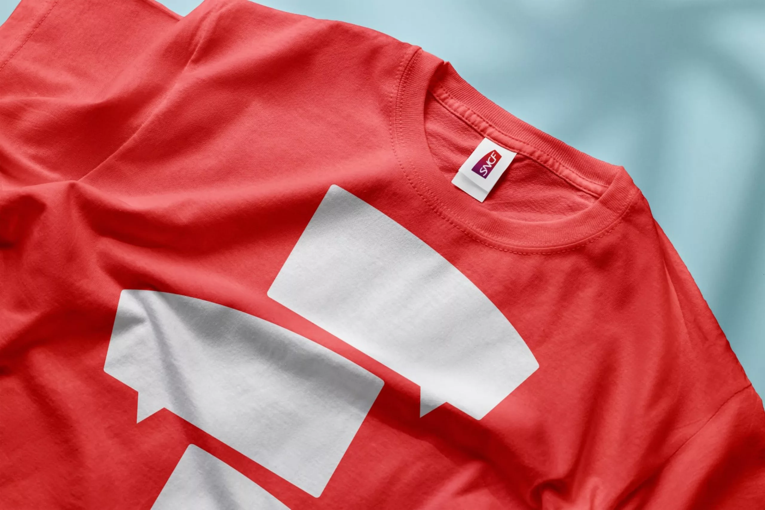
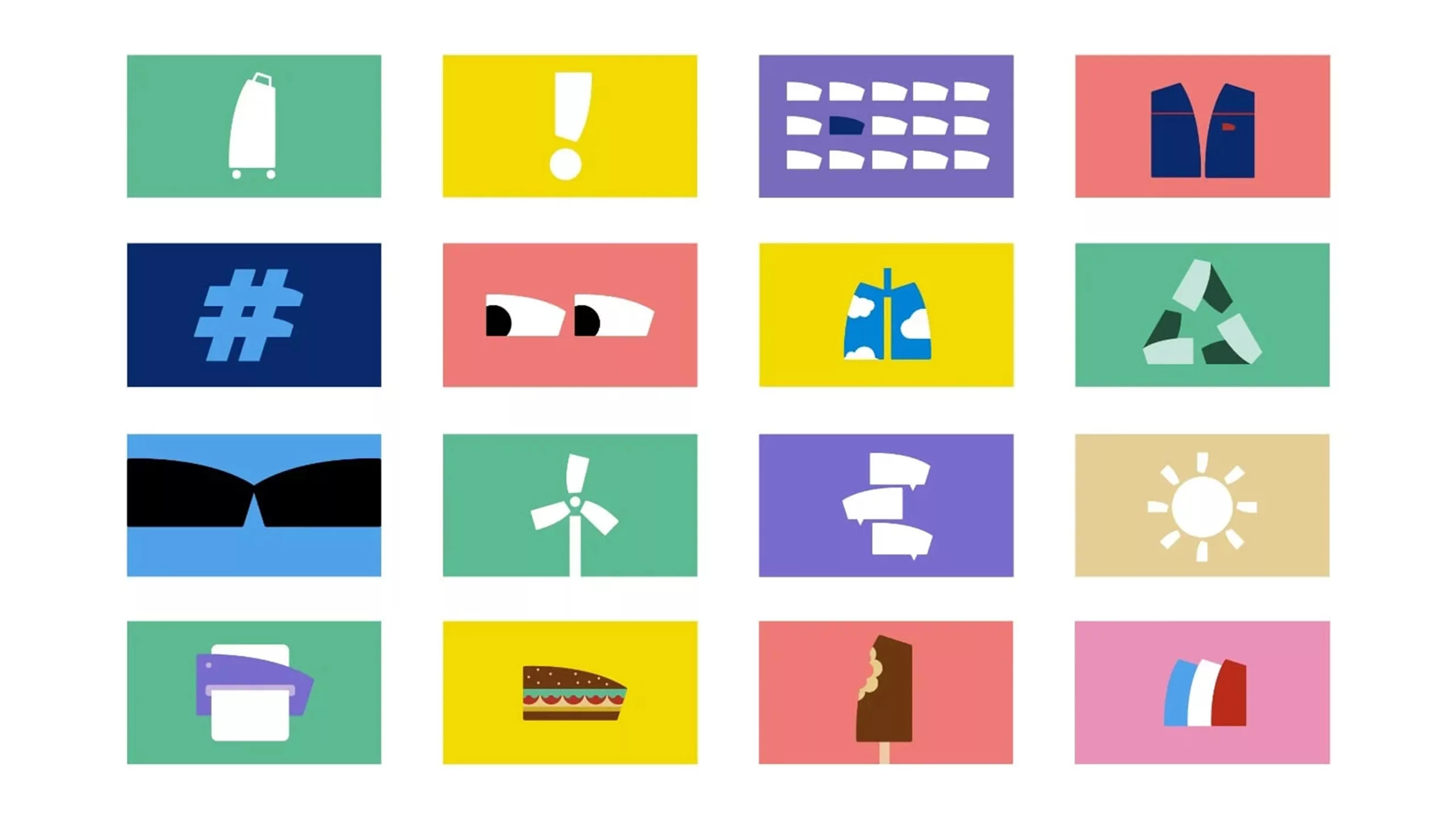
In France, the logo featuring the ligature of the letters ‘SNCF’ has been renamed ‘La Motrice’. It helps to establish a corporate brand identity that is more distinctive and expressive. The new identity was designed in 2023 by Landor & Fitch. It has been adapted in a playful and illustrated style to boost the brand’s appeal.

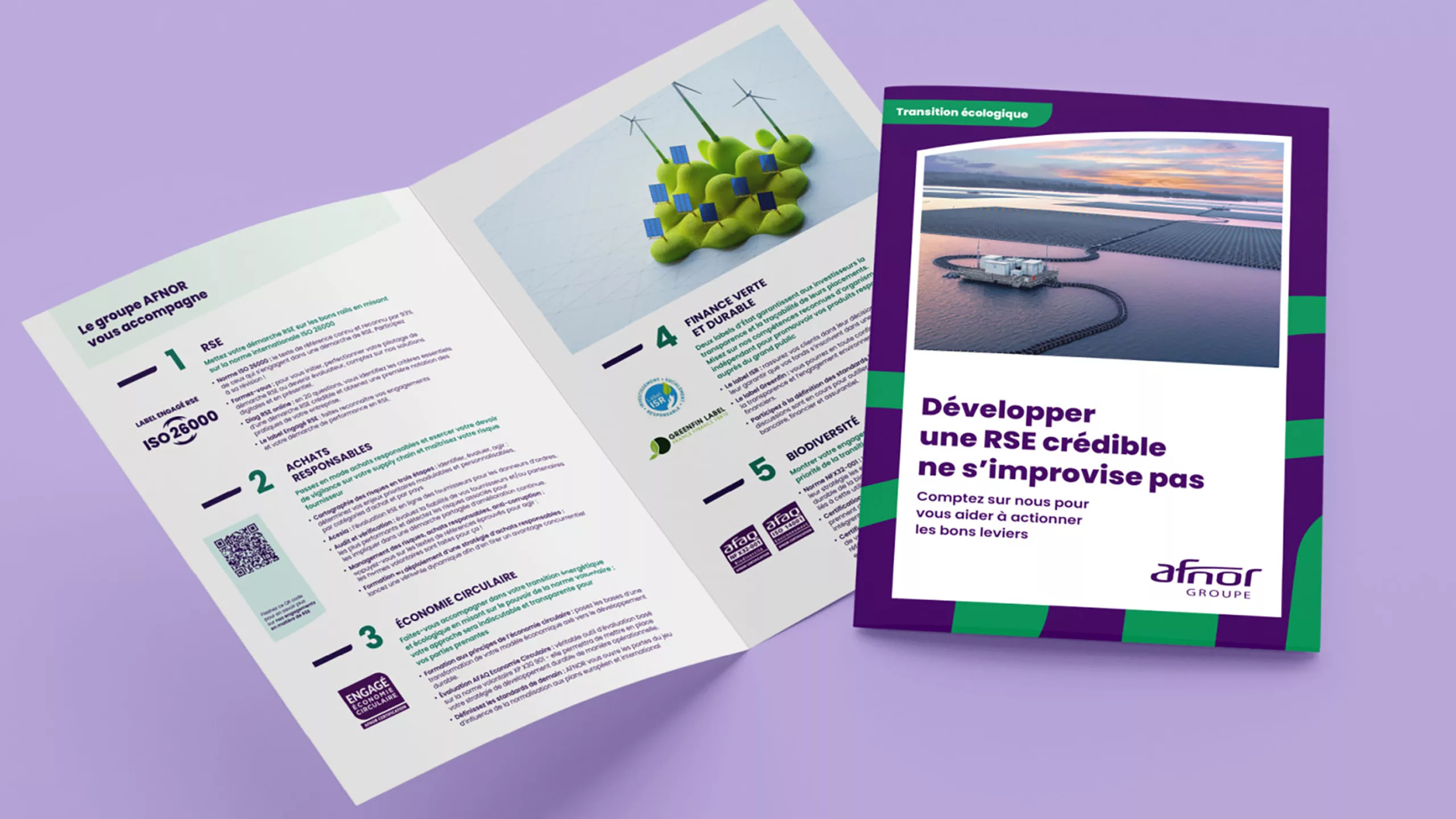
In 2026, Carré Noir proposed a rebranding of AFNOR’s identity. The design featured on the new communication materials resembles the SNCF’s ‘Motrice’ train. This highlights the limitations of a system that emphasises the originality of a silhouette, and the risk posed by this trend should it become fixed on ultra-minimalist forms.
Reimagining nature with National Geographic
Created by the agency Geismar & Chermayeff & Haviv in 1967, the emblem of National Geographic is probably one of the most effective in its field. The yellow rectangle originally came from the border on the magazine’s covers before becoming the brand’s logo. A border (red) can also be found in Times Magazine or on Gallimard book covers (black frame and red line), but these frames have not been developed as elements of a graphic identity.
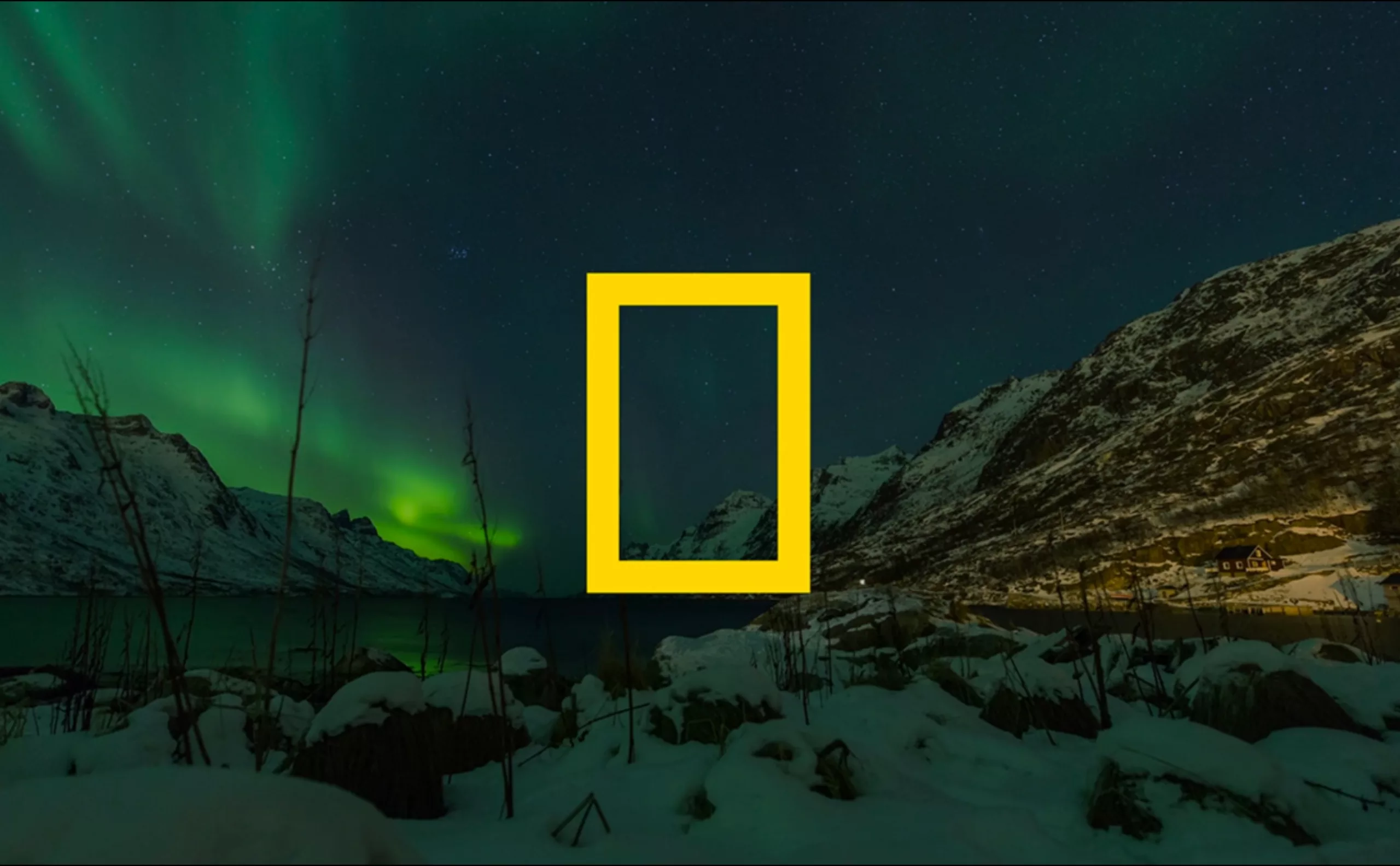
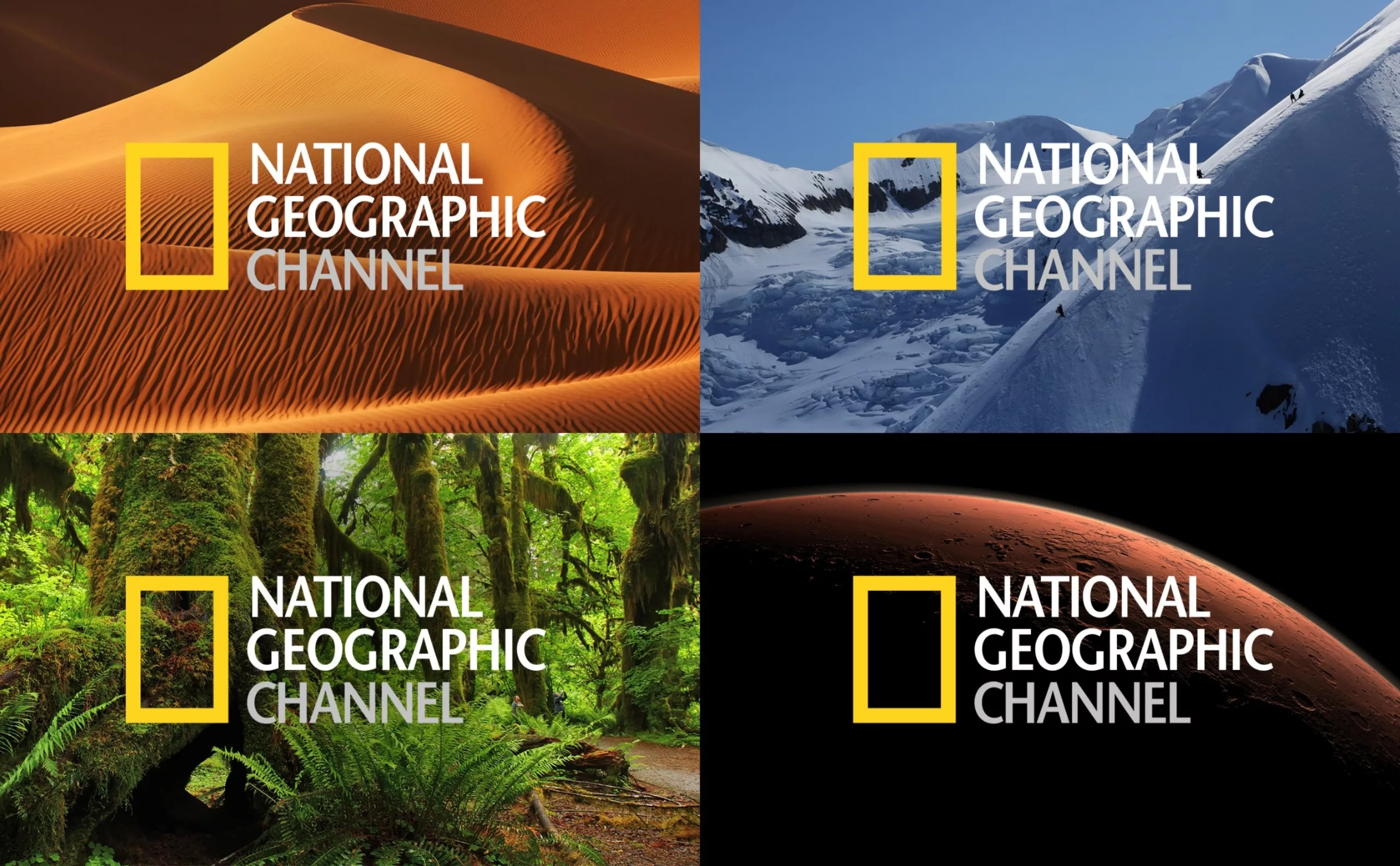
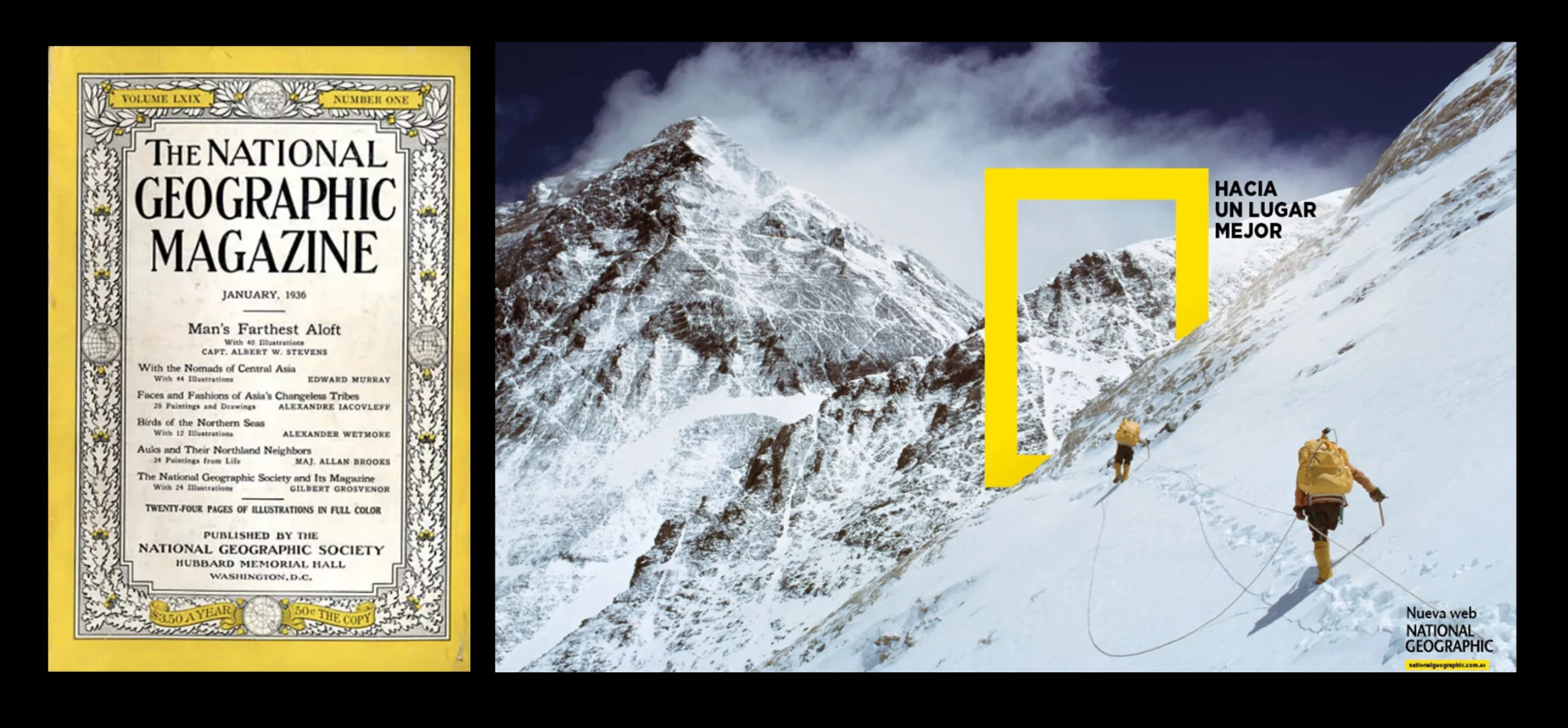
Whilst the system is simple, it does, however, need to be underpinned by a strong, recognisable brand with a distinctive form.
This story serves as a reminder that contemporary branding is no longer solely about the logo. Brands now seek to possess forms, colours, gestures or visual codes capable of existing independently. It is a powerful strategy, but one that also carries a risk: through excessive simplification and minimalism, certain brand identities end up looking alike.
Being recognisable without a logo has become a goal in itself. The question remains: how many brands will succeed in the future in being recognised by their silhouette alone, without being confused with that of their competitors?
On the subject
-
Iconic Branding: Building a Star Identity
Celebrities are a marketing product that can be manufactured or natural. Let’s take a closer look at celebrities’ personal branding and how they build their image or become icons, from Taylor Swift to Jul, via Marilyn. FIFA is removing logos, but making them more visible
-
Has branding become an amusement park?
Playful, entertaining and festive styles are emerging as the new trends in graphic design for communication.
In recent years, brand identities and branding have seemed to be on a high, constantly evolving, with bouncy typefaces and bright, vibrant colours.
Can branding do without widespread gamification? Nothing could be further from the truth… -
New logo for OM: analyzing a sports crest
OM will soon be changing its logo. This is an opportunity to delve into 125 years of heritage to understand the challenges of the future.