Stefan Sagmeister, incorrigible optimistic
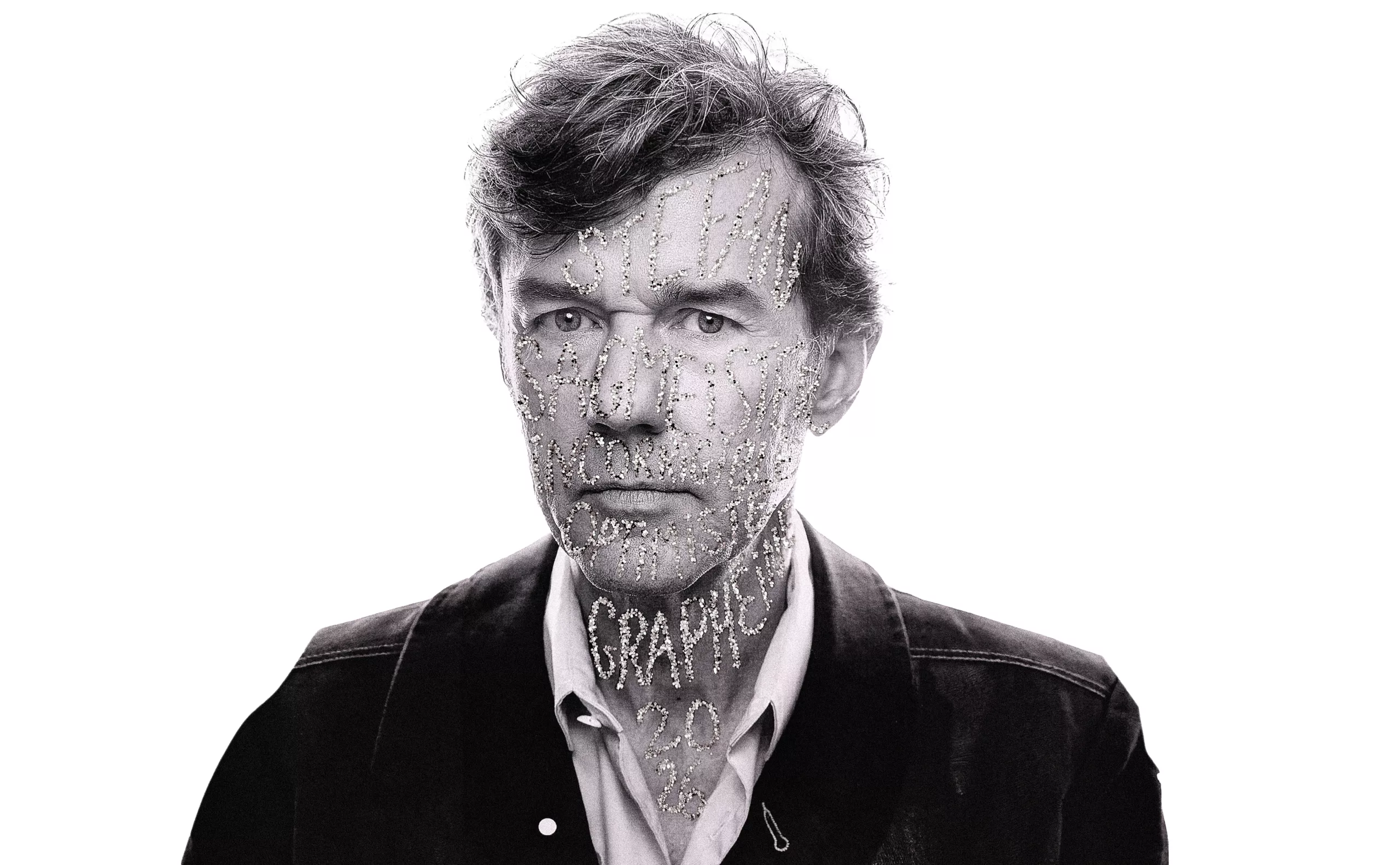
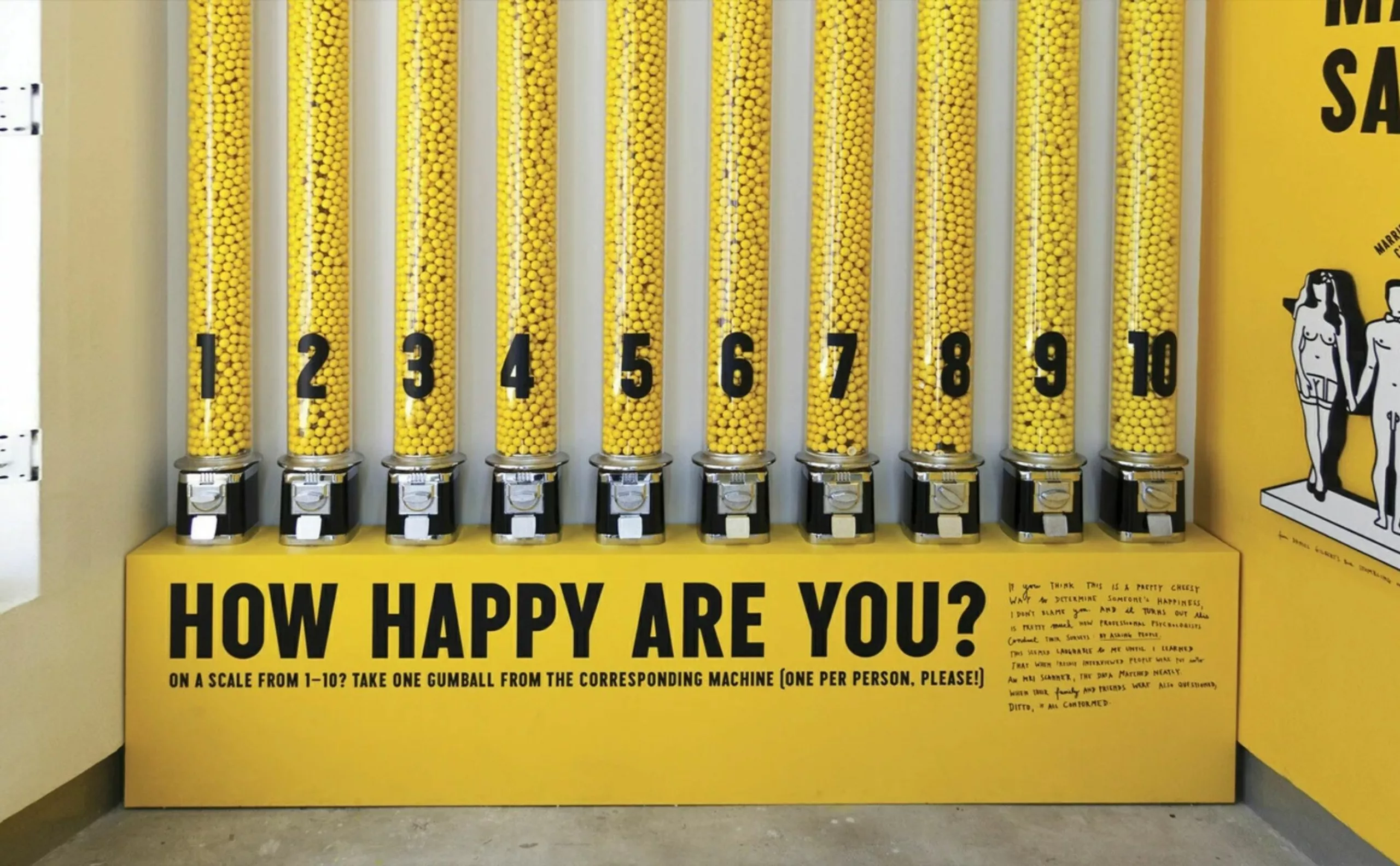
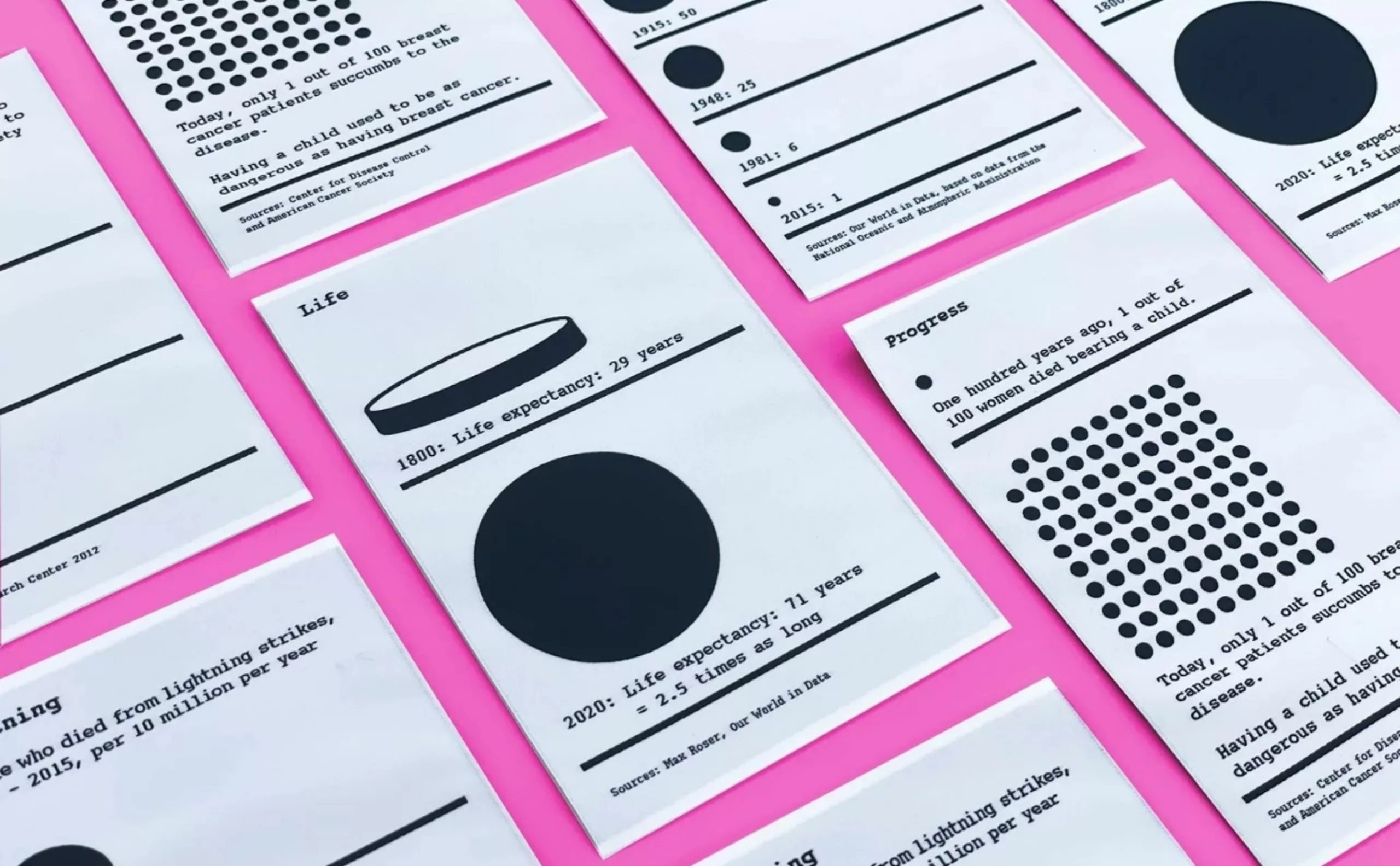
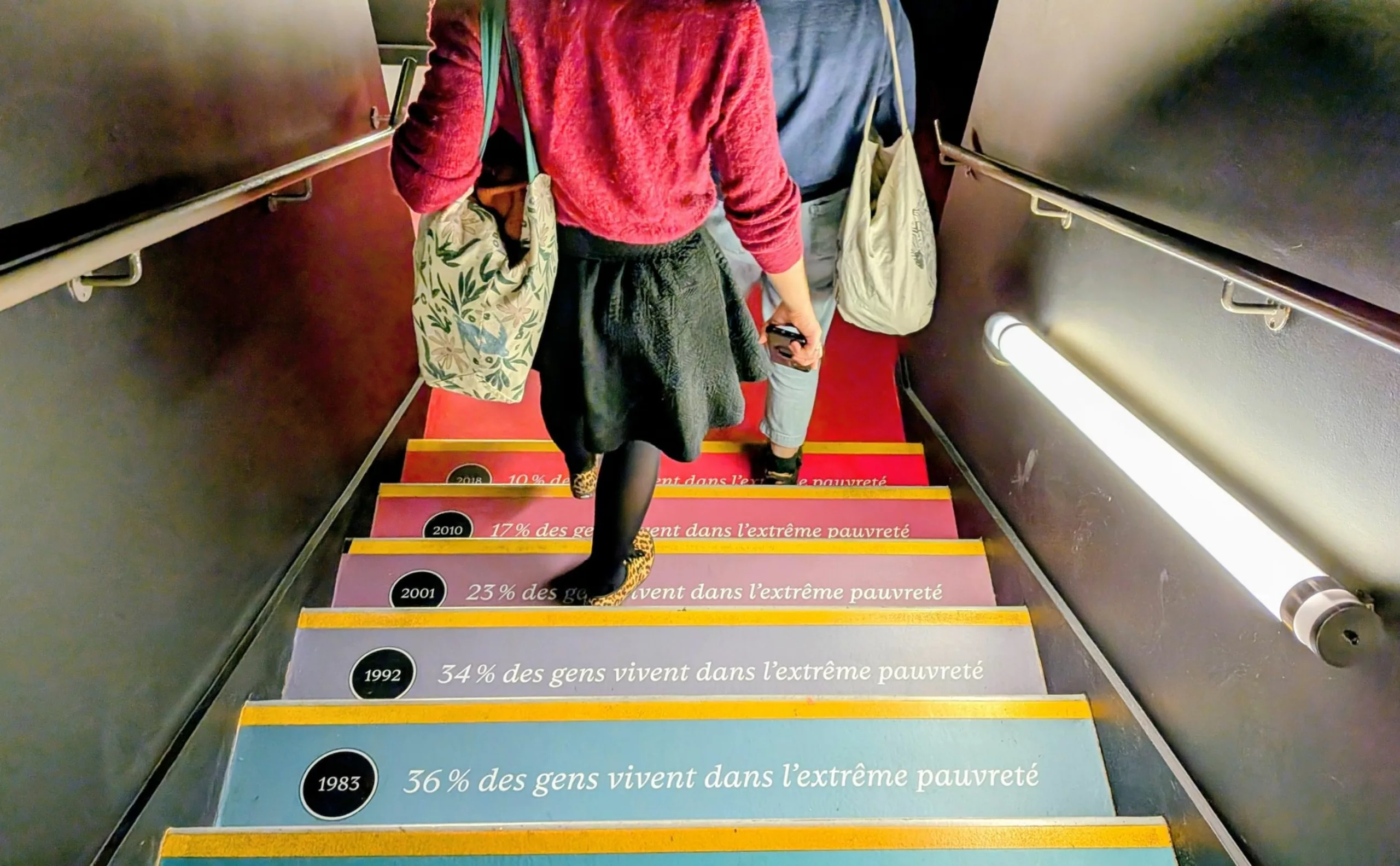
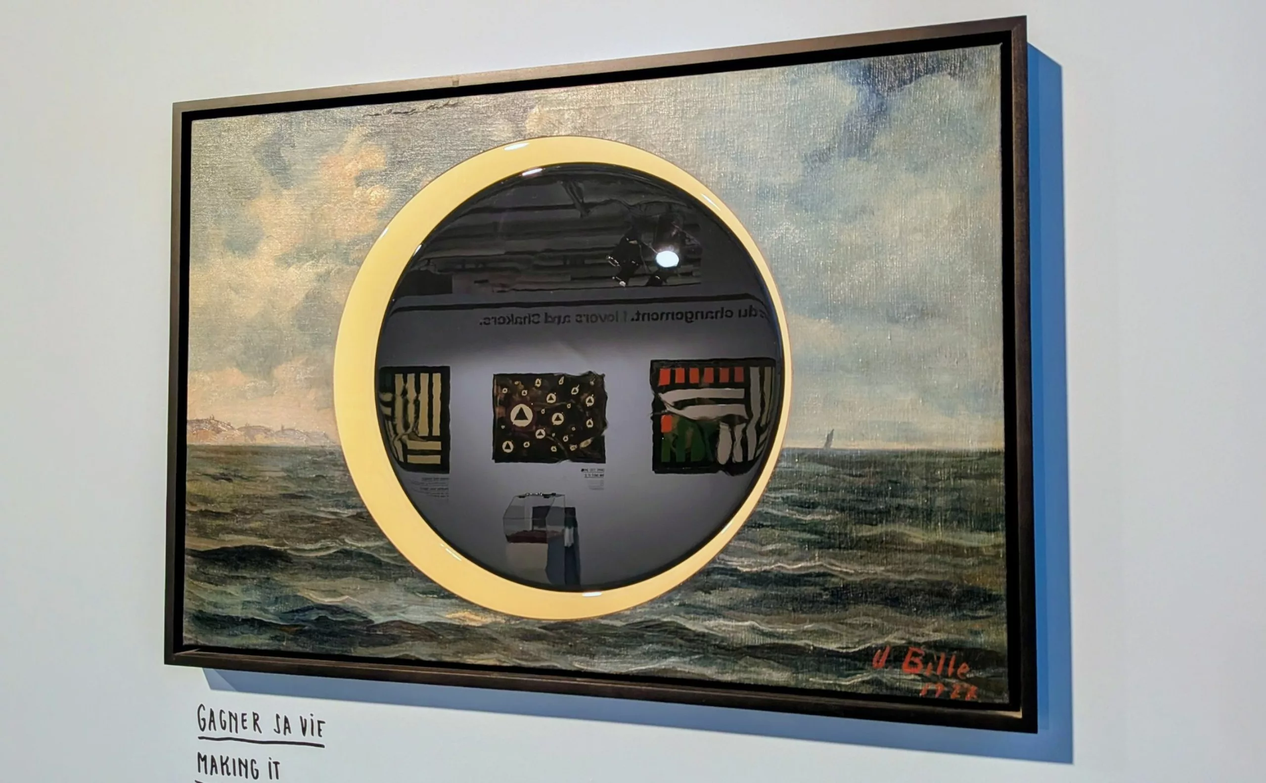
Stefan Sagmeister is known for highlighting functionality and beauty through playful graphic design and public service projects. He has evolved from a graphic designer into an artist, creating exhibitions in which scientific data comes to life within visual and often interactive installations. His latest exhibition, Finally Something Good, is currently on display at La Gaité Lyrique in Paris. It highlights statistics on the state of the world to demonstrate that, when viewed from a broader perspective (spanning around 200 years), things are generally getting better in the world!
The data is hard to believe (though it’s not questionable) given the events we’re currently going through, but the exhibition has the advantage of prompting us to ask ourselves questions, and offering a breath of optimism.
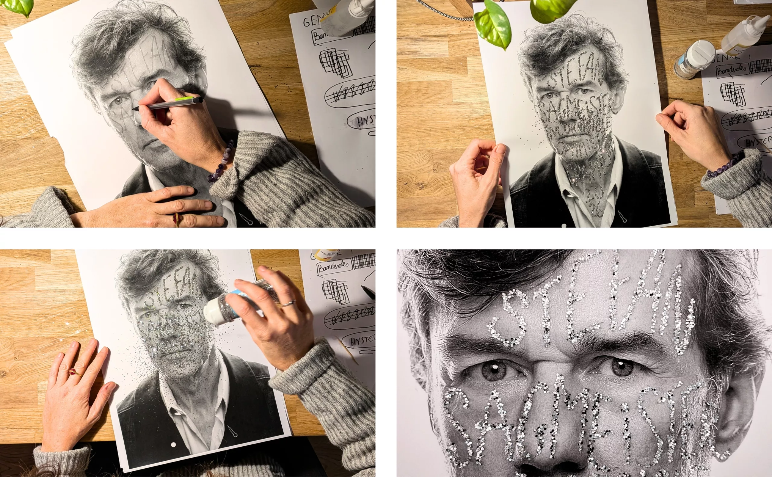
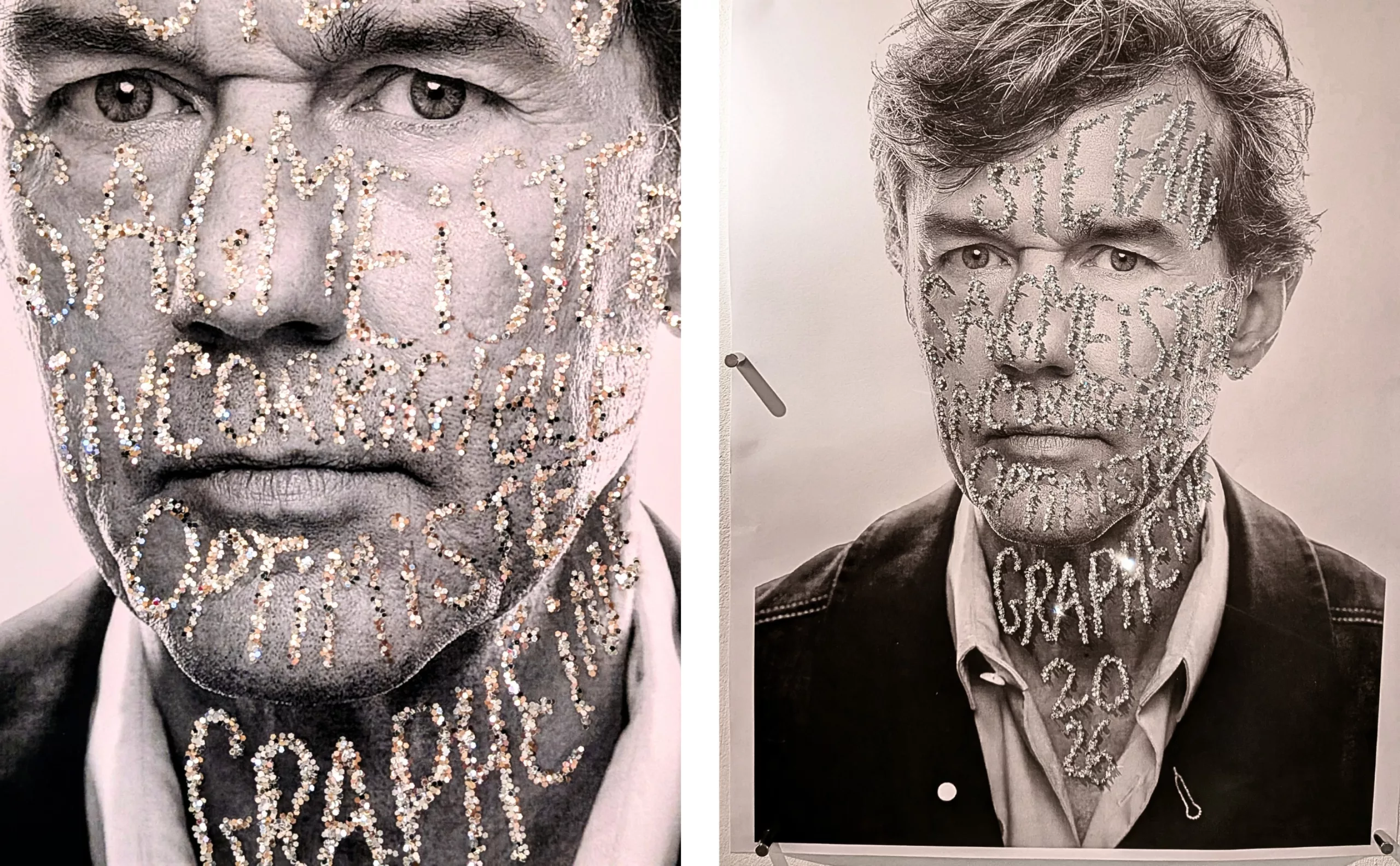
P.S.: At the end of this article, we’ll show you the backstage of this article’s cover picture.
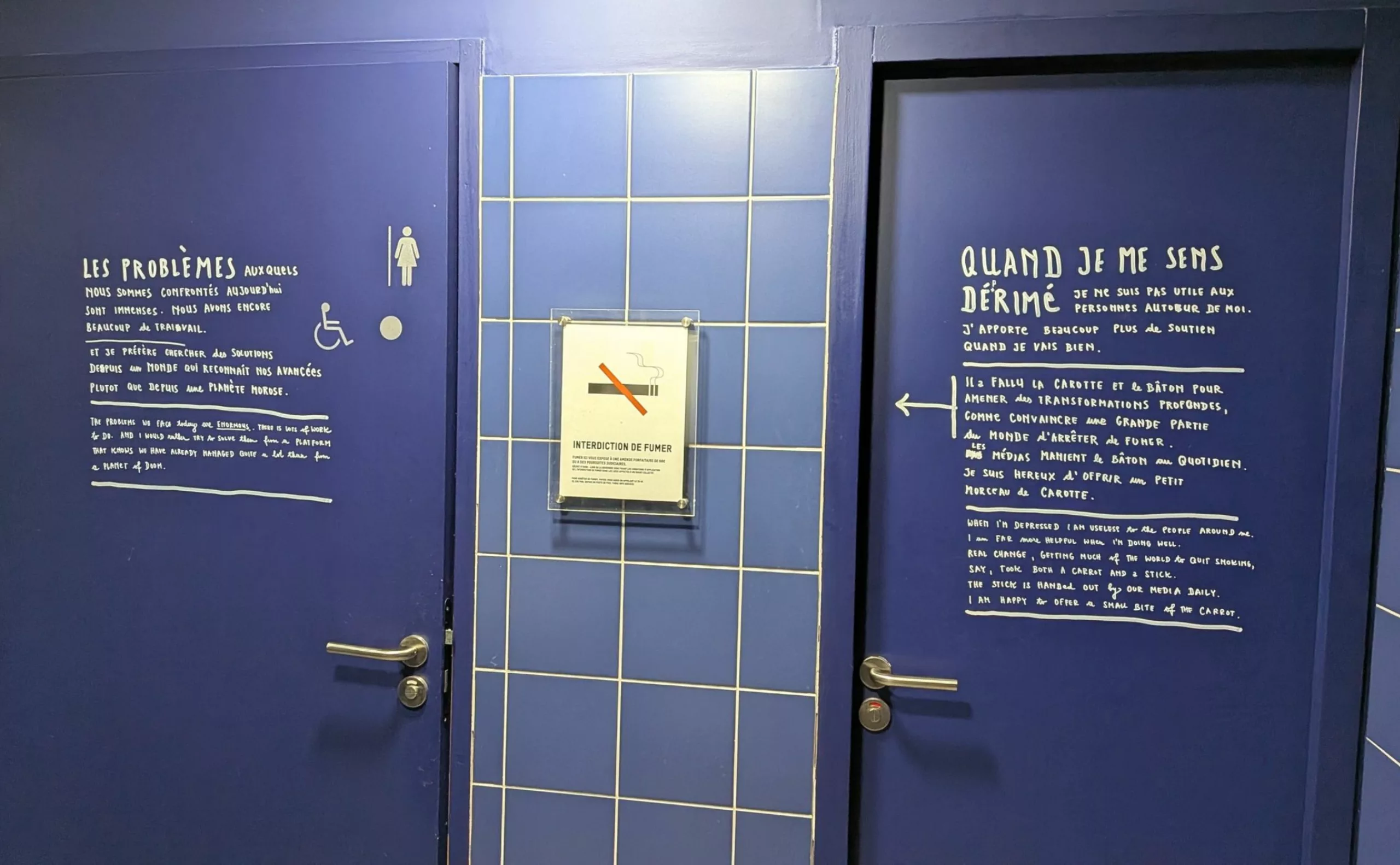
One mentor, not two
Stefan Sagmeister was born in 1962 in Austria. His grandfather was a sign painter, and Stefan Sagmeister grew up surrounded by hand-painted signs covered in gold leaf. He began his career at age 15 as a freelancer for an Austrian newspaper, but quickly realized he preferred layout design to writing. He studied graphic design at the University of Applied Arts in Vienna, before moving to the Pratt Institute in New York on a scholarship. He then moved to Hong Kong to work at Leo Burnett before returning to New York to work at M&Co with the man he would call his mentor and “one and only design hero,” Tibor Kalman.
Kalman tells him that you should only do things twice: “The first time, you don’t know what you’re doing; the second time, you’ve mastered the method; the third time, it gets boring… ” A true enthusiast, Kalman could sell his projects to any client without compromising his ideas in the slightest; they reached the public in their raw form. When his mentor retired five years later, in 1993, Stefan took the plunge and opened his own studio, Sagmeister Inc. He learned from his mentor the value of always remaining a small operation over the years, a principle he applied to his own agency. “In a small studio, everyone does a little bit of everything.”
Sagmeister and Record Covers
He decided to combine his two passions, design and music, and began creating CD and vinyl album covers for increasingly well-known artists. Among them were Lou Reed, the Rolling Stones, David Byrne & Brian Eno, and the Talking Heads, as well as companies such as HBO, the Guggenheim Museum, and Time Warner. When he designs a new album cover, Sagmeister discusses the album’s content, lyrics, and overall vibe with the band, and says to “absolutely avoid” talking about the cover.
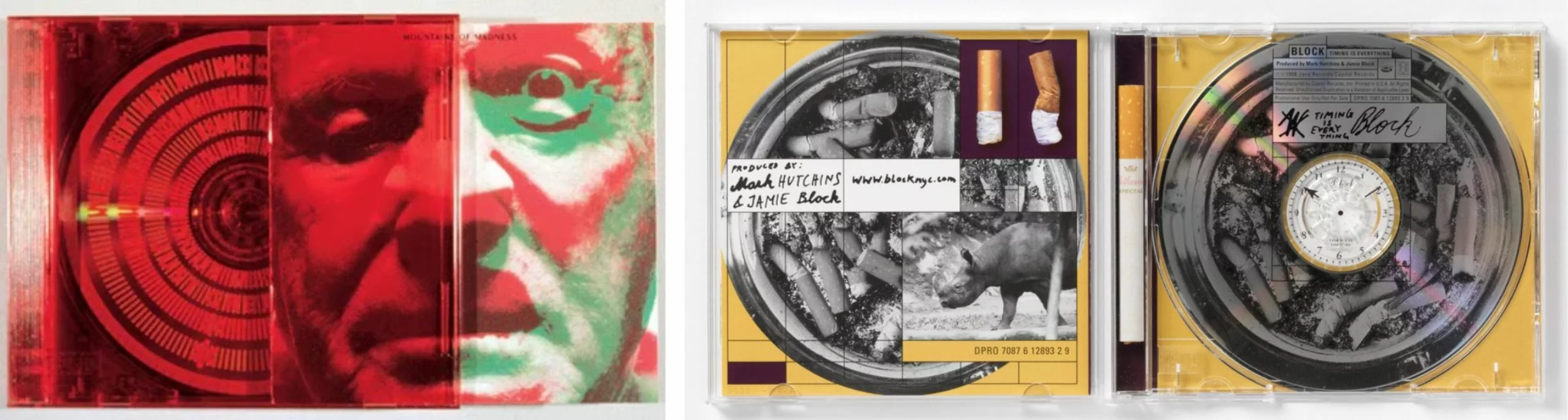
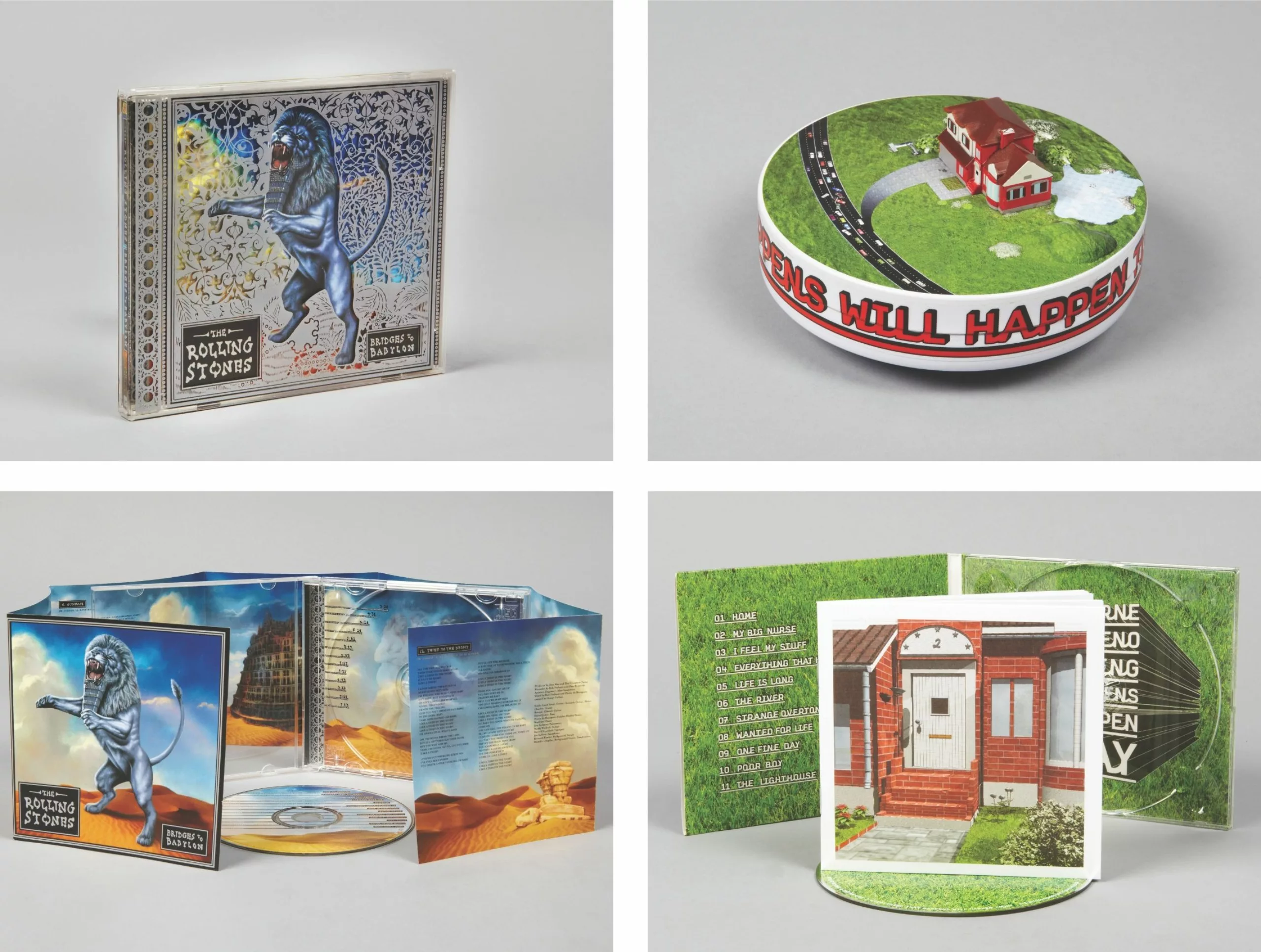
Generally speaking, in his graphic design work, Stefan Sagmeister first seeks to understand the project—what clients want to achieve, what change they’re aiming for, and who their audience is. “If there’s nothing to change, there’s nothing to do,” he explains. “If you’re designing a new logo, the process is mainly about understanding the most important things the brand wants to communicate and how to distill all of that into a single image.”
Sagmeister puts his heart and soul into his work
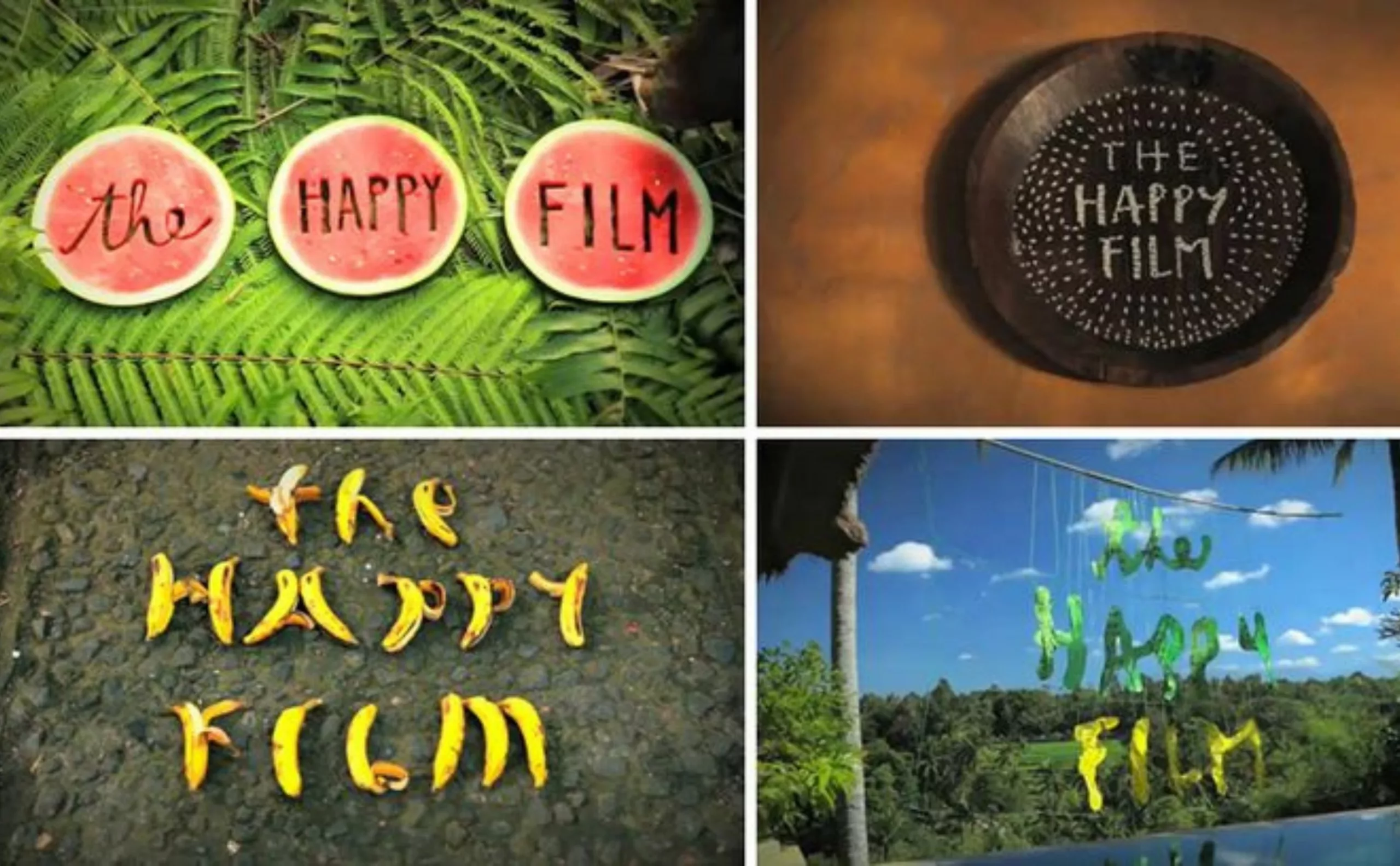
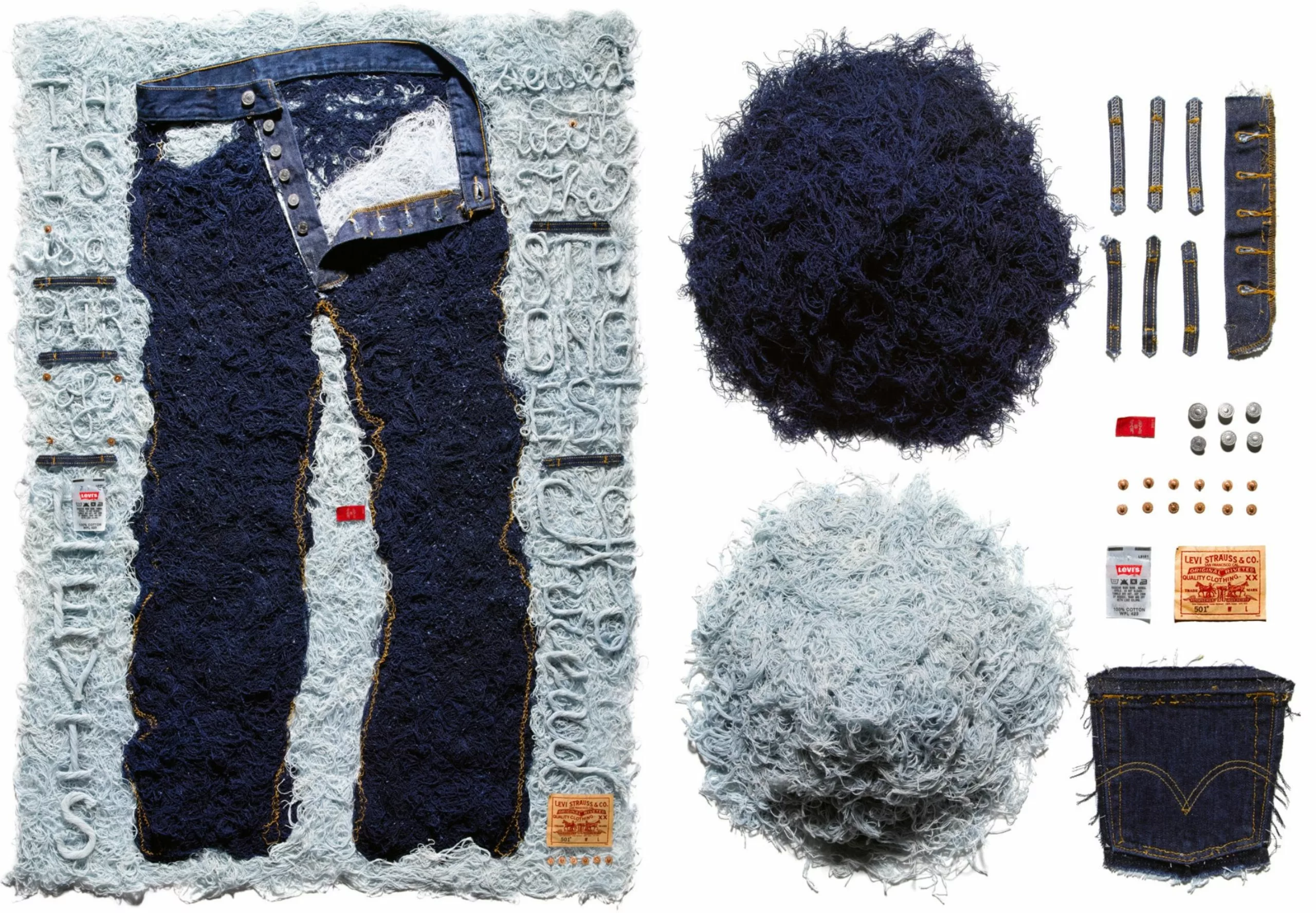
But what truly sets Sagmeister apart from other graphic designers is his offbeat sense of humor and his handmade, often ephemeral creations (he has created lettering using plants or bananas), as if he were constantly playing while never losing his passion for his craft. As a result, he is often a pioneer and frequently surprises his audience. Sagmeister also doesn’t limit the language of graphic design to sales or communication; he uses it in art as well. “Design has two aspects: functionality (the desire to communicate) and the ability to bring joy. These two elements combined are essential to any type of design.”
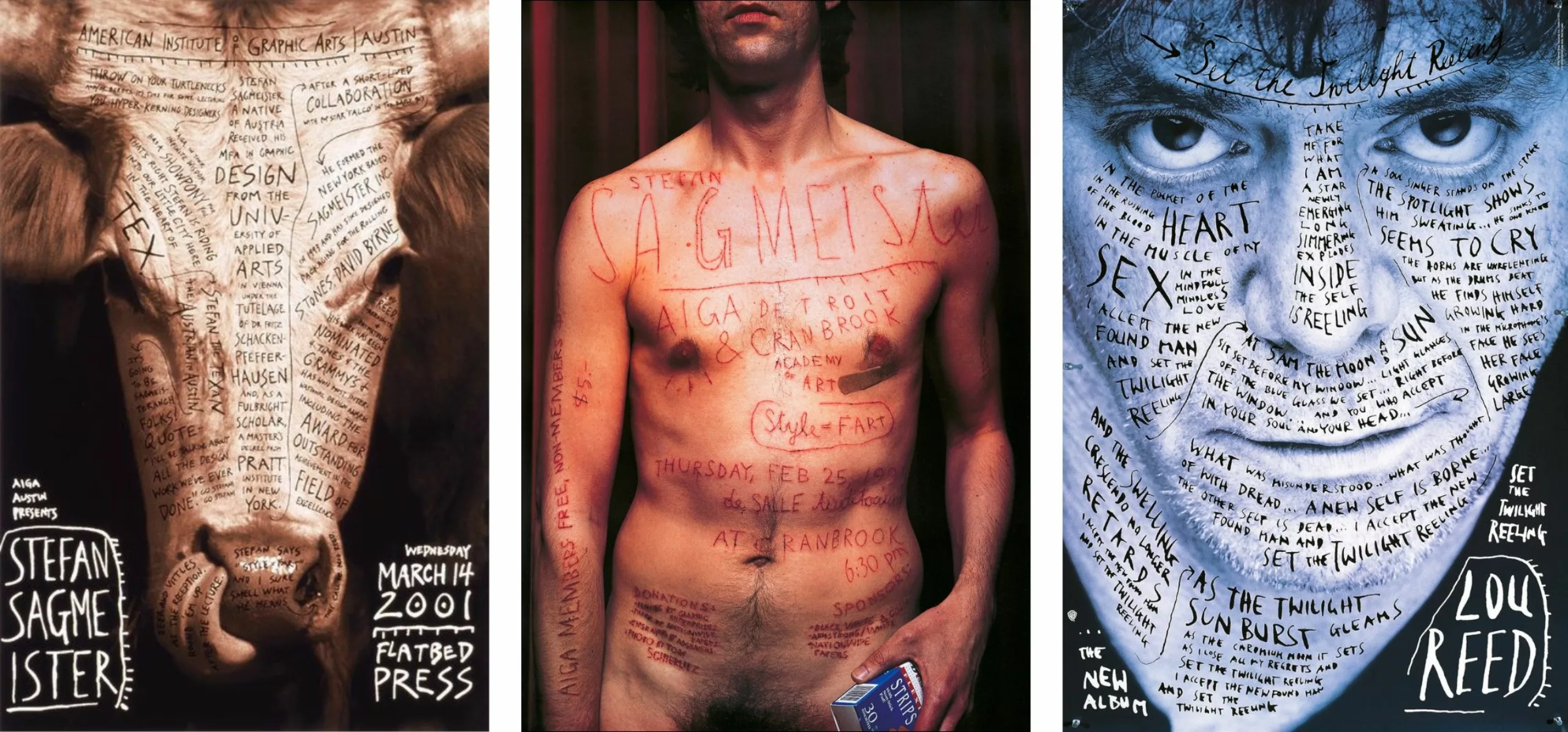
Sagmeister throws himself heart and soul into creating posters, notably the one for the AIGA Detroit conference in which he had text carved into his chest with a utility knife in 1999. In 2008, he sent a labeled banana as an invitation to promote his book “Things I Have Learned in My Life, So Far.”
The overlaying of text on the image encourages a dual interpretation, breaking away from the traditional layout that establishes a hierarchy among elements. As a result, the audience is invited to take the time to read each inscription carefully.
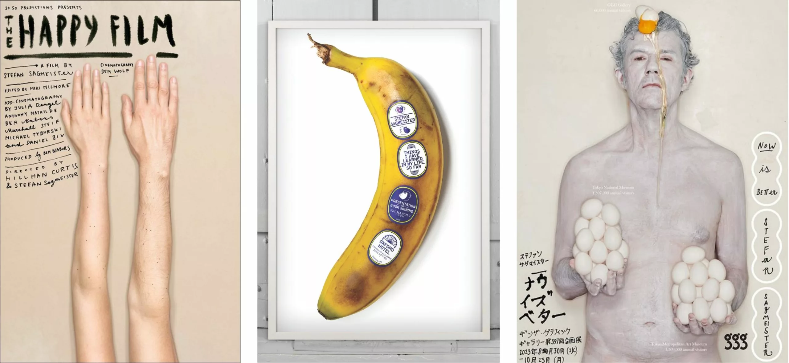
For eight years, he filmed himself searching for and testing ways to be happy. “The Happy Film“ was initially conceived as a graphic design project but evolved into a blend of personal development and graphic and psychological experiments in which Sagmeister portrays himself unfiltered, revealing his human vulnerability. “Chasing the deeper meaning of things turns out to be a real pain in the ass,” he sums up with his characteristic cynicism.
Playing with Words
Since then, his works have been hybrid and, more often than not, surprising. He has created typographic chairs in Bali, composed of hair-thin typefaces made from cents, cotton thread, or branches, and has repeatedly gotten his shirt wet in films featuring water bombs that explode in slow motion. He also doesn’t hesitate to use AI to create visually satisfying graphic worlds.
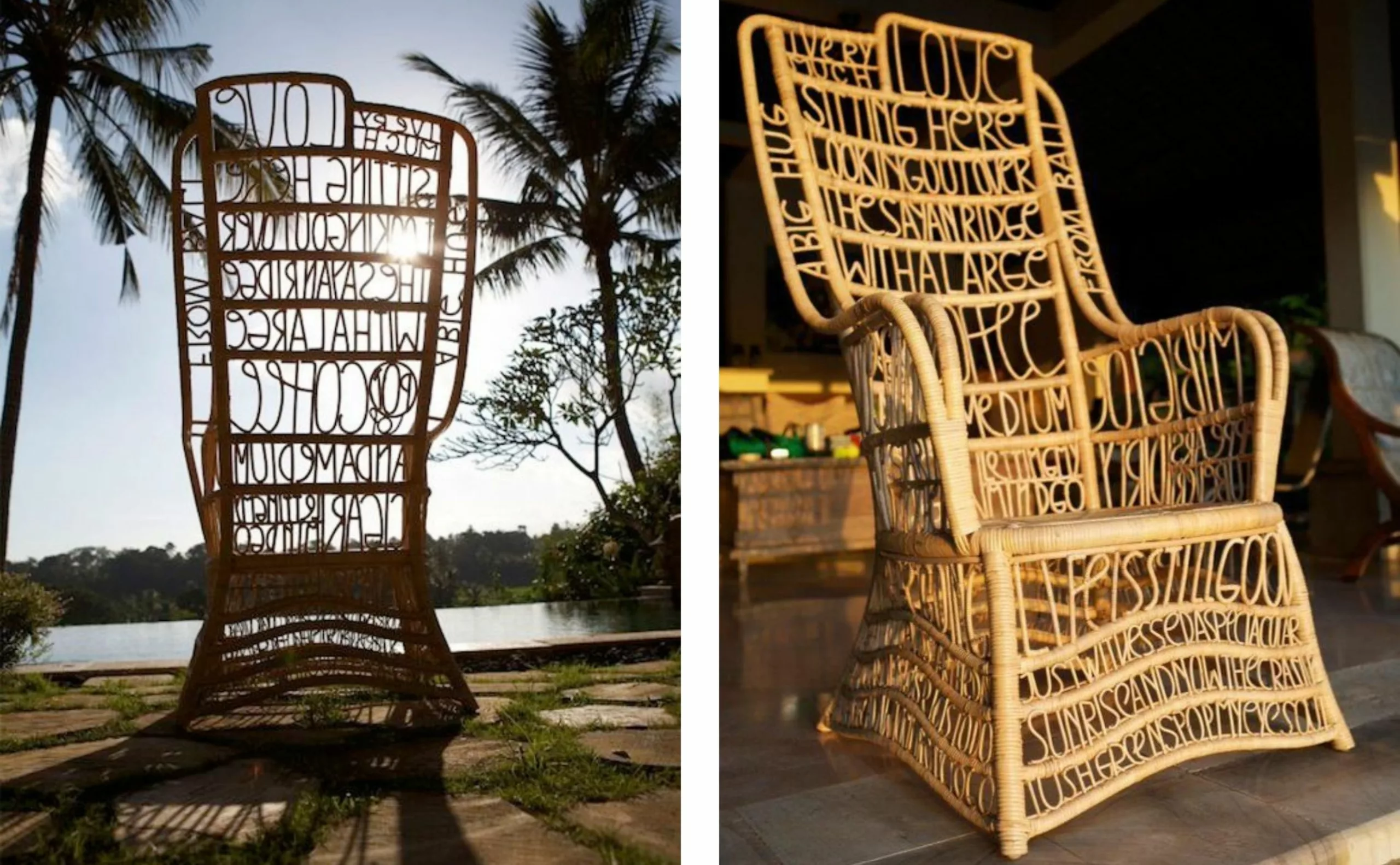
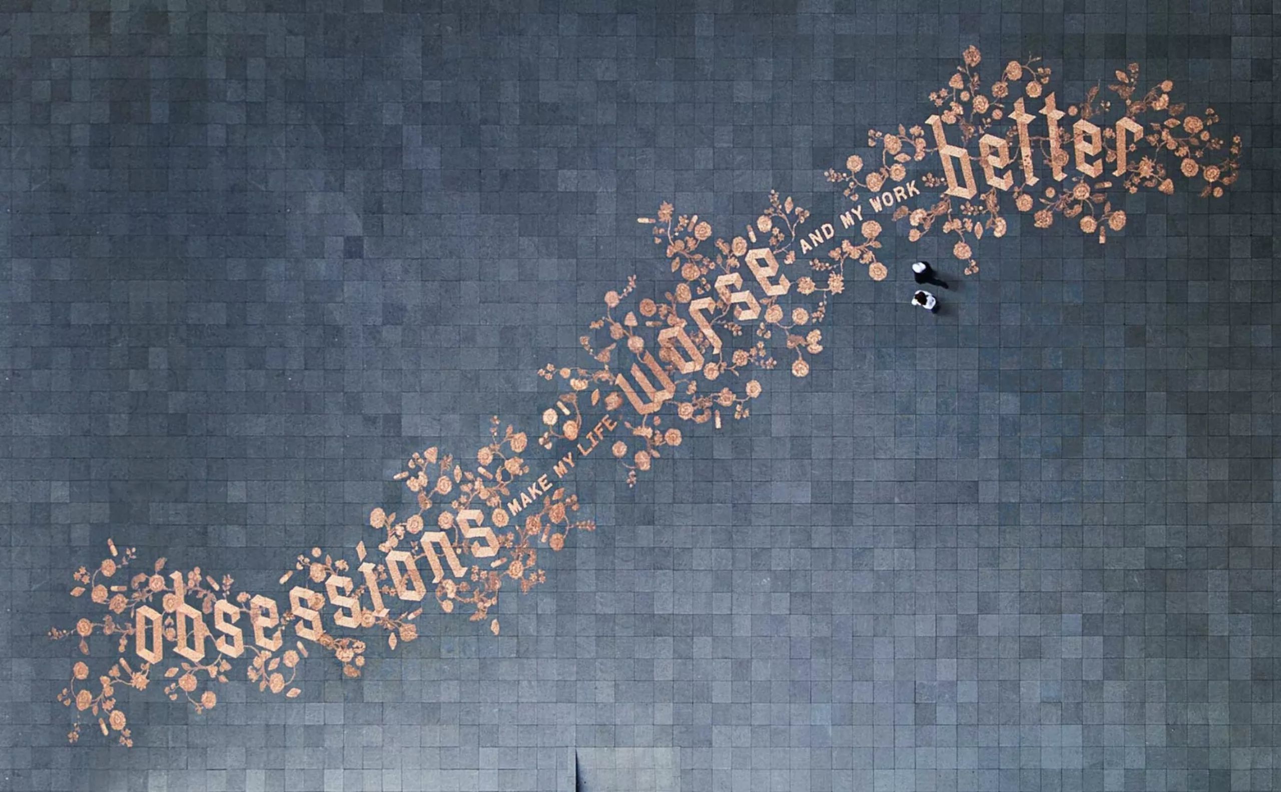
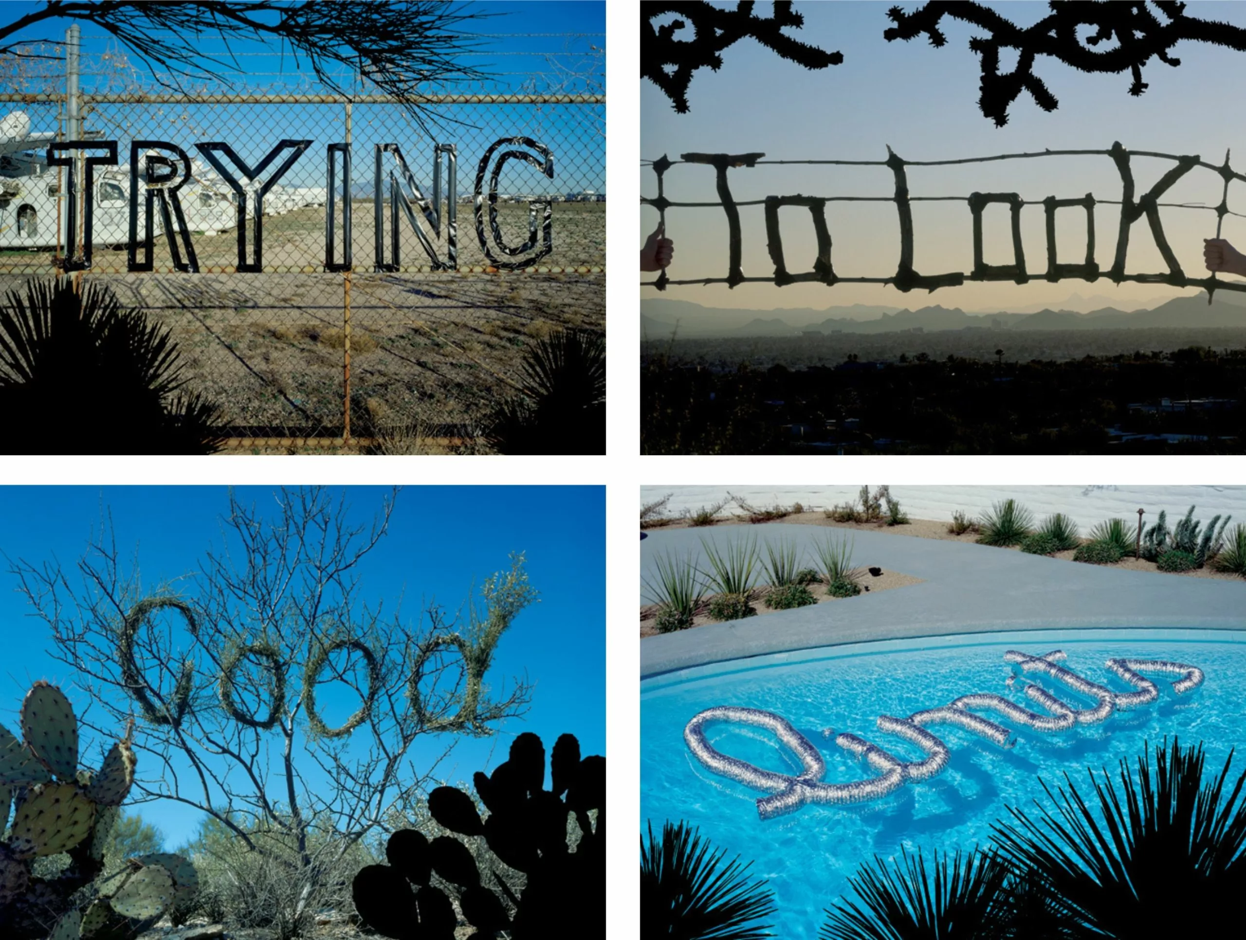
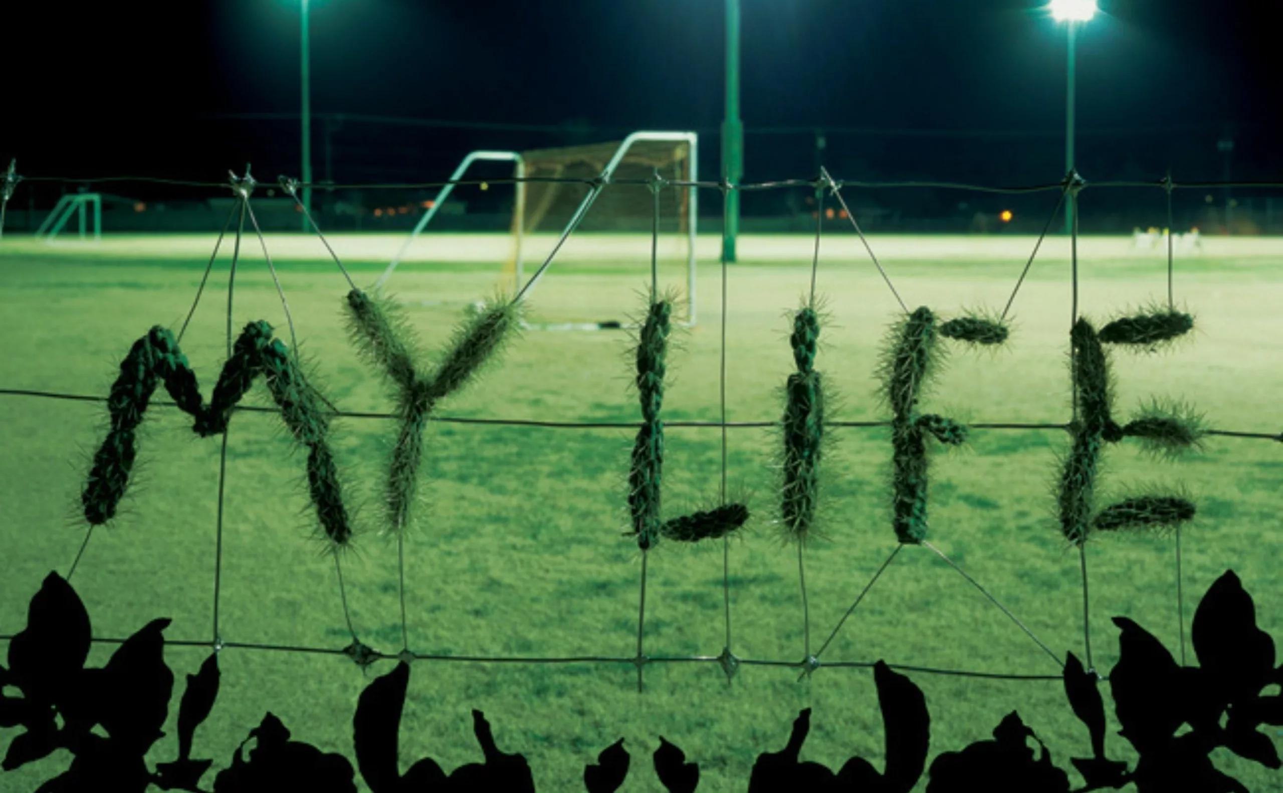
His typographic experiments, often done by hand, feature mishaps, erasures, and imperfections. Instead of fading into the background like a crystal glass, they are ever-present and forge a connection between the graphic designer and the audience, like riddles waiting to be deciphered. These typefaces invite contemplation, provoke surprise, and make one think: they are alive.
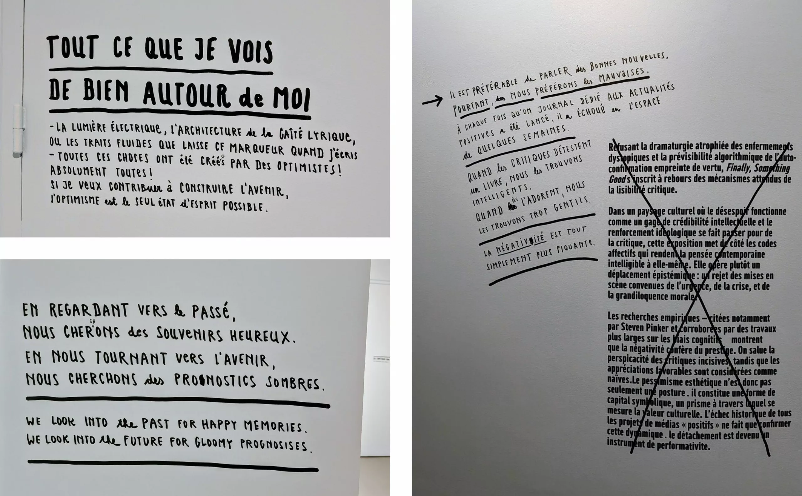
In his exhibition “Finally Something Good,” Sagmeister wrote each caption by hand, leaving the cross-outs and corrected mistakes visible. Studies indicate that fonts that aren’t very fluid attract more attention, which may lead to better retention. This is the concept of “desirable difficulty,” which forces the brain to concentrate more and retain information better.
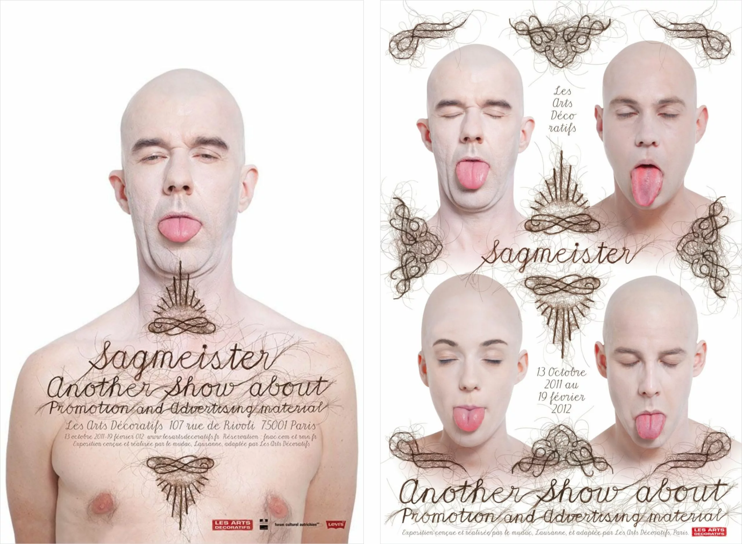
The Importance of the “Breath of Life” and Imperfection
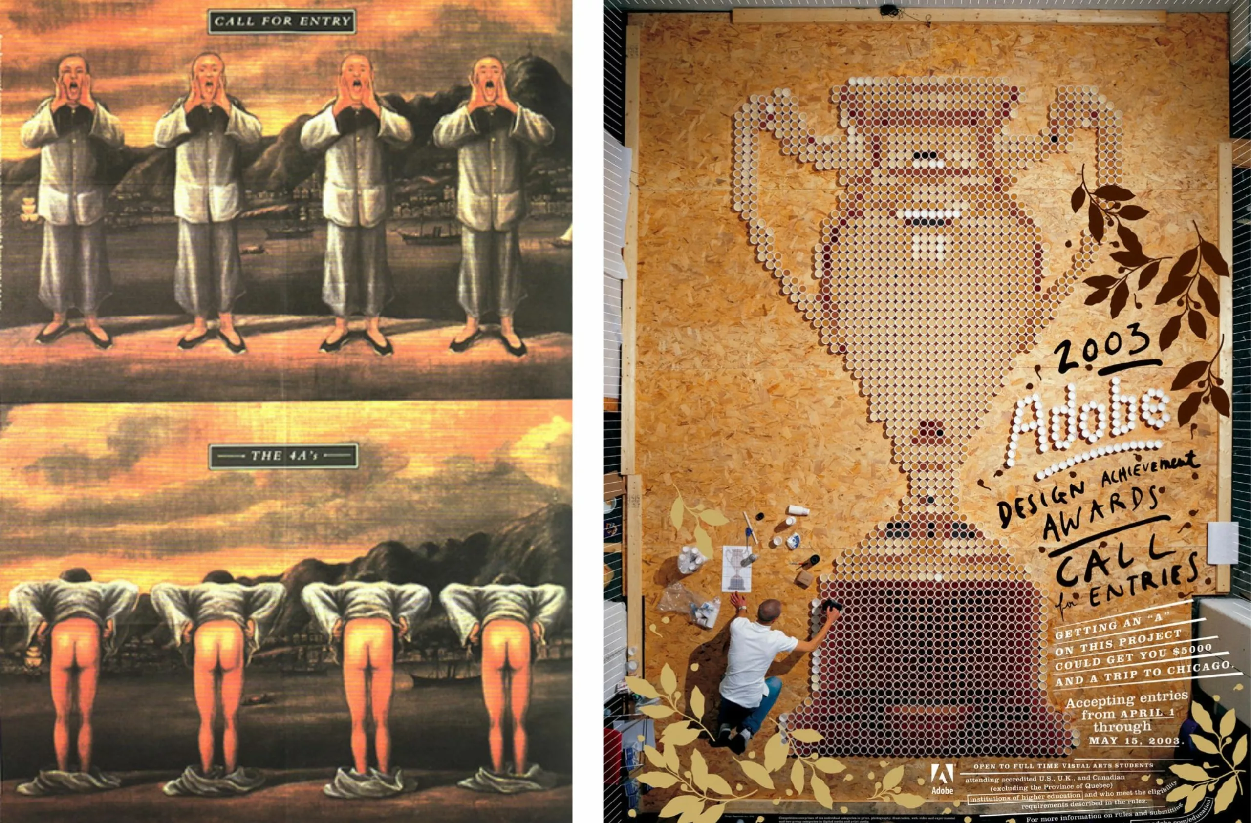
For an advertising awards ceremony in Hong Kong in the early 1990s, the 4As (Association of Accredited Advertising Agencies of Hong Kong—in English, a play on words with 4 ass, the 4 butts), Sagmeister designed a poster that sparked controversy. He drew on the conventions of Chinese propaganda, in which four figures show their buttocks to illustrate the event to the letter… In 2003, with the rise of Adobe and the digital age, Stefan Sagmeister created a poster entirely by hand for the Adobe Design Achievements Awards, in which he fashioned a winner’s cup out of 2,500 plastic cups that gave the impression of a pixel grid.
He thus highlights the importance of imperfection—a line that is bolder than another, an off-center void, manual craftsmanship, and an ultimately human ethos that seeks to break free from all forms of universalism or commercial and conservative aesthetics, as embodied by pure functionalism.
This is the concept that Ed Fella calls “anti-mastery” and that designer Lorraine Wild explains in reference to Seigmaster: “His commitment to ‘anti-mastery’ (summarized in the motto ‘one must be inconsistently irregular’) has freed graphic design from digital perfection to reconnect it with everyday life and pure poetry.” This is what Paul Elliman, a British designer who teaches at Yale, describes as “the breath of life.”
He fuels this inspiration through a creative detour: every seven years, since 2000, he takes a one-year sabbatical, or three months of vacation each year. New York, Bali, Tokyo… the graphic designer explores different worlds, tries his hand at other disciplines, and experiments with new creative processes. Although he was afraid of losing all his clients during his first sabbatical, he quickly realized that, in reality, this break was doubly beneficial and profitable: it allows him to rediscover and nurture his creativity, fuel his passion, avoid monotony, and thus offer more interesting, higher-quality projects that command higher rates from clients.
In the long run, the ideas he developed over his seven years of work stem primarily from his year-long break. “What I took away most from that sabbatical year is that I was able to continue viewing design as a calling rather than just a job. And that’s very important, because getting burned out on what you do is a huge problem in most professions,” he explains.
Sagmeister & Walsh, duo de choc
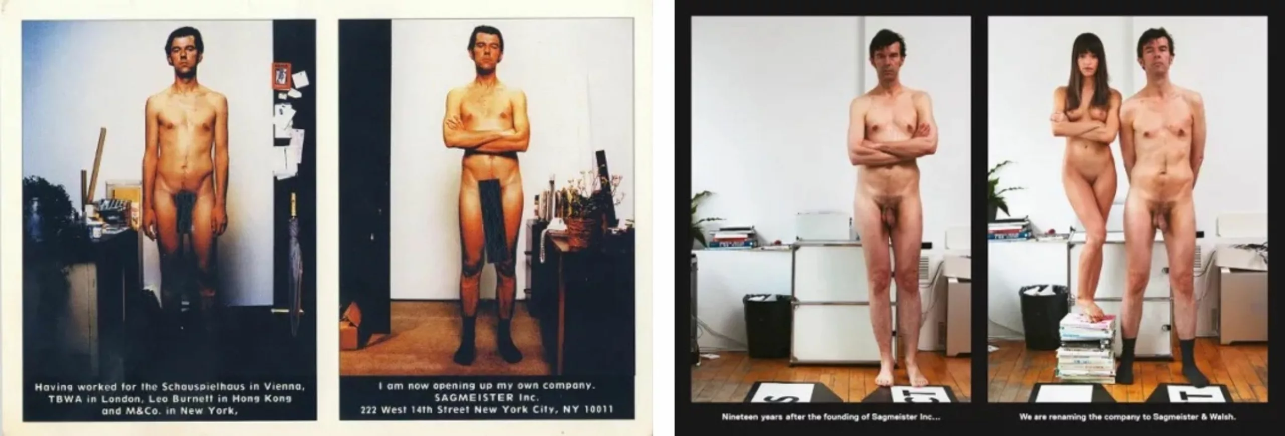
In 2012, one of his employees, Jessica Walsh, became his business partner. To announce this new chapter, the duo posed nude for a photo shoot. Visually, they demonstrated that their commitment to their clients is a complete and transparent revelation. It’s also, of course, a great way to get people talking about them and their zany world, which always tends to go beyond what you’d expect from a standard studio. The announcement certainly caused quite a stir. “As you can see in the photo, I have a big ego. Jessica’s isn’t that big.” ” The staging—to be taken with a grain of salt—echoes the announcement of Sagmeister’s studio opening in 1993, in which he posed completely naked twice, with a long black line to hide his private parts, as if to show he had what it takes.
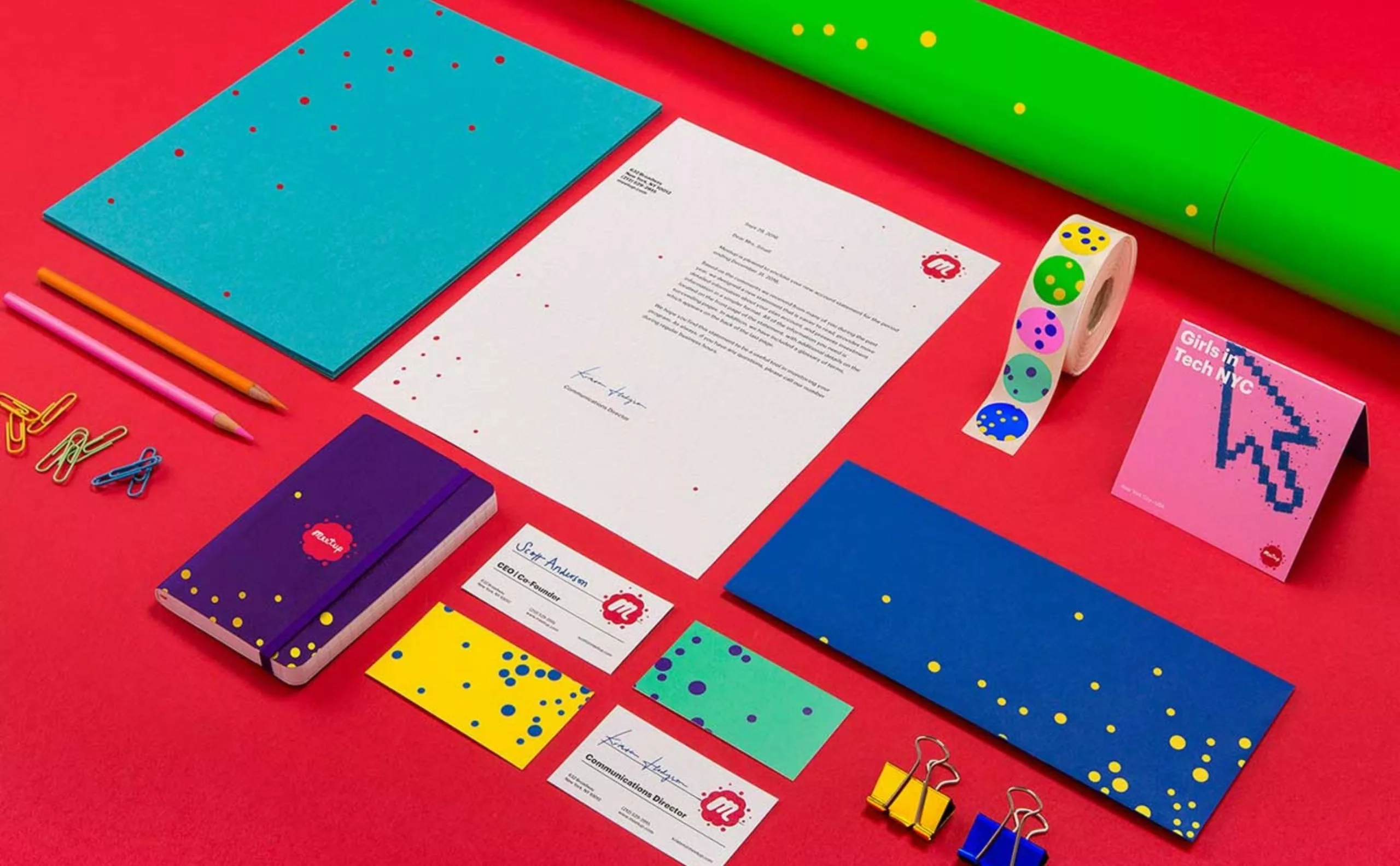
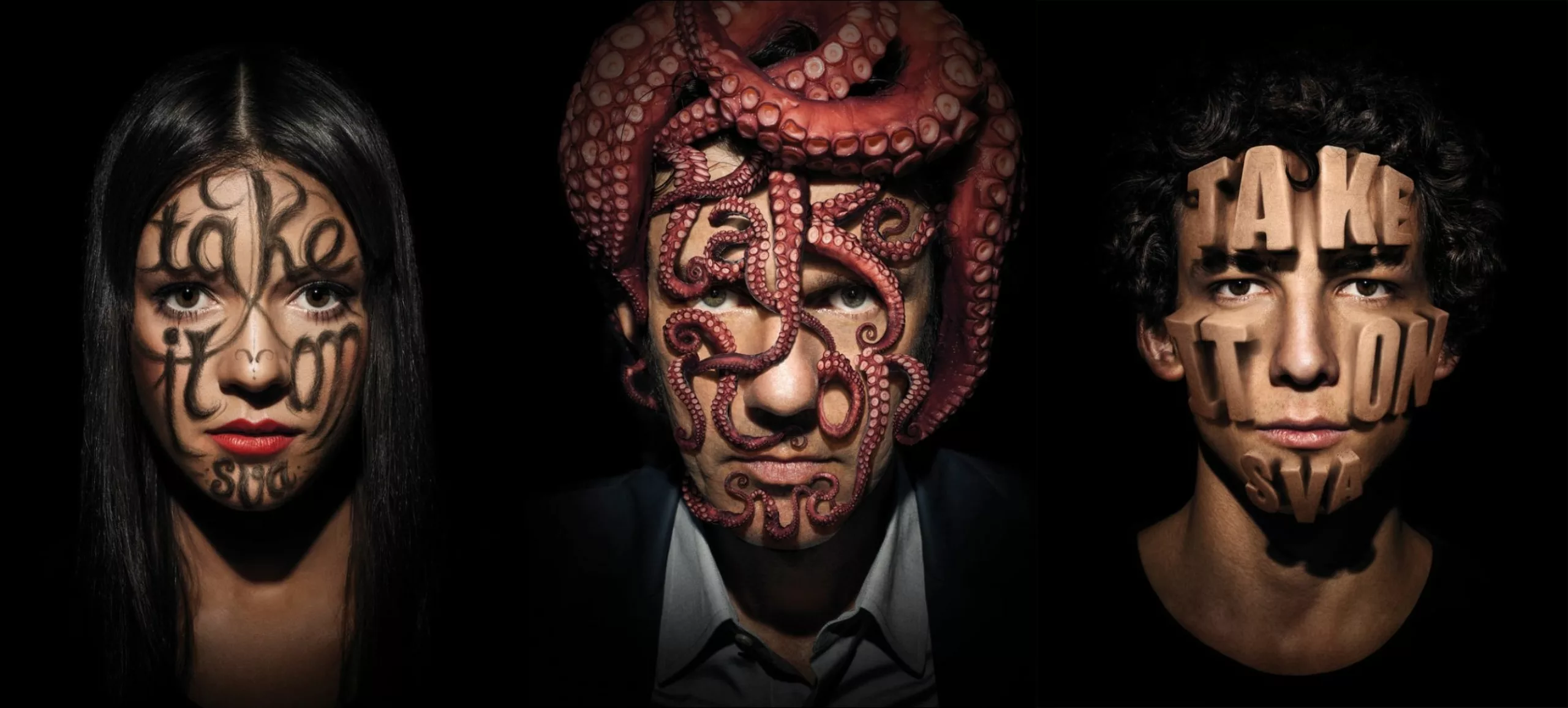
With the formation of the duo, Walsh took charge of the more commercial and lucrative projects, allowing Sagmeister to focus on freer and more creative ones. Together, they produce offbeat, colorful, and playfully provocative projects.

Functionality and beauty—never one without the other
A graphic explorer and artist, Sagmeister works from the gut and offers a design approach centered on people rather than a purely functional one. “When I was a young designer, I thought the essence lay in the idea, and that form and style were merely secondary. Formal attributes, including beauty, play an absolutely essential role when it comes to creating anything intended to function well. I am firmly convinced that the exclusive pursuit of functionality often leads to creations that don’t work at all.”
In 2018, Walsh and he created an exhibition in Vienna on Beauty, Beauty, which challenges the pure functionalism that our society has inherited from the quest for universal graphic design. In an interview, he explains that “it is designers who have spent 50 years defining seriousness as the absence of beauty. The remedy is to take beauty seriously and not be afraid of appearing naive in the eyes of one’s peers.”
In a contemplative ASMR video, Jessica Walsh explains that “beauty isn’t a superficial strategy, but an essential part of our humanity. We find beauty in things done well, with love, care, and attention. We can find beauty through all five senses. Without beauty, nothing ever truly works.” As designers, we must never forget how crucial beauty is, or we’ll be doomed to a world where only utility becomes the norm. By aiming beyond mere utilitarian solutions, we achieve more, and we can improve people’s lives. Beauty IS function.”
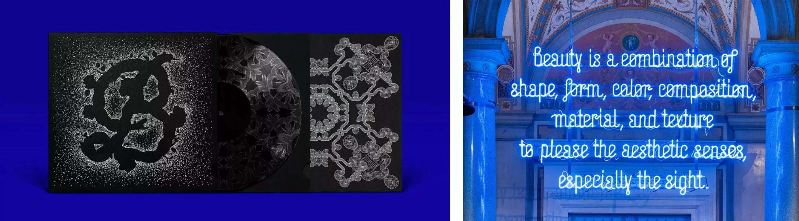
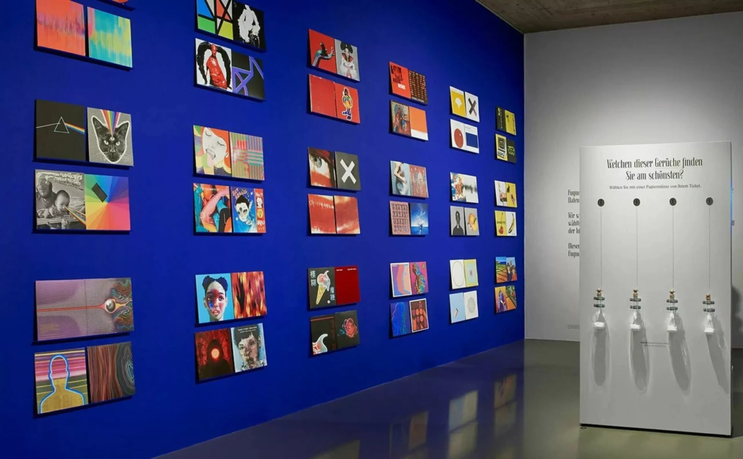
In 2019, Jessica Walsh took over the graphic design studio, which she named &Walsh, while Stefan Sagmeister continued his work as an artist on his own. Each of them continues to demonstrate that design can be playful, hands-on, colorful, and useful in making the world a more beautiful place.
Be sure to check out his exhibition Finally Something Good at La Gaité Lyrique, through April 18, 2027!
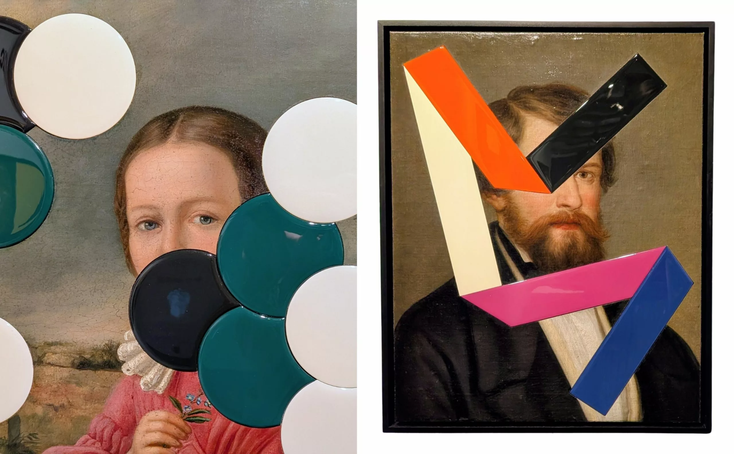
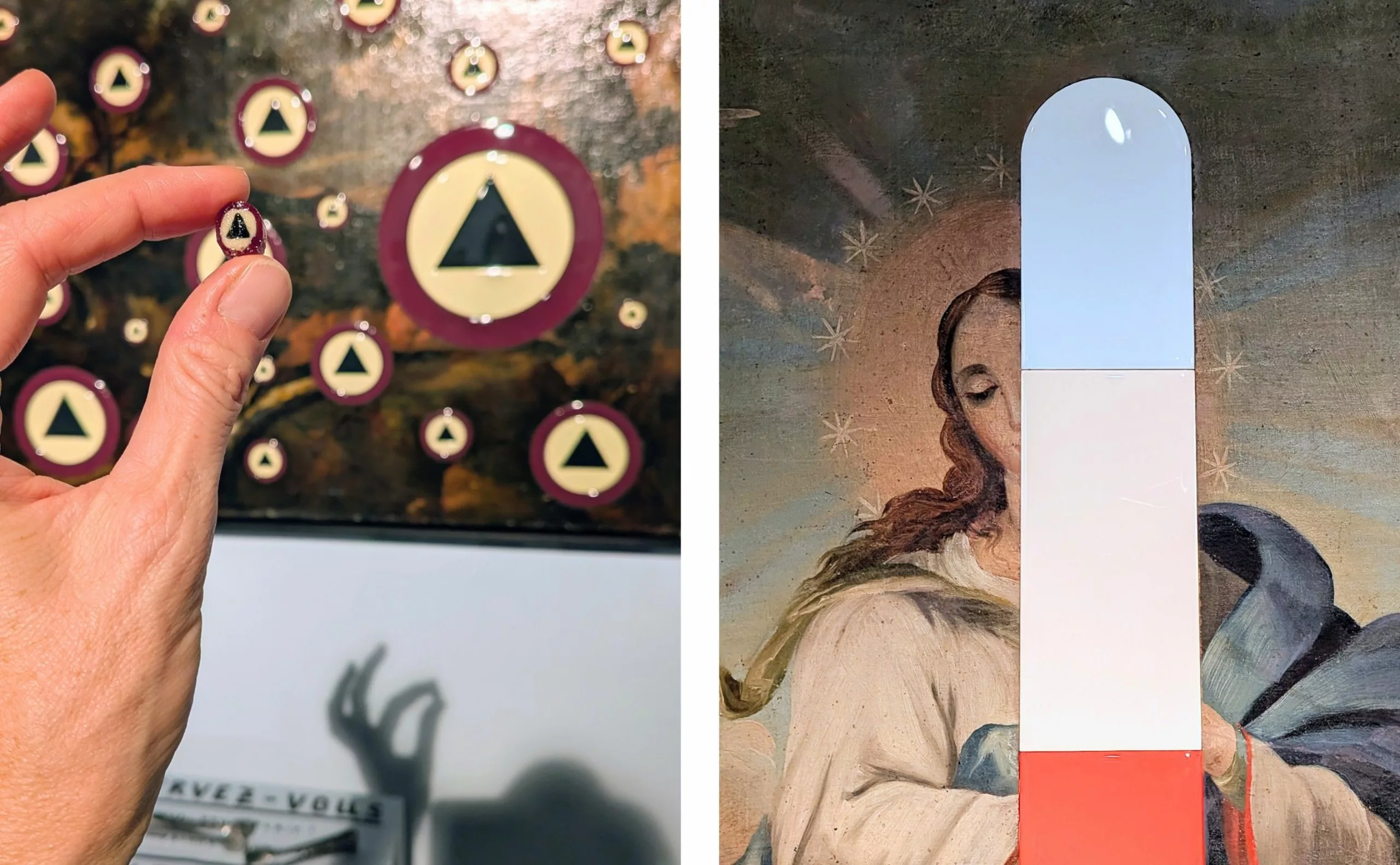
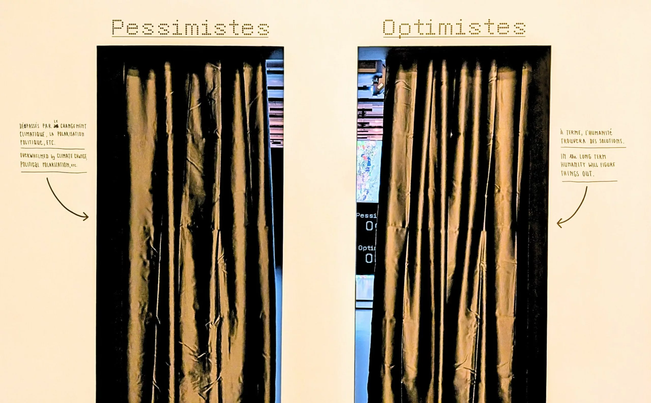
Which door would you choose?
When creating the cover image for this article, we wondered how we could pay tribute to Sagmeister’s work. It was a chance to have a little fun. What could be better than a handmade poster with imperfect letters? The letters were drawn with glue and then covered with glitter. The texture and shine change depending on the light.
Thank you, Stefan, for bringing some sparkle into our lives.
On the subject
-
Sign painters make cities glow up
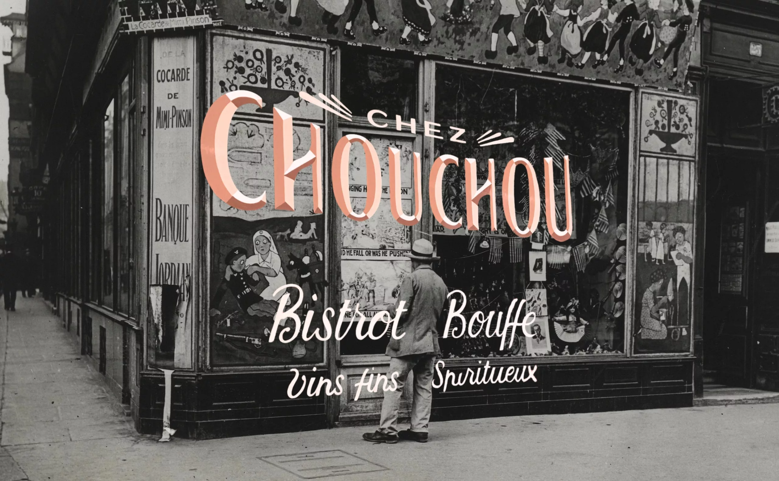
After serving for several centuries as the standard for decorating our storefronts, hand-painted lettering fell into obscurity. It has been making a colorful comeback over the past decade or so, and today it is a symbol of authenticity, handcrafted quality, craftsmanship, luxury, and expertise for the shops that display it.
-

When the Anatome gallery was the place to be for graphic design in Paris
For a long time, Paris did not have a specific space for exhibiting graphic design. It was not until the turn of the 20th century, in 1999, that Marie-Anne Couvreu and Henri Meynadier opened the Anatome gallery. For more than 12 years, they have taken up the challenge of promoting and bringing to life the diversity of graphic design. For a long time, Paris did not have a specific space for exhibiting graphic design. It was not until the turn of the 20th century, in 1999, that Marie-Anne Couvreu and Henri Meynadier opened the Anatome gallery. For more than 12 years, they have taken up the challenge of promoting and bringing to life the diversity of graphic design.
-
Where does modernism come from? 1 – Man propelled by Modernity
Episode #1. To understand modernism, we need to understand its relationship with modernity, and its meteoric rise at the end of the 19th century.