fr
fr

Marraud Group

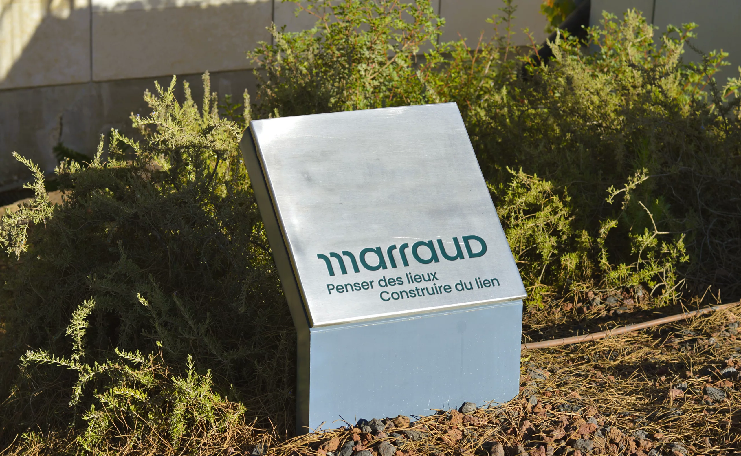
Designing places. Building connections.

A new brand name to unite every construction specialty under one roof

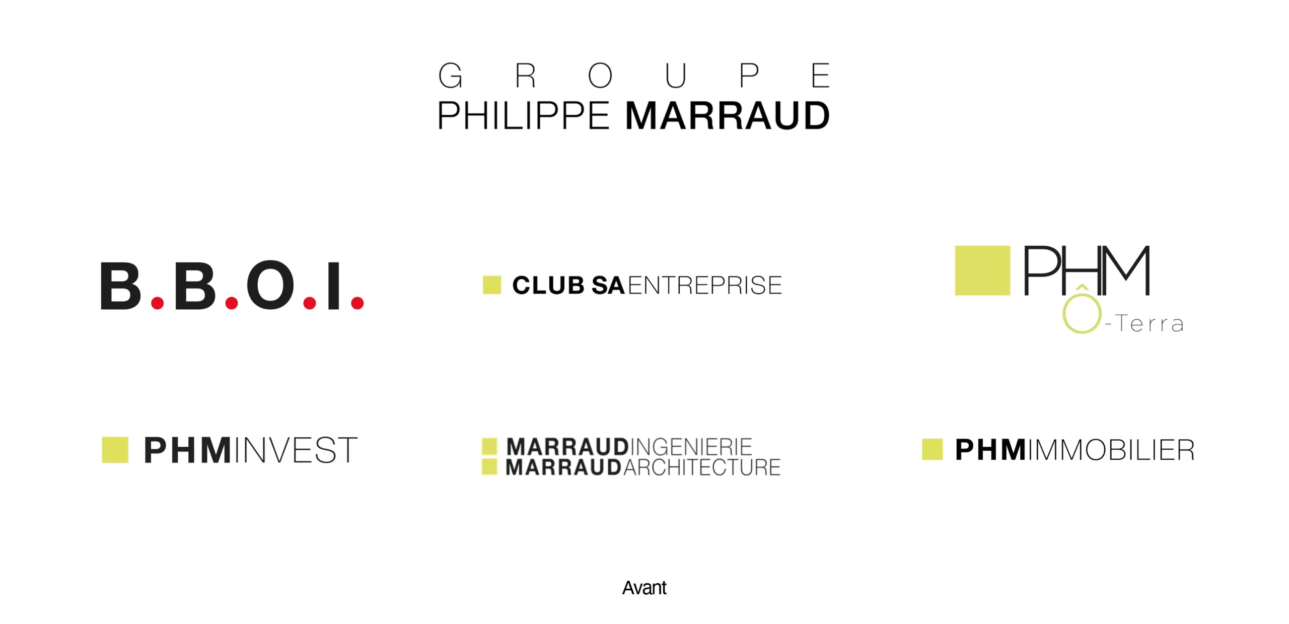
Founded in 1975 by Philippe Marraud, a trained architect, Groupe Philippe Marraud has gradually expanded its activities across the construction industry. As the group grew, new areas of expertise were added to its business, leading to the creation of six companies with complementary skills. This growth also resulted in an increasing number of names and visual identities, with little overall consistency. Over time, the group’s structure became harder to navigate, and its identity no longer fully reflected the diversity of its activities.

Against this backdrop, the group approached us to rethink its brand identity. The challenge was to bring all six companies together under a shared identity while making each of their activities easier to identify.

From a founder’s surname to a brand name

Qualitative interviews and workshops revealed a shared ambition: to strengthen the group’s identity and reinforce the connections between its different sub-brands.

The name Marraud emerged as the common thread linking all activities. Already present in the parent brand’s name, it naturally established itself as the group’s defining name. It preserves the connection with the company’s family heritage while moving beyond the founder’s individual identity to represent the full breadth of its activities and expertise.

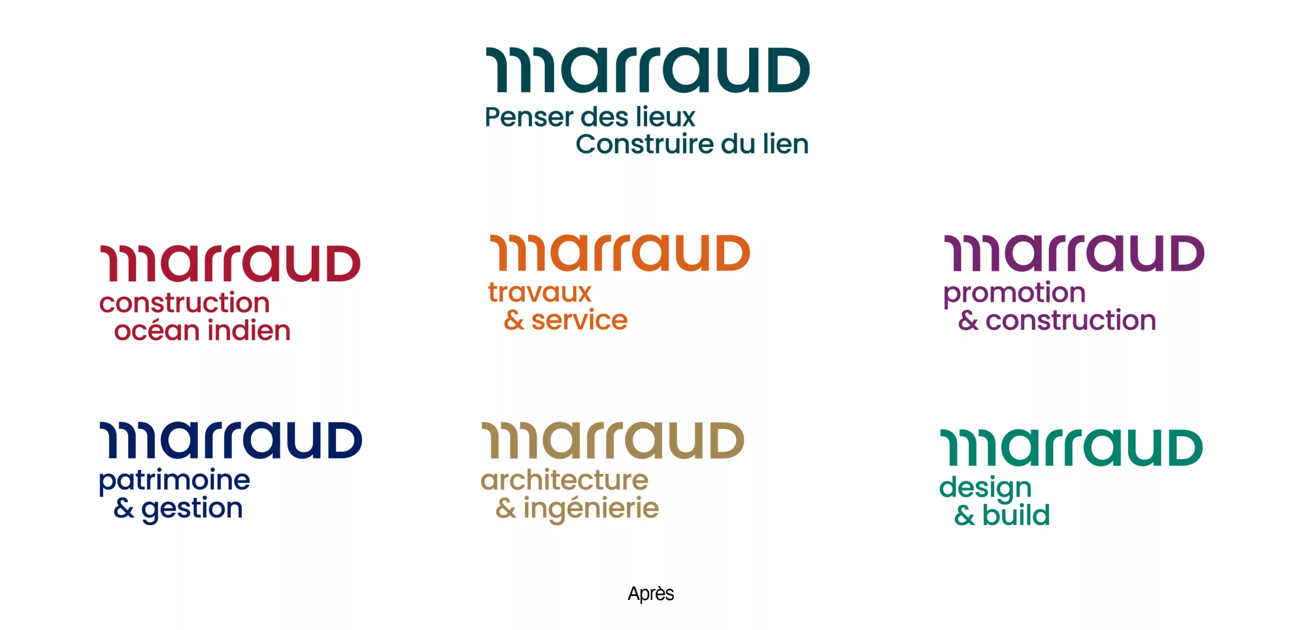
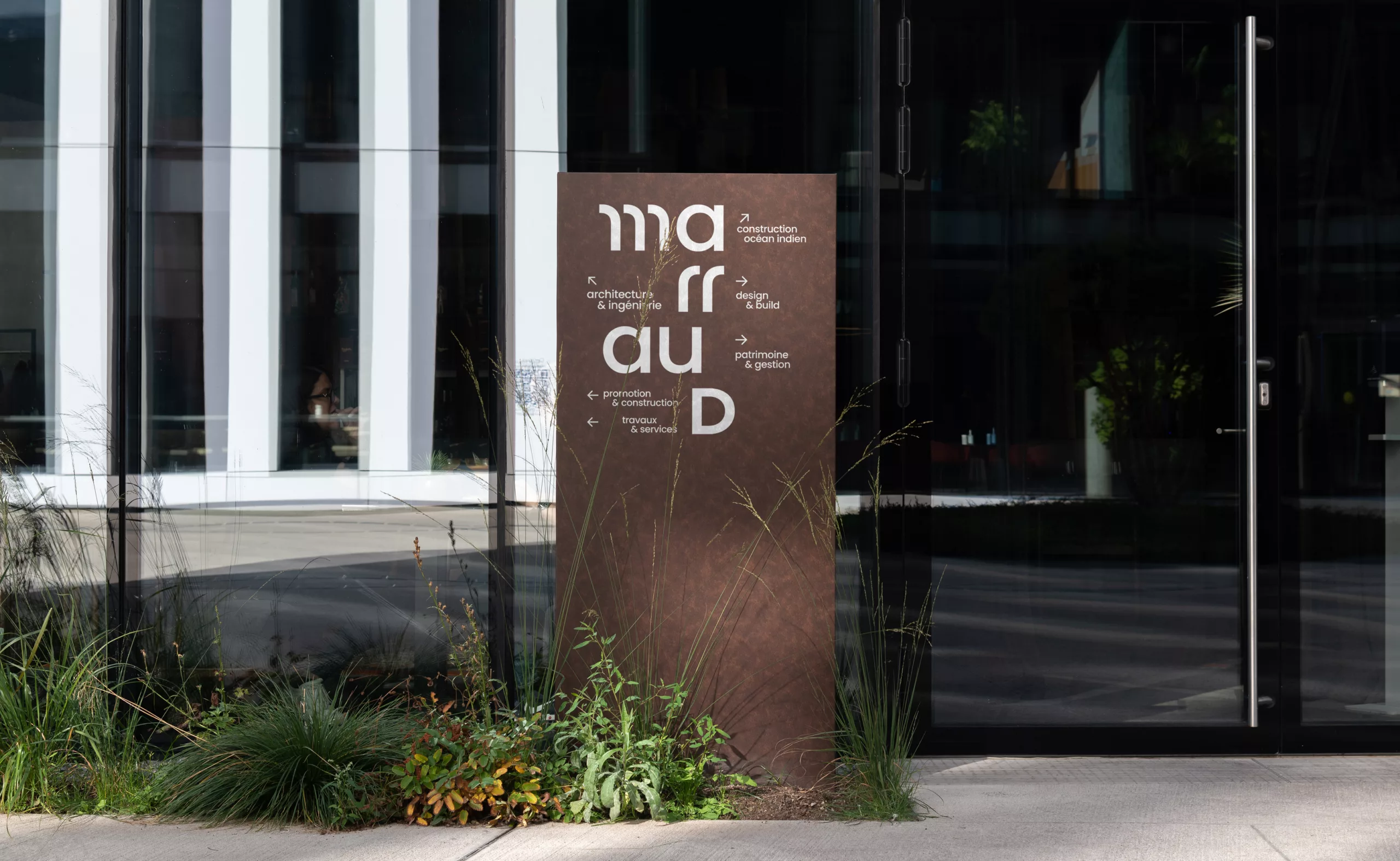
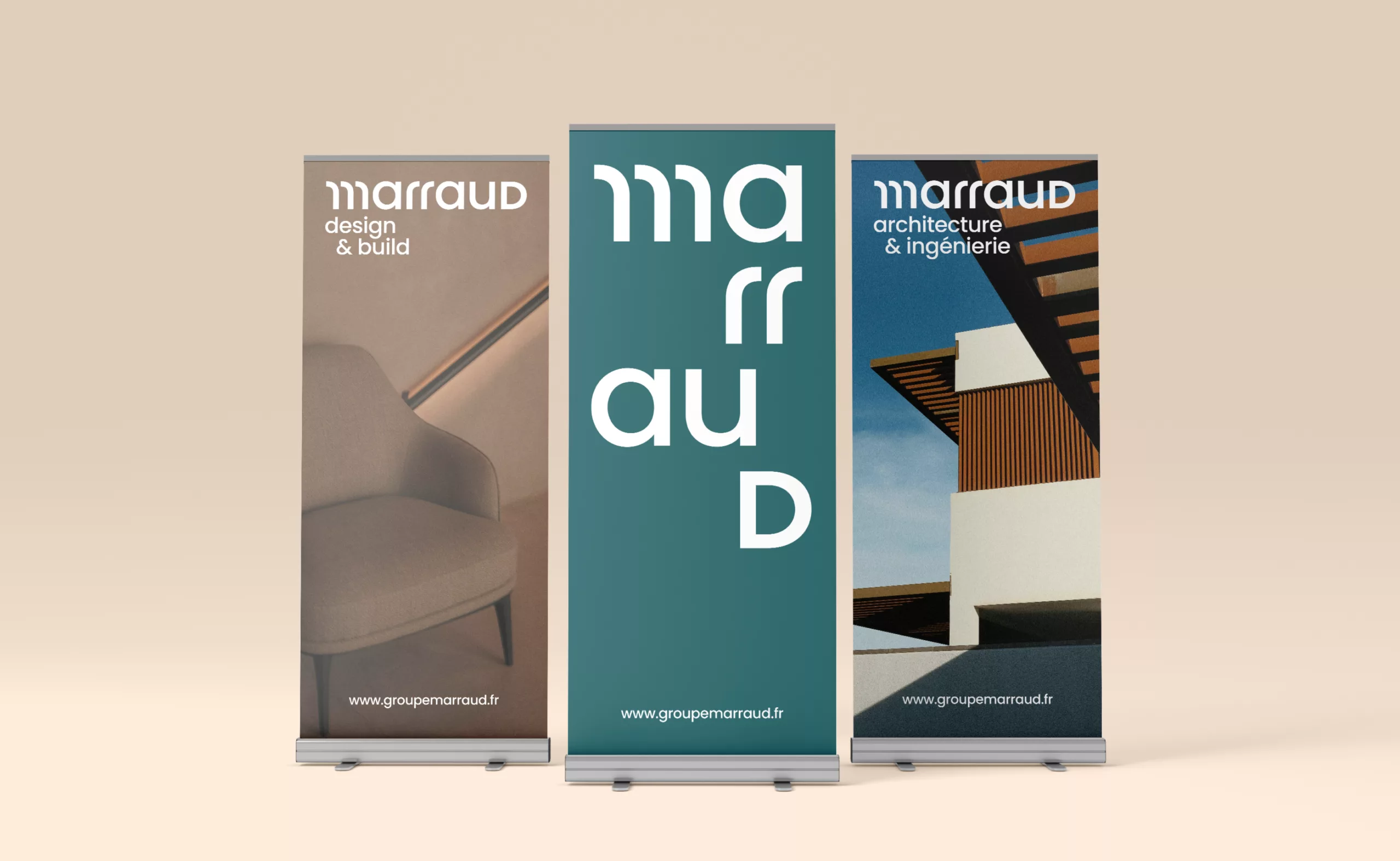
This naming evolution made it possible to create a clearer, simpler brand architecture: Groupe Marraud as the parent brand, supported by six sub-brands whose names we harmonised around the Marraud name. By renaming each company, we highlighted the group’s ability to support clients at every stage of their projects, from A to Z. Each company retained its own expertise, clearly expressed in its name: Architecture & Engineering, Site Work & Services, Design & Build, Development & Construction, Property & Asset Management, and Indian Ocean Construction.

This structure makes each company’s relationship to the group immediately recognisable while making its individual area of expertise easier to understand.

A new name, a distinctive new wordmark

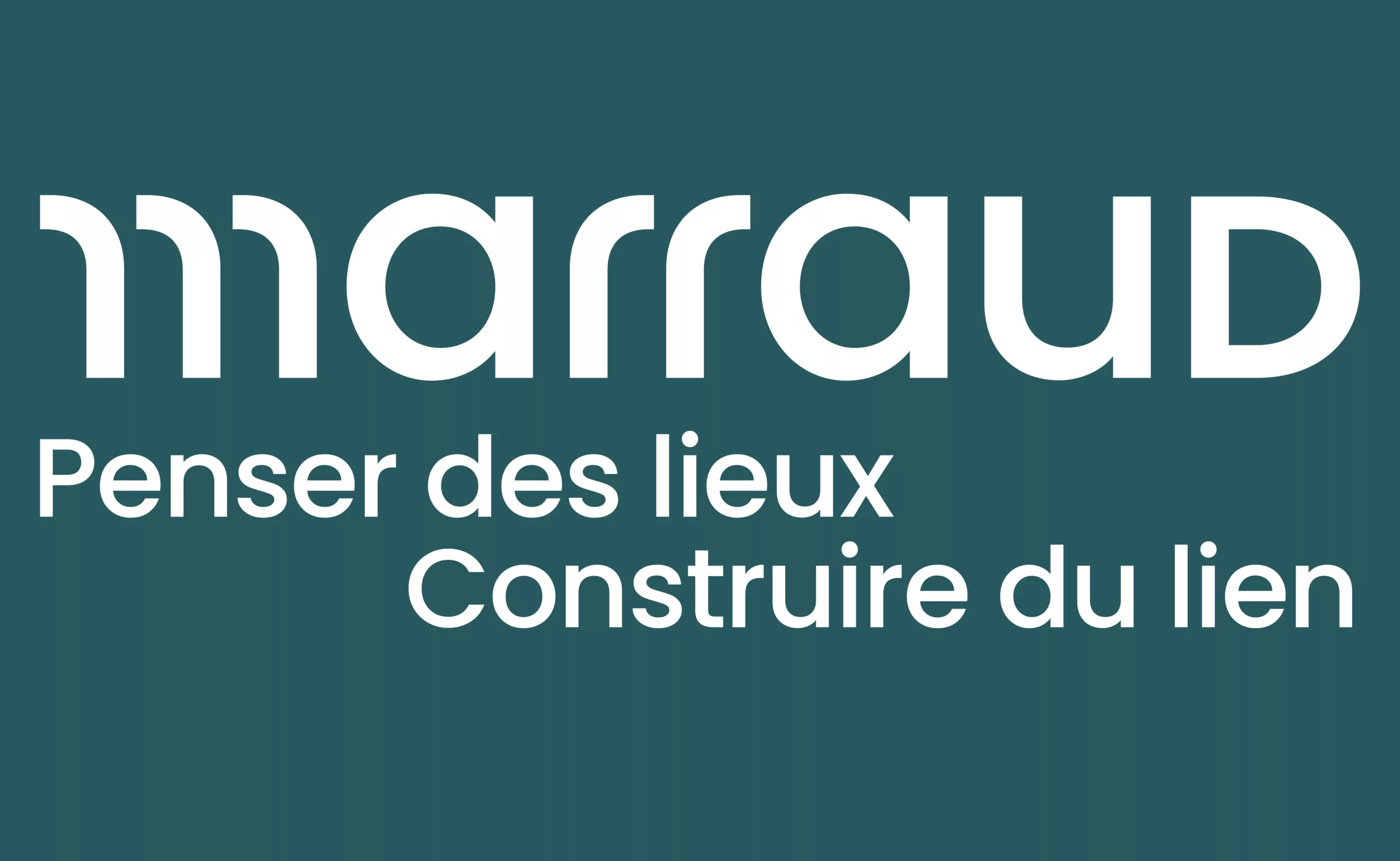
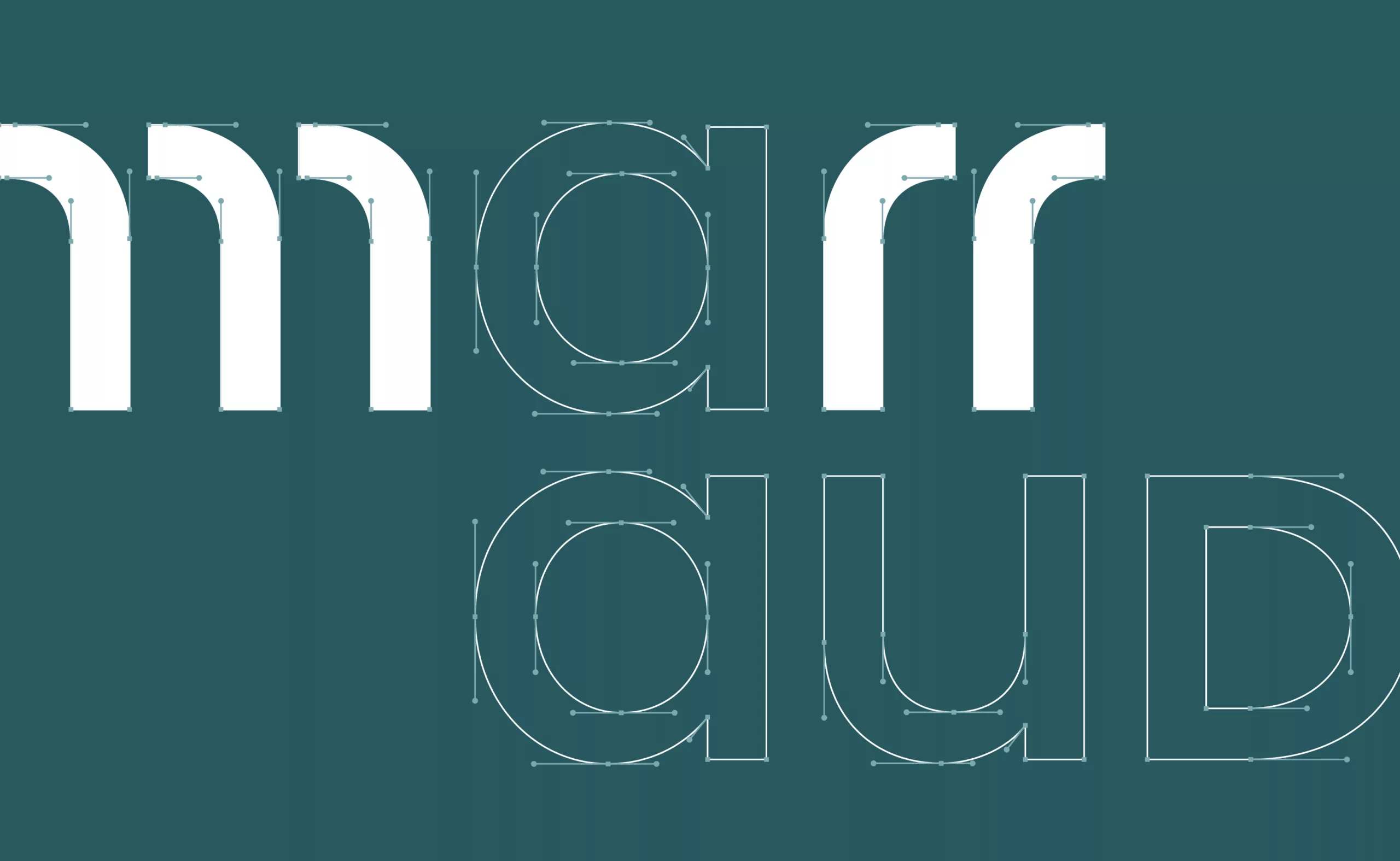
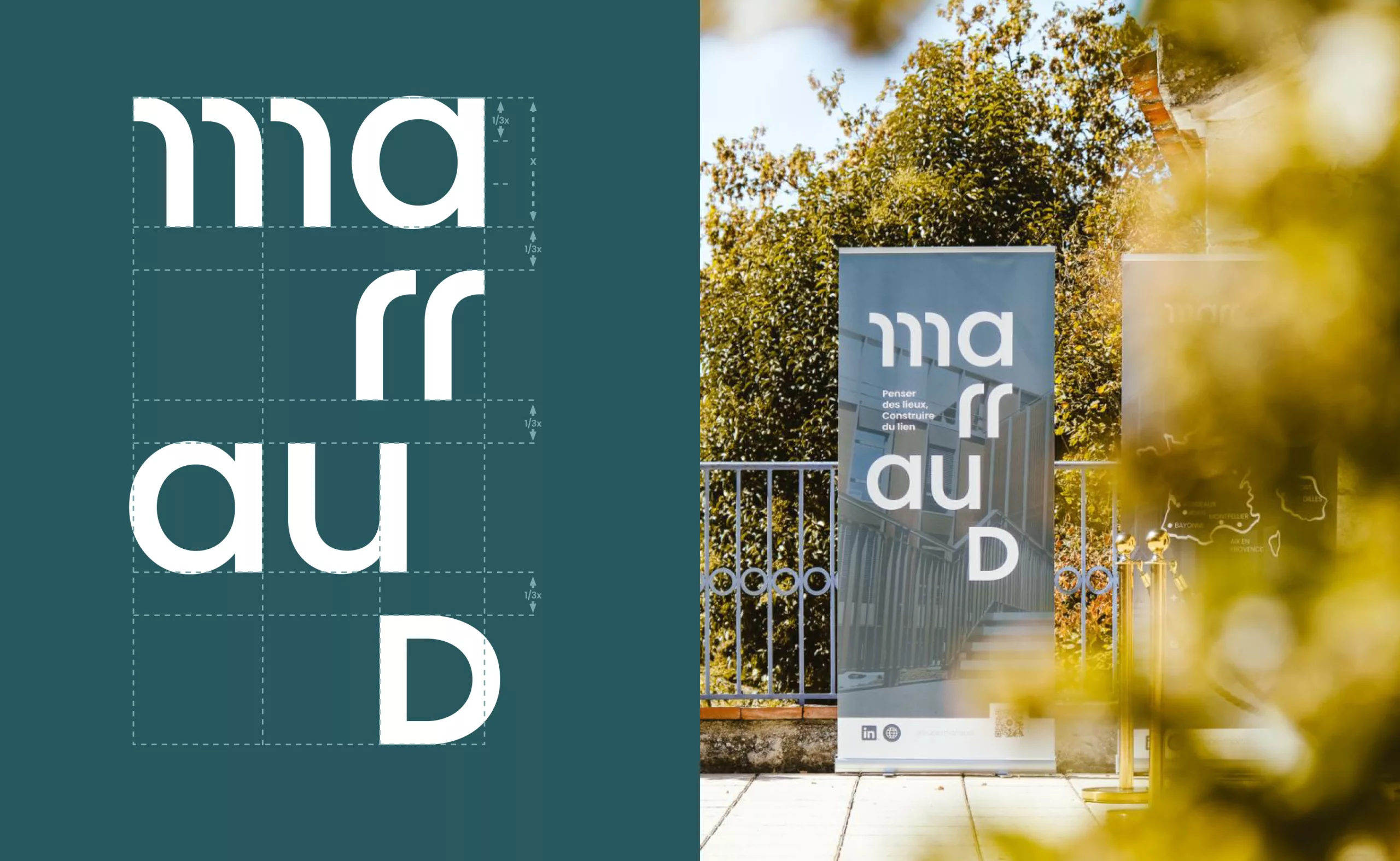
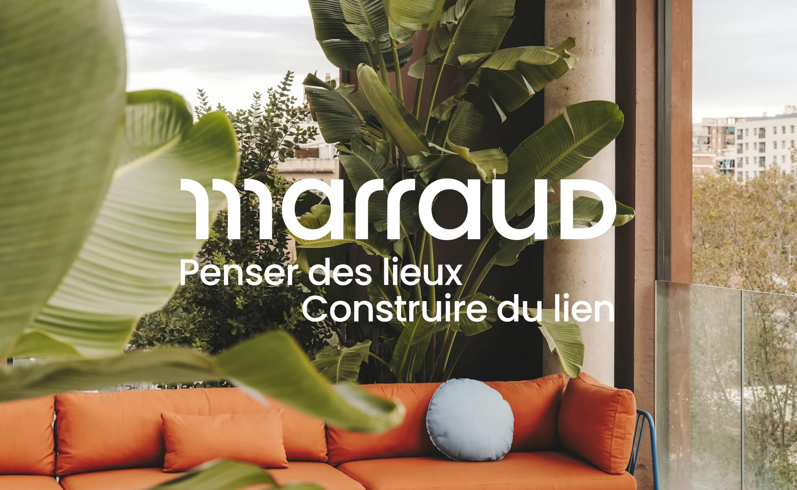
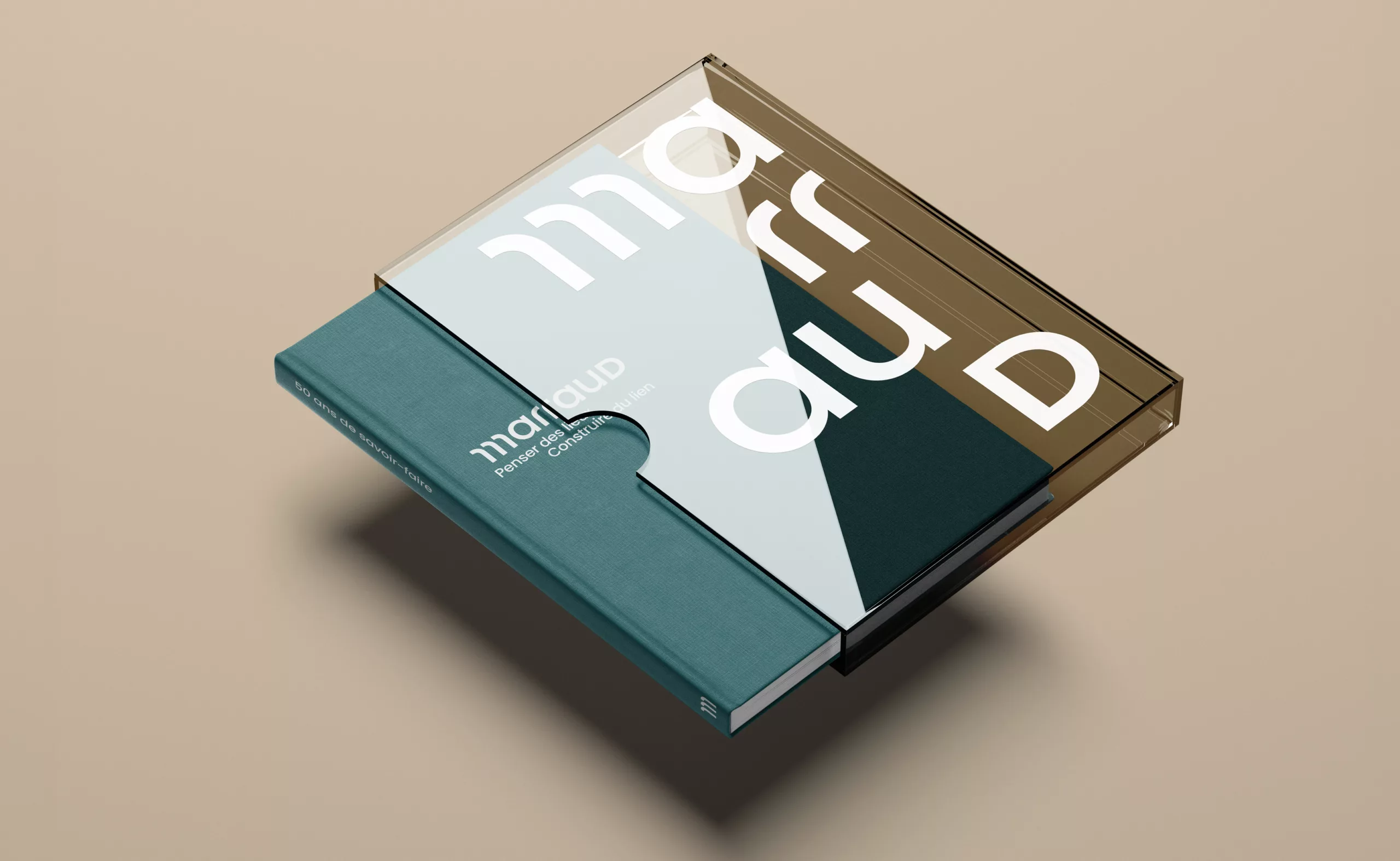
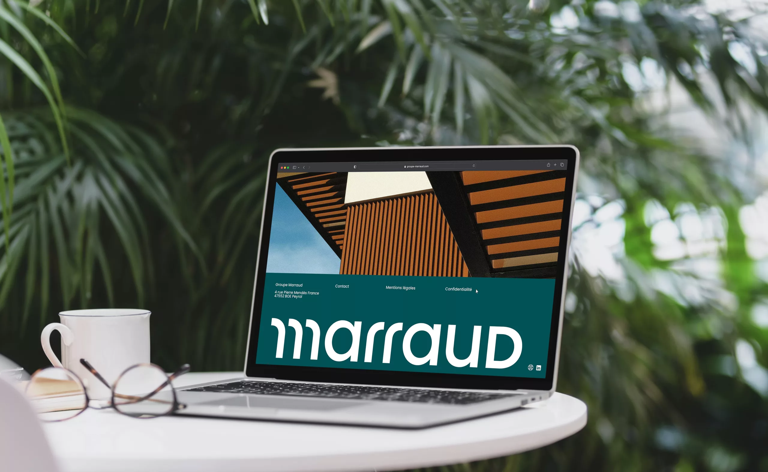
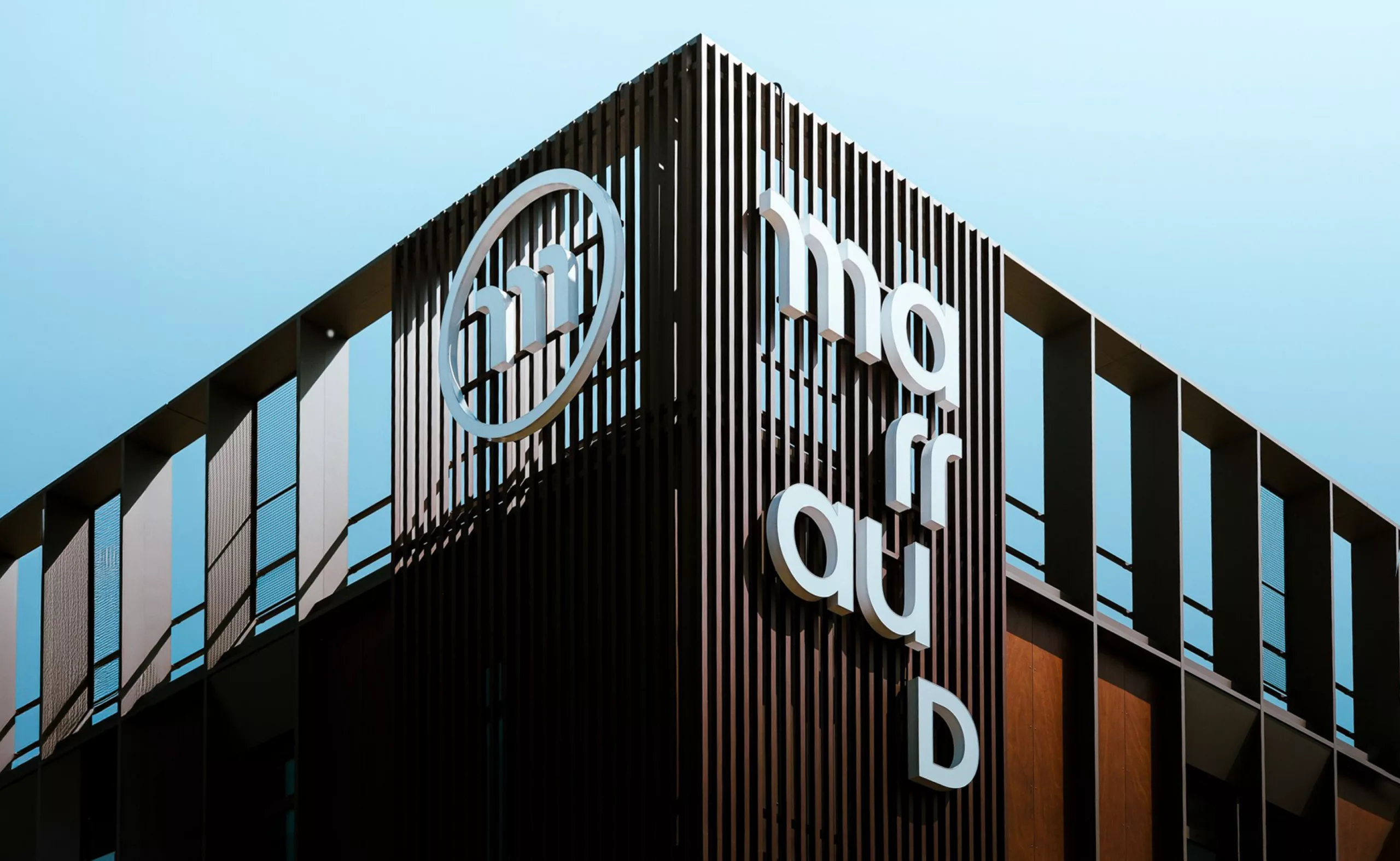
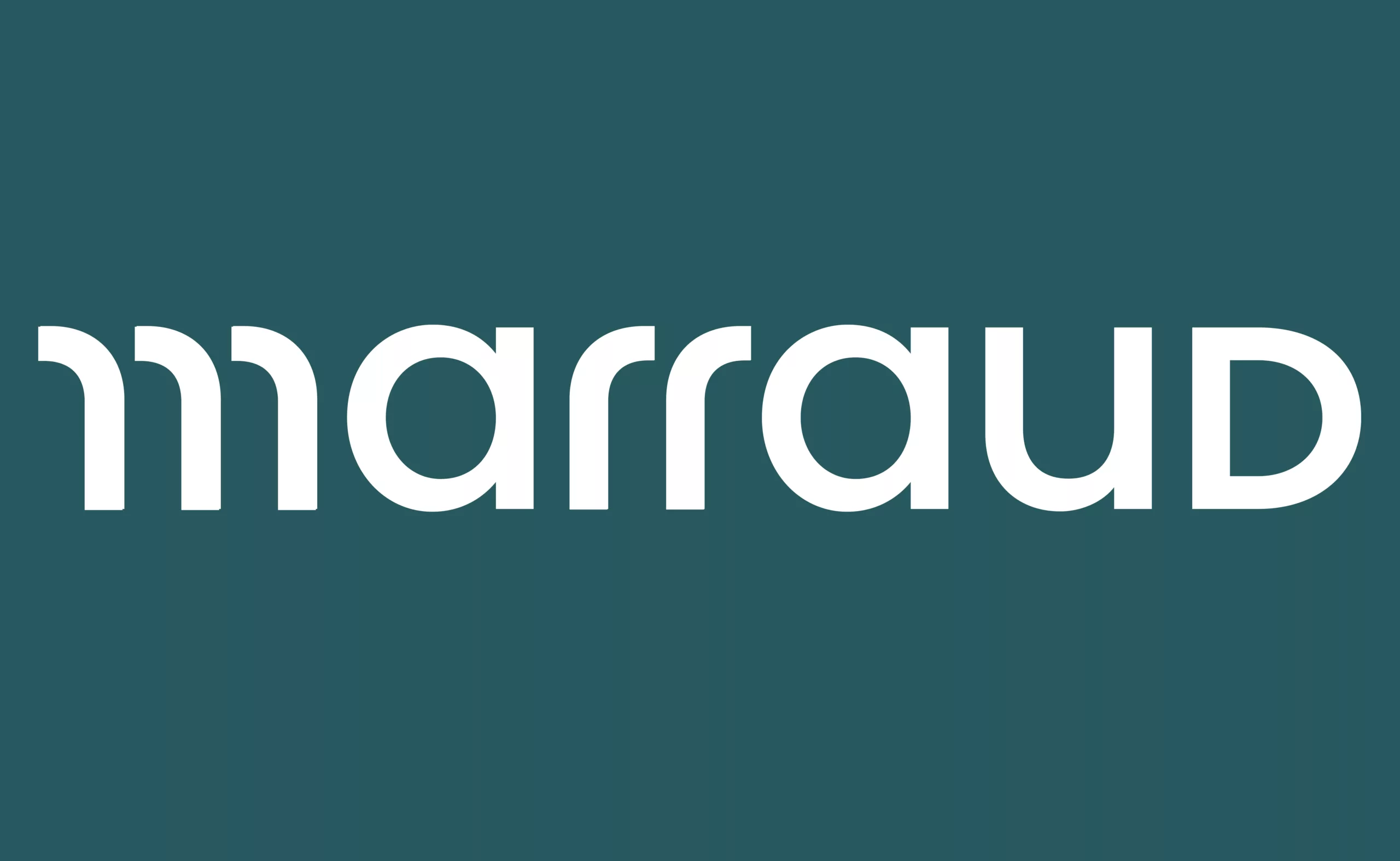
To accompany this transformation, we created a custom wordmark that turns the name “Marraud” itself into a distinctive visual signature. The word “Groupe” was removed from the logotype. Shorter and more direct, the name has more impact and firmly establishes itself as a brand in its own right.

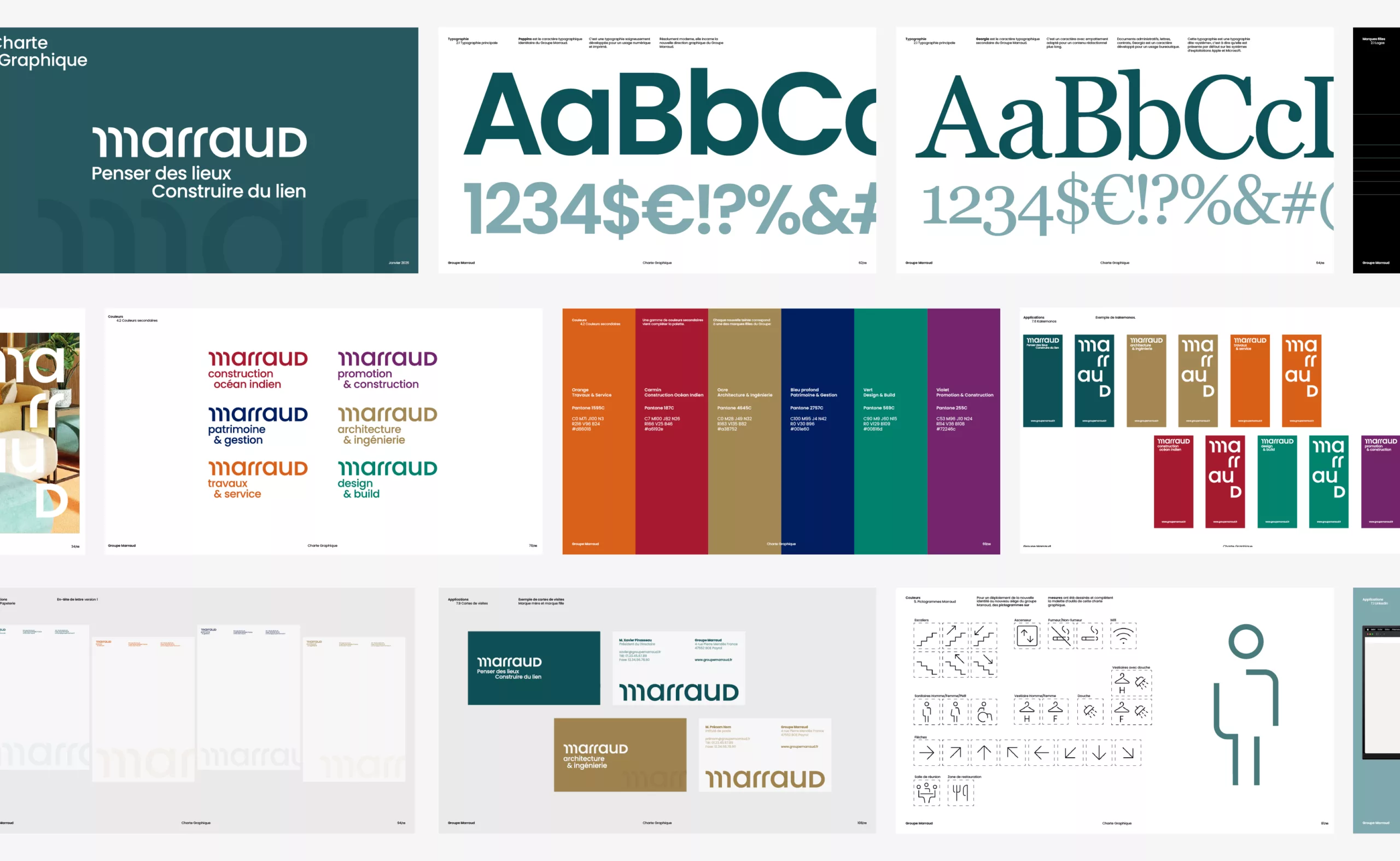
Based on the Poppins typeface, the lettering was customised through specific work on the M, R and D. Its geometric treatment and combination of uppercase and lowercase letters give it a compact, contemporary silhouette.

The M, built around three branches, becomes the defining symbol of the identity. Its graphic design represents the group’s three core pillars: creativity, versatility and sustainability.

A tagline that builds connections

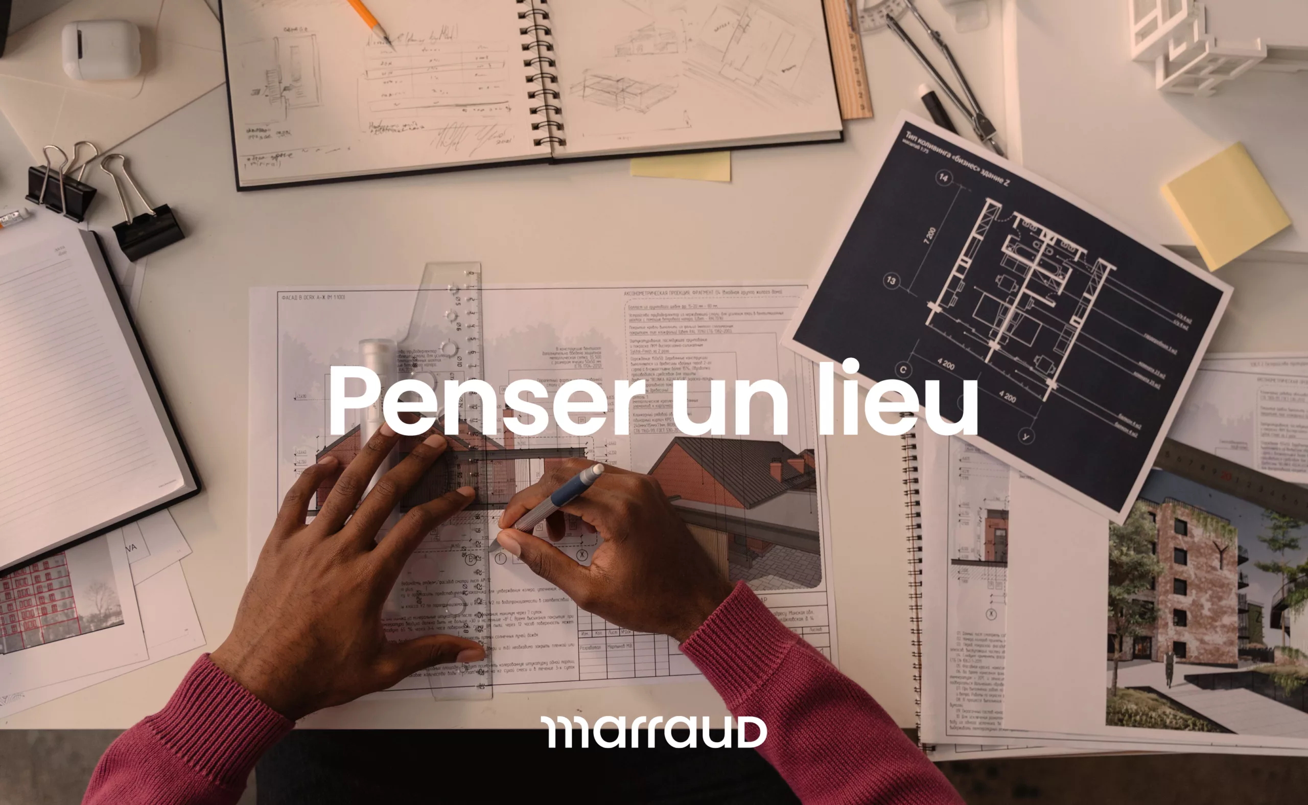
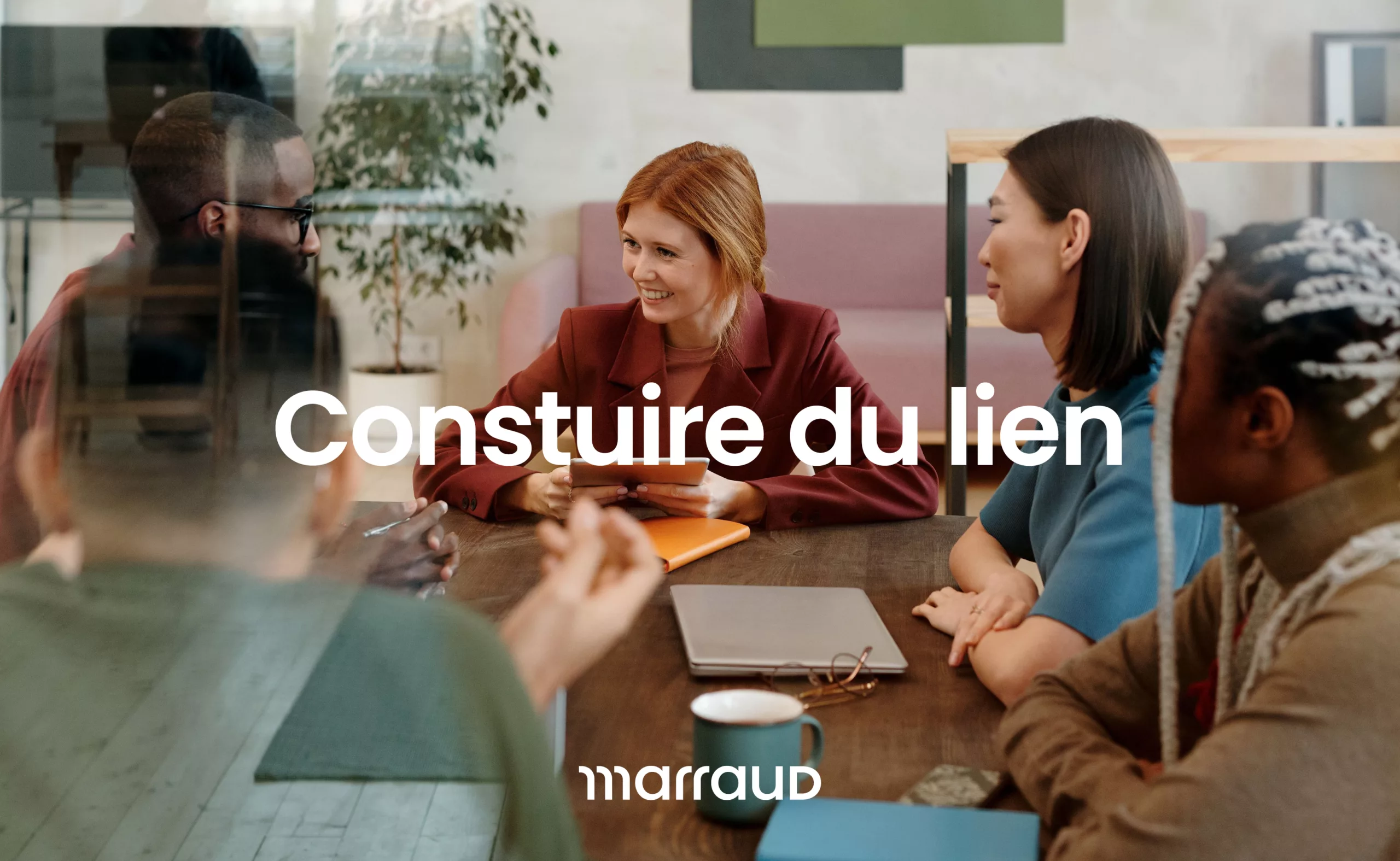
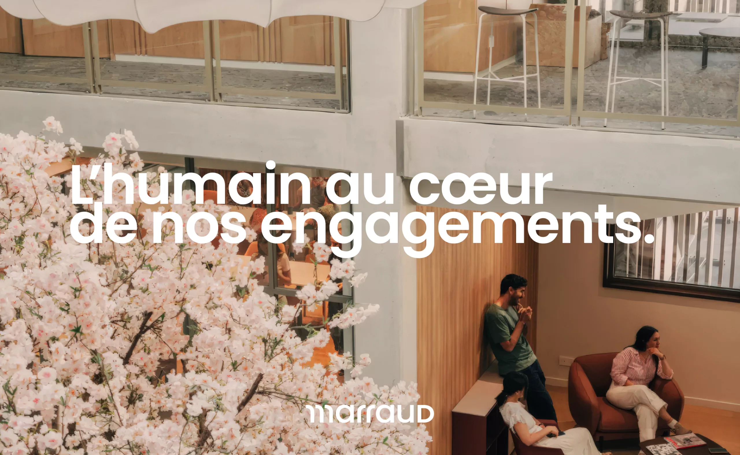
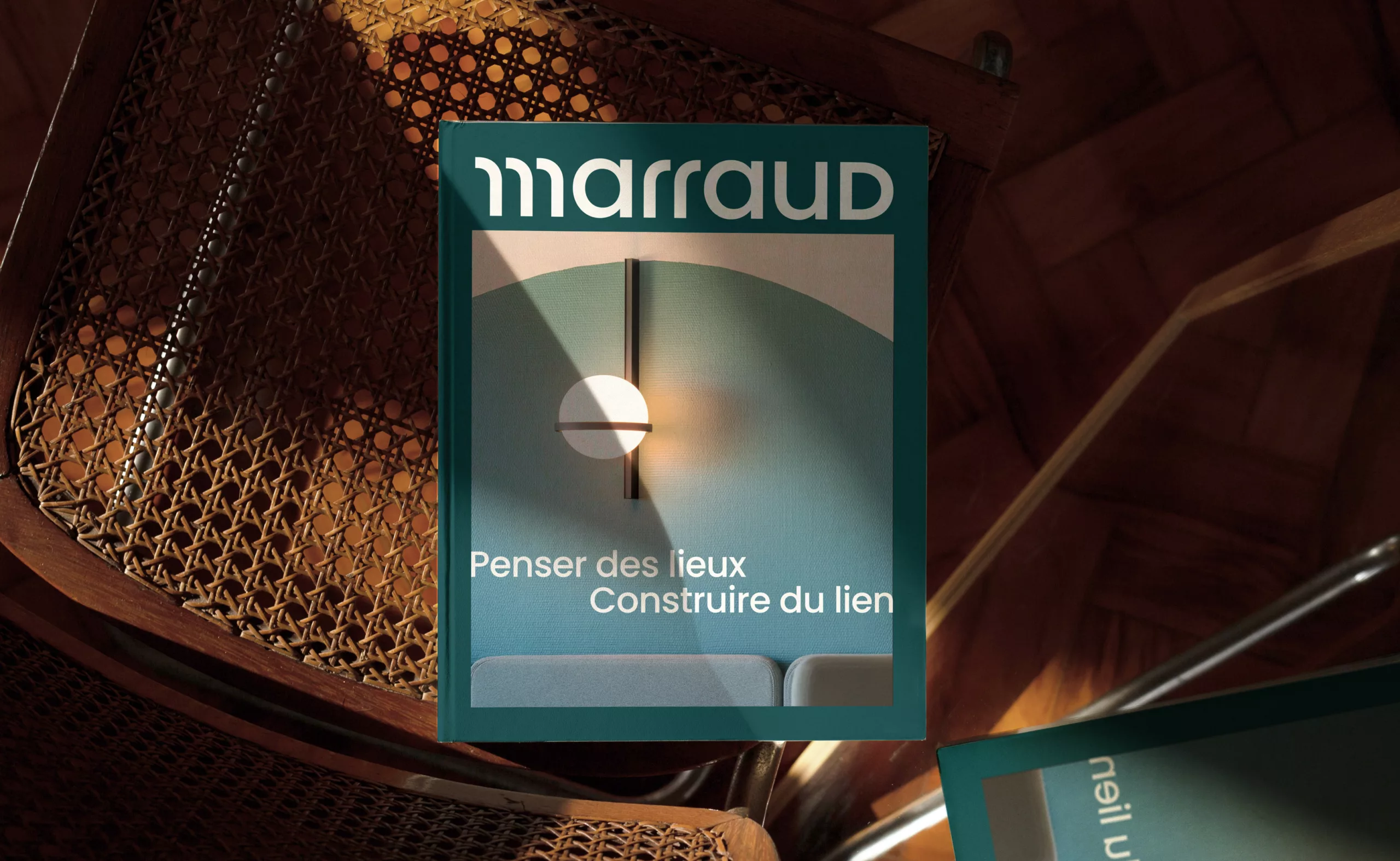
Beyond its construction expertise, the group places human relationships at the heart of its business. This vision is expressed through a new tagline: “Penser des lieux. Construire du lien.”

It reflects the group’s expertise while conveying a more human approach to construction, one rooted in lasting connections between people, the ways they use spaces and the places they inhabit.

One identity, six areas of expertise

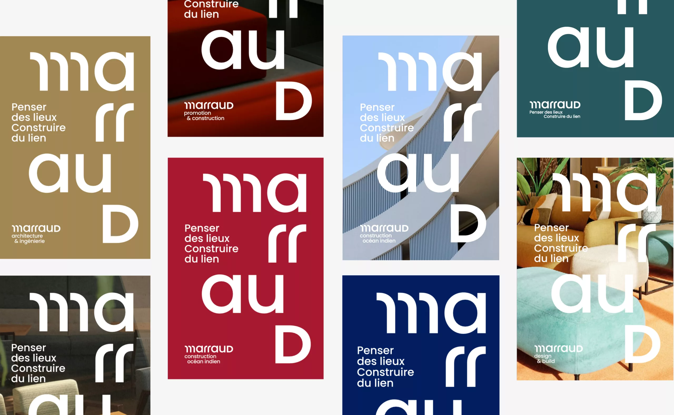
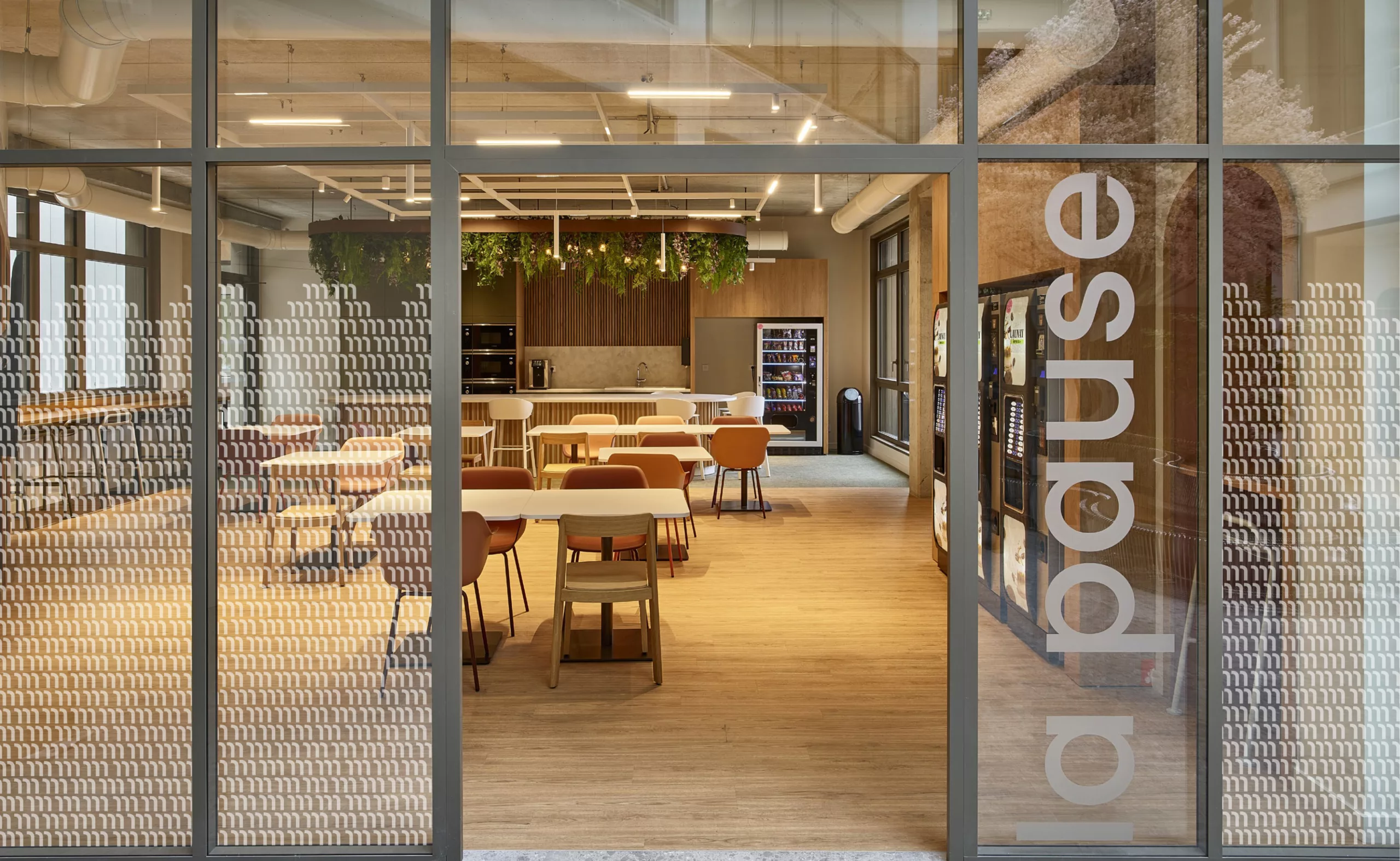
To signify this brand architecture, we developed a shared visual identity for all six companies. The Poppins typeface became the foundation of the system, with consistent geometric and typographic principles carried through every composition.

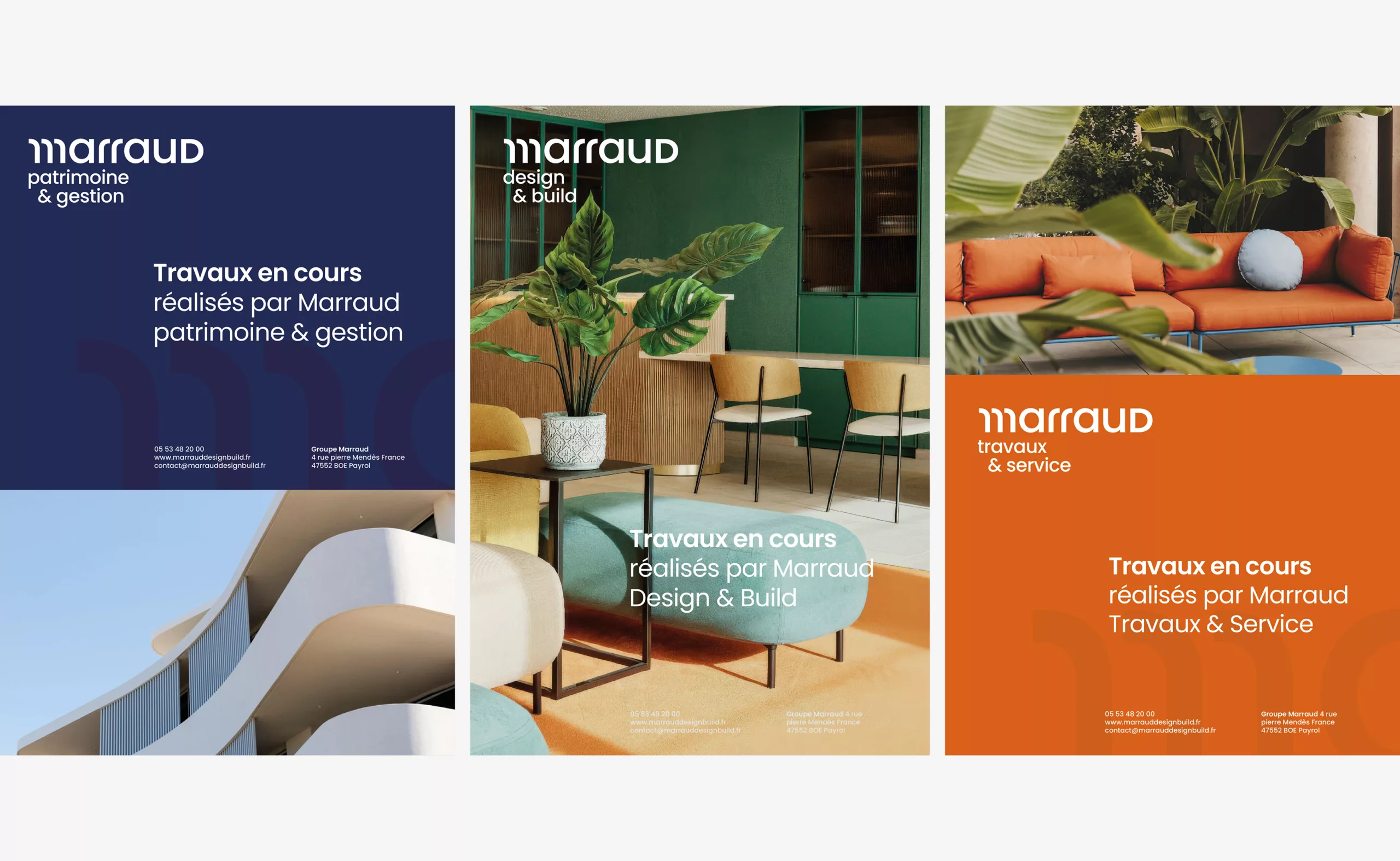
Each company nevertheless has its own colour, making its activities easier to identify without compromising the overall unity of the brand. The parent brand adopts a refined, deep teal-blue, conveying its institutional stature and ambition to move upmarket. The other entities each feature a distinctive colour palette, selected to reflect their respective areas of expertise.

Together, these elements form a clear and adaptable system: one shared identity to bring the group together, and distinctive visual cues to help people navigate its different areas of expertise. The group can now speak with one voice without losing the richness and diversity of its capabilities.

A name that embodies its ambition

This rebranding marks a new chapter in the evolution of Marraud and supports its continued growth. By establishing a shared brand as an overarching banner, we helped structure the transition from a family business into a group capable of asserting its diverse expertise without losing sight of what brings them together.

An identity that makes the brand easier to recognise, understand and, above all, lets it build the next chapter of the Marraud story.