An identity designed to bring people together
In 2022, Université fédérale Toulouse Midi-Pyrénées commissioned us to create the visual identity of the future “Université de Toulouse” Comue. At the time, the challenge was significant: to unite 31 higher education and research institutions around a shared brand, without erasing the individuality or autonomy of each one.
But in 2024, a new institutional trajectory reshaped the project. A new experimental public institution was formed around the former Université Toulouse III – Paul Sabatier and, since 2025, it is this institution that has carried the name Université de Toulouse.
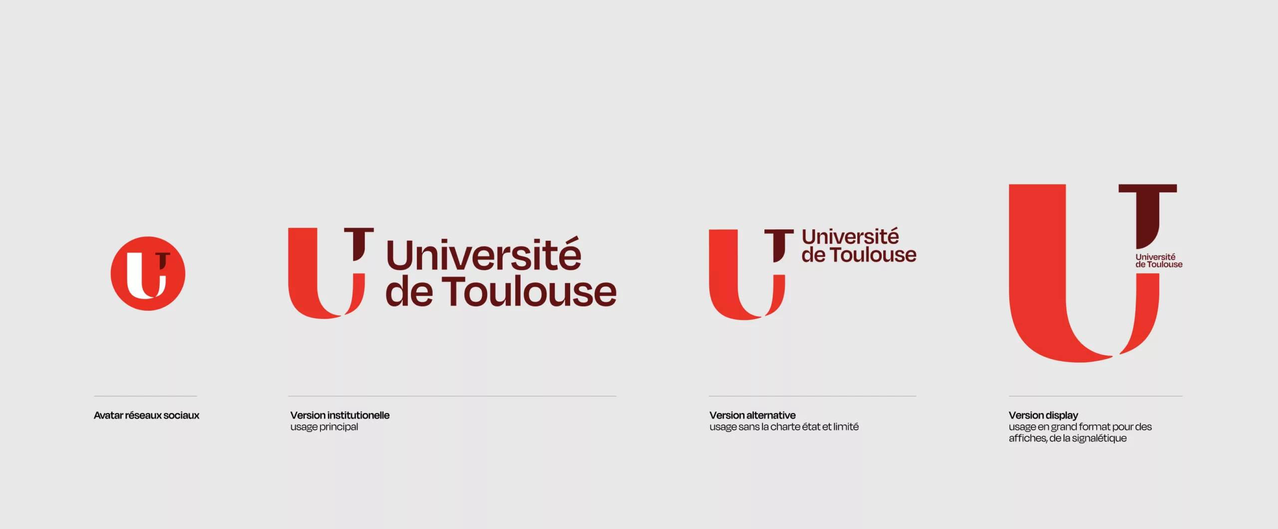
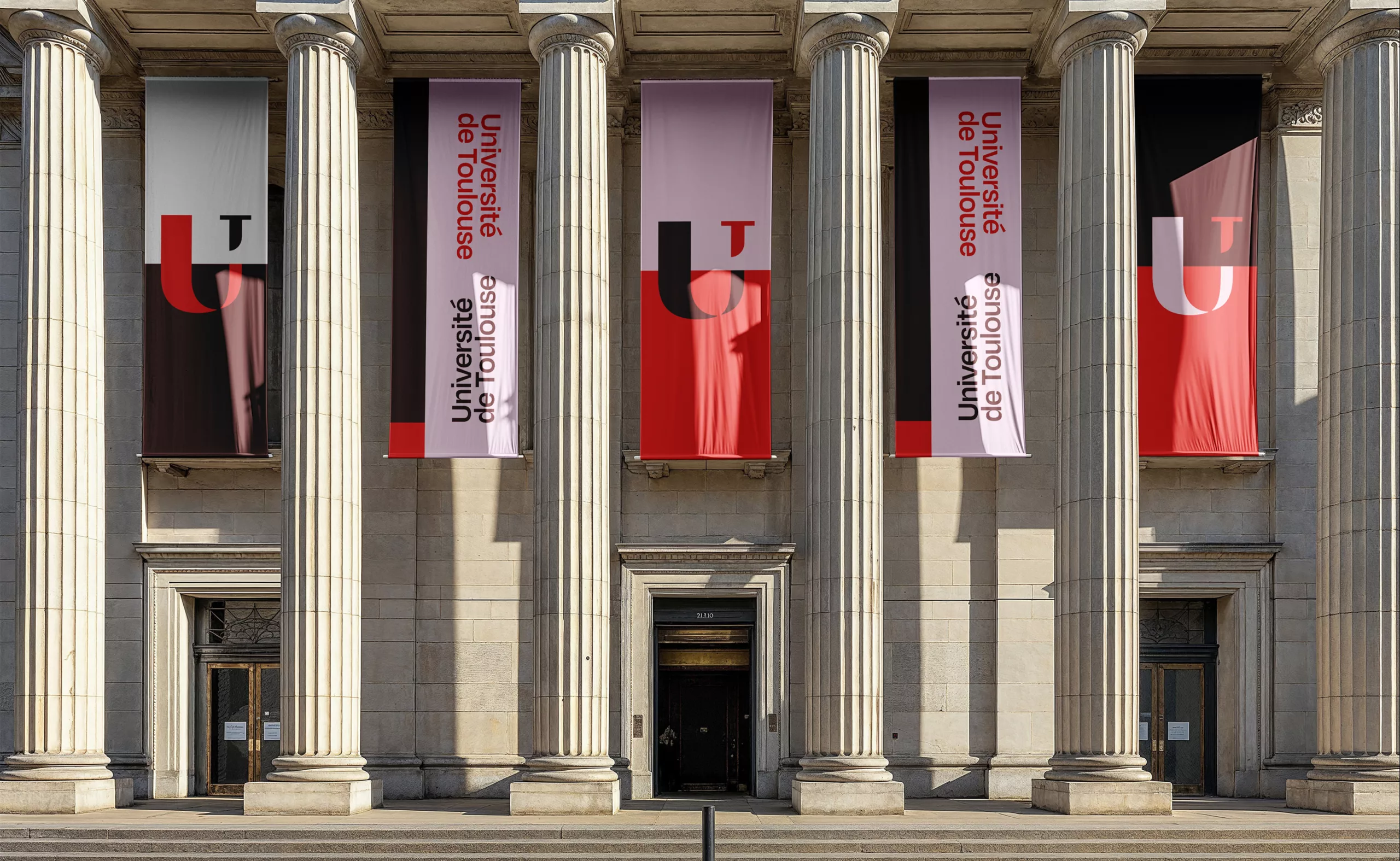
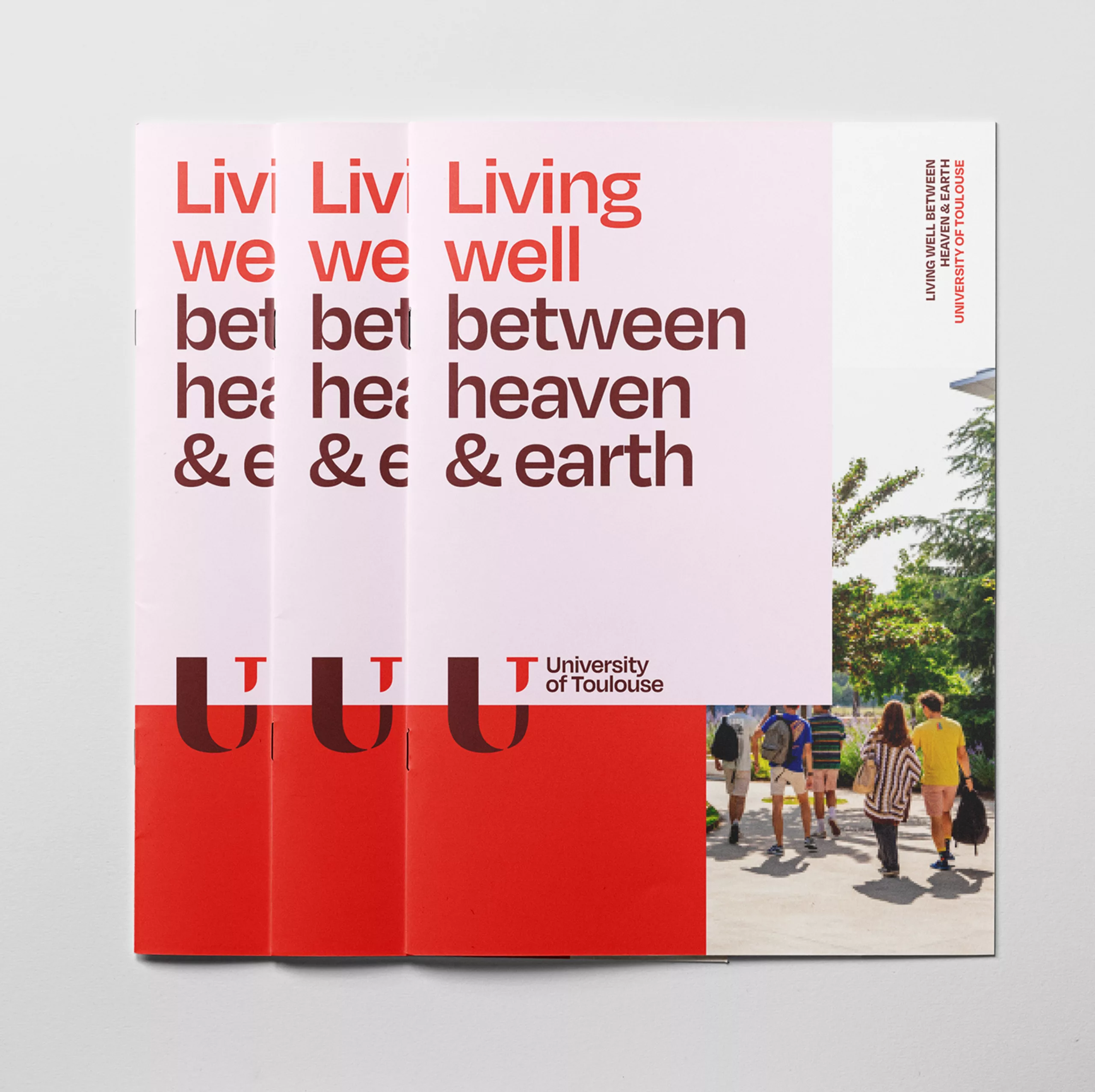
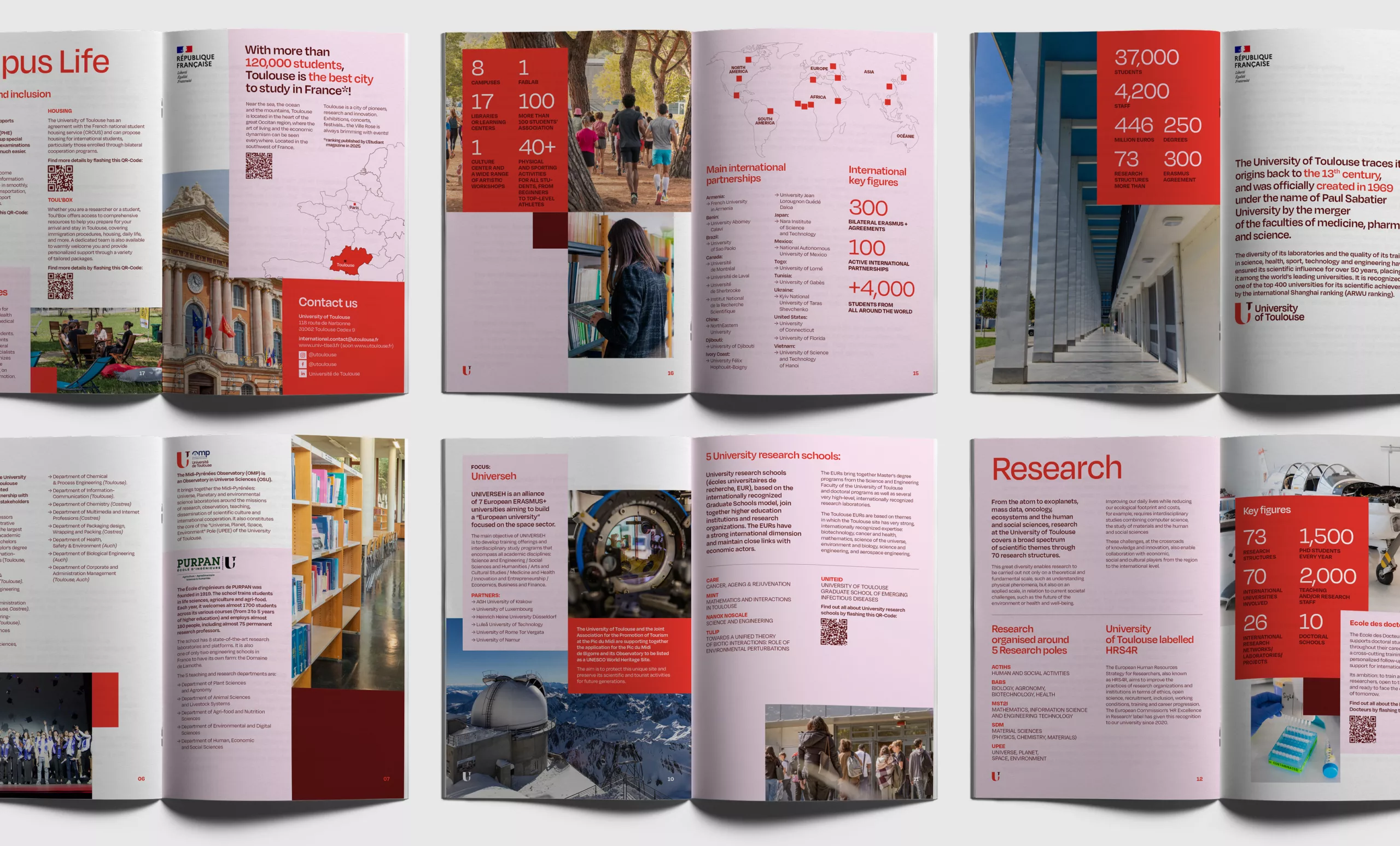
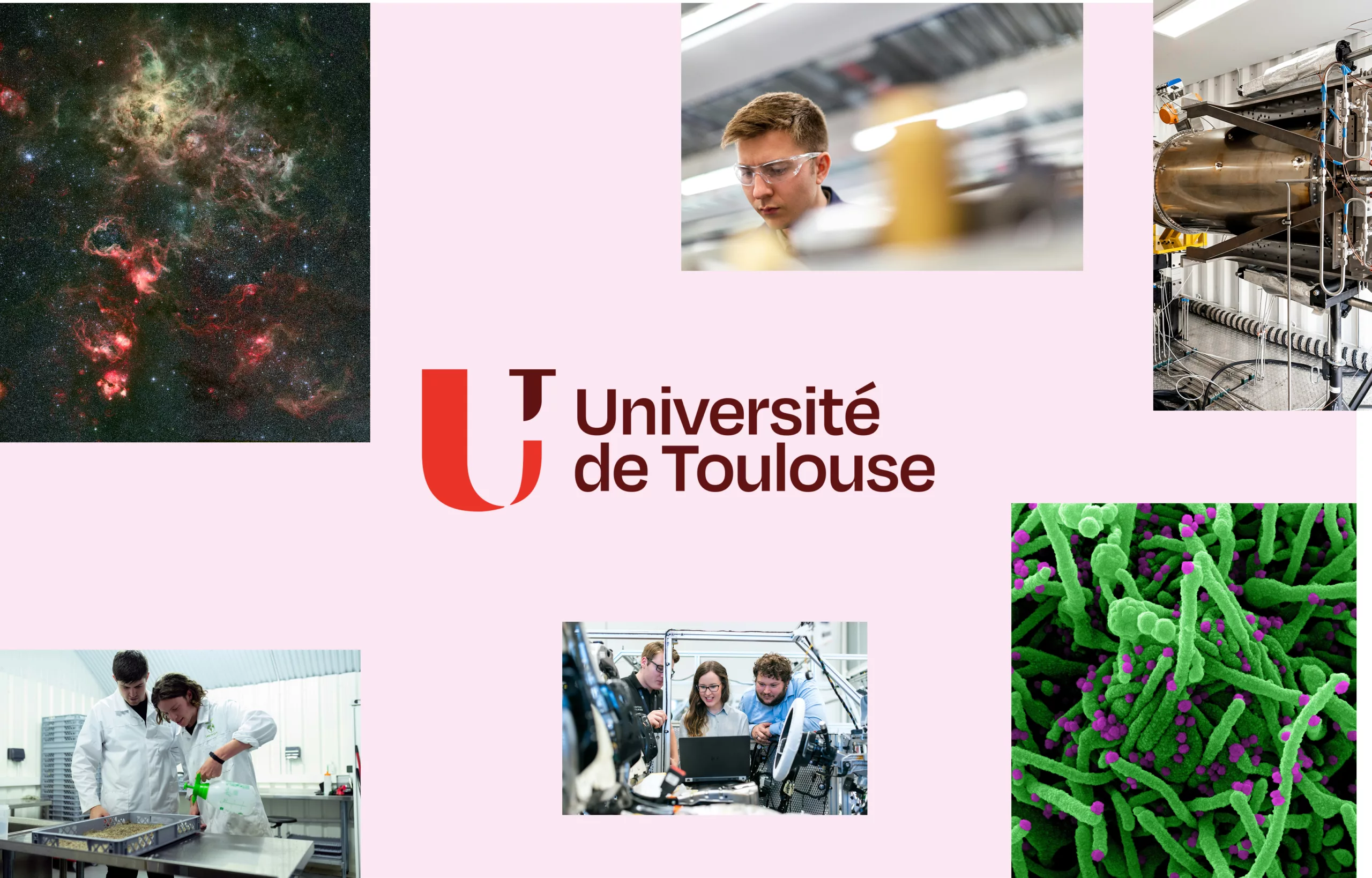
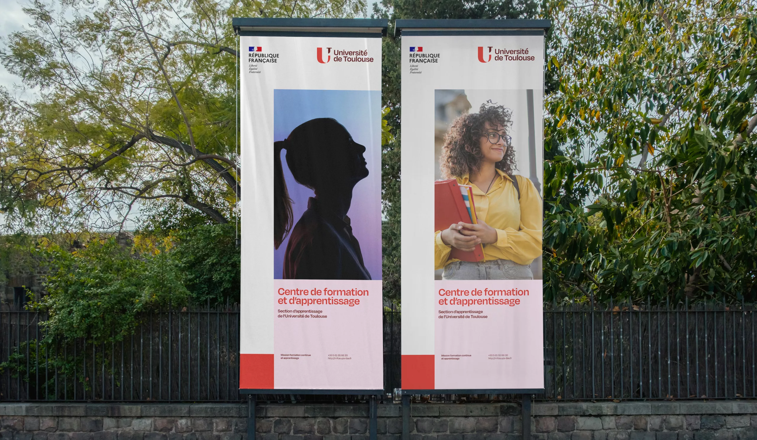
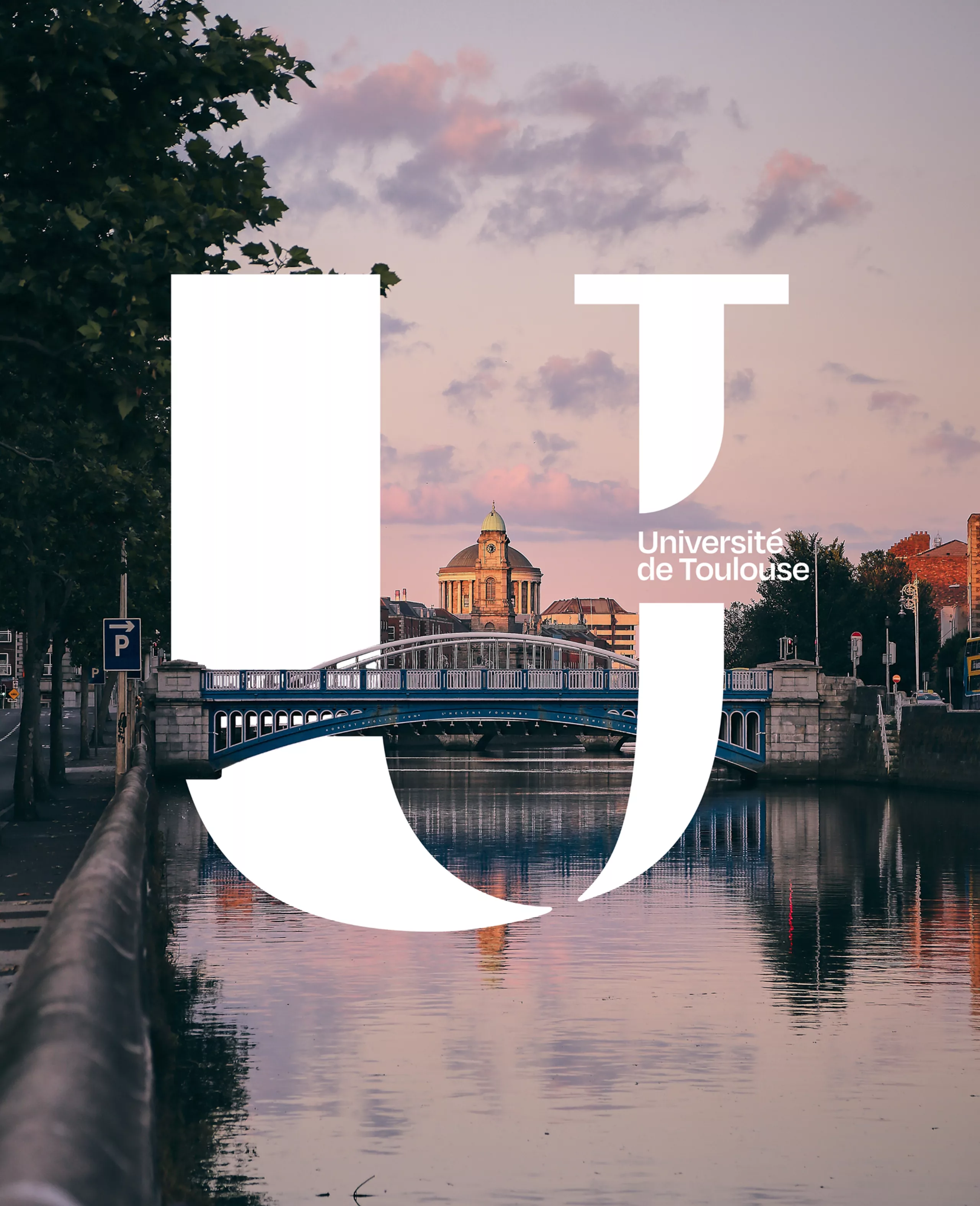
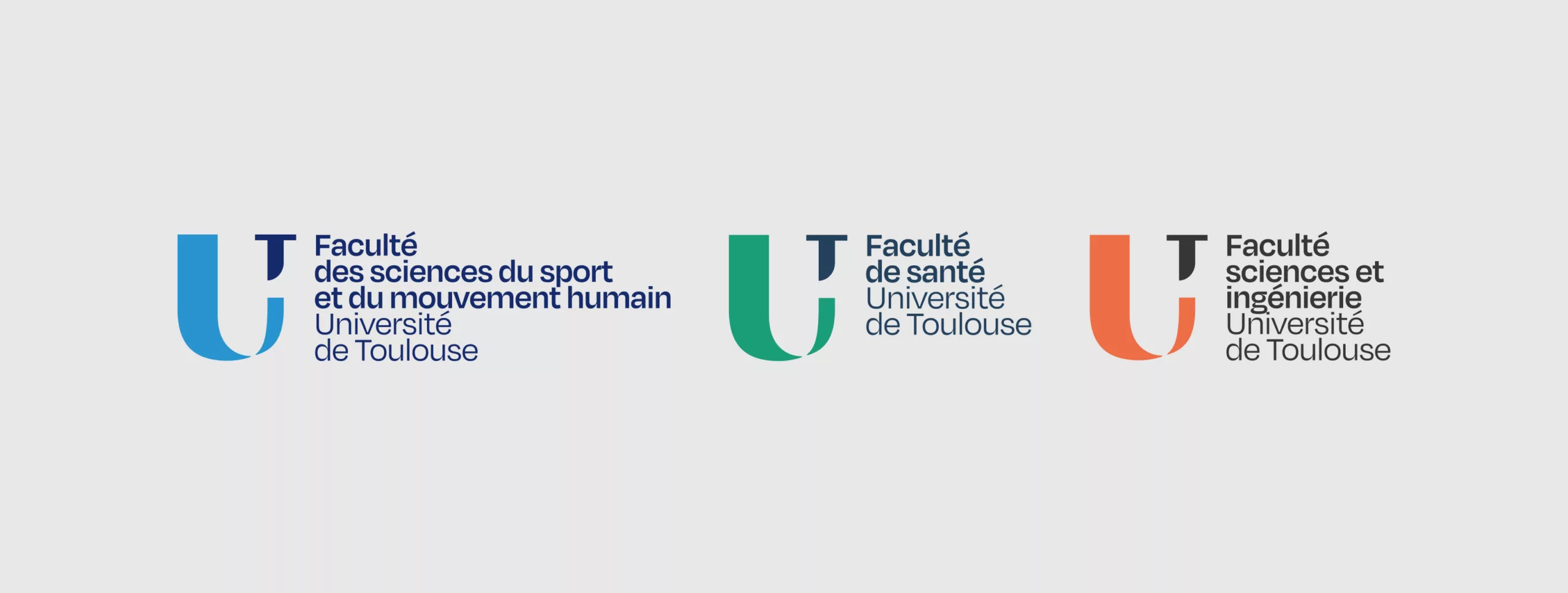
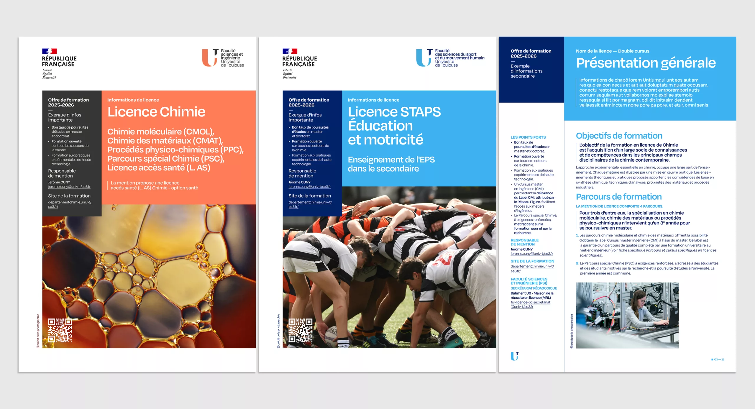
Originally conceived as a unifying brand for an ecosystem of institutions, the identity therefore changed status: it became the identity of a university in its own right. A shift in scale that led us to evolve the graphic system, while preserving the original symbol.
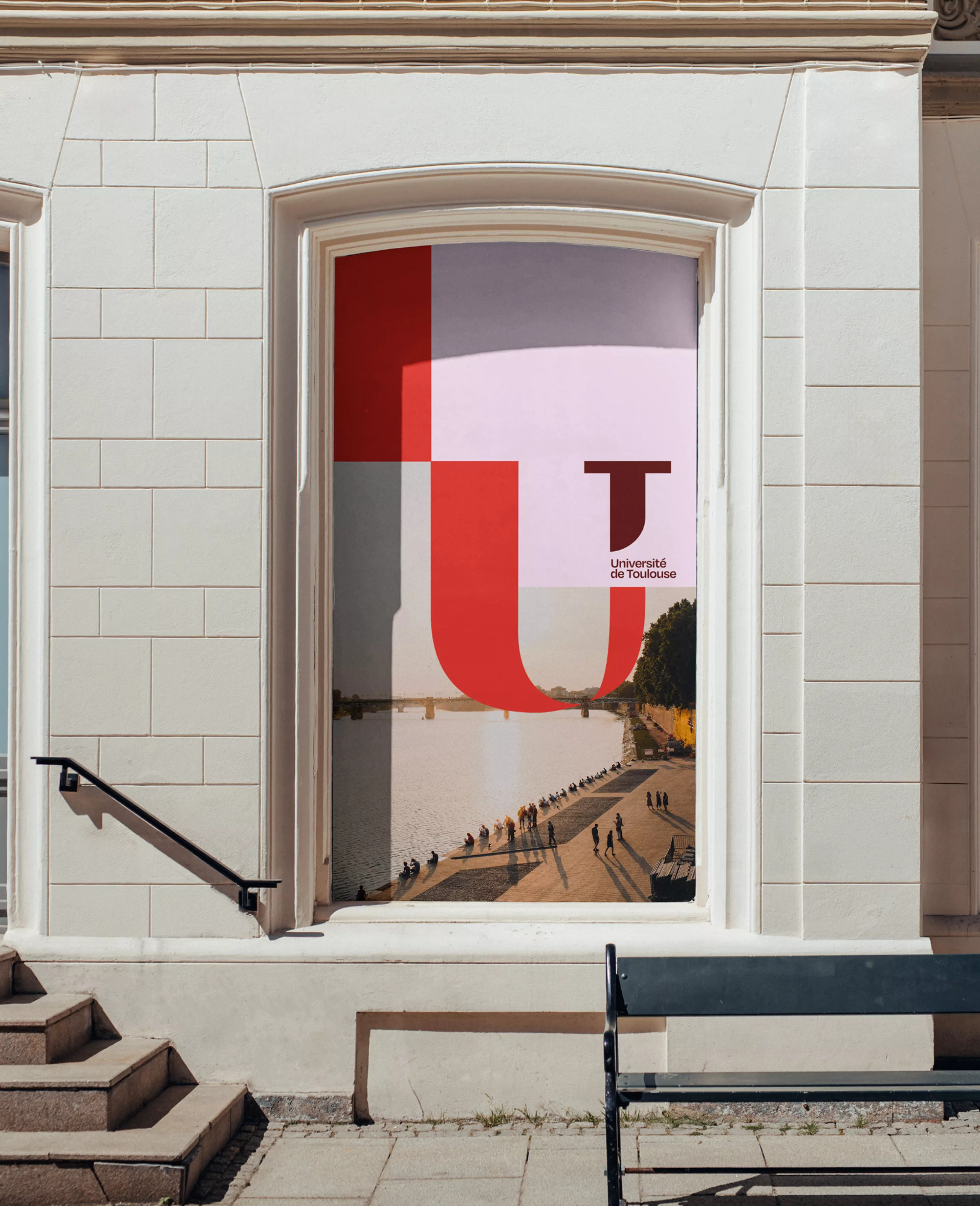
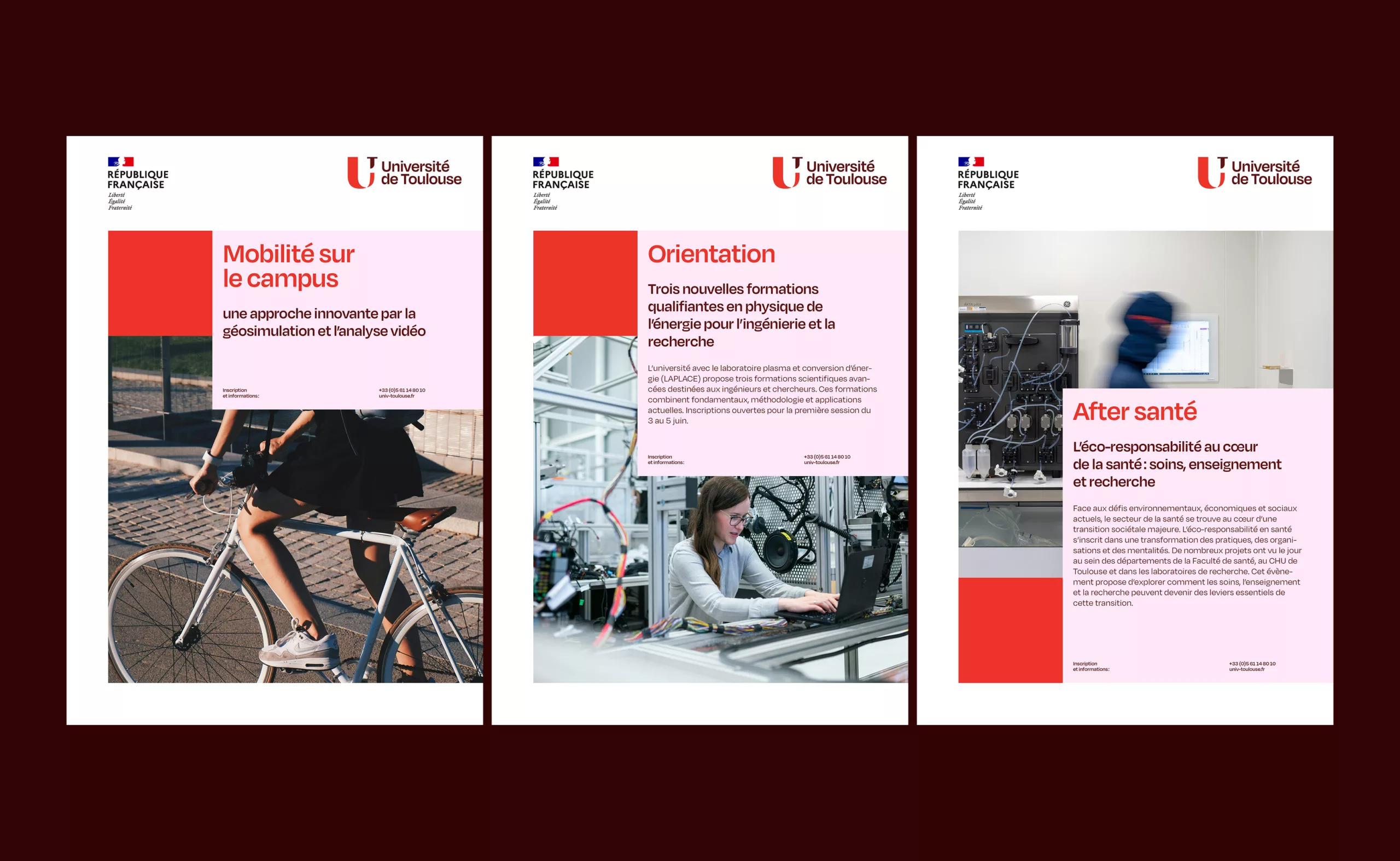
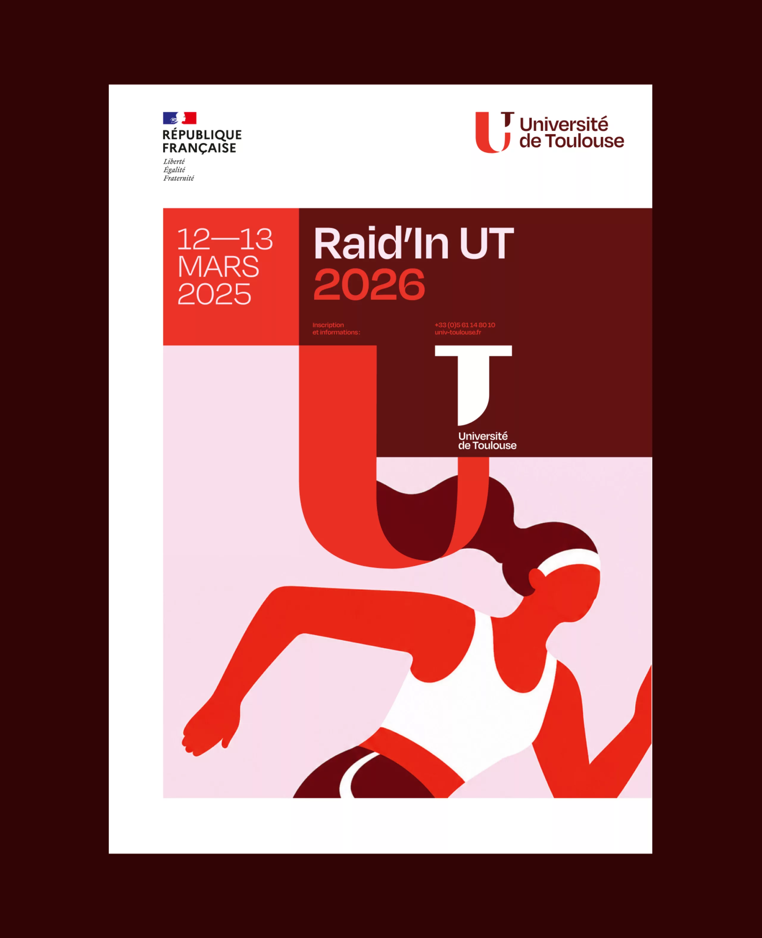
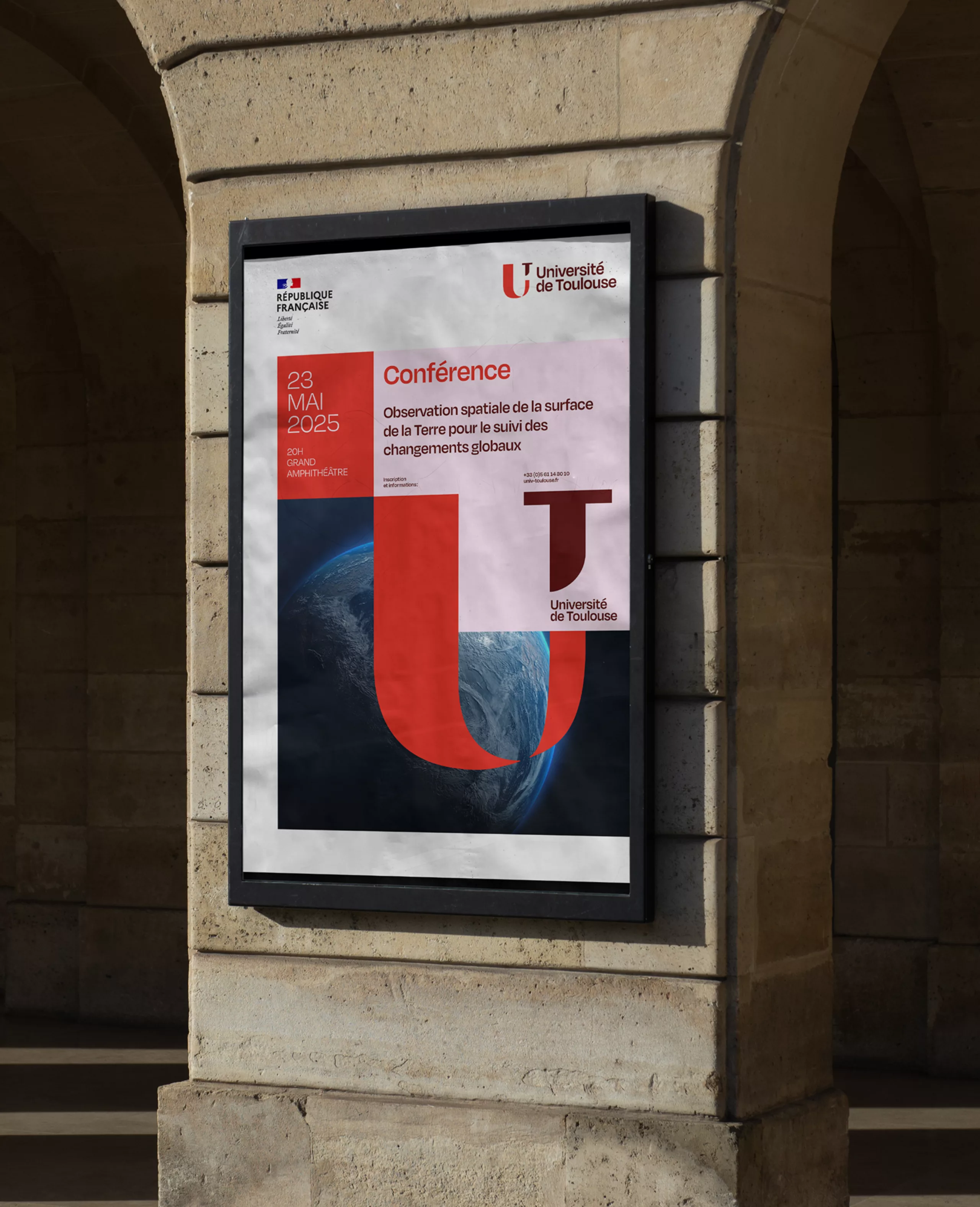
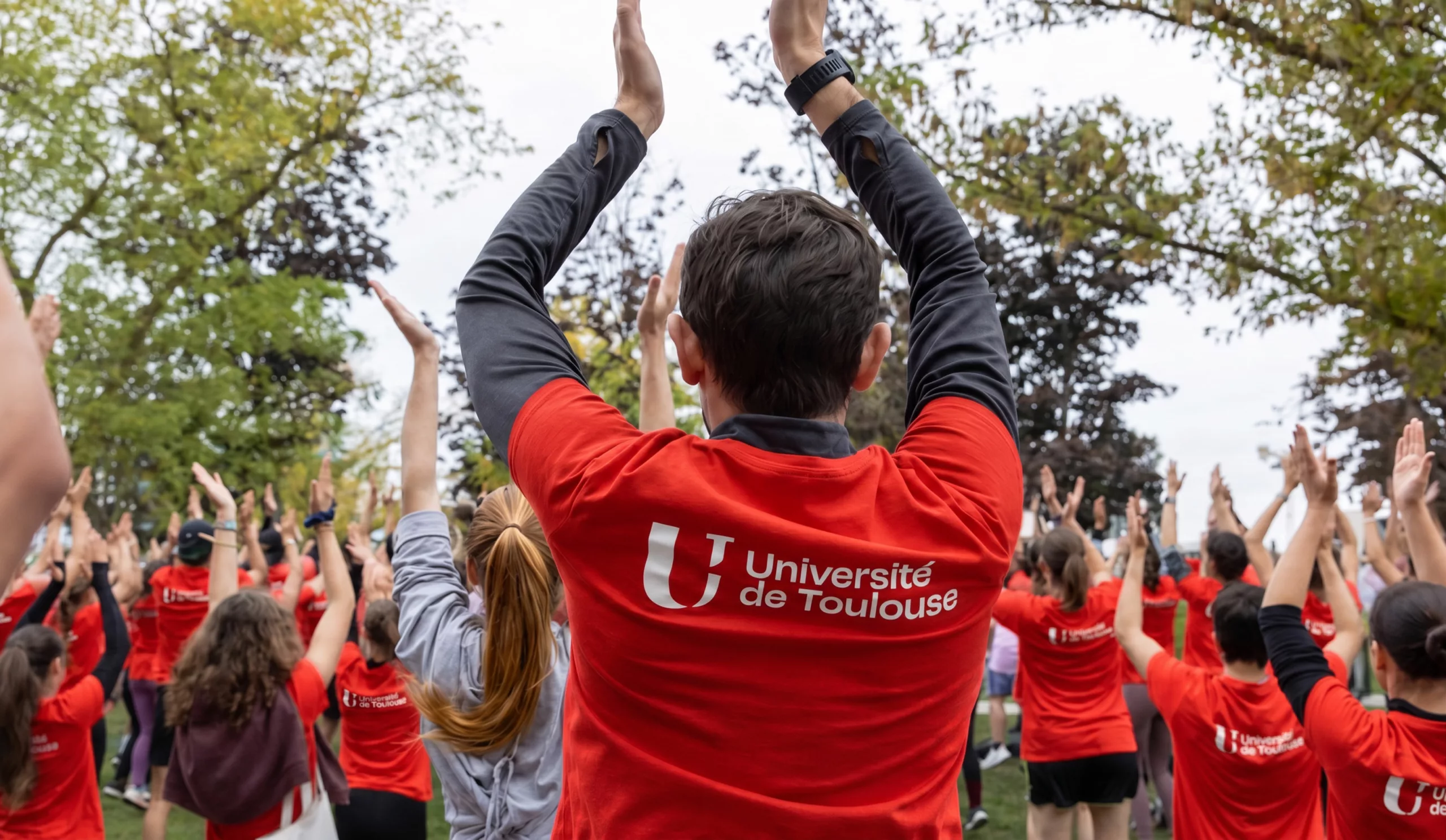
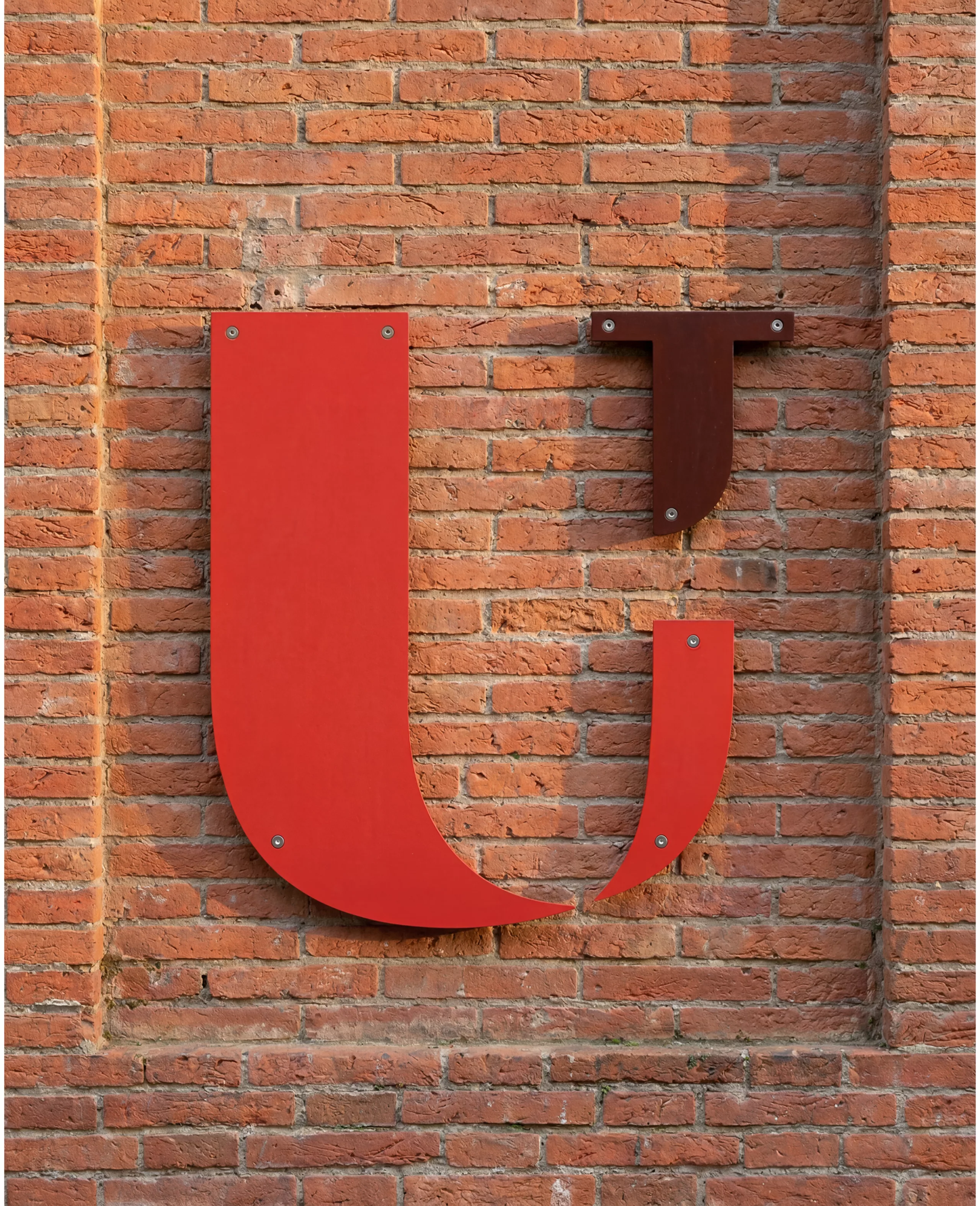
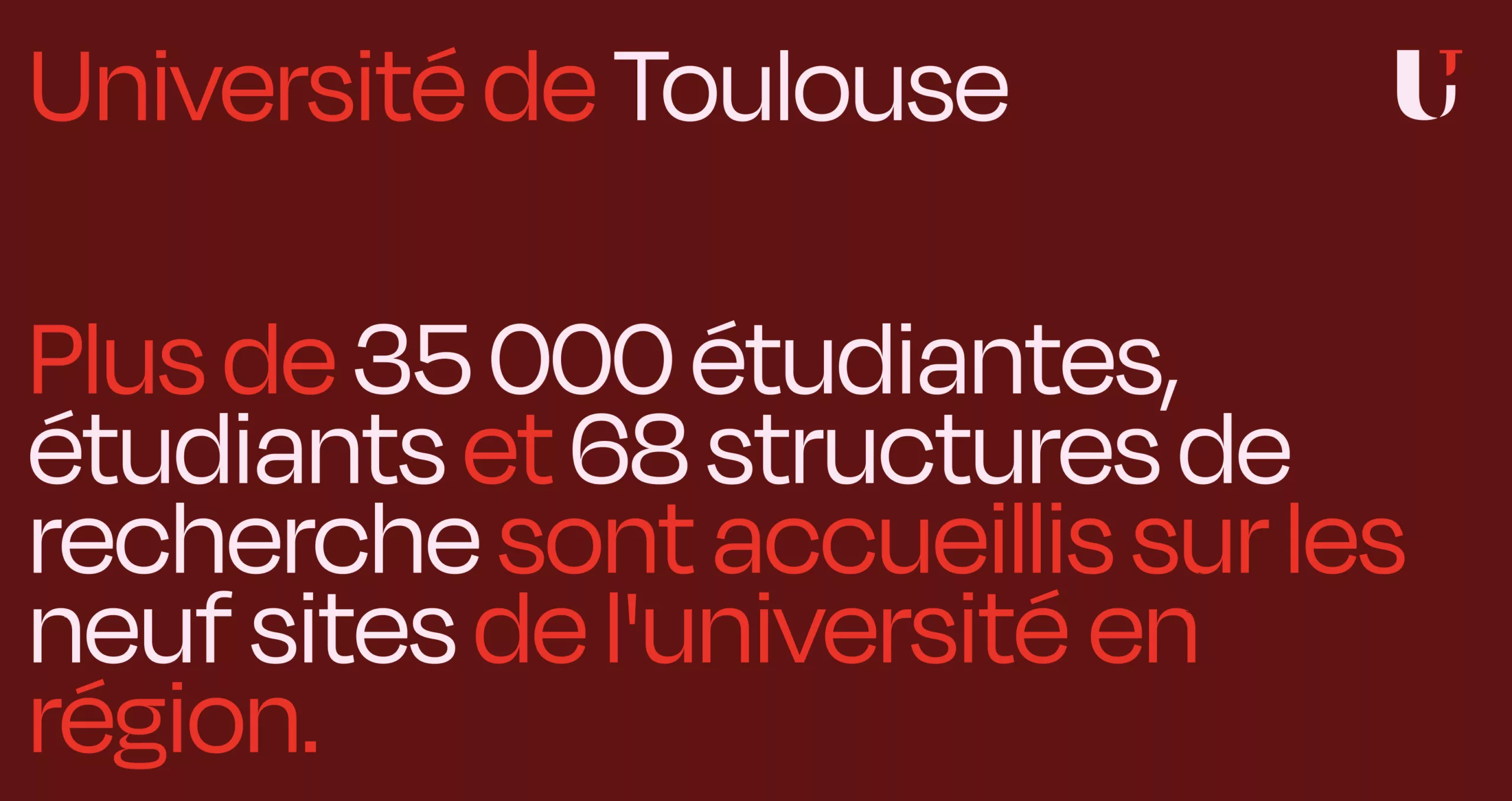
With this new incarnation came colour. And in Toulouse, it felt almost inevitable. Toulouse is known as the Pink City. Its traditional bricks, shifting from orange to pink to brown depending on the light and the time of day, have shaped the city’s landscape and imagination for centuries. The palette was almost self-evident.
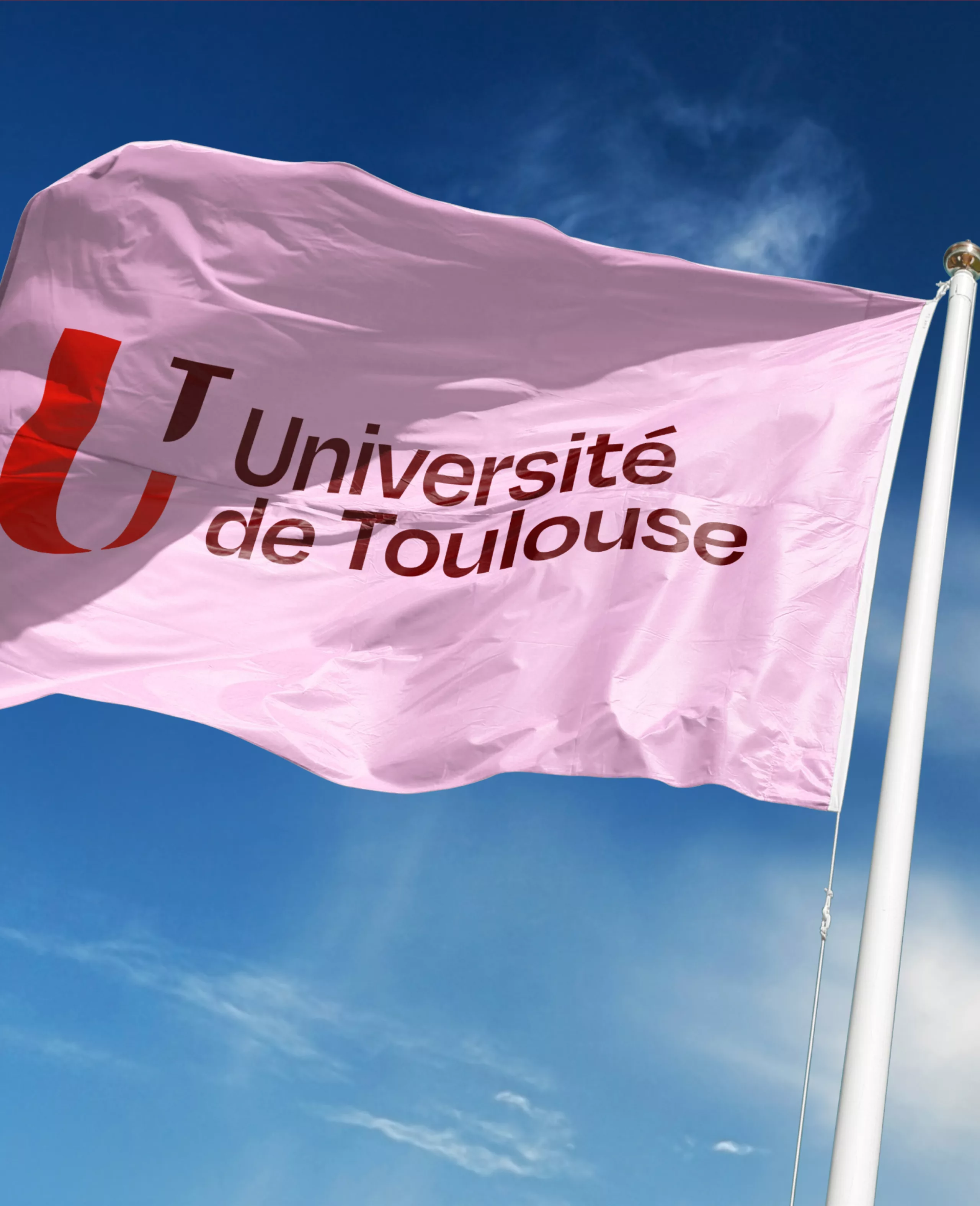
Burnt orange, pale pink, deep brown: this new colour range anchors the University more strongly in its territory, while moving away from the institutional blues traditionally associated with the academic world. A warmer, more distinctive and more embodied identity, in the image of Toulouse itself.