fr
fr

Bayard Kids

Growing in confidence.

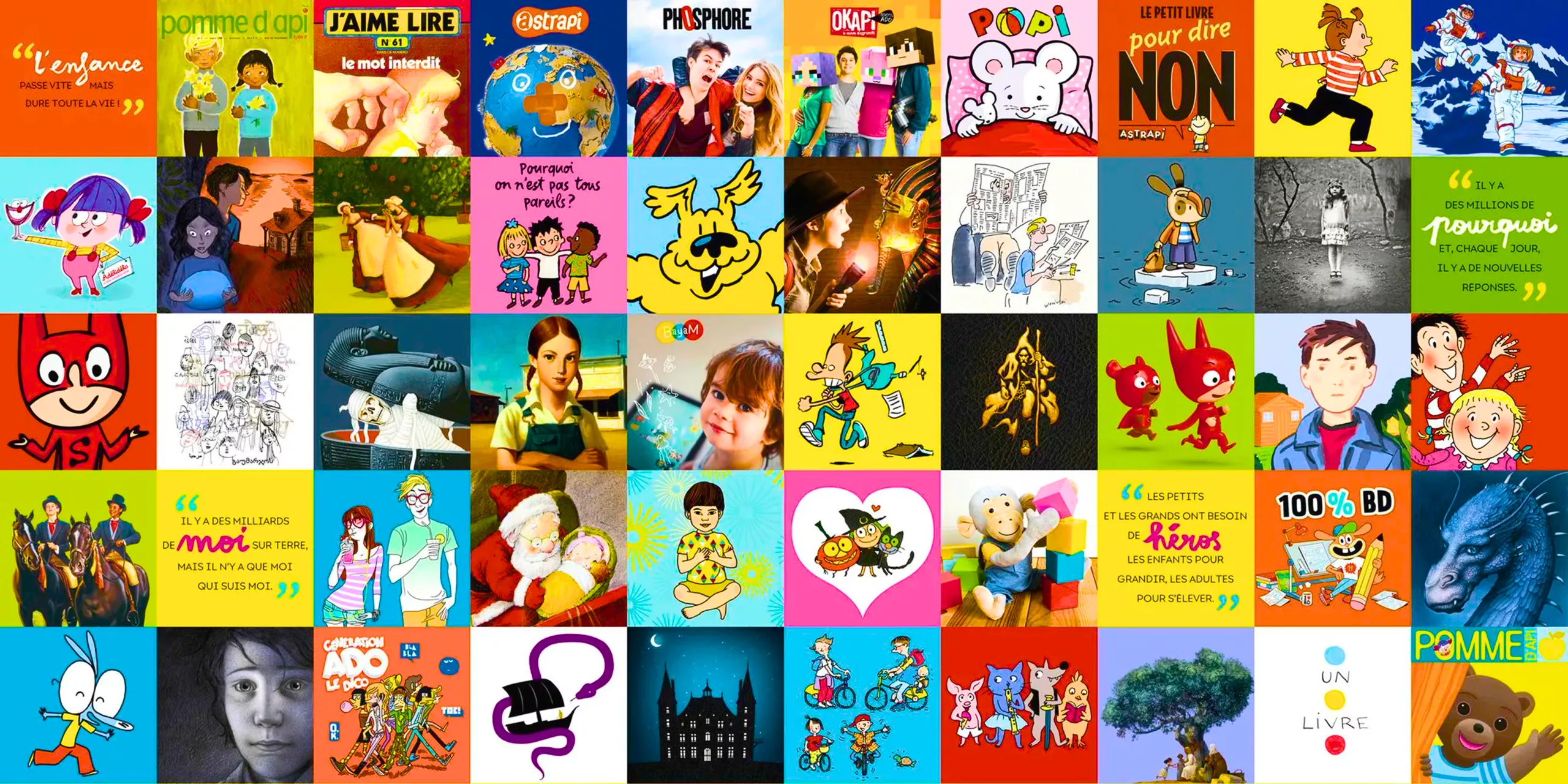
For 60 years, Bayard Jeunesse has accompanied children and teenagers through their discoveries, learning experiences and countless adventures. From Petit Ours Brun to Ariol, from Pomme d’Api to Phosphore, the brand has helped generations of young readers grow up through an incredible diversity of stories, characters and imaginary worlds.

Today, stories are no longer told on paper alone. Books, magazines, apps, podcasts, animated series… Bayard Jeunesse has become a multimedia brand, exploring every avenue of creative content for young audiences. Whether through a magazine or an animated series, the ambition remains the same: to inspire laughter, play, curiosity and reflection, helping children grow and find their own voice by nurturing a love of reading, a hunger for knowledge and a thirst to discover the world.

In a landscape dominated by Disney, Netflix and YouTube, Bayard Jeunesse is determined to champion an ambitious vision of children’s content and proudly stand by its promise: “Growing Up with Confidence.”

How do you bring this galaxy of creative worlds together under one brand without compromising their individual identities? This was the challenge at the heart of our mission: to evolve the brand identity and strengthen the Bayard Jeunesse masterbrand, giving it greater character, visibility and consistency, from print to screen, in France and around the world.
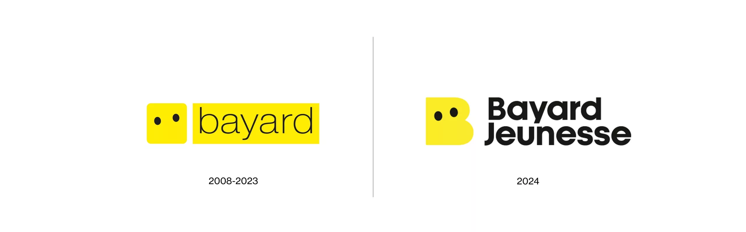
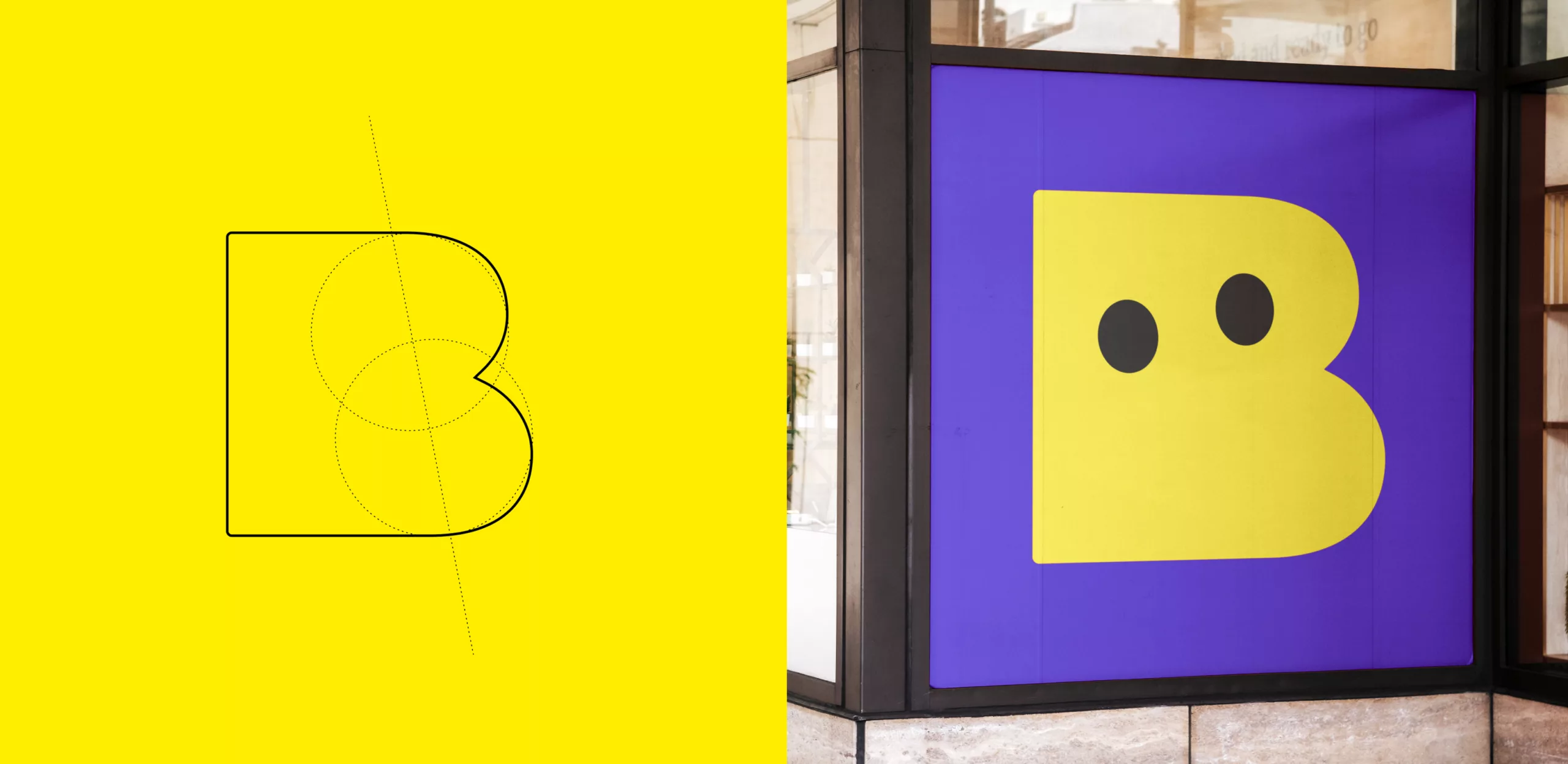
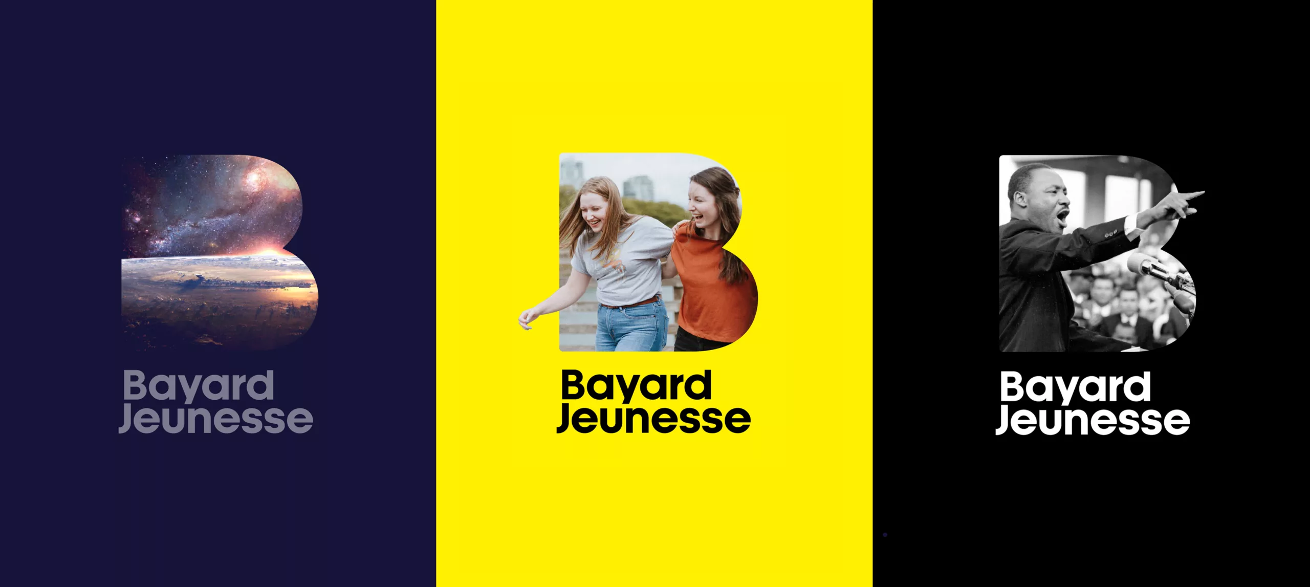
A New Symbol

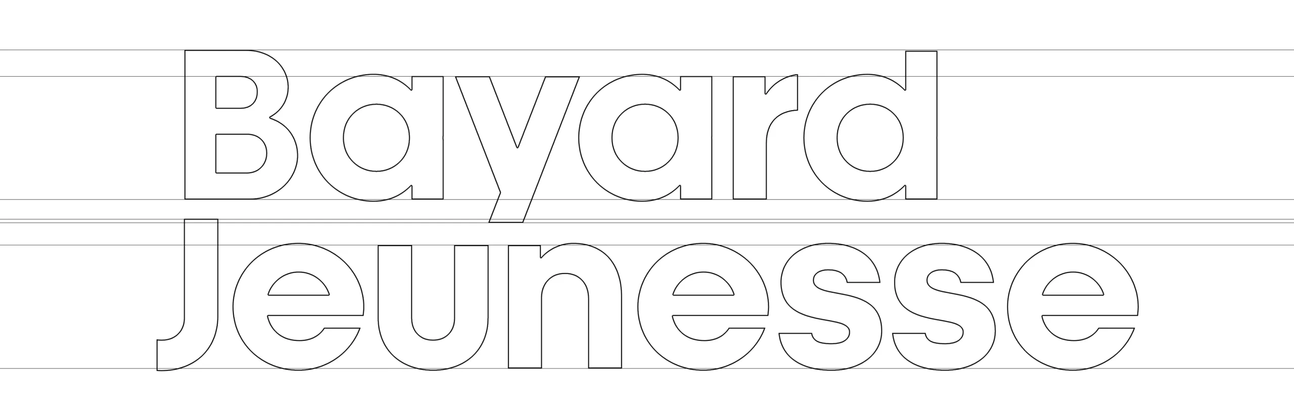
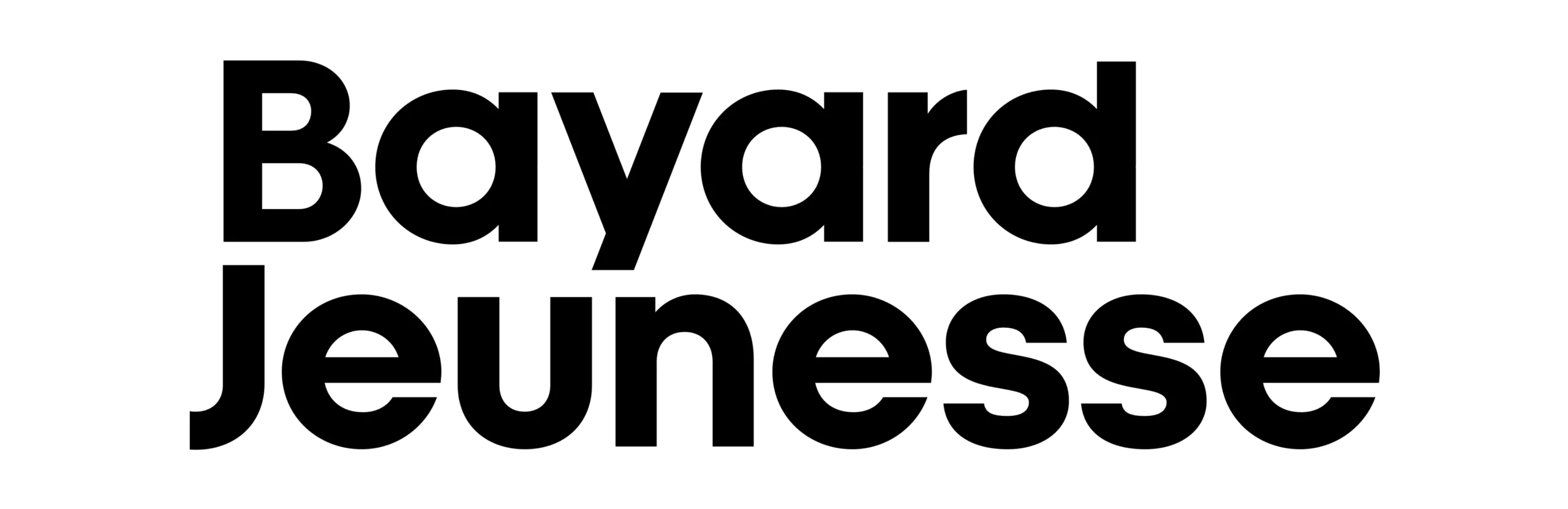
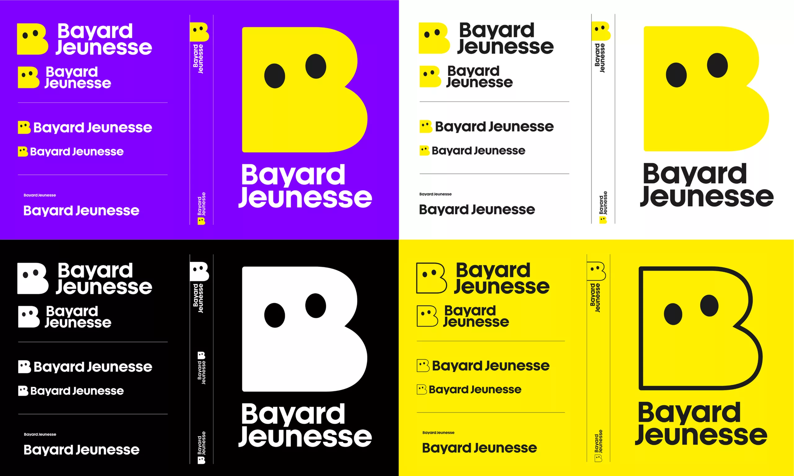
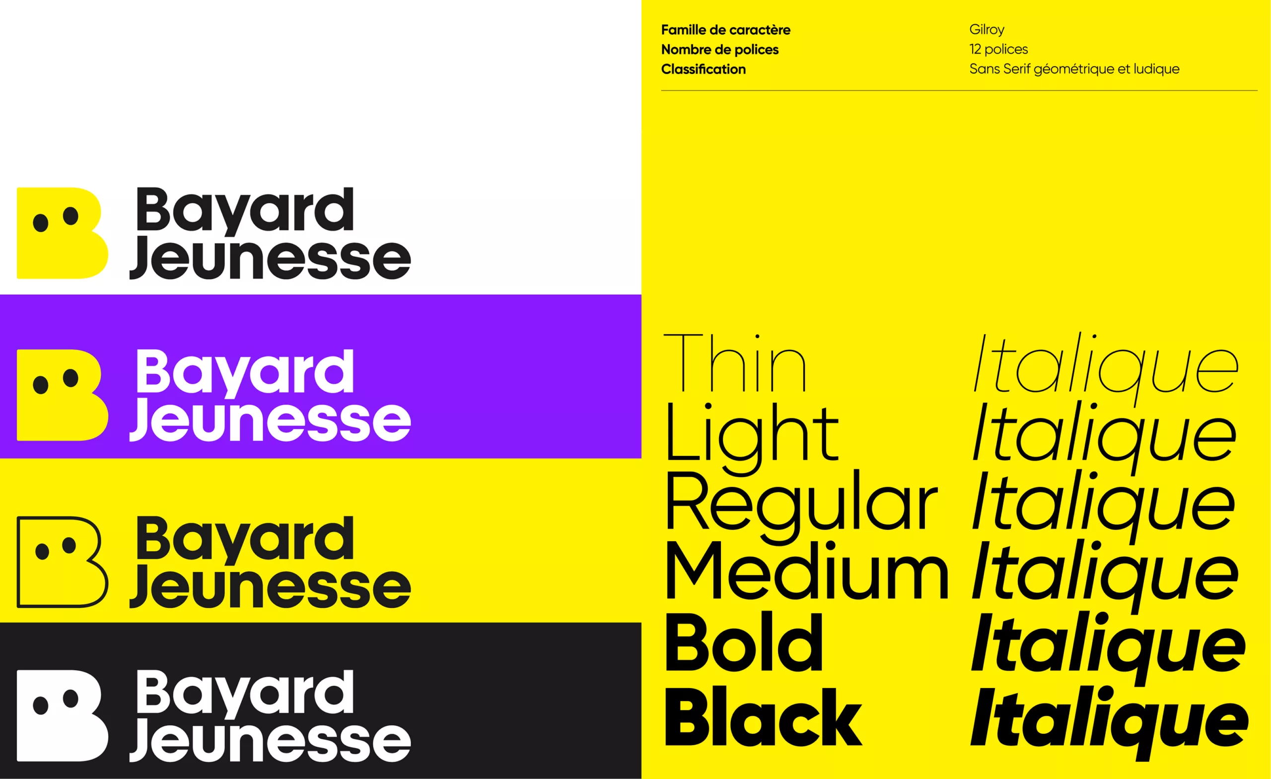
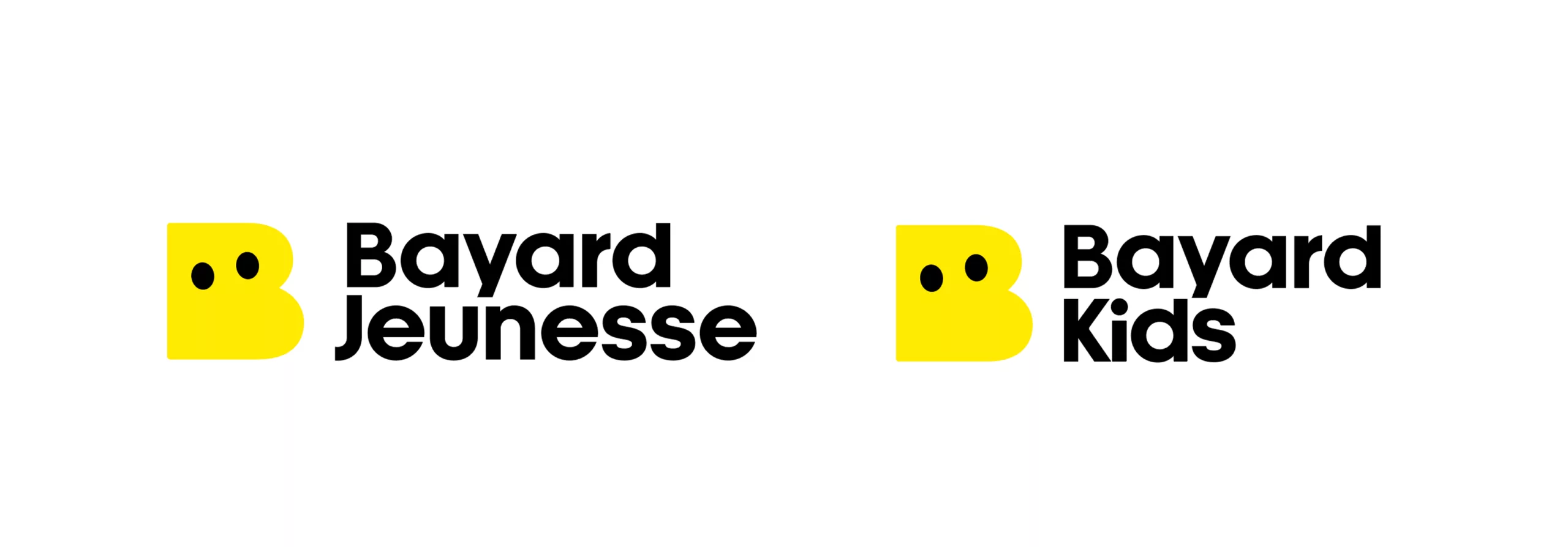
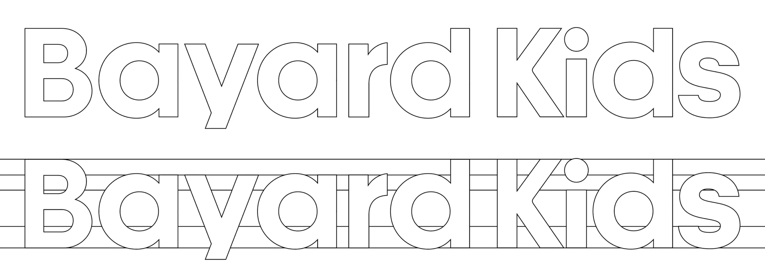
To complement this new symbol, we redesigned the wordmark. Proportions were rebalanced, shapes simplified and letterforms given greater weight to create a visual signature that is bold, approachable and expressive.

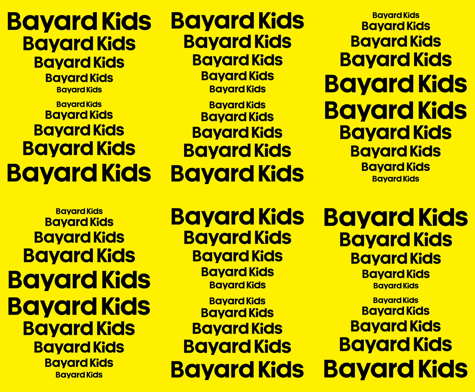
The return of the word “Jeunesse” clearly reaffirms the brand’s focus on young audiences. Designed to work across one or two lines, the wordmark adapts seamlessly to the requirements of different formats and media.

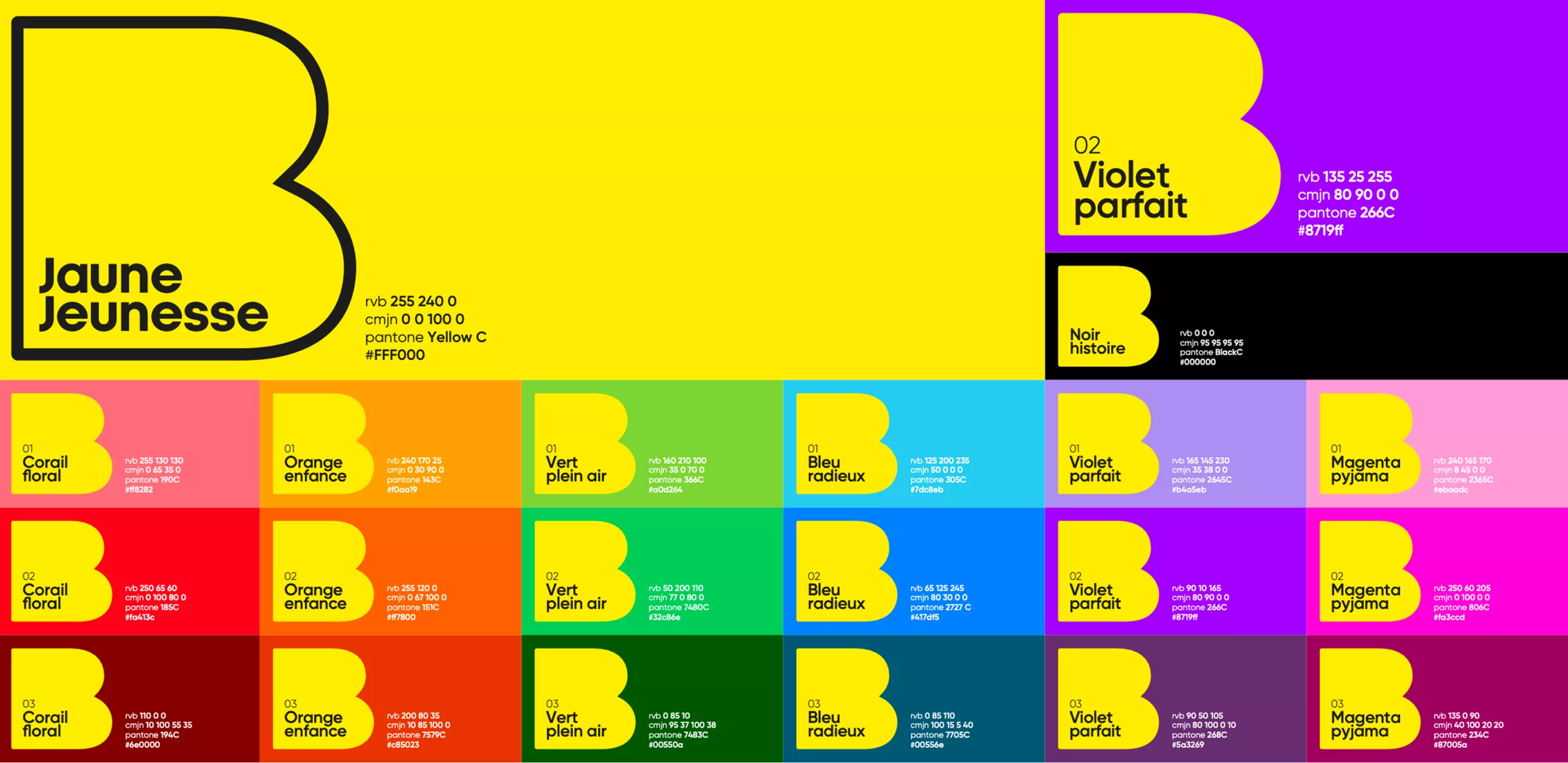
The combination of Bayard’s iconic yellow, deep black and geometric shapes creates an instantly recognisable identity, equally at home on a book cover or a smartphone screen.

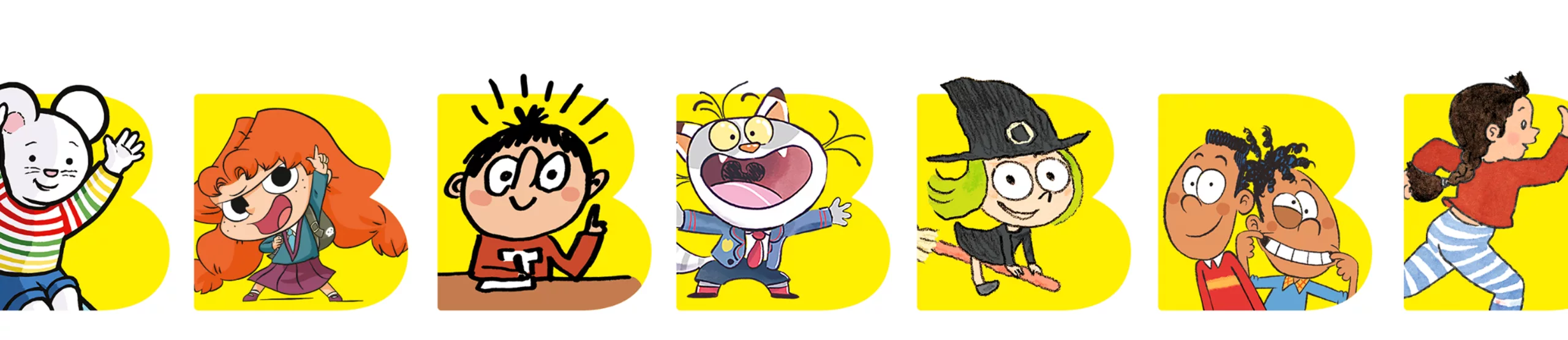
One B, a Thousand Stories to Tell

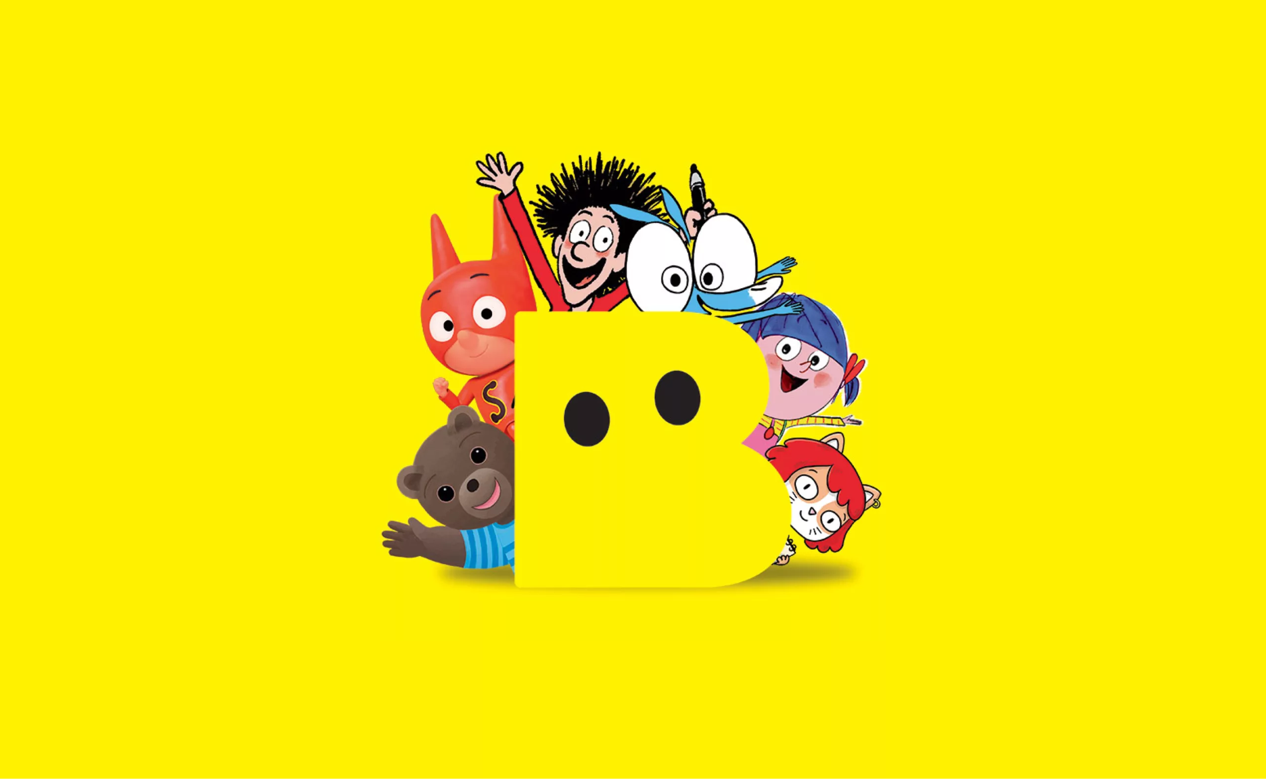
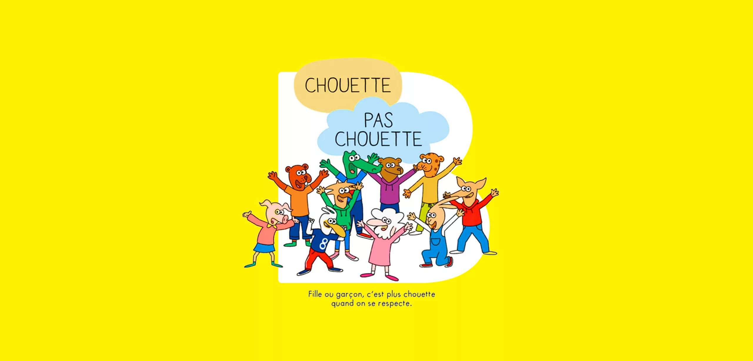
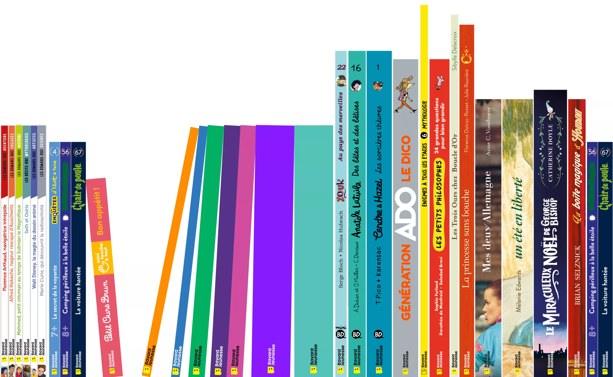
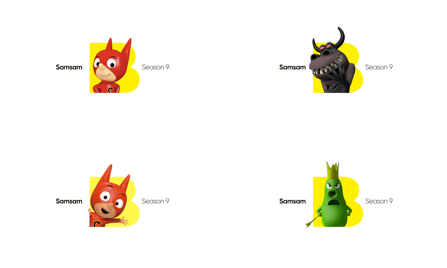
Petit Ours Brun, SamSam, Ariol, Anatole Latuile… Bayard Jeunesse brings together a wide variety of characters and visual worlds. The challenge was not to standardise this diversity, but to give it a unifying symbol.

The new wordmark acts as a shared signature, bold enough to identify the publisher yet discreet enough to let the illustrations, characters and stories take centre stage. Whether placed at the bottom of a book cover, on magazines or across different collections, it creates a visual connection between creations that each retain their own distinct personality.

In short, we set out to design a brand that brings stories together without ever stealing the spotlight.

Growing Up with Confidence

A brand positioning built around a simple promise with a big ambition. Growing up means having a thousand questions to ask adults. It means discovering, trying, making mistakes and starting all over again. To support children through their first steps and their greatest discoveries, Bayard Jeunesse places trust and confidence at the heart of its promise.

Above all, it’s about the confidence children develop in themselves, in others and in the world around them. A belief that spans generations and finds expression in every form of creative content, from books to animated series.

Because it’s not just about telling stories. It’s also about giving children the tools to understand the world, nurture their curiosity and forge their own path.

Used independently on certain applications, the wordmark has been redesigned to give the brand a stronger visual presence and a more distinctive personality. The custom lettering builds on the geometric foundations of the previously used typeface, Gilroy. Its playful and approachable character has been preserved, while the black has been made bolder and the ascenders and descenders shortened, allowing the wordmark to work effectively on either one or two lines.

Today, a children’s brand needs to move seamlessly from books to apps, from magazine covers to animated series.

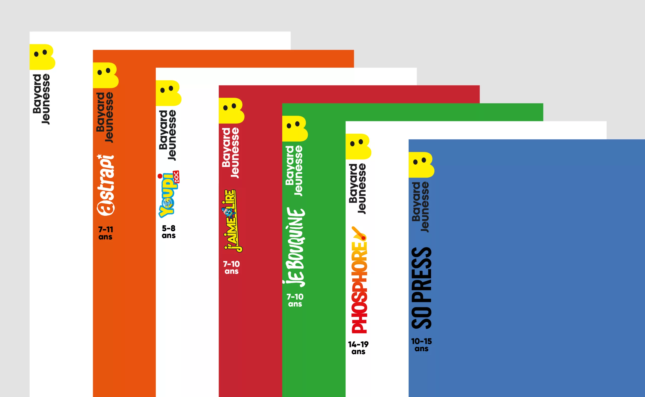
Designed to work across this wide range of formats, the new identity combines simplicity, legibility and versatility. The B becomes a distinctive visual symbol that can stand on its own, while the complete wordmark reinforces Bayard Jeunesse’s presence across all its productions.

An identity that preserves the strength of traditional publishing while embracing the codes and conventions of digital media.

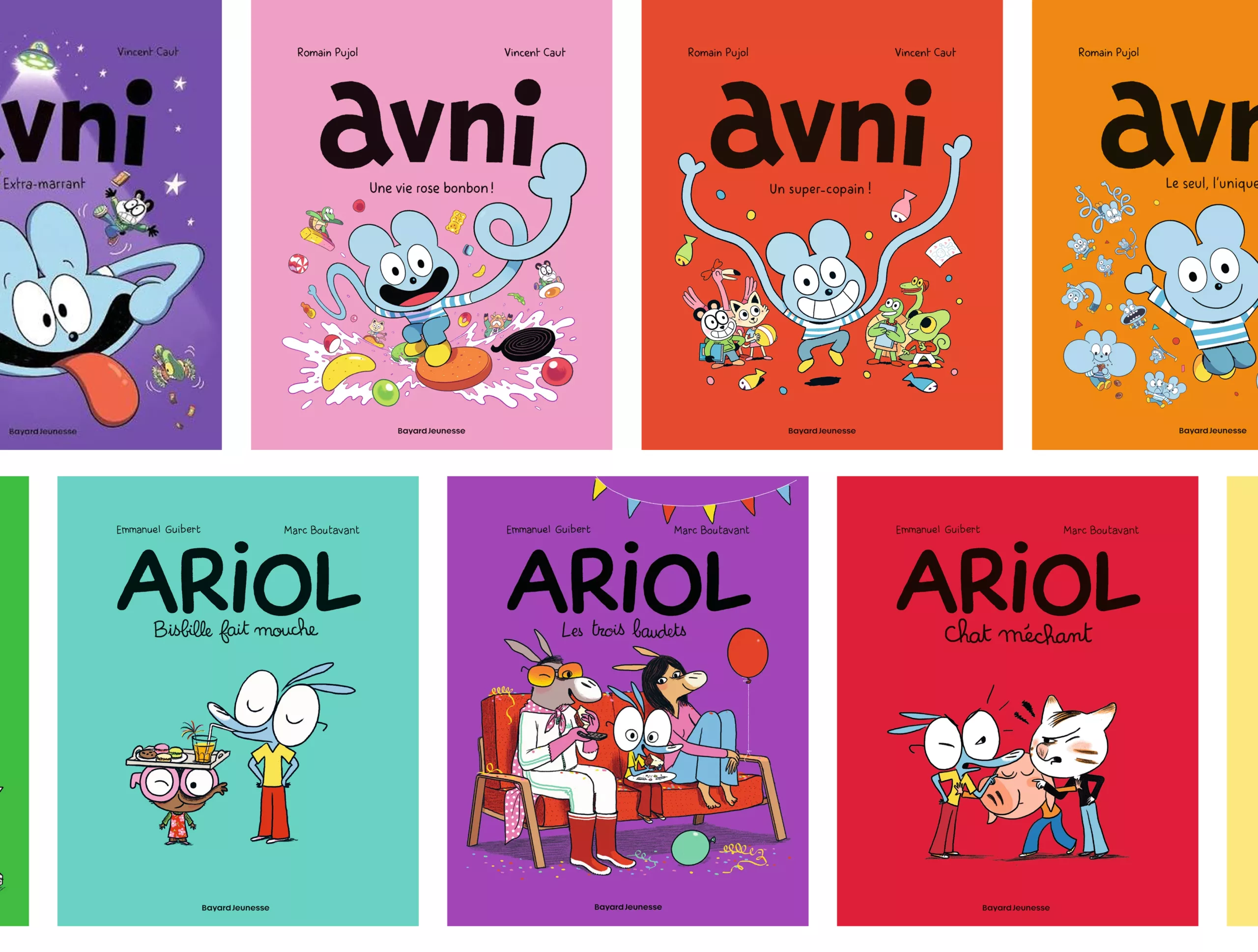
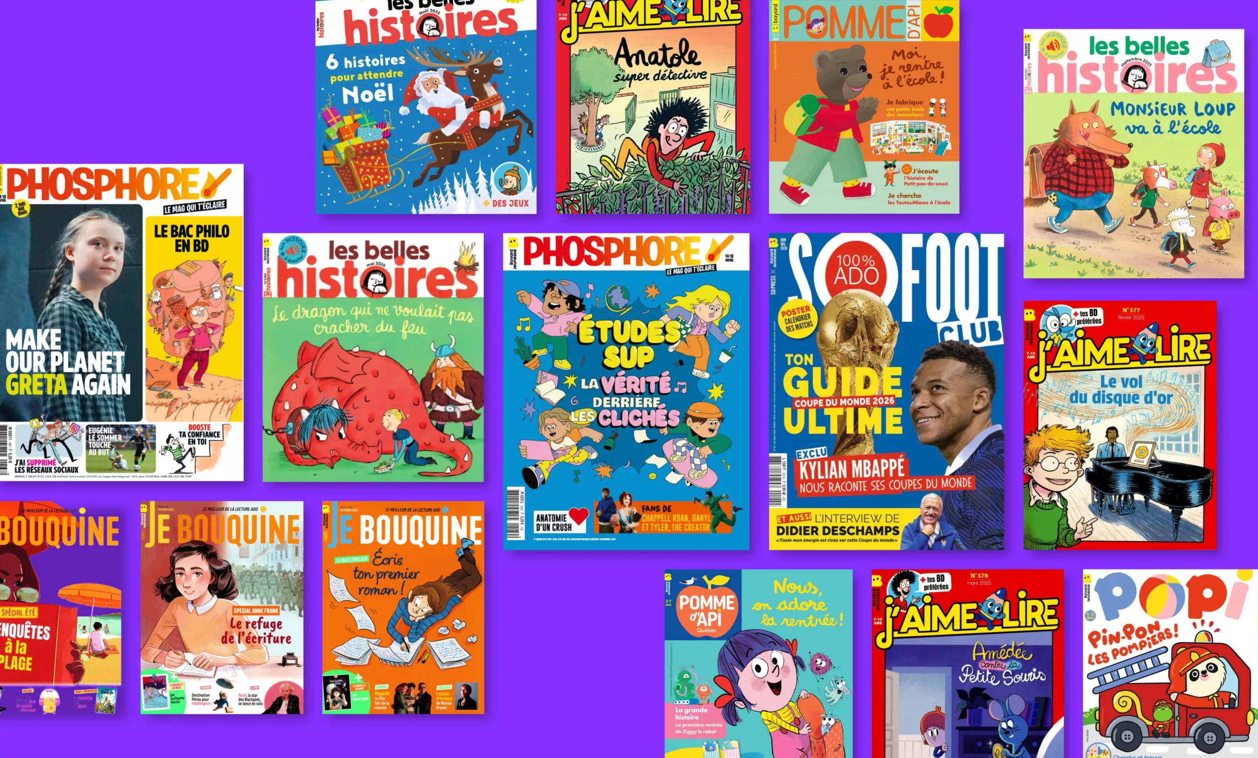
The wordmark is placed at the bottom of book covers across the various collections, while the full version is used in a vertical layout on all magazines.

Bayard Kids: Stories Without Borders

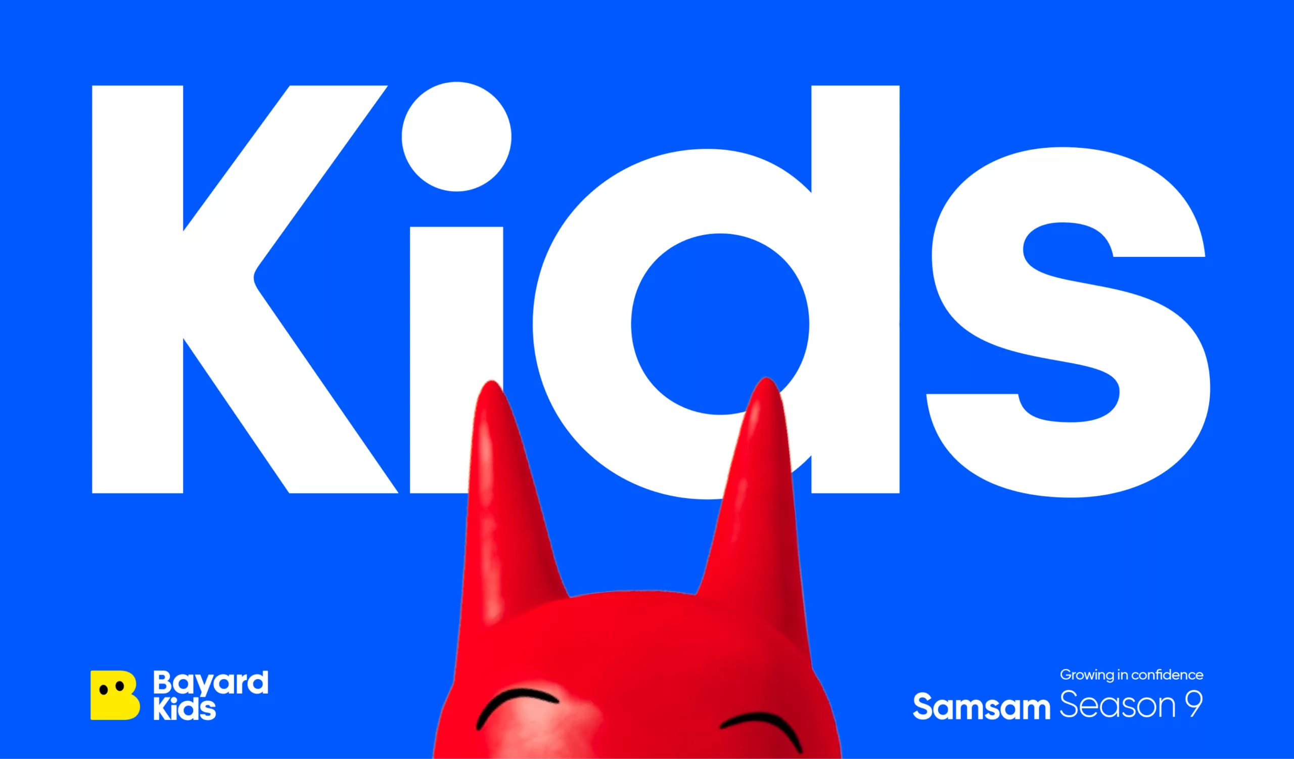
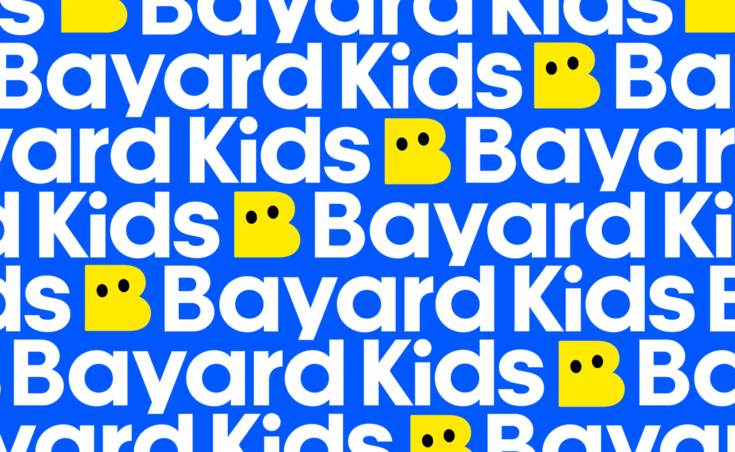
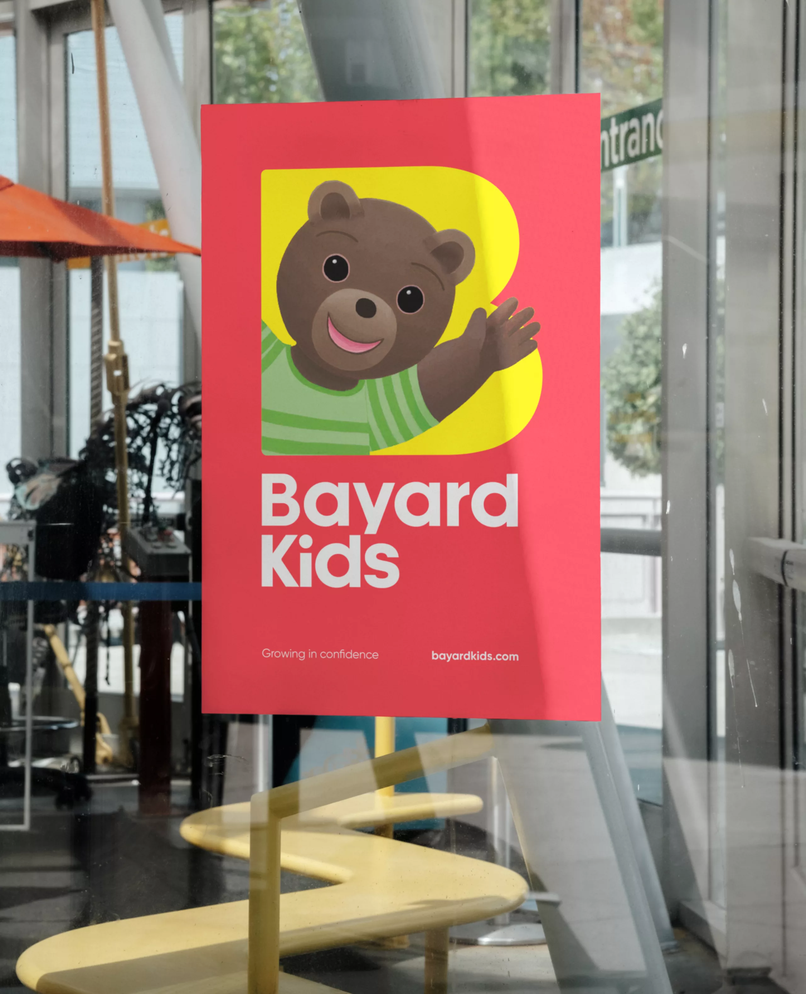
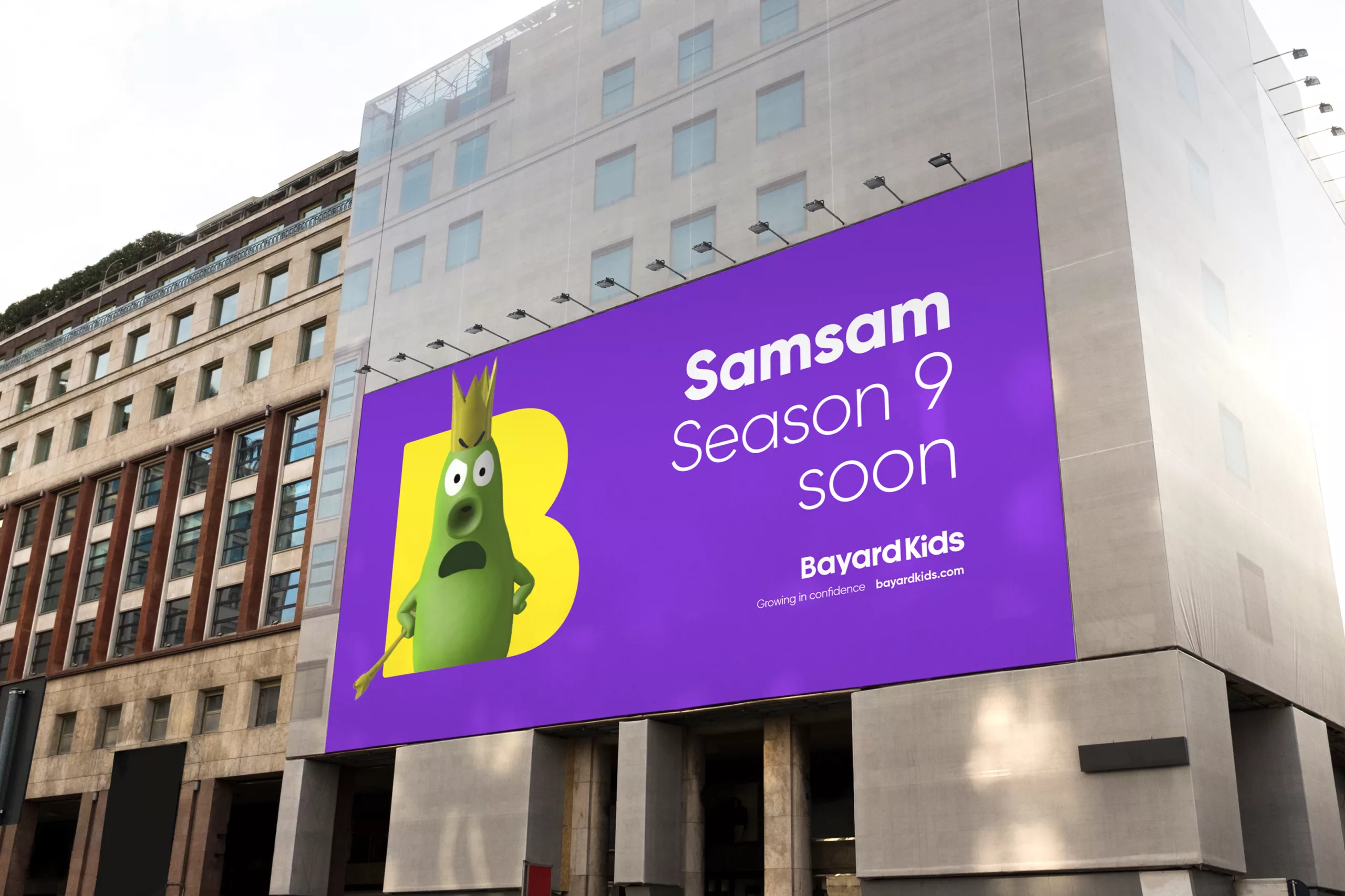
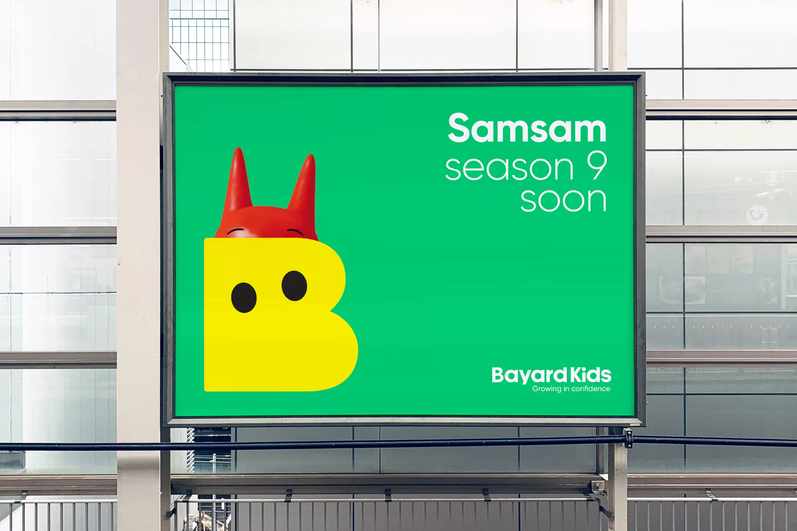
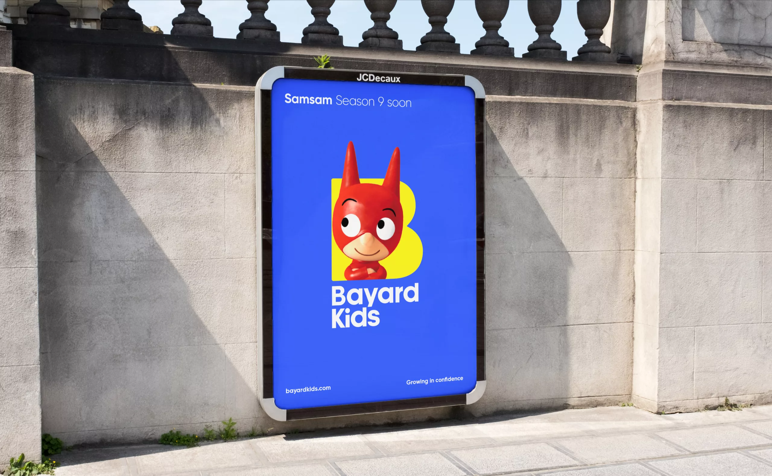
With Bayard Kids, the identity continues its expansion internationally. Built on the same graphic principles as Bayard Jeunesse, this adaptation retains the iconic B and an instantly recognisable typographic signature. The visual system adapts to different markets and supports a range of content with a particular focus on animation, digital media and audiovisual productions.

Two expressions of the same brand, sharing the same spirit of discovery and the same ambition: to help children broaden their horizons and explore the world. An identity that grows alongside its audiences, its stories and its ever-expanding creative possibilities.
Acknowledgments:
Thank you to Héloïse des Monstiers, Corine Worms, Frédéric Benaglia, and Aline Lefrère for their trust throughout the project.
Special thanks to Vincent Gaudas (Sound Design) and Cyril Calgaro (Motion Design).